『エンジニアでも知っておきたいデザインの基礎知識 』の英語版です。
もしよければ英文の編集リクエストもお願いします。
Target readers
This is design knowledge that you can use when need to coding based on wireframe.
You don't have to read this article if you have a Design mock.
(This isn't an idea for creating a new design.)
Outline
When you write HTML code, you may not receive Design mock, because lately web sites are simple design.
This article is written about that case with example.
Design isn't made of only aesthetic taste. Many bad design cases are logically explained why they look dirty.
Example
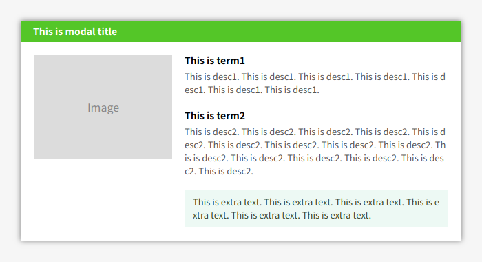
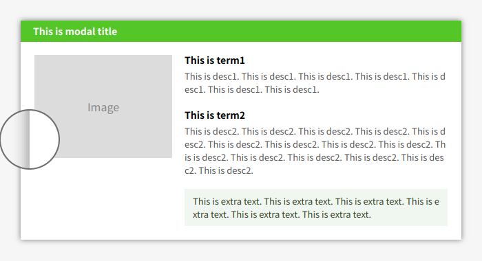
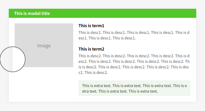
Now, You need to coding a new partial for the existing website without design mock.
You got a following wireframe.
Design of the new partial should be followed to the existing website.
existing website is Qiita in this example.
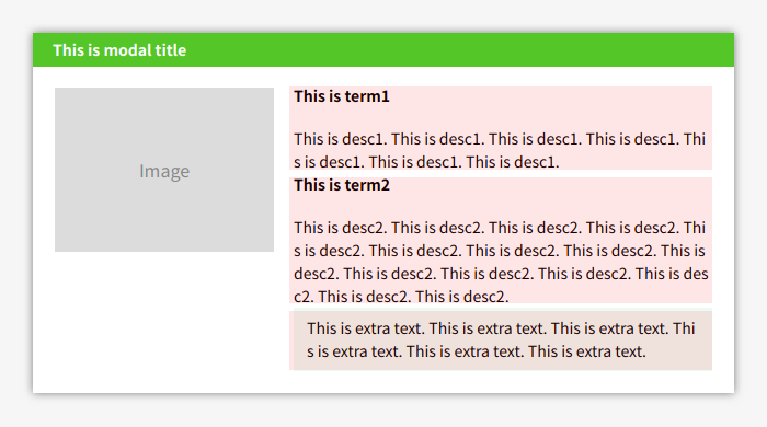
Then, this is a Bad design made by engineer.
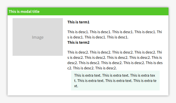
You might can't understand about why is it Bad.
Let's try to check before read below.
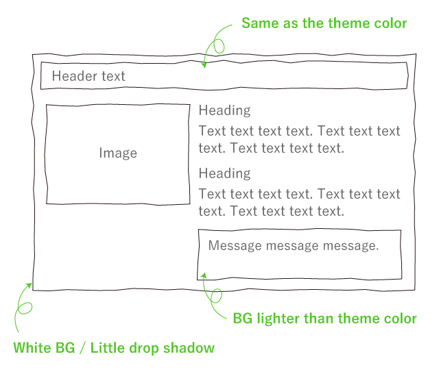
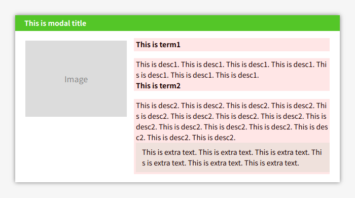
Invisible lines
Each elements should be aligned to the invisible lines.
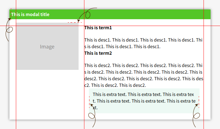
I made it visible. Let's make marked elements align to the red lines.
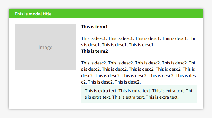
Now fixed all. I removed red lines, But maybe you still can see invisible line.
Groups
Term1 and Desc1 must be same group, but they don't look so.
Let's make margin between groups bigger than margin between elements inside of group.
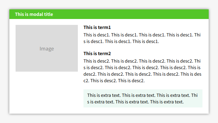
You should think about groups before adjust margin.
Contrast
The heading already bold.
I believe the description should be more smaller than the heading.
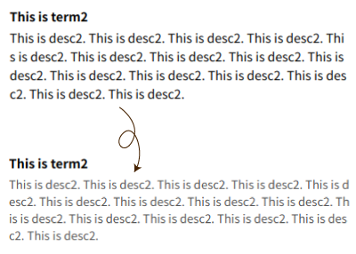
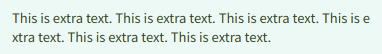
I made description 1px small and made color lighter.
Description strength should be around 60~80% of the heading.
Now you can read the headings easily.
Change color brightness
This BG color isn't bad, but it is different as the theme color.
The theme color includes a little yellow. The Bad color includes a little blue.
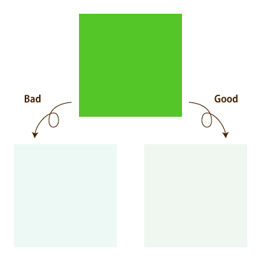
Even if you can't understand those difference, it is OK.
First, The Hue of the color must not be changed.
For that, you can use a color picker kind of this.
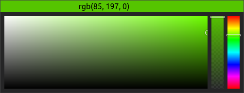
The rightmost indicator is Hue adjuster. Please don't change it.
The leftmost square map is chroma and brightness adjuster.
If you want to make BG, need to move it to left top than original color.

Now, it is correct Hue BG.
Good effects
You needed to apply drop shadow, but it is too strong.
Let's make it weakness.
This is difficult adjustment.
The effects should be You can barely see the effects.
Fixed all

I showed minor adjustment in this article.
You can fix it if you can notice my first example is Bad and why is it Bad.