はじめに
UIButton.Configuration は、UIButtonの見た目や動作などを指定する構成で、iOS 15.0以上で利用可能です。
UIButton.Configuration の導入により、画像の配置位置を変更したり、ボタン内にindicatiorを導入したり、サブタイトルを追加したりなどが簡単にできるようになり、よりリッチなボタンの実装を行いやすくなりました。
それに伴いiOS 15.0以上で今までのUIButtonで利用していたプロパティやメソッドがDeprecatedとなっており、Deployment Targetを15.0以上に変更する際には警告を消すためには UIButton.Configuration への置き換えやSwiftUIへの書き換えが必要になります。
UIButton.Configuration の記事が少なく思ったような実装を行うのに苦労したので、わかったこともわからなかったことも併せて記載していきます。
Environment
- macOS Ventura 13.1
- Xcode 14.2
- Simulator: iPhone 14 Pro(iOS 16.2)
基本
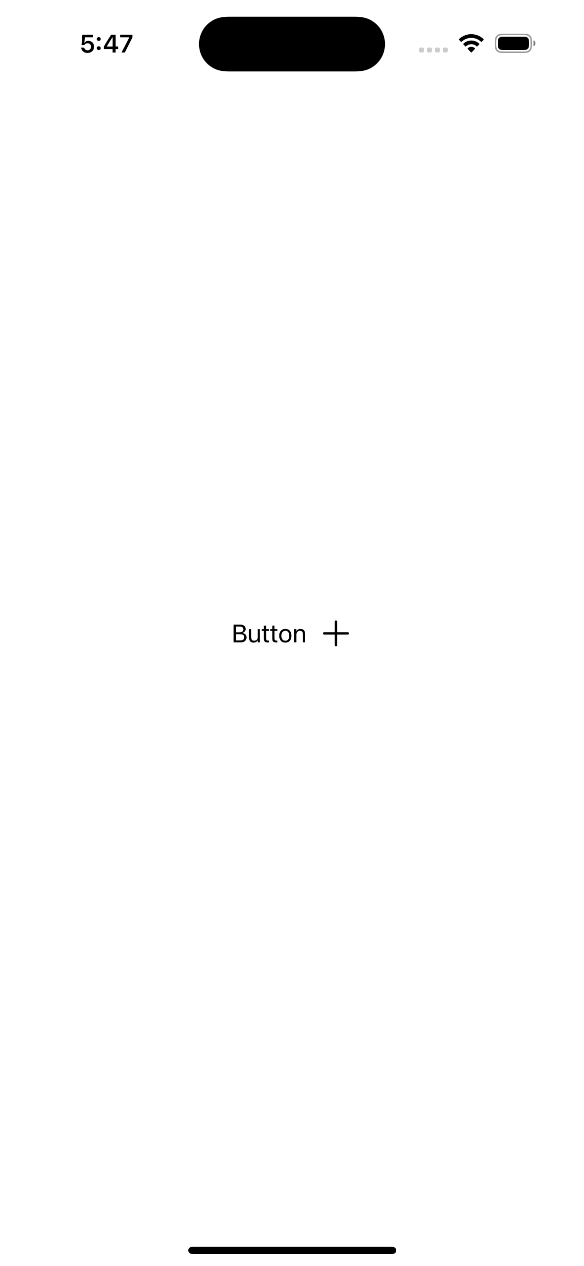
背景なしのシンプルなボタン
今までと異なり、アイコンがタイトルの右にあるボタンやサブタイトルを持つボタンが実装しやすくなりました。
/// Only title
final class TitleButton: UIButton {
    convenience init() {
        self.init(frame: .zero)

        var config = UIButton.Configuration.plain()
        config.title = "Button"
        config.baseForegroundColor = .black // title, imageの色の設定
        configuration = config
    }
}

/// Title + Icon
final class TitleIconButton: UIButton {
    convenience init() {
        self.init(frame: .zero)

        var config = UIButton.Configuration.plain()
        config.title = "Button"
        config.image = UIImage(systemName: "plus")
        config.imagePadding = 8 // titleとimageのpaddingを設定
        config.imagePlacement = .trailing // titleに対するimageの位置を設定
        config.baseForegroundColor = .black
        configuration = config
    }
}

/// Title + Subtitle
final class TitleSubtitleButton: UIButton {
    convenience init() {
        self.init(frame: .zero)

        var config = UIButton.Configuration.plain()
        config.title = "Button"
        config.subtitle = "subtitle"
        config.baseForegroundColor = .black
        config.titlePadding = 12 // titleとsubtitleのpaddingを設定
        configuration = config
    }
}
| Only title | Title + Icon | Title + Subtitle |
|---|---|---|
 |
 |
 |
背景色あり
configuration を生成するメソッドを適切なものに変更すると背景色をつけることができるようになります。
.plain() のままだと背景色は変更されません。 .tinted() filled() .gray() などから適切なものを設定します。
( baseBackgroundColor を設定する場合、 filled() .gray() には差がなさそう?)
/// tinted
final class TintedButton: UIButton {
    convenience init() {
        self.init(frame: .zero)

        // .tinted()で背景色が半透明になる
        var config = UIButton.Configuration.tinted()
        config.title = "Button"
        config.image = UIImage(systemName: "plus")
        config.imagePadding = 8
        config.imagePlacement = .trailing
        config.baseForegroundColor = .black
        config.contentInsets = .init(top: 8, leading: 16, bottom: 8, trailing: 16) // button自体のpaddingを設定
        config.baseBackgroundColor = .red // 背景色を設定
        configuration = config
    }
}

/// filled
final class FilledButton: UIButton {
    convenience init() {
        self.init(frame: .zero)

        // .filled()で背景色が不透明になる
        var config = UIButton.Configuration.filled()
        config.title = "Button"
        config.image = UIImage(systemName: "plus")
        config.imagePadding = 8
        config.imagePlacement = .trailing
        config.baseForegroundColor = .black
        config.contentInsets = .init(top: 8, leading: 16, bottom: 8, trailing: 16)
        config.baseBackgroundColor = .red
        configuration = config
    }
}
| tinted | filled |
|---|---|
 |
 |
枠線をつける
今までUIButtonで枠線をつける場合は layer.borderColor layer.borderWidth で設定していましたが、 UIButton.Configuration を利用する場合、設定した UIBackgroundConfiguration をUIButton.Configurationにセットすることで設定可能になります。
( UIButton.Configuration.borderd() がありますが、これを設定しても枠線はつきませんでした。背景色の有無に応じて .plain() を使うか .filled() を使うかなどを決めると良さそうです  )
)
UIBackgroundConfiguration を生成するためのstatic funcはそのほとんどがUICollectionViewやUITableViewのためのものなので、よほどの事情がなければ .clear() のみを利用するのが良さそうです。
/// plain + border
final class BorderedPlainButton: UIButton {
    convenience init() {
        self.init(frame: .zero)

        var config = UIButton.Configuration.plain()
        config.title = "Button"
        config.image = UIImage(systemName: "plus")
        config.imagePadding = 8
        config.imagePlacement = .trailing
        config.baseForegroundColor = .black
        config.contentInsets = .init(top: 8, leading: 16, bottom: 8, trailing: 16)

        // 背景の設定を行う
        var backgroundConfig = UIBackgroundConfiguration.clear()
        backgroundConfig.strokeColor = .black // 枠線の色を設定
        backgroundConfig.strokeWidth = 2 // 枠線の太さを設定
        config.background = backgroundConfig // UIBackgroundConfigurationをセット

        configuration = config
    }
}

/// filled + border + capsule
final class CapsuleBorderedFilledButton: UIButton {
    convenience init() {
        self.init(frame: .zero)

        var config = UIButton.Configuration.filled()
        config.title = "Button"
        config.image = UIImage(systemName: "plus")
        config.imagePadding = 8
        config.imagePlacement = .trailing
        config.baseForegroundColor = .black
        config.contentInsets = .init(top: 8, leading: 16, bottom: 8, trailing: 16)
        config.baseBackgroundColor = .red
        config.cornerStyle = .capsule // cornerRadiusを常にカプセル状になるように設定する

        var backgroundConfig = UIBackgroundConfiguration.clear()
        backgroundConfig.strokeColor = .black
        backgroundConfig.strokeWidth = 2
        config.background = backgroundConfig

        configuration = config
    }
}
background を設定した時に cornerStyle をデフォルトのままにしていると何故か角丸でなくなります
UIButton.Configuration の cornerStyle を設定するか、UIBackgroundConfigの cornerRadius を設定してあげると背景と枠線に角丸が適用されます。
| plain + border | filled + border + capsule |
|---|---|
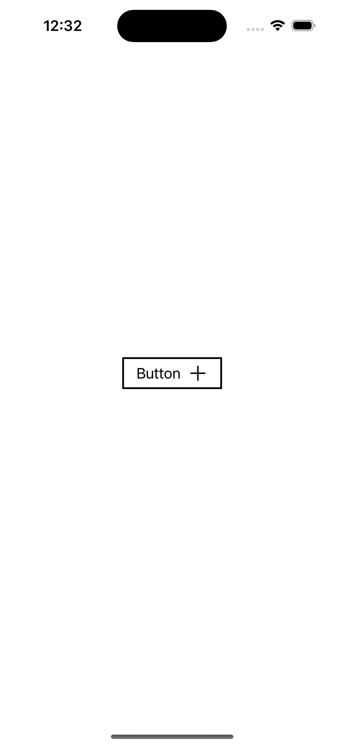 |
 |
思い通りのUIを実装する
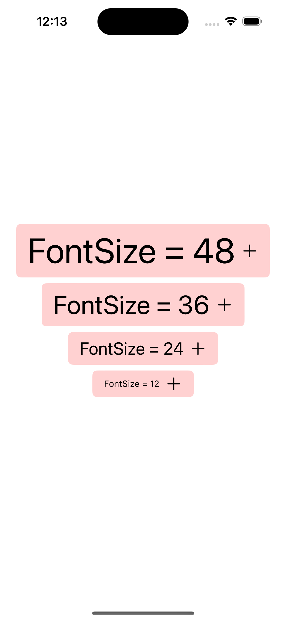
フォントサイズを変える
UIButton.Configuration には buttonSize というプロパティが用意されていますが、指定できるのはenumで定義された4種類のみしか無く、自在にサイズを指定できるわけではありません。

直接フォントサイズを指定することもできませんが、 attributedTitle でAttributedStringを指定することでラベルの装飾を細かく指定できます。
attributedSubtitle も存在します。
final class FixedFontSizeButton: UIButton {
    convenience init(
        title: String,
        fontSize: CGFloat
    ) {
        self.init(frame: .zero)

        var config = UIButton.Configuration.tinted()
        // attributedTitleを設定する
        // titleは不要なので削除
        let container = AttributeContainer([
            .font: UIFont.systemFont(ofSize: fontSize)
        ])
        config.attributedTitle = AttributedString(title, attributes: container)
        config.image = UIImage(systemName: "plus")
        config.imagePadding = 8
        config.imagePlacement = .trailing
        config.baseForegroundColor = .black
        config.contentInsets = .init(top: 8, leading: 16, bottom: 8, trailing: 16)
        config.baseBackgroundColor = .red

        configuration = config
    }
}
Stateに合わせて見た目を変える
上記に記した実装でもボタンの状態に応じてOS側で自動的に色を変えてくれるようになっていますが、業務でUIを実装する際にはボタンの状態ごとに色が明確に決められている場合もあるかと思います。
UIButton.Configuration の titleTextAttributesTransformer や imageColorTransformer 、 UIBackgroundConfiguration の backgroundColorTransformer や strokeColorTransformer などを使うことでボタンの状態が変化したときに思い通りの見た目に更新することができます。
(枠線をつける場合、 strokeColorTransformer のみ実装しても色がつかず、 strokeColor を追加する必要がありました。バグなのかな…… )
final class ColorTransformerButton: UIButton {
    convenience init(
        title: String,
        isEnabled: Bool
    ) {
        self.init(frame: .zero)

        var config = UIButton.Configuration.filled()
        config.attributedTitle = AttributedString(title)
        config.image = UIImage(systemName: "plus")
        config.imagePadding = 8
        config.imagePlacement = .trailing
        config.contentInsets = .init(top: 8, leading: 16, bottom: 8, trailing: 16)
        // attributedTitleのattributesを設定する
        // `baseForegroundColor` は不要なので削除
        config.titleTextAttributesTransformer = .init { [weak self] _ in
            guard let self = self else { return .init([:]) }
            let color: UIColor = {
                switch self.state {
                case .disabled:     return .darkGray
                case .highlighted:  return .white
                default:            return .black
                }
            }()
            return .init([
                .font: UIFont.systemFont(ofSize: 14),
                .foregroundColor: color
            ])
        }
        // imageColorを設定する
        config.imageColorTransformer = .init { [weak self] _ in
            guard let self = self else { return .clear }
            switch self.state {
            case .disabled:     return .darkGray
            case .highlighted:  return .white
            default:            return .black
            }
        }

        var backgroundConfig = UIBackgroundConfiguration.clear()
        backgroundConfig.strokeWidth = 1
        backgroundConfig.cornerRadius = 4
        // backgroundColorを設定
        // `config.baseBackgroundColor` は不要なので削除
        backgroundConfig.backgroundColorTransformer = .init { [weak self] _ in
            guard let self = self else { return .clear }
            switch self.state {
            case .disabled:     return .lightGray
            case .highlighted:  return .magenta
            default:            return .systemPink
            }
        }
        // strokeColorを設定
        backgroundConfig.strokeColor = .black // 初期値を入れないとstrokeColorが反映されない
        backgroundConfig.strokeColorTransformer = .init { [weak self] _ in
            guard let self = self else { return .clear }
            switch self.state {
            case .disabled:     return .darkGray
            case .highlighted:  return .white
            default:            return .black
            }
        }

        config.background = backgroundConfig
        configuration = config

        self.isEnabled = isEnabled
    }
}

UIButton.Configuration で実現できなかったこと
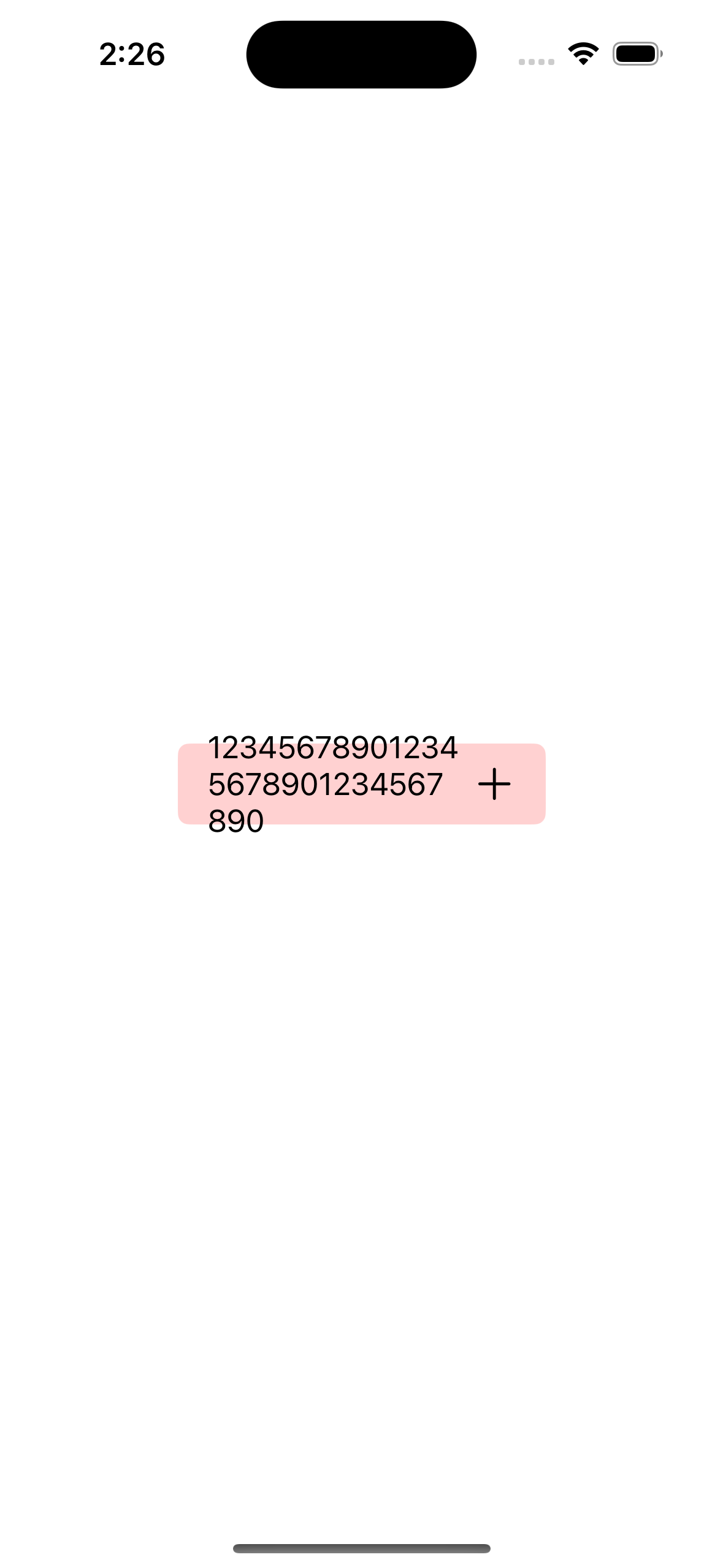
UIButton.Configuration を使用しない従来の方法でUIButtonを実装する際にラベルの行数を制限したい時、 titleLabel?.numberOfLines = 1 を追加するとラベルの行数を1行に制限することができました。
しかしながら、 UIButton.Configuration を使用して実装した場合にはUIButtonが持つ titleLabel に対して設定を追加しても反映されないため、 UIButton.Configuration に代替となるプロパティが存在しない numberOfLines textAlignment adjustsFontSizeToFitWidth などの設定はできませんでした。
タイトルの長さによってボタンのサイズは自動的に変わってくれますが、サイズに制約を追加している状態だとボタンからタイトルがはみ出してしまうことがあります。
よって、ボタンのサイズに対して長いタイトルが挿入される場合や、任意のタイトルが挿入されるようなボタンを実装する場合には注意が必要です。
| 幅の制約のみ | 幅・高さの制約あり |
|---|---|
 |
 |
おわりに
UIButton.Configuration の登場によってindicatorを追加するなど柔軟なボタンの実装はできるものの、従来の方法では出来ていたことができなくなってしまうなど痒い所に手が届かない印象を受けました。
現状の UIButton.Configuration で思い通りのボタンを実装するのは難しい場合もあり、warningが出るのを承知で従来の方法を使い続けて UIButton.Configuration が改善されるのを待つか、SwiftUIのButtonに置き換えるかした方がいいかもしれません
時代はやはりSwiftUIということなんでしょうか……。
とはいえ、UIKitで実装された画面上のボタンを実装する際に、タイトルを動的に変更する必要があったり、タイトルがボタンのサイズに対して小さい分には実用に足るものかと思ったので、今後の改善を待ちたいところです。