JupyterLabで使う
公式ドキュメントのJupyterLab Supportを参照。
一応手順だけ抜粋しておくと (2021年3月2日現在)
拡張機能のインストール
pip install jupyterlab "ipywidgets>=7.5"
jupyter labextension install jupyterlab-plotly@4.14.3
jupyter labextension install @jupyter-widgets/jupyterlab-manager plotlywidget@4.14.3
上記を入れたうえで、以下の様に普通にプロットすれば、プロットされたグラフをクリック・マウス操作することにより任意のグラフを消したり、拡大縮小したり等、インタラクティブに使える。良い。
Plotly Graph Objects
インポート
import plotly.graph_objects as go
全般
疑似コード
# 空のFigureを作って、
fig = go.Figure()
# add_traceメソッドによりグラフを追加していく。
fig.add_trace(
   # go.Barとかgo.Scatterとかの、具体的なグラフのインスタンスをここへ。
)
# 軸の名前、グラフのタイトル、グラフのサイズとかはupdate_layoutメソッドで。
#  JupyterLabで表示している場合は、幅はノートブックの幅に勝手に合わせてくれるので、
#  heightだけ適当に調整するとよさげ。
fig.update_layout(
    xaxis_title='hoge',
    yaxis_title='fuga',
    title='piyo',
    height=500
)

fig.show()
ラインプロット
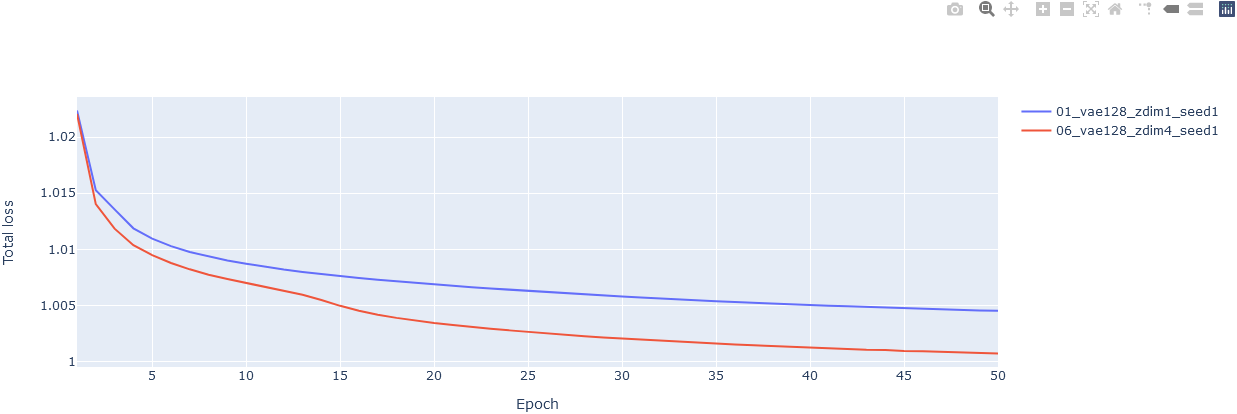
入力データ1 (df1)
| epoch | average_gen_loss | kld | total_loss | |
|---|---|---|---|---|
| 0 | 1 | 1.02231 | 0.924802 | 1.02239 |
| 1 | 2 | 1.01518 | 1.22425 | 1.01527 |
| 2 | 3 | 1.01342 | 1.9432 | 1.01357 |
| 3 | 4 | 1.01169 | 2.33714 | 1.01187 |
| 4 | 5 | 1.01076 | 2.46732 | 1.01095 |
| (以下省略) |
入力データ2 (df2)
| epoch | average_gen_loss | kld | total_loss | |
|---|---|---|---|---|
| 0 | 1 | 1.02196 | 1.57333 | 1.02208 |
| 1 | 2 | 1.01388 | 2.00052 | 1.01403 |
| 2 | 3 | 1.01166 | 2.32075 | 1.01184 |
| 3 | 4 | 1.01018 | 2.45098 | 1.01037 |
| (以下省略) |
(※ 別に入力データはデータフレームである必要はない)
コード
# 空のFigureを作って、
fig = go.Figure()
# グラフを追加していく。ラインプロットといいつつScatterを使う必要がある。
fig.add_trace(
    go.Scatter(x=df['epoch'], y=df['total_loss'], name='01_vae128_zdim1_seed1')
)
# 追加。
fig.add_trace(
    go.Scatter(x=df2['epoch'], y=df2['total_loss'], name='06_vae128_zdim4_seed1')
)
# 軸の名前とかタイトルとかを追加。
fig.update_layout(
    xaxis_title='Epoch',
    yaxis_title='Total loss'
)
fig.show()
Plotly Express
インポート
import plotly.express as px
ラインプロット
入力データ
| epoch | average_gen_loss | kld | total_loss | |
|---|---|---|---|---|
| 0 | 1 | 1.02231 | 0.924802 | 1.02239 |
| 1 | 2 | 1.01518 | 1.22425 | 1.01527 |
| 2 | 3 | 1.01342 | 1.9432 | 1.01357 |
| 3 | 4 | 1.01169 | 2.33714 | 1.01187 |
| 4 | 5 | 1.01076 | 2.46732 | 1.01095 |
| (以下省略) |
コード
# とにかくデータフレーム渡して、軸はカラム名を指定すればヨシ
fig = px.line(df, x='epoch', y='total_loss')
fig.show()

ラインプロットを複数
どうも2つ以上のデータフレームを同時にプロットする方法は簡単には見つからない。
(例えば学習曲線がデータフレームに入っているときに、データフレームを複数渡して1つのグラフに重ねてプロットする、とか)
plotly.express ではなくて、plotly.graph_object を使えということかもしれない。