CSSでborderの上に見出しを重ねたボックスを作るを拝見しまして、そういやこんなの作ってたことを思い出した。
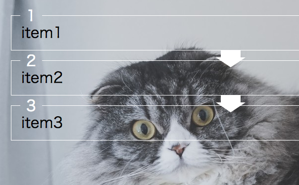
背景に画像使ってくれというのがオーダー。
ありがちっぽいのにこれといって類似のコードも見当たらず、結構試行錯誤したのに、いざもっかいやれと言われると忘れてそうなので、メモ。
<ol>
  <li>
    <div><span></span></div>
    item1
  </li>
  <li>
    <div><span></span></div>
    item2
  </li>
  <li>
    <div><span></span></div>
    item3
  </li>
</ol>
* {
  box-sizing: border-box;
}
ol {
  counter-reset: i;
}
li {
  list-style: none;
  position: relative;
  margin-top: 20px;
  padding: 20px;
  border-width: 0 1px 1px;
  border-style: solid;
  border-color: #fff;
  font-size: 30px;
  counter-increment: i;
}
li::before,
li::after {
  content: "";
  position: absolute;
  margin: auto;
}
li::before {
  right: 0;
  bottom: -15px;
  left: 0;
  width: 40px;
  height: 15px;
  background-color: #fff;
}
li::after {
  border-width: 20px 30px 0;
  border-style: solid;
  border-color: #fff transparent;
  width: 0;
  right: 0;
  bottom: -35px;
  left: 0;
}
li:last-of-type::before,
li:last-of-type::after {
  content: none;
}
li div {
  position: absolute;
  overflow: hidden;
  margin-right: -20px;
  margin-left: -20px;
  width: 100%;
  color: #fff;
  top: 1px;
  -webkit-transform: translateY(-50%);
          transform: translateY(-50%);
}
li div::before,
li div::after {
  position: absolute;
  top: 50%;
  margin-top: -1px;
  height: 1px;
  background-color: #fff;
  content: "";
}
li div::before {
  left: 0;
  width: 2%;
}
li div::after {
  right: 0;
  width: 93%;
}
li div span {
  display: inline-block;
  width: 5%;
  text-align: center;
  margin-left: 2%;
}
li div span::before {
  content: counter(i);
}
案外力技だった。
調整のしようはいくらでもあると思うのでどうぞ。