お世話になっております。コウヤです。
今回はフォームのデザインのうち、ラジオボタンについて作成していきたいと思います。
前回、フォームのデザイン(テキスト・テキストエリア)について説明しました。こちらもあわせて確認していただければと思います。
https://qiita.com/ko0821/items/3359c891315a2b989f64
また、チェックボックスに関する記事のリンクもありますのでご確認ください。
https://qiita.com/ko0821/items/d600bbe372e8146effda
ラジオボタンについて
ラジオボタンは単数選択となります。以下のように、○の中に単数選択することが可能となります。(デザインはまだしていません)

こちらもチェックボックスと同じように、○の箇所を大きくしていきたいと思います。今回は以下のようにデザインしていきます。(色などは別の色になる予定です)

(1)ラジオボタンの作成
まずはHTMLで現状のコードを作成していきます。(一部CSSで修正済み)

<!DOCTYPE html>
<html lang="ja">
<head>
<meta charset="UTF-8">
<meta http-equiv="X-UA-Compatible" content="IE=edge">
<meta name="robots" content="noindex">
<meta name="viewport" content="width=device-width, initial-scale=1.0">
<link rel="stylesheet" href="css/reset.css">
<title>フォームデザイン(ラジオボタン)</title>
<style type="text/css">
.ly__wrapper {
margin: 0 auto;
max-width: 375px;
}
.EntryForm__area {
padding-top: 98px;
background-color: white;
border-radius: 15px;
max-width: 1140px;
height: 2500px;
margin: 0 auto;
padding-left: 10px;
padding-right: 10px;
}
.EntryForm__area .EntryForm__title {
color: #333;
font-family: Noto Sans JP;
font-size: 26px;
font-style: normal;
font-weight: 400;
line-height: normal;
text-align: center;
margin-bottom: 48px;
}
.Form__Q {
display: flex;
flex-direction: column;
margin-bottom: 61px;
}
.Form__Q p {
margin-bottom: 10px;
}
.Form__Q label {
line-height: 2em;
font-size: 16px;
}
/*必須に関するデザイン*/
.required::before {
content: "必須";
margin-right: 15px;
color: #FFF;
font-family: Noto Sans JP;
font-weight: 400;
line-height: 100%;
background: #339999;
width: auto;
height: 27px;
flex-shrink: 0;
padding-top: 4px;
padding-right: 5px;
padding-bottom: 4px;
padding-left: 5px;
}
.Form__btn{
text-align: center;
}
.btn {
margin-top:50px;
cursor: pointer;
background-color: #005eb8;
border:2px solid #005eb8;
width: 330px;
height: 84px;
border-radius: 42px;
color: white;
font-size: 18px;
font-weight: 700;
}
.btn:hover {
margin-top:50px;
cursor: pointer;
background-color: white;
border:2px solid #005eb8;
width: 330px;
height: 84px;
border-radius: 42px;
color: #005eb8;
font-size: 18px;
font-weight: 700;
}
/*PCでのデザイン*/
@media screen and (min-width:768px) {
.ly__wrapper {
margin: 0 auto;
max-width: 768px;
}
.Form__Q label {
font-size: 20px;
}
}
</style>
</head>
<body>
<main>
<div class="ly__wrapper">
<div class="EntryForm__area">
<h1 class="EntryForm__title">フォームデザイン(ラジオボタン)</h1>
<form class="FormArea" action="#"method="post" target="_self">
<div class="Form__Q">
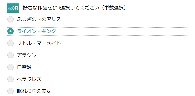
<p><label class="required">好きな作品を1つ選択してください(単数選択)</label></p>
<div class="Form_Q_radioinput">
<label><input type="radio" name="movie" value="ふしぎの国のアリス"><span>ふしぎの国のアリス</span></label>
<label><input type="radio" name="movie" value="ライオン・キング" ><span>ライオン・キング</span></label>
<label><input type="radio" name="movie" value="リトル・マーメイド"><span>リトル・マーメイド</span></label>
<label><input type="radio" name="movie" value="アラジン" ><span>アラジン</span></label>
<label><input type="radio" name="movie" value="白雪姫" ><span>白雪姫</span></label>
<label><input type="radio" name="movie" value="ヘラクレス" ><span>ヘラクレス</span></label>
<label><input type="radio" name="movie" value="眠れる森の美女" ><span>眠れる森の美女</span></label>
</div>
</div>
<div class="Form__btn">
<a href="#" >
<input type="submit" value="エントリーする" class="btn">
</a>
</div>
</form>
</div>
</div>
</main>
</body>
</html>
(2)現在のラジオボタンの箇所を削除する
先ほどのラジオボタンでは幅が狭く、チェックしづらい状態でした。これを改良するのですが、現状のチラジオボタンを変更させるのは無理なため、方針として、まずはラジオボタンを削除し、そのあとに新たにラジオボタンを自分で作成していくことにします。
チェックボックスの箇所を消すため、以下のCSSを指定します。
    .FormArea input[type=radio] {
        opacity: 0;
        position: absolute;
    }

    /*クリック範囲を指定している*/
    .FormArea input[type="radio"]+span {
        display: block;/*縦表記するにはblock、横表記するにはinline-block*/
        position: relative;
        padding: 0.3em 0.3em 0.3em 40px;/*左から40pxの位置にラベルを置くため*/
        line-height: 1;
        cursor: pointer;
        margin-bottom: 15px;
        border:1px dotted #fff;
    }
すると以下の通りになります。

(3)ラジオボタンを新たに作成する
次にラジオボタンの枠を作成していきます。ここではinputの前にチェックボックスを置くので、:beforeの疑似要素を使用しています。(チェックボックスのときと同じです)
     /*ラジオボタンの枠を描く*/
    .FormArea input[type=radio] + span::before {
        content: "";/*一旦空白を置く*/
        position: absolute;
        width: 26px;
        height: 26px;
        border-radius: 50%;
        border:1px solid #ccc;
        background-color: #eee;
        box-sizing: border-box;
        top: 2px;
        left: 0px;
    }

contentで一旦空白を起き、その箇所に円を描くようにします。大きさはwidthなどで指定し、円を描く場合はborder-radius:50% で指定します。
ただしこのままでは、まだチェックができない状態ですので次に指定していきます。
(4)チェックマークの作成
ラジオボタンをチェックしたときに●を入れるようにします。:checkedの疑似要素でチェックされたときにどうするかというのを描きます。
    /*ラジオボタンをチェックした際の●を描く*/
    .FormArea input[type=radio]:checked + span::after {
        content: "";
        position: absolute;
        width: 26px;
        height: 26px;
        border-radius: 50%;
        border: 9px solid #339999;
        top: 2px;
        left: 0px;
        box-sizing: border-box;
        }

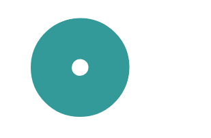
具体的に説明すると、ラジオボタンの枠だけが以下の状態です。

これにクリックしたときに、
border: 9px solid #339999;
で枠の太さが9pxの色付きの枠を重ねています。以下のドーナツ型の箇所はborderの太さを調整しているのみです。
もう少しラジオボタンをデザインしてみる(ここからは任意)
チェックボックスのときにも少しデザインを追加していきましたが、ここでも紹介していきます。
●のマークを中央にする方法
以下のように、中央に白丸を置くのではなく、中央に色付きの丸を置くこともできます。

    .FormArea input[type=radio]:checked + span::after {
        display: block;
        content: "";
        position: absolute;
        width: 7px;
        height: 7px;
        border-radius: 50%;
        top: 7px;
        left: 7px;
        border: 6px solid #339999;
        box-sizing: border-box;
    }
今回は紹介のみで、以後は今まで通り、中央に白丸を置く方法で説明します。
マウスをホバーさせたときに点線枠を表示させる
選択肢のラベル箇所にマウスを乗せたとき、点線枠で表示されるように設定します。これにより、今どこの選択をしようとしているのかがわかりやすくなります。

    /*マウスをラベルの載せたときに枠を表示*/
    input[type="radio"]+span:hover{
        border:1px dotted #999;
    }
チェックしたときに文字の色も変える
チェックしたときに、文字の色も変えたほうが、チェックされたかどうかがわかりやすいケースがあります。それについて説明します。

    /*チェックした際の文字の色を変更*/
    .FormArea input[type="radio"]:checked+span{
        color:#339999;
        font-weight: 700;
    }
キーボードのTabキーとカーソルキーとスペースキーでもチェックできるようにする
マウスで入力するだけでなく、キーボードで入力することもあります。アクセシビリティ対応の観点から今後は必須になると思われます。
:focus の疑似要素を使用することで、フォーカスされたときの動作を指定できます。前述の通り、Tabキーとカーソルキーで選択した際にドット枠が表示されます。さらにそこでスペースキーを押すと選択できます。
    /*tabキーとカーソルキーで選択できるようにする*/
    .FormArea input[type="radio"]:focus+span{
        border:1px dotted #999;
    }
コードまとめ
今まで書いたコードを以下にまとめます。
<!DOCTYPE html>
<html lang="ja">
<head>
    <meta charset="UTF-8">
    <meta http-equiv="X-UA-Compatible" content="IE=edge">
    <meta name="robots" content="noindex">
    <meta name="viewport" content="width=device-width, initial-scale=1.0">
    <link rel="stylesheet" href="css/reset.css">


    <title>フォームデザイン(ラジオボタン)</title>
    <style type="text/css">
        .ly__wrapper {
            margin: 0 auto;
            max-width: 375px;
        }


        .EntryForm__area {
        padding-top: 98px;
        background-color: white;
        border-radius: 15px;
        max-width: 1140px;
        height: 2500px;
        margin: 0 auto;
        padding-left: 10px;
        padding-right: 10px;
        }
        .EntryForm__area .EntryForm__title {
        color: #333;
        font-family: Noto Sans JP;
        font-size: 26px;
        font-style: normal;
        font-weight: 400;
        line-height: normal;
        text-align: center;
        margin-bottom: 48px;
        }

        .Form__Q {
        display: flex;
        flex-direction: column;
        margin-bottom: 61px;
        }

        .Form__Q p {
        margin-bottom: 10px;
        }

        .Form__Q label {
            line-height: 2em;
            font-size: 16px;
        }

    /*必須に関するデザイン*/
    .required::before {
        content: "必須";
        margin-right: 15px;
        color: #FFF;
        font-family: Noto Sans JP;
        font-weight: 400;
        line-height: 100%;
        background: #339999;
        width: auto;
        height: 27px;
        flex-shrink: 0;
        padding-top: 4px;
        padding-right: 5px;
        padding-bottom: 4px;
        padding-left: 5px;
    }


    .Form__btn{
        text-align: center;
    }
    .btn {
        margin-top:50px;
        cursor: pointer;
        background-color: #005eb8;
        border:2px solid #005eb8;
        width: 330px;
        height: 84px;
        border-radius: 42px;
        color: white;
        font-size: 18px;
        font-weight: 700;
    }
    .btn:hover {
        margin-top:50px;
        cursor: pointer;
        background-color: white;
        border:2px solid #005eb8;
        width: 330px;
        height: 84px;
        border-radius: 42px;
        color: #005eb8;
        font-size: 18px;
        font-weight: 700;
    }

    .FormArea input[type=radio] {
        opacity: 0;
        position: absolute;
    }

    /*クリック範囲を指定している*/
    .FormArea input[type="radio"]+span {
        display: block;/*縦表記するにはblock、横表記するにはinline-block*/
        position: relative;
        padding: 0.3em 0.3em 0.3em 40px;/*左から40pxの位置にラベルを置くため*/
        line-height: 1;
        cursor: pointer;
        margin-bottom: 15px;
        border:1px dotted #fff;
    }

    /*ラジオボタンの枠を描く*/
    .FormArea input[type=radio] + span::before {
        content: "";/*一旦空白を置く*/
        position: absolute;
        width: 26px;
        height: 26px;
        border-radius: 50%;
        border:1px solid #ccc;
        background-color: #eee;
        box-sizing: border-box;
        top: 2px;
        left: 0px;
    }

    /*ラジオボタンをチェックした際の●を描く*/
    .FormArea input[type=radio]:checked + span::after {
        content: "";
        position: absolute;
        width: 26px;
        height: 26px;
        border-radius: 50%;
        border: 9px solid #339999;
        top: 2px;
        left: 0px;
        box-sizing: border-box;
        }

    /*マウスをラベルの載せたときに枠を表示*/
    input[type="radio"]+span:hover{
        border:1px dotted #999;
    }

    /*チェックした際の文字の色を変更*/
    .FormArea input[type="radio"]:checked+span{
        color:#339999;
        font-weight: 700;;
    }

    /*tabキーで選択できるようにする*/
    .FormArea input[type="radio"]:focus+span{
        border:1px dotted #999;
    }
    /* .FormArea input[type=radio]:checked + span::after {
        display: block;
        content: "";
        position: absolute;
        width: 7px;
        height: 7px;
        border-radius: 50%;
        top: 7px;
        left: 7px;
        border: 6px solid #339999;
        box-sizing: border-box;
    } */
    /*PCでのデザイン*/
    @media screen and  (min-width:768px) {
        .ly__wrapper {
            margin: 0 auto;
            max-width: 768px;
        }

        .Form__Q label {
            font-size: 20px;
            }

    }
    </style>

</head>
<body>


<main>
    <div class="ly__wrapper">
        <div class="EntryForm__area">
            <h1 class="EntryForm__title">フォームデザイン(ラジオボタン)</h1>
            <form  class="FormArea" action="#"method="post" target="_self">

                <div class="Form__Q">
                    <p><label class="required">好きな作品を1つ選択してください(単数選択)</label></p>
                    <div class="Form_Q_radioinput">
                        <label><input type="radio" name="movie" value="ふしぎの国のアリス"><span>ふしぎの国のアリス</span></label>
                        <label><input type="radio" name="movie" value="ライオン・キング" ><span>ライオン・キング</span></label>
                        <label><input type="radio" name="movie" value="リトル・マーメイド"><span>リトル・マーメイド</span></label>
                        <label><input type="radio" name="movie" value="アラジン" ><span>アラジン</span></label>
                        <label><input type="radio" name="movie" value="白雪姫" ><span>白雪姫</span></label>
                        <label><input type="radio" name="movie" value="ヘラクレス" ><span>ヘラクレス</span></label>
                        <label><input type="radio" name="movie" value="眠れる森の美女" ><span>眠れる森の美女</span></label>
                    </div>
                  </div>

                <div class="Form__btn">
                        <a href="#" >
                        <input type="submit" value="エントリーする" class="btn">
                        </a>
                </div>


            </form>
        </div>
    </div>
</main>


</body>
</html>
次回はプルダウンメニューについて説明していこうと思います。