まぁ、よくこういう事をするわけです。
library(tidyverse)

dat <- iris %>%
  select_at(1:4) %>%
  prcomp(scale = T)

biplot(dat, xpd = T)

これ自体はいいんですが。
時々、この図の、例えばSepal.Widthの赤い矢印を指して、**「平面中のプロットにおいて、このパラメータは、この矢印の方向に行くに従って大きくなります(なると期待されます)。」**と解説する方がいらっしゃいます。
これは、アウトです。
確かめてみましょう。
Q. 「この平面内で、Sepal.Widthが大きくなって行く(と期待される)方向(線)」を求めたい。
A. Sepal.Widthに対して、主成分PC1とPC2を重回帰します。
# パラメータの整理
y <- iris$Sepal.Width %>% scale(center = mean(.), scale = sd(.))
x1 <- dat$x %>% data.frame %>% .$PC1
x2 <- dat$x %>% data.frame %>% .$PC2

# 重回帰を実行し係数を抽出
coeff <- lm(y ~ x1 + x2) %>% coefficients
値の確認
> coeff
  (Intercept)         x1          x2
 1.491745e-16 -0.2693474 -0.92329566
これをプロットします。

biplot(dat)
arrows(0, 0, coeff[2] * 10, coeff[3] * 10, lwd = 3) # `*10`はスケールを合わせているだけ
ほーらズレてる。
ところでこの傾きの値は、主成分分析の結果にある$rotationと一致します。
日本語ではコレを固有ベクトルと言います。
> dat$rotation
                    PC1         PC2        PC3        PC4
Sepal.Length  0.5210659 -0.37741762  0.7195664  0.2612863
Sepal.Width  -0.2693474 -0.92329566 -0.2443818 -0.1235096
Petal.Length  0.5804131 -0.02449161 -0.1421264 -0.8014492
Petal.Width   0.5648565 -0.06694199 -0.6342727  0.5235971
なので、平面内でそのパラメータが大きくなる方向を描きたい時は、固有ベクトルを使うのが道理です。ただ、傾きが大きいと、その近似が信頼できるは、話が違う事に注意が必要です。
因子負荷量
じゃぁ赤い矢印は、何なのか。
日本語では因子負荷量と呼びます。
コレは何か。
元のパラメータと、主成分スコアの相関係数です。1
fl <- iris %>%
  select_at(1:4) %>%
  map_df( ~ scale(.)) %>%
  cor(., dat$x) %>%
  data.frame
値の確認
> fl
                    PC1         PC2         PC3         PC4
Sepal.Length  0.8901688 -0.36082989  0.27565767  0.03760602
Sepal.Width  -0.4601427 -0.88271627 -0.09361987 -0.01777631
Petal.Length  0.9915552 -0.02341519 -0.05444699 -0.11534978
Petal.Width   0.9649790 -0.06399985 -0.24298265  0.07535950
描いてみると、
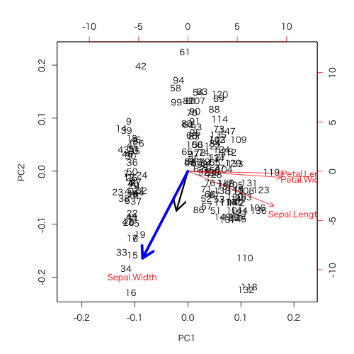
biplot(dat)
arrows(0, 0, 10*coeff[2], 10*coeff[3], lwd = 3)
arrows(0, 0, 10*fl$PC1[2], 10*fl$PC2[2], lwd = 5, col = "Blue")
ほら一致した。
つまり、この青い矢印を見て言えることは、主成分軸に対する相関の度合い、つまり、「PC1, 2両方に負の相関を持っているけれど、PC2に対する相関の方がより強い」ですわな。しかし、相関の強さであって変化量の大きさでは無いという事に注意が必要です。
確かめてみましょう。
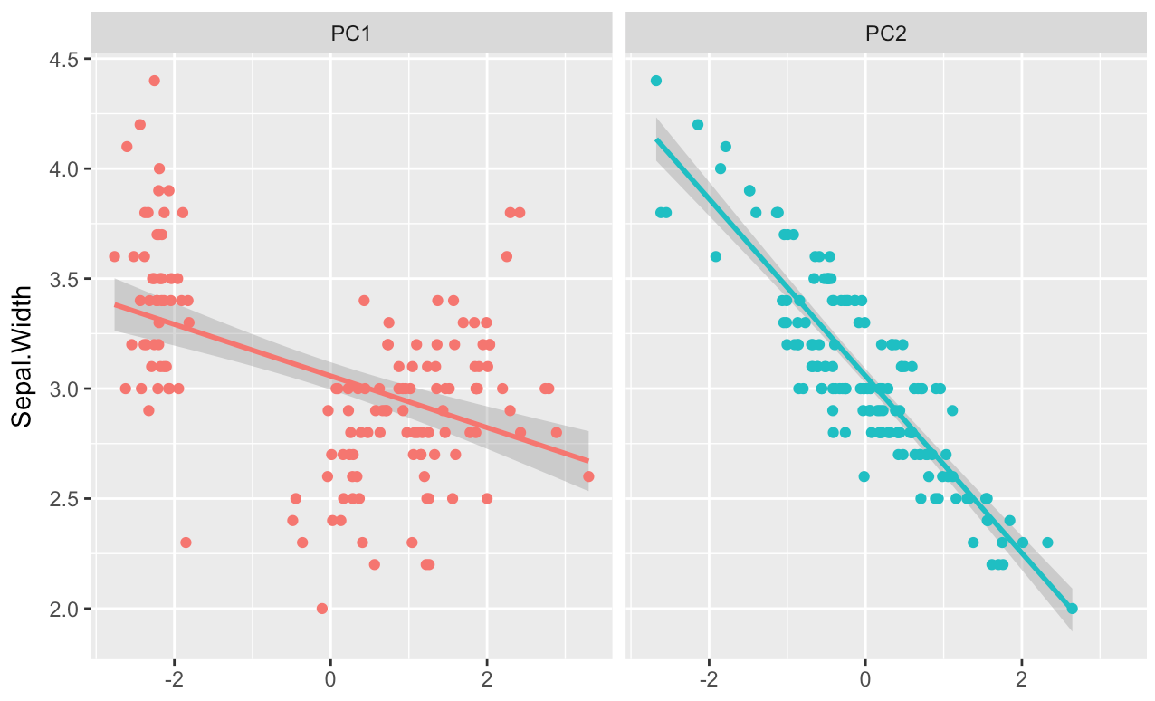
dat_g <- data.frame(Sepal.Width = iris$Sepal.Width, PC1 = x1, PC2 = x2) %>%
  gather(key, value, -c(Sepal.Width))

ggplot(dat_g, aes(value, Sepal.Width, color = key))+
  geom_smooth(method = "lm")+
  geom_point()+
  facet_wrap(~key)+
  theme(legend.position = "none")+
  xlab("")
ほーら、PC1の回帰直線に対してバラツキが大きい。
因子負荷量は、このバラツキです。傾きの大きさと勘違いしてはいけません。
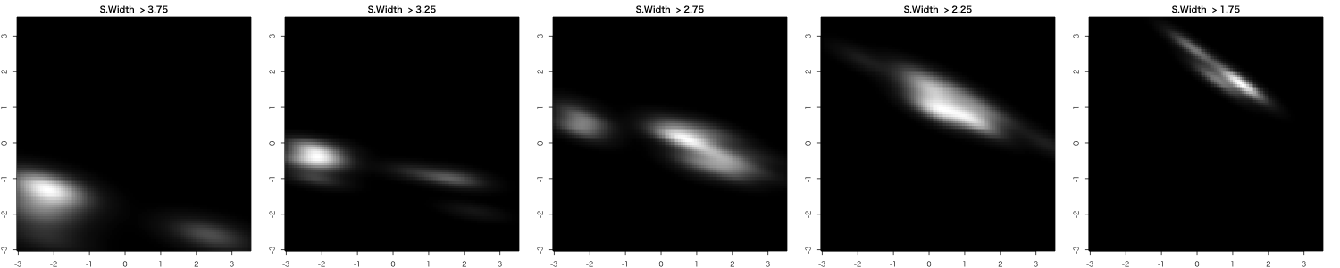
無理して線形に落とさなくてもいーんじゃないか。
上の図のSepal.Width ~ PC1とか、ゼッテェ無理あるし。
ごもっとも。
例えば適当な閾値でSepal.Widthを離散化して、平面上の密度分布を推定する事もできます。
-
相関係数はscaleしてもしなくても変わらないんですけどね ↩