material.textfield.TextInputLayoutとEditTextを使った入力フォームと近しいデザインをComposeで作りたかったのですが、実現に意外と苦戦したので共有します。
※ composeVersionは1.2.0-rc02です。
※androidx.compose.material:material:1.2.0-alpha04でリリースされたTextFieldDefaults.TextFieldDecorationBox を使えることが必須条件になります。
| 今回実現したいレイアウト |
|---|
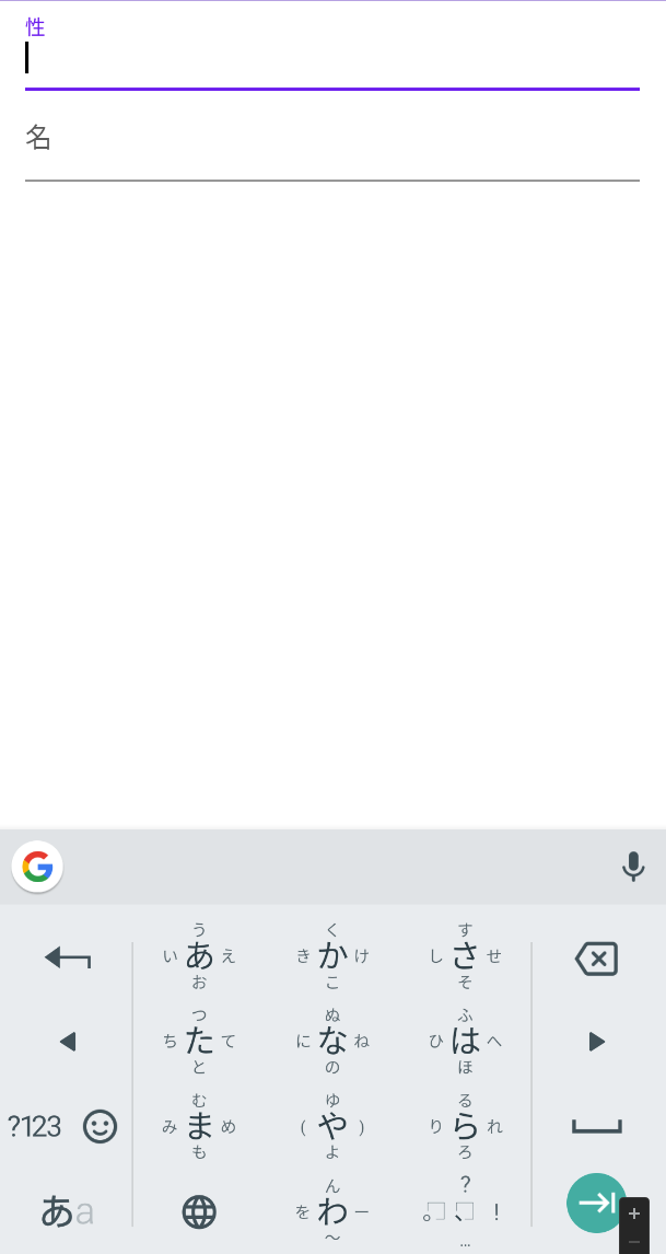 |
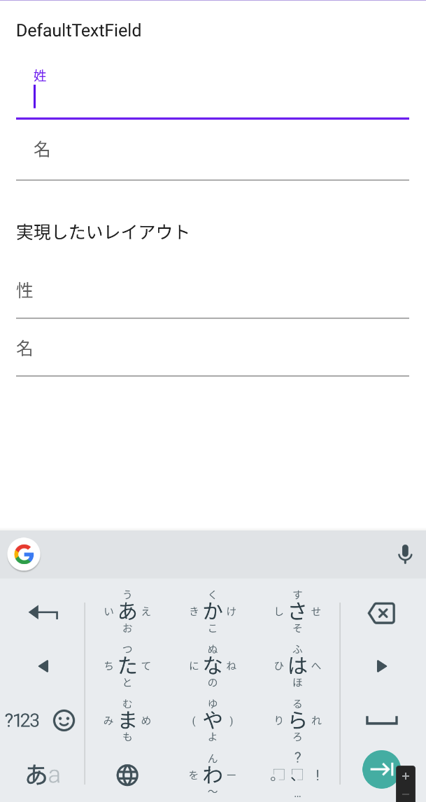
TextFieldの落とし穴
TextFieldを使えばフォーム自体は簡単に作れたのですが、
valueとlabelにpadding値がデフォルトで埋め込まれていて、且つそれが外から修正できないという大きな落とし穴がありました。
そのため、下記のようなレイアウトとなり、実現したいレイアウトと乖離してしまいました。
@Composable
fun NormalTextField(
    value: String,
    label: String,
    keyboardOptions: KeyboardOptions = KeyboardOptions.Default,
    keyboardActions: KeyboardActions = KeyboardActions.Default,
    onValueChange: (String) -> Unit
) {
    TextField(
        value = value,
        onValueChange = { onValueChange(it) },
        label = { Text(text = label) },
        colors = TextFieldDefaults.textFieldColors(
            backgroundColor = Color.Transparent
        ),
        modifier = Modifier.fillMaxWidth(),
        keyboardOptions = keyboardOptions,
        keyboardActions = keyboardActions,
    )
}
原因元調査: TextFieldの内部を見てみる
@Composable
fun TextField(
    value: String,
    onValueChange: (String) -> Unit,
    modifier: Modifier = Modifier,
    enabled: Boolean = true,
    readOnly: Boolean = false,
    textStyle: TextStyle = LocalTextStyle.current,
    label: @Composable (() -> Unit)? = null,
    placeholder: @Composable (() -> Unit)? = null,
    leadingIcon: @Composable (() -> Unit)? = null,
    trailingIcon: @Composable (() -> Unit)? = null,
    isError: Boolean = false,
    visualTransformation: VisualTransformation = VisualTransformation.None,
    keyboardOptions: KeyboardOptions = KeyboardOptions.Default,
    keyboardActions: KeyboardActions = KeyboardActions(),
    singleLine: Boolean = false,
    maxLines: Int = Int.MAX_VALUE,
    interactionSource: MutableInteractionSource = remember { MutableInteractionSource() },
    shape: Shape =
        MaterialTheme.shapes.small.copy(bottomEnd = ZeroCornerSize, bottomStart = ZeroCornerSize),
    colors: TextFieldColors = TextFieldDefaults.textFieldColors()
) {
    // If color is not provided via the text style, use content color as a default
    val textColor = textStyle.color.takeOrElse {
        colors.textColor(enabled).value
    }
    val mergedTextStyle = textStyle.merge(TextStyle(color = textColor))

    @OptIn(ExperimentalMaterialApi::class)
    BasicTextField(
        value = value,
        modifier = modifier
            .background(colors.backgroundColor(enabled).value, shape)
            .indicatorLine(enabled, isError, interactionSource, colors)
            .defaultMinSize(
                minWidth = TextFieldDefaults.MinWidth,
                minHeight = TextFieldDefaults.MinHeight
            ),
        onValueChange = onValueChange,
        enabled = enabled,
        readOnly = readOnly,
        textStyle = mergedTextStyle,
        cursorBrush = SolidColor(colors.cursorColor(isError).value),
        visualTransformation = visualTransformation,
        keyboardOptions = keyboardOptions,
        keyboardActions = keyboardActions,
        interactionSource = interactionSource,
        singleLine = singleLine,
        maxLines = maxLines,
        decorationBox = @Composable { innerTextField ->

            TextFieldDefaults.TextFieldDecorationBox(  // ← here
                value = value,
                visualTransformation = visualTransformation,
                innerTextField = innerTextField,
                placeholder = placeholder,
                label = label,
                leadingIcon = leadingIcon,
                trailingIcon = trailingIcon,
                singleLine = singleLine,
                enabled = enabled,
                isError = isError,
                interactionSource = interactionSource,
                colors = colors
            )  // ↑ 先に結論: contentPaddingが設定されていない
        }
    )
}
次にTextFieldDefaults.TextFieldDecorationBoxの中身を辿ってみます。
    @Composable
    @ExperimentalMaterialApi
    fun TextFieldDecorationBox(
        value: String,
        innerTextField: @Composable () -> Unit,
        enabled: Boolean,
        singleLine: Boolean,
        visualTransformation: VisualTransformation,
        interactionSource: InteractionSource,
        isError: Boolean = false,
        label: @Composable (() -> Unit)? = null,
        placeholder: @Composable (() -> Unit)? = null,
        leadingIcon: @Composable (() -> Unit)? = null,
        trailingIcon: @Composable (() -> Unit)? = null,
        colors: TextFieldColors = textFieldColors(),
        contentPadding: PaddingValues =
            if (label == null) {
                textFieldWithoutLabelPadding() // ← here
            } else {
                textFieldWithLabelPadding() // ← here
            }
    ) {
        CommonDecorationBox(
            type = TextFieldType.Filled,
            value = value,
            innerTextField = innerTextField,
            visualTransformation = visualTransformation,
            placeholder = placeholder,
            label = label,
            leadingIcon = leadingIcon,
            trailingIcon = trailingIcon,
            singleLine = singleLine,
            enabled = enabled,
            isError = isError,
            interactionSource = interactionSource,
            colors = colors,
            contentPadding = contentPadding
        )
    }

    // ここで余白のデフォルト値を設定してる...
    @ExperimentalMaterialApi
    fun textFieldWithLabelPadding(
        start: Dp = TextFieldPadding,
        end: Dp = TextFieldPadding,
        top: Dp = FirstBaselineOffset,
        bottom: Dp = TextFieldBottomPadding
    ): PaddingValues = PaddingValues(start, top, end, bottom)

    // ここで余白のデフォルト値を設定してる...
    @ExperimentalMaterialApi
    fun textFieldWithoutLabelPadding(
        start: Dp = TextFieldPadding,
        top: Dp = TextFieldPadding,
        end: Dp = TextFieldPadding,
        bottom: Dp = TextFieldPadding
    ): PaddingValues = PaddingValues(start, top, end, bottom)
internal val TextFieldPadding = 16.dp
internal val HorizontalIconPadding = 12.dp
はい、ということで勝手にPaddingが設定されてしまったのは
TextFieldDecorationBoxにcontentPaddingが指定されていないことが原因でした。
逆に言えば、contentPaddingをカスタマイズさえできればPadding問題が解決できそうです。
解決方針
TextFieldDecorationBoxにcontentPaddingを指定する。
→ BasicTextFieldを自前で作る
→1から作る必要はなく、TextField内のBasicTextFieldの設定を真似しつつ必要な部分をカスタマイズする
実装
@OptIn(ExperimentalMaterialApi::class)
@Composable
fun CustomTextField(
    label: String,
    value: String,
    enabled: Boolean = true,
    singleLine: Boolean = true,
    visualTransformation: VisualTransformation = VisualTransformation.None,
    interactionSource: MutableInteractionSource = remember { MutableInteractionSource() },
    isError: Boolean = false,
    keyboardOptions: KeyboardOptions = KeyboardOptions.Default,
    keyboardActions: KeyboardActions = KeyboardActions.Default,
    onValueChange: (String) -> Unit
) {
    BasicTextField(
        value = value,
        modifier = Modifier
            .background(Color.Transparent, TextFieldDefaults.TextFieldShape)
            .indicatorLine(
                enabled,
                isError,
                interactionSource,
                TextFieldDefaults.textFieldColors()
            )
            .fillMaxWidth(),
        onValueChange = { onValueChange(it) },
        enabled = enabled,
        keyboardOptions = keyboardOptions,
        keyboardActions = keyboardActions,
        interactionSource = interactionSource,
        singleLine = singleLine,
    ) { innerTextField ->
        TextFieldDefaults.TextFieldDecorationBox(
            value = value,
            innerTextField = innerTextField,
            enabled = enabled,
            singleLine = singleLine,
            visualTransformation = visualTransformation,
            interactionSource = interactionSource,
            label = { Text(label) },
            // ↓ ここでPaddingを調整
            contentPadding = TextFieldDefaults.textFieldWithLabelPadding(0.dp)
        )
    }
}
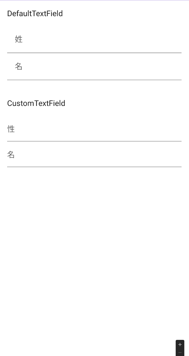
結果、余白をなくすことに成功しました!
最後に
ここまで実装はできたのですが、versionを1.2.0-alpha04以上にする必要があるということで、今回案件でのCompose使用は諦めました🥲
(composeVersionを1.2.0-rc02に上げるためにはcompileSdkを32に上げる必要があったため)
デフォルトでpadding設定されるのはいいけど、せめて外から設定変えさせてよ。というのが正直な感想です。
Composeはまだまだ改善の余地がありそうですね。