リファレンスサイト
・作って学ぶコーディング学習サイト
⭐プロフィールサイト
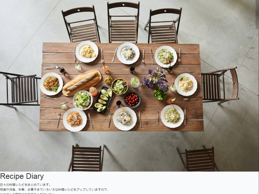
完成図

全体のレイアウト
- header
- ナビバー
- main
- メインビジュアル
- aboutセクション
- bicycleセクション
- footer
- コピーライト表記
    {{-- 全体のスタイル --}}
    <style>
        html {
            font-size: 100%;
        }

        body {
            color: #383e45;
            font-size: 0.9rem;
        }

        a {
            text-decoration: none;
        }
       img {
            max-width: 100%;
        }

        ul {
            list-style: none;
            padding: 0;
        }

        .wrapper {
            max-width: 960px;
/* 左右中央揃え */
            margin: 0 auto 100px auto;
            padding: 0 4%;
            text-align: center;
        }
    </style>
css適用前と後の画像 適用後、画面外へのはみ出しがなくなり、中央揃えになった

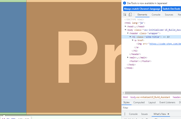
img要素にmax-width:100%;を適用する理由
・img要素の親要素でサイズを指定しても画像ははみだしてしまう
・例えば下の画像のように親要素にwidth:120px;があっても無視される。
・インライン要素からブロック要素に変更しても はみ出す。
header(ナビ)
イメージ図(完成図)

現状:

css
    <style>
        .site-title {
           /*imgの親要素にwidth:120px; img要素にmax-width:100%;*/
            width: 120px;
            line-height: 1px;/*後ろの方で動作確認あり*/
            padding: 10px 0;
        }
    </style>
html
    <header id="header" class="wrapper">
        <h1 class="site-title"><a href="index.html"><img src="{{ asset('storage\profile\logo.svg') }}" alt="Profile"></a></h1>
        <nav>
          <ul>
            <li><a href="#about">About</a></li>
            <li><a href="#bicycle">Bicycle</a></li>
          </ul>
        </nav>
      </header>
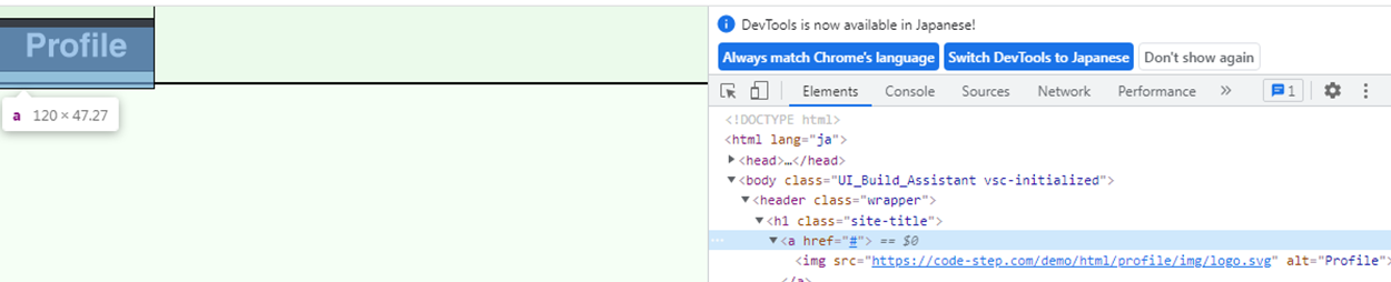
インライン要素のaタグが親要素から下にずれているのを修正する。
aタグが親要素のh1タグとずれている。
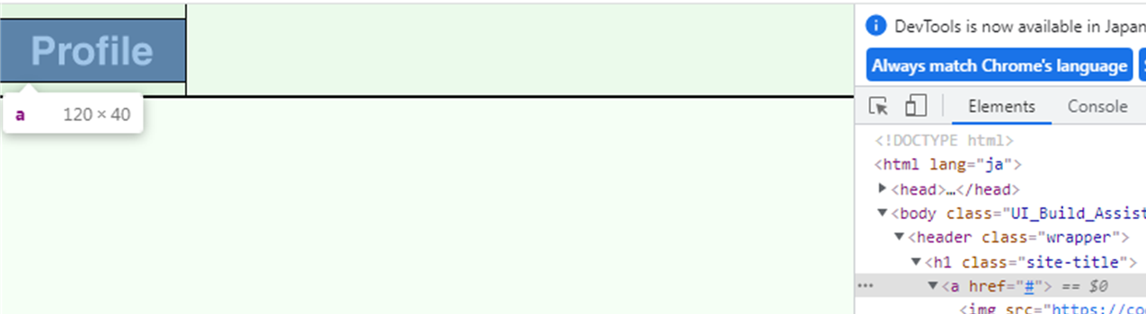
    <style>
        .site-title {
            width: 120px;
/*line-height にh1タグの高さよりも小さい値「1px」を指定することで、*/
/*h1タグ(h1に限らずdiv等)の上下の余白が消えるため、ロゴ画像の高さと揃う*/
/*「line-height: 0;」を指定してもOKです*/
            line-height: 1px;
            padding: 10px 0;
        }
/* + インライン要素からブロック要素に変更するとこでwidthとheightが効く,marginやpaddingが可能になる*/
        .site-title a {
            display: block;
        }
    </style>

    <header id="header" class="wrapper">
        <h1 class="site-title"><a href="index.html"><img src="{{ asset('storage\profile\logo.svg') }}" alt="Profile"></a></h1>
        <nav>
        </nav>
      </header>
収まった。
header要素を横並びに変更する。
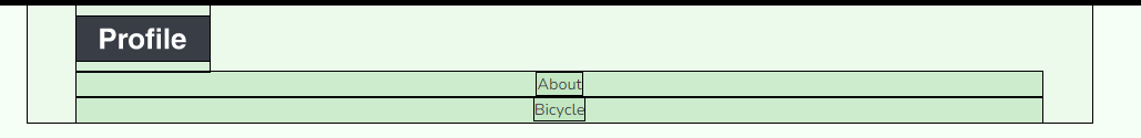
- ロゴとnavを横並び
- navのulリストを横並び
<style>
/* + */
        #header {
/*横並び*/
            display: flex;
/*軸と平行方向の配置*/
            justify-content: space-between;
/*軸と交差方向の配置*/
            align-items: center;
        }
</style>
    <header class="wrapper">
        <h1 class="site-title">
            <a href="#"><img src="https://code-step.com/demo/html/profile/img/logo.svg" alt="Profile">
            </a>
        </h1>
        <nav>
            <ul>
                <li><a href="#about">About</a></li>
                <li><a href="#bicycle">Bicycle</a></li>
            </ul>
        </nav>
    </header>
ロゴとnavを横並び

インライン要素であるaタグとliタグがずれているのを修正する。
 /* + */
        #header li a {
            display: block;
            color: #24292e;
        }
        #header li a:hover {
            opacity: 0.7;
        }
きれいにおさまった

ulリストも横並びにする

ul要素を横並びのリストに変更する
li要素の2番めにmargin-leftを設定する
 /* + */
        header ul {
            display: flex;
        }
 /* + */
        header li:nth-child(n+2) {
            margin-left: 30px;
        }

-
nth-childとnth-type-ofのざっくりとした使い分け- 兄弟要素が全て同じタグ
- 全て
liタグ ならnth-child
- 全て
- 兄弟要素に異なるタグがある
-
dtとddならnth-type-of
-
- 兄弟要素が全て同じタグ
#header.warapperにかかるマージンボトムを上書きにして0にする。
        #header.wrapper {
            margin-bottom: 0;
        }

次、メインビジュアルの作成
{{-- mainvisualのスタイル --}}
        <style>
            #mainvisual {
                margin-bottom: 60px;
            }
/* + すでにimg要素にはmax-width:100%;*/
            #mainvisual img {
                max-width: 1920px;
/* +max-widthを修正したため、width:100%;がいる.基本画像には貼っとけ。親要素の幅になる*/
                width: 100%;
                height: 600px;
/* 画像の縦横比を維持して指定した幅、高さで表示してくれる。w,h,oは画像の3点セット */
                object-fit: cover;
            }
        </style>

        <div id="mainvisual">
            <img src="{{ asset('storage\profile\mainvisual.jpg') }}" alt="テキストテキストテキスト">
        </div>
メモ:画像のトリミング
            #mainvisual img {
                max-width: 1920px;
                height: 600px;
  /* 画像の縦横比はそのまま。維持したい場合はcover */
                object-fit: none;
 /* 画像の位置を調整。iosでは機能しないみたい・・ */
                object-position: 80% 40%;
                width: 100%;
            }
画像の位置が変更された

セクションの全体のスタイル
セクションタイトル css適用前
コンテンツタイトル
{{-- section共通スタイル --}}
<style>
.section-title {
margin-bottom: 60px;
border-bottom: 1px solid #000;
/*ボーダーの幅を文字幅にするための、d-inline-block*/
display: inline-block;
font-size: 2rem;
font-weight: bold;
}
.content-title {
font-size: 1.25rem;
padding: 30px 0 30px 0;
font-weight: bold;
text-align: center;
}
</style>
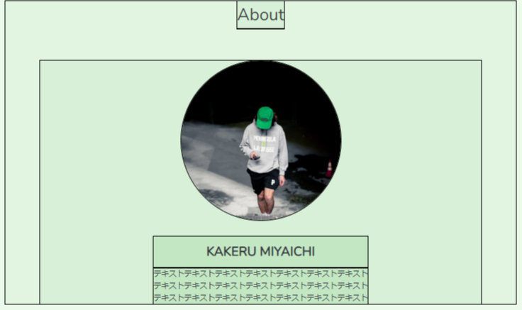
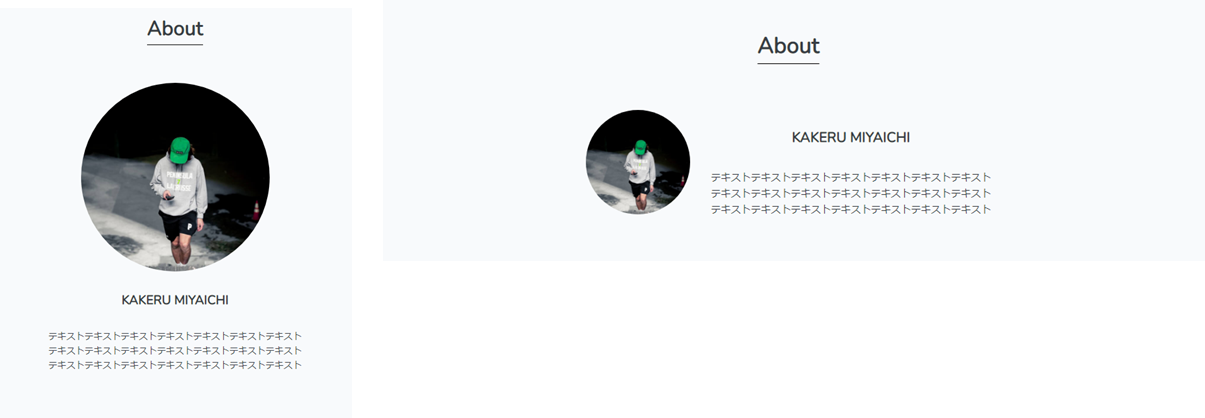
<h2 class="section-title">About</h2>
<h3 class="content-title">KAKERU MIYAICHI</h3>
セクションタイトル css適用後

セクションaboutの作成
css適用前

・画像要素を縮小
・テキストの書字方向を左書きにする。
        {{-- aboutセクションのスタイル --}}
        <style>
            #about img {
                width: 300px;
                height: 300px;
                border-radius: 50%;
            }
            #about .text {
                text-align: left;
            }
        </style>

        <section id="about" class="wrapper">
            <h2 class="section-title">About</h2>
            <div class="content">
                <img src="{{ asset('storage\profile\about.jpg') }}" alt="テキストテキストテキスト">
                <div class="text">
                    <h3 class="content-title">KAKERU MIYAICHI</h3>
                    <p>
                        テキストテキストテキストテキストテキストテキストテキスト<br>
                        テキストテキストテキストテキストテキストテキストテキスト<br>
                        テキストテキストテキストテキストテキストテキストテキスト
                    </p>
                </div>
            </div>
        </section>
css適用後 コンテンツタイトルとテキストが左によりすぎているのを修正する。

        {{-- section共通スタイル --}}
        <style>
        .content-title {
            font-size: 1.5rem;
            font-weight: bold;
            padding: 10px 0 10px 0;
/* + */
            text-align: center;
        }
        </style>
        {{-- aboutセクションのスタイル --}}
        <style>

            #about img {
                width: 300px;
                height: 300px;
                border-radius: 50%;
/* +2 */
/* block要素にして幅が拡張されて改行されるわけではない */
/* 幅は300pxと指定した分だけ、block要素にすることで改行される */
/*+1で .textをinline-blockに変更したため、横並びになったのでblock要素にすることで改行させている。*/
                display: block;
                margin: 0 auto 30px auto;
            }
            #about .text {
                text-align: left;
/* +1 インライン要素にすることで幅がコンテンツの幅になる*/
/*wrapperのtext-centerが効いて中央揃えになる*/
                display: inline-block;
            }
        </style>
+1後の画像 横並びになったので+2で修正した

+2後の画像 imgをblock要素にしたことで改行されたが、.wrapperのtext-centerが効かなくなったが、
幅は300pxしかないのでmx-autoで中央揃えにした。(block要素+幅指定+余白=mx-autoが可能)
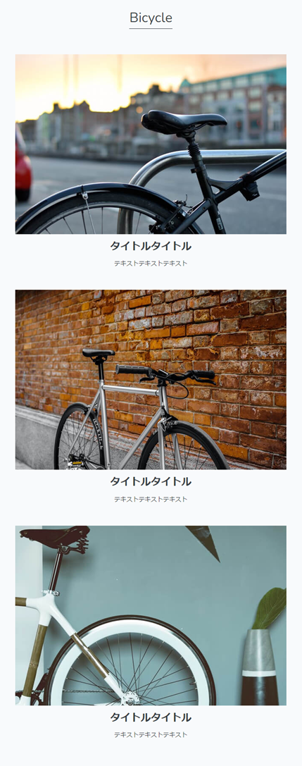
セクションbisycleの作成
css適用前の画像 .wrapperのtext-centerで画像は中央揃えになっている。

テキストのいちが下の画像にくっついているため、誤解されてしまうのを修正
        {{-- bicycleセクション --}}
        <style>
            #bicycle p {
                margin-bottom: 50px;
            }
        </style>

        <section id="bicycle" class="wrapper">
            <h2 class="section-title">Bicycle</h2>
            <ul>
                <li>
                    <img src="{{ asset('storage\profile\bicycle1.jpg') }}" alt="テキストテキストテキスト">
                    <h3 class="content-title">タイトルタイトル</h3>
                    <p>テキストテキストテキスト</p>
                </li>
                <li>
                    <img src="{{ asset('storage\profile\bicycle2.jpg') }}" alt="テキストテキストテキスト">
                    <h3 class="content-title">タイトルタイトル</h3>
                    <p>テキストテキストテキスト</p>
                </li>
                <li>
                    <img src="{{ asset('storage\profile\bicycle3.jpg') }}" alt="テキストテキストテキスト">
                    <h3 class="content-title">タイトルタイトル</h3>
                    <p>テキストテキストテキスト</p>
                </li>
            </ul>
        </section>
css適用後
footerを作成する
css適用前

・フォントサイズを縮小
・中央に配置
{{-- footerスタイル --}}
<style>
#footer {
text-align: center;
padding: 10px 0 10px 0;
font-size: 0.625rem;
}
</style>
<footer id="footer">
<p>© 2020 Profile</p>
</footer>
css適用後

レスポンシブデザインに変更する
aboutセクションを横並びに変更する
画像は css適用前と適用後
        <style>
            #about img {
                width: 300px;
                height: 300px;
                border-radius: 50%;
                display: block;
                margin: 0 auto 30px auto;
            }
            #about .text {
                display: inline-block;
                text-align: left;
            }
/* + */
            @media screen and (min-width: 600px) {
                #about .content {
                    display: flex;
                    justify-content: center;
                    align-items: center;
                }

                #about img {
                    width: 150px;
                    height: 150px;
                    margin: 0 30px 0 0;
                }
            }
        </style>

        <section id="about" class="wrapper">
            <h2 class="section-title">About</h2>
            <div class="content">
                <img src="{{ asset('storage\profile\about.jpg') }}" alt="テキストテキストテキスト">
                <div class="text">
                    <h3 class="content-title">KAKERU MIYAICHI</h3>
                    <p>
                        テキストテキストテキストテキストテキストテキストテキスト<br>
                        テキストテキストテキストテキストテキストテキストテキスト<br>
                        テキストテキストテキ
                    </p>
                </div>
            </div>
        </section>
bicycleセクションのul画像リストを横並びにする
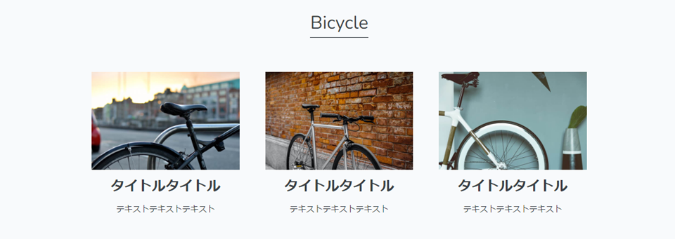
        <style>
            #bicycle p {
                margin-bottom: 50px;
            }
 /* + */
            @media screen and (min-width: 600px) {
                #bicycle ul {
                    display: flex;
                    justify-content: space-between;
                }

                #bicycle li {
                    width: calc(100%/3 - 30px);
                }
            }
        </style>
        <section id="bicycle" class="wrapper">
            <h2 class="section-title">Bicycle</h2>
            <ul>
                <li>
                    <img src="{{ asset('storage\profile\bicycle2.jpg') }}" alt="テキストテキストテキスト">
                    <h3 class="content-title">タイトルタイトル</h3>
                    <p>テキストテキストテキスト</p>
                </li>
                  {{-- 省略 --}}
            </ul>
        </section>
メモ:
<-- bootstrapのカードみたい-->
    <li>
        <img src="{{ asset('storage\profile\bicycle1.jpg') }}" alt="テキストテキストテキスト">
        <h3 class="content-title">タイトルタイトル</h3>
        <p>テキストテキストテキスト</p>
    </li>
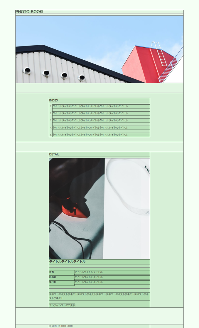
⭐PHOTO BOOK
完成図

<link rel="stylesheet"href="https://cdn.jsdelivr.net/npm/destyle.css@1.0.15/destyle.css"/>
全体のレイアウト
- header
- logo
- メインビジュアル
- メイン
- INDEXセクション
- DETAILセクション
- footer
    {{-- 全体のCSS --}}
    <style>
            html {
                font-size: 100%;
            }
            body {
                background-color: #f4f9ff;
                color: #333;
                font-size: 0.875rem;
            }
            img {
                max-width: 100%;
            }
 /* サイト全体のコンテンツ幅を設定 */
            .wrapper {
                max-width: 1000px;
                margin: 0 auto;
            }
/* 中のコンテンツ部分の最大幅を設定 */
            .inner {
                max-width: 600px;
                margin: 0 auto;
                padding: 0 40px;
            }
    </style>
css適用後
headerを作成する
- ロゴの横幅を設定する
- hタグの上下の余白を消去
- aタグの高さ幅を揃える。
- 上下に余白を設定する
{{-- headerのCSS --}}
        <style>
            #header {
                padding: 0 10px;
                margin-top: 60px;
                margin-bottom: 15px;
            }
/*h1タグ
line-height にh1タグの高さよりも小さい値「1px」を指定することで、
h1タグの上下の余白が消えるため、ロゴ画像の高さと揃う
「line-height: 0;」を指定してもOKです*/
            #header .site-title {
                width: 160px;
                line-height: 1px;
            }
/* aタグのリンク範囲を親要素のサイズに広げる */
            #header .site-title a {
                display: block;
            }
        </style>
        <header id="header">
            <h1 class="site-title">
                <a href="index.html"><img src="{{ asset('storage\PHOTO BOOK\logo.svg') }}" alt="PHOTO BOOK"></a>
            </h1>
        </header>
h1の上下に余白がある(リセットCSSによってはなくなる)

            #header .site-title {
                width: 160px;
/*+*/
                line-height: 1px;
                margin-bottom: 15px;
            }
余計な余白がなくなった

セクション全体のスタイルを作成する
{{-- section全体のCSS --}}
        <style>
            .section-title {
                font-size: 1.125rem;
                font-weight: bold;
                margin-bottom: 10px;
            }
        </style>

   <h2 class="section-title">INDEX</h2>
   <h2 class="section-title">DETAIL</h2>
メインビジュアルを作成する
{{-- mainvisualのスタイル --}}
            <style>
                #mainvisual {
                    margin-bottom: 60px;
                    padding: 0 10px;
                }
            </style>

            <div id="mainvisual">
                <img src="{{ asset('storage\PHOTO BOOK\mainvisual.jpg') }}" alt="テキストテキストテキスト">
            </div>
css適用前と後 画像の左右に少し余白もできた
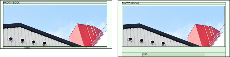
セクションindexを作成する
css適用前とサイトの完成図 リセットCSSでolの番号は消えている。

            <style>
                #index {
                    background-color: #fff;
                    padding: 30px 0;
                    margin-bottom: 60px;
                }
 /*olタグはリストの先頭に番号がつくので、その分だけ左に移動
※番号を消したい場合は、「list-style-type: none;」を設定*/
                #index .index-list {
                    margin-left: 20px;
                    list-style-type: decimal;
                }
                #index .index-list li {
                    margin-bottom: 20px;
                }
/* リストの最後は下にマージンをつけない */
                #index .index-list li:last-child {
                    margin-bottom: 0;
                }
            </style>
            <section id="index">
                <div class="inner">
                    <h2 class="section-title">INDEX</h2>
                    <ol class="index-list">
                        <li>タイトルタイトルタイトルタイトルタイトルタイトルタイトルタイトル</li>
                         x 5
                    </ol>
                </div>
            </section>
css適用後

セクションdetail
css適用前とサイトの完成図

            <style>
                #detail {
                    margin-bottom: 100px;
                }
                #detail .content .title {
                    font-size: 1.125rem;
                    font-weight: bold;
                }
                #detail .content .img {
                    margin: 0 0 25px 0;
                }
                #detail .content .text p {
                    margin-bottom: 20px;
                }
                #detail .content dl {
/* dt、ddを横並びにする */
                    display: flex;
/* dtとddが100%になったら、横並びを折り返す */
                    flex-wrap: wrap;
                    padding: 16px 0;
                    margin-bottom: 25px;
/* ulの上下に線 */
                    border-top: solid 1px #dedede;
                    border-bottom: solid 1px #dedede;
                }
                #detail .content dt {
                    width: 25%;
                }
               #detail .content dd {
                    width: 75%;
                   /*ddの下にはdefautでmbがあるこういうのをresetCssが消してくる*/
                   /*今回使用しているのは残っていたので消去する必要がある*/
                    margin-bottom: 0;
                }
                #detail .content .link {
                    color: #333;
                }
                #detail .content .link:hover {
                    opacity: 0.8;
                }
            </style>
            <section id="detail">
                <div class="inner">
                    <h2 class="section-title">DETAIL</h2>
                    <div class="content">
                        <img class="img" src="{{ asset('storage\PHOTO BOOK\detail.jpg') }}" alt="">
                        <div class="text">
                            <p class="title">タイトルタイトルタイトル</p>
                            <dl>
                                <dt>著者</dt>
                                <dd>タイトルタイトルタイトル</dd>
                                <dt>出版社</dt>
                                <dd>タイトルタイトルタイトル</dd>
                                <dt>発行年</dt>
                                <dd>タイトルタイトルタイトル</dd>
                            </dl>
                            <p>
                                テキストテキストテキストテキストテキストテキスト
                                テキストテキストテキストテキストテキストテキスト
                            </p>
                            <a class="link" href="#" target="_blank" rel="noopener noreferrer">オンラインストアで見る</a>
                        </div>
                    </div>
                </div>
            </section>
後

ddにmargine-bottome:0;がない場合とある場合

フッター
<style>
#footer {
font-size: 0.625rem;
padding: 15px 0;
}
</style>
<footer id="footer">
<p class="inner">© 2020 PHOTO BOOK</p>
</footer>
前

後

レスポンシブ対応に変更
css適用前とサイトの完成図

detailセクションを横並びに変更
    {{-- 全体のCSS --}}
    <style>
        /* 中のコンテンツ部分の最大幅を設定 */
        .inner {
            max-width: 600px;
            margin: 0 auto;
            padding: 0 40px;
        }

        @media screen and (min-width: 1024px) {
            .inner {
                padding: 0 0;
            }
        }
    </style>
        {{-- headerのCSS --}}
        <style>
            #header {
                padding: 0 10px;
                margin-top: 60px;
                margin-bottom: 15px;
            }
            @media screen and (min-width: 1024px) {
                    #header {
                        padding: 0 0;
                    }
                }
        </style>
            {{-- mainvisualのCSS --}}
            <style>
                #mainvisual {
                    margin-bottom: 60px;
                    padding: 0 10px;
                }
                @media screen and (min-width: 1024px) {
                    #mainvisual {
                        padding: 0 0;
                    }
                }
            </style>
css適用後、もともとあるかないかの余白を消しただけほぼ変わらない。
detailセクションを画像とテキストの横並びに変更
/* detailセクション */
            <style>
                #detail .content .img {
/* この部分を上書き */
                    margin: 0 0 25px 0;
                }
  /* + */
                @media screen and (min-width: 1024px) {
  /* + */
                    #detail .content {
                        display: flex;
  /* 縦方向は上揃え */
                        align-items: flex-start;
                    }

                    #detail .content img {
                        width: 270px;
                        margin-right: 60px;
                    }
                }
            </style>

                    #detail .content {
                        display: flex;
  /* 縦方向は上揃え */
  /*align-items: flex-start;*/
                   }
画像がデフォルトのストレッチがかかって伸びてしまう。

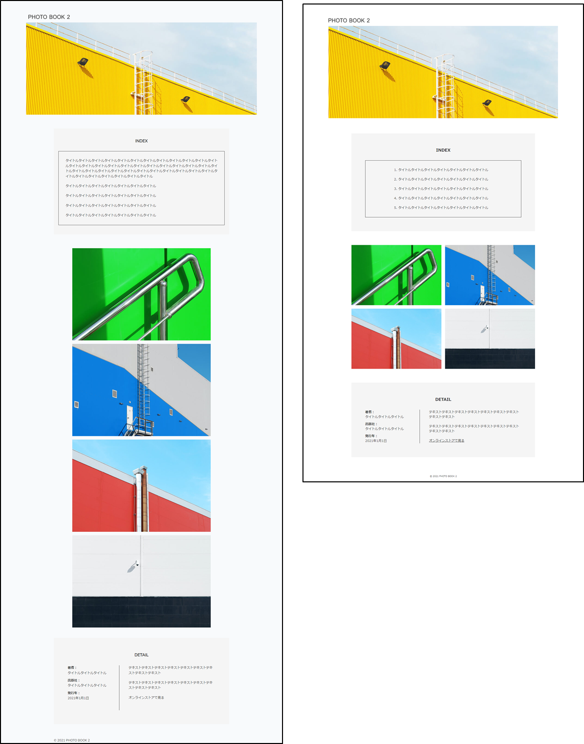
PHOTO BOOK 2
全体図

css適用前

        {{-- 全体のCSS --}}
        <style>
            html {
                font-size: 100%;
            }

            body {
                color: #333;
                font-size: 0.875rem;
            }

            img {
                max-width: 100%;
            }

            ul {
                list-style: none;
                padding: 0;
            }

            /* サイト全体のコンテンツ幅を設定 */
            .wrapper {
                max-width: 1000px;
                margin: 0 auto;
            }

            /* 中のコンテンツ部分の最大幅を設定 */
            .inner {
                max-width: 800px;
                margin: 0 auto;
                padding: 0 20px;
            }
        </style>
css適用後 画像が収まってサイドに余白ができた。

ヘッダーのスタイルを作成する
        <style>
            #header {
                margin-top: 60px;
                margin-bottom: 15px;
                padding: 0 10px;
            }
/*h1タグ
line-height にh1タグの高さよりも小さい値「1px」を指定することで、
h1タグの上下の余白が消えるため、ロゴ画像の高さと揃う
「line-height: 0;」を指定してもOKです*/
            #header .site-title {
                width: 180px;
                line-height: 1px;
            }
/* aタグのリンク範囲を親要素のサイズに広げる */
            #header .site-title a {
                display: block;
            }
        </style>
        <header id="header">
            <h1 class="site-title">
                <a href="index.html"><img src="{{ asset('storage\photobook\logo.svg') }}" alt="PHOTO BOOK 2"></a>
            </h1>
        </header>
前
後

メインビジュアルのスタイルを作成
            <style>
                #mainvisual {
                    margin-bottom: 60px;
                }
            </style>
            <div id="mainvisual">
                <img src="{{ asset('storage\photobook\mainvisual.jpg') }}" alt="テキストテキストテキスト">
            </div>
後 余白ができた

indexセクションのスタイルを作成
  {{-- indexセクションのスタイル --}}
                <style>
          /* indexセクション全体 */
                    #index {
                        background-color: #f5f5f5;
                        padding: 40px 20px;
                        margin-bottom: 60px;
                    }

        /* olタグの親要素 */
                    #index .index-inner {
                        border: solid 1px #333;
                        padding: 30px;
                    }

        /* olタグ「display: table;」と「margin: 0 auto;」で自要素を中央に配置。
            ※この方法を使うとテキストの長さに応じて可変で中央配置できる
               buttonやaタグなどのインライン要素も中央揃えできる。滅茶苦茶便利*/
                    #index .index-inner .index-list {
                        display: table;
                        margin: 0 auto;
                    }

                    #index .index-inner .index-list li {
                        margin-bottom: 20px;
                    }

        /*最後のliタグには margin-bottom を設定しない*/
                    #index .index-inner .index-list li:last-child {
                        margin-bottom: 0;
                    }

                </style>
                <section id="index">
                    <h2 class="section-title">INDEX</h2>
                    <div class="index-inner">
                        <ol class="index-list">
                            <li>タイトルタイトルタイトルタイトルタイトルタイトルタイトル</li>
                            <li>タイトルタイトルタイトルタイトルタイトルタイトルタイトル</li>
                            <li>タイトルタイトルタイトルタイトルタイトルタイトルタイトル</li>
                            <li>タイトルタイトルタイトルタイトルタイトルタイトルタイトル</li>
                            <li>タイトルタイトルタイトルタイトルタイトルタイトルタイトル</li>
                        </ol>
                    </div>
                </section>
css適用前と適用後 画像リストはトリミングのし忘れ。2つに分けて貼るつもりだった。

display: table;margin: 0 auto;がない場合とある場合
コンテンツの要素の幅に応じて中央に配置できる。text-centerだとコンテンツが膨れた場合、めちゃくちゃ崩れるし。
d-table + mx-auto で自要素のテキスト中央揃えはめちゃくちゃいいかもしれん。

画像リストのスタイルを作成する
                {{-- 画像リスト --}}
                <style>
                    /* ulタグ */
                    .list {
                        margin: 30px 0 45px 0;
                    }

                    .list li {
                        margin-bottom: 15px;
                        text-align: center;
                    }

                    /*画像の下にできる隙間を消す*/
                    .list li img {
                        vertical-align: bottom;
                    }
                </style>

                <ul class="list">
                    <li><img src="{{ asset('storage/photobook/photo1.jpg') }}" alt=""></li>
                    <li><img src="{{ asset('storage/photobook/photo2.jpg') }}" alt=""></li>
                    <li><img src="{{ asset('storage/photobook/photo3.jpg') }}" alt=""></li>
                    <li><img src="{{ asset('storage/photobook/photo4.jpg') }}" alt=""></li>
                </ul>
css適用前と適用後

忘れてた
section全体のスタイルを作成する
{{-- section全体のスタイル --}}
<style>
 /* セクションのタイトル<h2>のスタイル */
            .section-title {
            font-size: 1.125rem;
            font-weight: bold;
            margin-bottom: 30px;
            text-align: center;
        }
</style>

<h2 class="section-title">INDEX</h2>
<h2 class="section-title">DETAIL</h2>
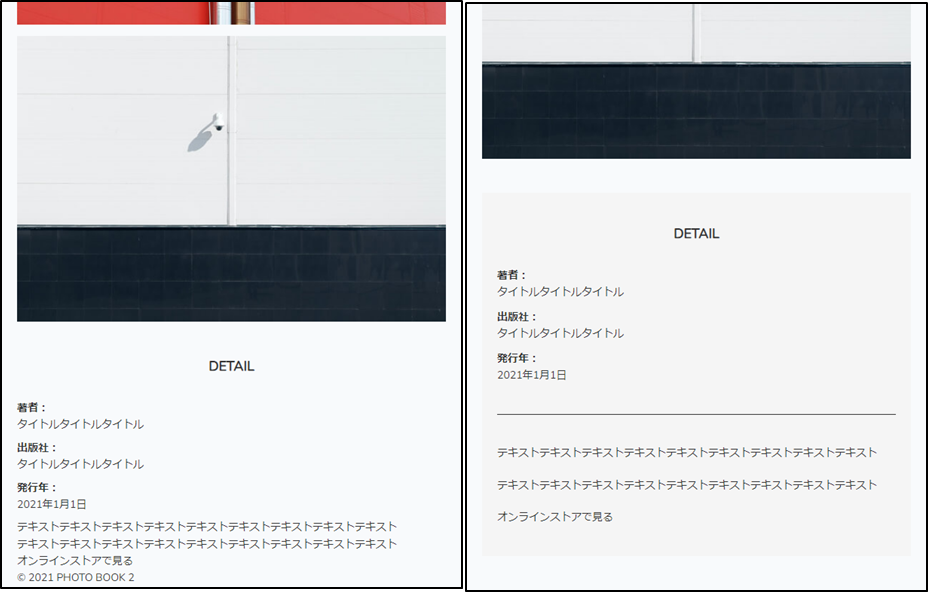
detailセクション
css適用前と適用後
                <style>
/* detailセクション全体  */
                    #detail {
                        background-color: #f5f5f5;
                        margin-bottom: 60px;
                        padding: 40px 20px;
                    }
                    #detail dl {
                        border-bottom: solid 1px #333;
                        padding: 0 0 40px 0;
                    }
                    #detail dt {
                        font-weight: bold;
                    }
                    #detail dd {
                        margin-bottom: 10px;
                    }
                    #detail dd:last-child {
                        margin-bottom: 0;
                    }
                    #detail .text {
                        padding: 40px 0 0 0;
                    }
                    #detail .text p {
                        margin-bottom: 20px;
                    }
                    #detail .text .link {
                        color: #333;
                    }
                    #detail .text .link:hover {
                        opacity: 0.8;
                    }
                </style>
                <section id="detail">
                    <h2 class="section-title">DETAIL</h2>
                    <div class="flex">
                        <dl>
                            <dt>著者:</dt>
                            <dd>タイトルタイトルタイトル</dd>
                            <dt>出版社:</dt>
                            <dd>タイトルタイトルタイトル</dd>
                            <dt>発行年:</dt>
                            <dd>2021年1月1日</dd>
                        </dl>
                        <div class="text">
                            <p>テキストテキストテキストテキストテキストテキストテキストテキストテキスト</p>
                            <p>テキストテキストテキストテキストテキストテキストテキストテキストテキスト</p>
                            <a class="link" href="#">オンラインストアで見る</a>
                        </div>
                    </div>
                </section>
フッター
<style>
#footer {
font-size: 0.625rem;
padding: 15px 0;
text-align: center;
}
</style>
<footer id="footer">
<p class="inner">© 2021 PHOTO BOOK 2</p>
</footer>
後

レスポンシブ対応にする
css適用前とサイト完成図
        /* 中のコンテンツ部分の最大幅を設定 */
        .inner {
            max-width: 800px;
            margin: 0 auto;
            padding: 0 20px;
        }

/* + */
        @media screen and (min-width: 1024px) {
            .inner {
                padding: 0;
            }
        }
           #header {
                margin-top: 60px;
                padding: 0 10px;
            }
/* + */
            @media screen and (min-width: 1024px) {
                #header {
                    padding: 0;
                }
            }
                    #index {
                        background-color: #f5f5f5;
                        padding: 40px 20px;
                        margin-bottom: 60px;
                    }

/* + */
                    @media screen and (min-width: 1024px) {
                        #index {
                            padding: 60px;
                        }
                    }
<style>
                    .list {
                        margin: 30px 0 45px 0;
                    }

                    .list li {
                        text-align: center;
                        margin-bottom: 15px;
                    }
/* + */
                    @media screen and (min-width: 1024px) {
                        .list {
                            display: flex;
                            flex-wrap: wrap;
                            justify-content: space-between;
                            margin: 30px 0 45px 0;
                        }
                        .list li {
                            width: 49%;
                            margin-bottom: 15px;
                        }
                    }
</style>
                <ul class="list">
                    <li><img src="{{ asset('storage/photobook/photo1.jpg') }}" alt=""></li>
                    <li><img src="{{ asset('storage/photobook/photo2.jpg') }}" alt=""></li>
                    <li><img src="{{ asset('storage/photobook/photo3.jpg') }}" alt=""></li>
                    <li><img src="{{ asset('storage/photobook/photo4.jpg') }}" alt=""></li>
                </ul>
<style>
                    /* detailセクション全体  */
                    #detail {
                        background-color: #f5f5f5;
                        margin-bottom: 60px;
                        padding: 40px 20px;
                    }
                    #detail dl {
                        border-bottom: solid 1px #333;
                        padding: 0 0 40px 0;
                    }
                    #detail .text {
                        padding: 40px 0 0 0;
                    }
/* + */
                    @media screen and (min-width: 1024px) {
                        #detail {
                            padding: 60px;
                        }
                        #detail .flex {
                        /*dlリストと.textを横並びにする。*/
                            display: flex;
                        }
                        #detail dl {
                            width: 35%;
                            border-right: solid 1px #333;
                            padding-right: 40px;
                            border-bottom: none;
                        }
                        #detail .text {
                            width: 65%;
                            padding: 0 0 0 40px;
                        }
                    }
</style>
                <section id="detail">
                    <h2 class="section-title">DETAIL</h2>
                    <div class="flex">
                        <dl>
                            <dt>著者:</dt>
                            <dd>タイトルタイトルタイトル</dd>
                            <dt>出版社:</dt>
                            <dd>タイトルタイトルタイトル</dd>
                            <dt>発行年:</dt>
                            <dd>2021年1月1日</dd>
                        </dl>
                        <div class="text">
                            <p>テキストテキストテキストテキストテキストテキストテキストテキストテキスト</p>
                            <p>テキストテキストテキストテキストテキストテキストテキストテキストテキスト</p>
                            <a class="link" href="#">オンラインストアで見る</a>
                        </div>
                    </div>
                </section>

⭐レシピサイト/トップページ

全体のレイアウト
-
メイン
- メインビジュアル
- テキスト
- 画像リスト
- ボタン
-
フッター
- snsリスト
- コピーライト表記
        html {
            font-size: 100%;
        }

        body {
            color: #2b2a27;
            font-family: "Helvetica Neue", "Arial", "Hiragino Sans", "Meiryo", sans-serif;
        }

        img {
            max-width: 100%;
        }

        ul {
            list-style: none;
        }

        a {
            color: #2b2a27;
        }
/*resetCSSでリセットされたため*/
        h1{
            font-size: 48px;
        }
適用後と適用前は画像が画面(bodY要素)からはみ出る

セクション全体のスタイル
ない。
メインビジュアルのスタイルを作成
<style>
#mainvisual img {
/* 画像要素を親要素のbodyの幅に合わせる = 画面幅 */
width: 100%;
/*要素の高さを windoww画面の高さに合わせる。 */
height: 100vh;
/*画像の縦横比を維持 */
object-fit: cover;
/*引き伸ばされた画像のい位置をトリミングできる */
object-position: center top;
margin-bottom: 80px;
}
</style>
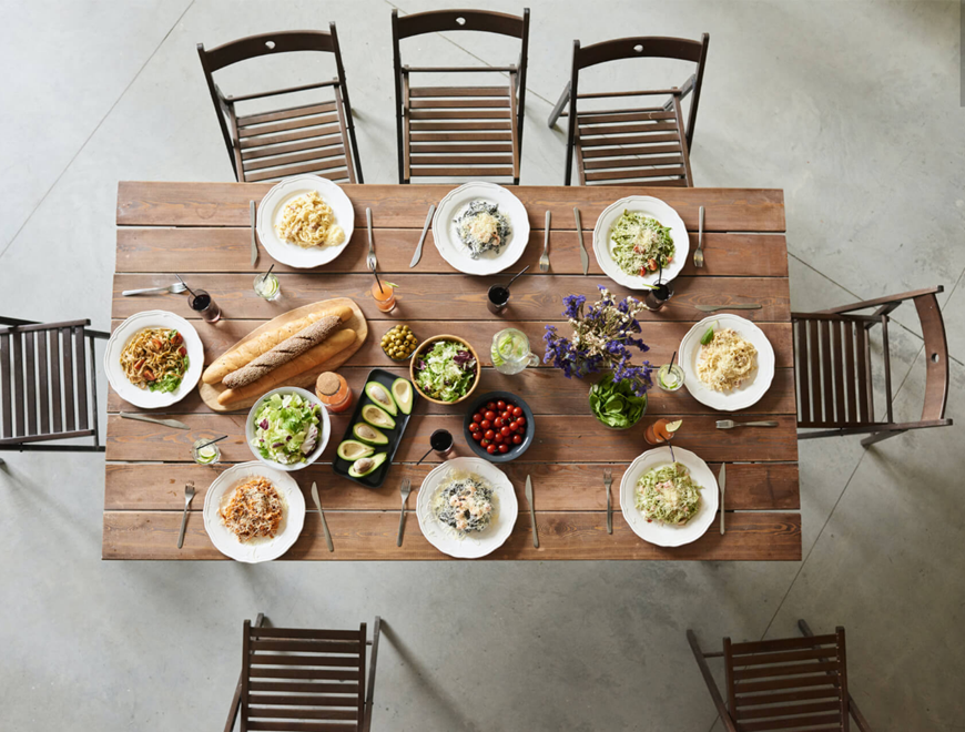
<div id="mainvisual">
<img src="{{ asset('storage\Recipe\mainvisual.jpg') }}" alt="">
</div>
css適用前
css適用後 画像の高さがwindowの高さになった
object-fitやobject-positionrについての解説サイト サイト下の画像をタイル状にするとか本当にわかりやすい。
Text部分のスタイル
css適用前
css適用後

<style>
.text {
text-align: center;
padding: 0 20px;
margin-bottom: 80px;
}
.text .site-title {
margin-bottom: 20px;
}
/*「display: inline-block;」でaタグに幅と高さを持たせる。
paddingでボタンのサイズを調整できるようになる。*/
.text .btn {
display: inline-block;
border: solid 1px #2b2a27;
font-size: 0.875rem;
padding: 18px 60px;
text-decoration: none;
}
</style>
<div class="text">
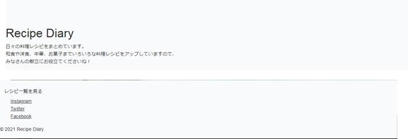
<h1 class="site-title">Recipe Diary</h1>
<p>
日々の料理レシピをまとめています。<br>
和食や洋食、中華、お菓子までいろいろな料理レシピをアップしていますので、<br>
みなさんの献立にお役立てくださいね!
</p>
</div>
---------------------------------
<div class="text">
<a class="btn" href="#">レシピ一覧を見る</a>
</div>
ul.flexの画像リストに高さを設定する
・高さは500px
・画像の縦横比を維持させる
        <style>
            .flex {
                margin-bottom: 60px;
            }
            .flex li img {
                width: 100%;
                height: 500px;
                object-fit: cover;
                vertical-align: bottom;
            }
        </style>
        <ul class="flex">
            <li><img src="{{ asset('storage/Recipe/recipe1.jpg') }}" alt=""></li>
            <li><img src="{{ asset('storage/Recipe/recipe2.jpg') }}" alt=""></li>
            <li><img src="{{ asset('storage/Recipe/recipe3.jpg') }}" alt=""></li>
        </ul>

フッターのスタイル
<style>
#footer {
font-size: 0.75rem;
padding: 20px;
text-align: center;
}
#footer .sns {
display: flex;
justify-content: center;
margin-bottom: 20px;
}
#footer .sns li {
/* 左右に10pxの余白 */
margin: 0 10px;
}
</style>
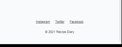
<footer id="footer">
<ul class="sns">
<li><a href="#">Instagram</a></li>
<li><a href="#">Twitter</a></li>
<li><a href="#">Facebook</a></li>
</ul>
<p>© 2021 Recipe Diary</p>
</footer>

レスポンシブ対応にする
・画像のリストを横並びに変更
/* 画像リスト部分のスタイル */
        <style>
            .flex {
                margin-bottom: 60px;
            }

            .flex li img {
                width: 100%;
                height: 500px;
                object-fit: cover;
                vertical-align: bottom;
            }
/* + */
            @media screen and (min-width: 834px) {
                .flex {
                    display: flex;
                }
                .flex li {
                    width: calc(100%/3);
                }
            }
        </style>

   <ul class="flex">
        <li><img src="{{ asset('storage/Recipe/recipe1.jpg') }}" alt=""></li>
        <li><img src="{{ asset('storage/Recipe/recipe2.jpg') }}" alt=""></li>
        <li><img src="{{ asset('storage/Recipe/recipe3.jpg') }}" alt=""></li>
    </ul>
ulの画像リストが横並びになった

⭐レシピサイト/レシピページ

全体のレイアウト
- main
- div(画像とテキスト)
- div(ボタン)
- footer
- snsリスト
- コピーライト表記
    {{-- ページ全体のCSS --}}
    <style>
        html {
            font-size: 100%;
        }

        body {
            color: #2b2a27;
            font-family: "Helvetica Neue", "Arial", "Hiragino Sans", "Meiryo", sans-serif;
        }

        img {
            max-width: 100%;
        }

        ul {
            list-style: none;
            padding: 0;
        }

        a {
            color: #2b2a27;
        }
        ol {
            padding: 0;
        }
        dd{
            margin: 0;
        }
    </style>
css前 画像が親要素(body画面)からはみ出している

css後 画像が画面幅(親のbody要素の幅)に収まる
画像省略
・画像に高さと縦横比をあて下の余白を消去
・レシピ部分(画像以外)に内側余白を設定
・dtとddを横並び+ドット下線(画像:材料部分)
・タイトルのフォントサイズと下線+余白の調整(h1とh2)
・li要素に下線と余白(画像:作り方のリスト部分)
       <style>
            .flex {
                margin-bottom: 60px;
            }

            .flex .image img {
/*親要素の幅、設定してなかった場合、大体画面横幅一杯になる*/
/* 気をつけるべきは % 画像の幅100%ではなく、親要素の幅100%*/
                width: 100%;
                height: auto;
                object-fit: cover;
                vertical-align: bottom;
            }
        </style>
       <div class="flex">
            <div class="image">
                <img src="{{ asset('storage/recipepage/recipe.jpg') }}" alt="">
            </div>
            <div class="recipe">
                  {-- 省略--}
            </div>
        </div>
{{-- recipeのスタイル --}}
        <style>
            .flex .recipe {
                padding: 40px 5% 0 5%;
            }
            .flex .recipe .page-title {
                font-size: 1.75rem;
                margin-bottom: 20px;
            }
            .flex .recipe .content-title {
                border-bottom: solid 1px #ccc;
                font-size: 1.25rem;
                padding-bottom: 5px;
                margin: 40px 0 15px 0;
            }
            /*dt要素とdd要素を横並びにしている*/
            .flex .recipe .ingredient-list {
                display: flex;
                flex-wrap: wrap;
            }
            /*border-bottom に「dotted」を指定して点線にする*/
            .flex .recipe .ingredient-list dt {
                width: 85%;
                border-bottom: dotted 1px #ccc;
                padding: 6px 0;
            }
            .flex .recipe .ingredient-list dd {
                width: 15%;
                border-bottom: dotted 1px #ccc;
                padding: 6px 0;
                text-align: right;
            }
                /*olタグのローマ数字を表記させる場合*/
                .flex .recipe .step-list {
                    list-style:decimal;
                    /*ローマ数字の幅だけ左に余白*/
                    margin-left: 20px;
                }
            .flex .recipe .step-list li {
                border-bottom: dotted 1px #ccc;
                padding: 6px 0;
            }
        </style>
        <div class="flex">
            <div class="image">
                <img src="{{ asset('storage/recipepage/recipe.jpg') }}" alt="">
            </div>

            <div class="recipe">
                <h1 class="page-title">ひよこ豆とアボガドのタコス</h1>
                <p>たっぷりのひよこ豆とレンズ豆にアボガドとトマトを添えて、少しライムを絞ったらおいしいタコスのできあがりです。</p>

                <h2 class="content-title">材料(2人分)</h2>
                <dl class="ingredient-list">
                    <dt>テキストテキスト</dt>
                    <dd>1個</dd>
                    <dt>テキストテキスト</dt>
                    <dd>1個</dd>
                    <dt>テキストテキスト</dt>
                    <dd>1個</dd>
                    <dt>テキストテキスト</dt>
                    <dd>1個</dd>
                    <dt>テキストテキスト</dt>
                    <dd>1個</dd>
                </dl>

                <h2 class="content-title">作り方</h2>
                <ol class="step-list">
                    <li>テキストテキストテキストテキスト</li>
                    <li>テキストテキストテキストテキスト</li>
                    <li>テキストテキストテキストテキスト</li>
                    <li>テキストテキストテキストテキスト</li>
                    <li>テキストテキストテキストテキスト</li>
                </ol>
            </div>
        </div>
後

・ボタンを作成
 {{-- ボタン要素 --}}
 <style>
    .btn {
        text-align: center;
        margin-bottom: 80px;
    }
/*「display: inline-block;」でaタグに幅と高さを持たせる。
paddingでボタンのサイズを調整が可能になる*/
    .btn a {
        display: inline-block;
        border: solid 1px #2b2a27;
        font-size: 0.875rem;
        padding: 18px 60px;
        text-decoration: none;
    }
</style>
        <div class="btn">
            <a href="#">レシピ一覧を見る</a>
        </div>
後

フッターのスタイル
<style>
#footer {
font-size: 0.75rem;
padding: 20px;
text-align: center;
}
/*リンクはul、liタグで記述
SNSのリンク集という、一つの意味をもったリスト群になるので、ul、liタグでグルーピング
※リストタグを使用しなくても問題ないが、使用した方が検索エンジンに対して
より適切に意味を伝えることができると考えリストタグを選択しています。*/
#footer .sns {
display: flex;
justify-content: center;
margin-bottom: 20px;
}
#footer .sns li {
/* 左右に余白 */
margin: 0 10px;
}
</style>
<footer id="footer">
<ul class="sns">
<li><a href="#">Instagram</a></li>
<li><a href="#">Twitter</a></li>
<li><a href="#">Facebook</a></li>
</ul>
<p>© 2021 Recipe Diary</p>
</footer>
後
レスポンシブ対応に変更する
・画像とレシピを横並びにする。
{{-- 画像と全体のスタイル --}}
        <style>
            .flex {
                margin-bottom: 60px;
            }
            .flex .image img {
                width: 100%;
                height: auto;
                object-fit: cover;
                vertical-align: bottom;
            }
        </style>
{{-- recipeのスタイル --}}
        <style>
            .flex .recipe {
                padding: 40px 5% 0 5%;
            }
        </style>
{{--+--}}
{{-- レスポンシブスタイル --}}
        <style>
            @media screen and (min-width: 834px) {
                .flex {
/* .imageと.recipeを横並びに変更 */
                    display: flex;
                     /*defaultはストレッチ*/
                    /* align-items: center; */
                }
                .flex .image {
                    width: 50%;
                }
                .flex .image img {
                    /* height: 700px; */
                    /*defaultのストレッチの時h:100%;は親要素の高さと一致する.それ以外は自要素の高さまで*/
                    height: 100%;
                    width: 100%;
                    object-fit: cover;
                }
                .flex .recipe {
                    width: 50%;
                }
            }
        </style>
d-flexの子要素は交差方向にはstretchがかかる。のでhight:100%;にすると要素一杯まで拡大される。
それ以外は、自要素の高さになるので、この場合の100%の高さはheight:auto;と同じ意味。
あくまでも、画像要素の幅高さの%は親要素が基準になる。


⭐ブランドサイト(ジュエリー)

全体のレイアウト
- メインビジュアル
- header
- logo
- navi
- メイン
- 画像とテキスト x 2
- フッター
- ロゴとコピーライト表記
/*リセットCSS*/
   <link rel="stylesheet" href="https://cdn.jsdelivr.net/npm/destyle.css@1.0.15/destyle.css" />
/*Crimson Textのfont*/
    <link href="https://fonts.googleapis.com/css2?family=Crimson+Text:wght@400;700&display=swap" rel="stylesheet">
    <style>
        html {
            font-size: 100%;
        }

        body{
            font-family: 'Crimson Text', serif;
        }

        img {
            max-width: 100%;
        }
    </style>
メインビジュアルを作成する
完成形 スマホとPC

css適用前

    <style>
        #mainvisual img {
            width: 100%;
            height: 50vh;
            object-fit: cover;
        }

        @media screen and (min-width: 760px) {
            .header-wrapper {
                width: 90vw;
                margin: 4% auto 0 auto;
            }
        }
    </style>

    <div class="header-wrapper">
        <div id="mainvisual">
            <img src="https://code-step.com/demo/html/brand/img/mainvisual.jpg" alt="">
        </div>
        <header id="header"></header>
css適用後 スマホとPC

headerの作成
完成図 スマホとPC

css適用前

css適用後

            <style>
                #header .site-title {
                    width: 120px;
                    line-height: 1px;
                    margin-right: 50px;
                }

                #header .site-title a {
                    display: block;
                }

                #header {
                    display: flex;
                    align-items: center;
                    padding: 20px 25px;
                }

                #header nav ul {
                    display: flex;
                }

                #header nav ul li:not(:last-child) {
                    margin-right: 10px;
                }

                @media screen and (min-width: 760px) {
                    #header {
                        padding: 30px 0;
                    }
                }
            </style>
    <div class="header-wrapper">
        <div id="mainvisual">{-- 省略 --}</div>
        <header id="header">
            <div class="site-title"><a href="#">
                <img src="../brand/img/logo.svg" alt=""></a>
            </div>
            <nav>
                <ul>
                    <li>Concept</li>
                    <li>Work</li>
                    <li>Contact</li>
                </ul>
            </nav>
        </header>
    </div>
section#concept#work
完成図

    <div class="wrapper">
        <main>
            <section id="concept" class="content">
                <div class="img">
                    <img src="../brand/img/concept.jpg" alt="">

                </div>
                <div class="text">
                    <h2 class="section-title">私たちの考えるジュエリーとは</h2>
                    <span class="section-title-en">Concept</span>
                    <p>テキストテキストテキストテキストテキストテキストテキストテキストテキスト</p>
                    <p>テキストテキストテキストテキストテキストテキストテキストテキストテキスト</p>
                </div>
            </section>
            <section id="work" class="content">
                <div class="img">
                    <img src="../brand/img/work.jpg" alt="">
                </div>
                <div class="text">
                    <h2 class="section-title">ハンドメイドにこだわる理由</h2>
                    <span class="section-title-en">Work</span>
                    <p>テキストテキストテキストテキストテキストテキストテキストテキストテキスト</p>
                    <p>テキストテキストテキストテキストテキストテキストテキストテキストテキスト</p>
                </div>
            </section>
        </main>
セクション全体のスタイル
    <style>
        .wrapper {
            max-width: 1000px;
            margin: 30px auto 0 auto;
            padding: 0 18px;
        }

        .content {
            margin-bottom: 60px;
        }

    </style>
    <div class="wrapper">
        <main>
            <section id="concept" class="content">{{-- 省略 --}}</section>

            <section id="work" class="content">{{-- 省略 --}}</section>
        </main>
    </div>
css適用前

css適用後 画像はsection:100%;だからsectionを中央にすれば、自然と中央になる

セクションのcss span(inline)要素はd-inline-blockにすることで、marginができる。
.content .img{width:100%; 不要。消し忘れ}
flex-direction:row-reverse;で画像とテキストの順番を入れ替えている。

    <style>
        .wrapper {
            max-width: 1000px;
            margin: 30px auto 0 auto;
            padding: 0 18px;
        }

        .content {
            margin-bottom: 60px;
        }

    </style>
    <div class="wrapper">
        <main>
            <style>
                .section-title {
                    font-weight: bold;
                    font-size: 1.25rem;
                    margin-bottom: 4px;
                }

                .section-title-en {
                    display: inline-block;
                    margin-bottom: 25px;
                }

                .content .img {
                    /*width: 100%; 不要 消し忘れ*/
                    margin-bottom: 10px;
                }

                .content .text p{
                    margin-bottom: 10px;
                }

                @media screen and (min-width: 760px) {
                    .section-title {
                        font-size: 1.5rem;
                    }

                    .content {
                        display: flex;
                        align-items: center;
                    }

                    .content .img {
                        width: 50%;
                        margin-bottom: 0;
                    }

                    .content .text {
                        width: 50%;
                        padding: 0 7%;
                    }

                    #work.content {
                        flex-direction: row-reverse;
                    }
                }
            </style>
            <section id="concept" class="content">
                <div class="img">
                    <img src="../brand/img/concept.jpg" alt="">

                </div>
                <div class="text">
                    <h2 class="section-title">私たちの考えるジュエリーとは</h2>
                    <span class="section-title-en">Concept</span>
                    <p>テキストテキストテキストテキストテキストテキストテキストテキストテキスト</p>
                    <p>テキストテキストテキストテキストテキストテキストテキストテキストテキスト</p>
                </div>
            </section>
            <section id="work" class="content">
                <div class="img">
                    <img src="../brand/img/work.jpg" alt="">
                </div>
                <div class="text">
                    <h2 class="section-title">ハンドメイドにこだわる理由</h2>
                    <span class="section-title-en">Work</span>
                    <p>テキストテキストテキストテキストテキストテキストテキストテキストテキスト</p>
                    <p>テキストテキストテキストテキストテキストテキストテキストテキストテキスト</p>
                </div>
            </section>
        </main>
footer
完成図

css適用前

<style>
footer ul {
display: flex;
justify-content: space-between;
padding: 10px 0;
align-items: center;
font-size: 0.625rem;
}
footer ul .logo {
line-height: 1px;
width: 120px;
}
</style>
<footer>
<ul>
<li class="logo"><img src="https://code-step.com/demo/html/brand/img/logo.svg" alt=""></li>
<li class="copy-right">© Wooden Jewelry</li>
</ul>
</footer>