統計学の基礎の基礎について話をしてきましたので、スライドと、そこで使用したコードです。

統計学の基礎の基礎 from Ken'ichi Matsui
このスライドの中で解説されている標準偏差のさらに詳細な説明は【統計学】初めての「標準偏差」(統計学に挫折しないために)にもありますので、よければご参照ください。
以下、スライド中でグラフ描画や、乱数生成を行ったPythonコードです。
モジュールインポート
%matplotlib inline
import matplotlib.pyplot as plt
from matplotlib import gridspec
import seaborn as sns
import numpy as np
import numpy.random as rd
import pandas as pd
import html5lib, time, sys
from datetime import datetime as dt
import statsmodels.graphics.tsaplots as tsaplots
import statsmodels.api as sm
import cPickle as pickle
import scipy.stats as st

sns.set(style="whitegrid", palette="muted", color_codes=True)
tips = sns.load_dataset("tips")
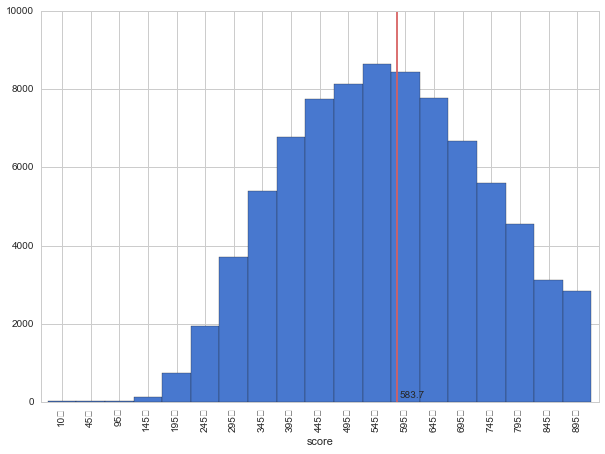
TOEICデータ
url = 'http://www.toeic.or.jp/toeic/about/data/data_avelist/data_dist01_04.html'
fetched_dataframes = pd.io.html.read_html(url, header=0, index_col=0)
df_total = fetched_dataframes[0]

df_total = df_total[['Unnamed: 5','Unnamed: 6','Unnamed: 7']]
df_total.columns = ['score','num','ratio']
df_total.index = df_total['score']
df_total = df_total.drop([u'(スコア区分)']).drop(['Total']).drop(['score'], axis=1).convert_objects(convert_numeric=True)
df_total['sortkey'] = [int(idx.replace(u'\uff5e','')) for idx in df_total.index]

df_total.sort(columns='sortkey')['num'].plot(kind='bar', color='b', figsize=(10,7),width=1)
plt.plot([11.7,11.7],[0,10000], color='r')
plt.text(11.8, 100, '583.7')
plt.show()
グラフを描く
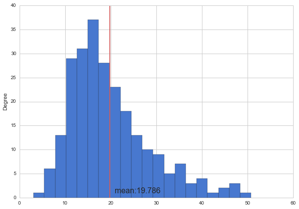
tips.total_bill.plot(kind="hist", bins=20, figsize=(10,7))
m = np.mean(tips.total_bill)
print m
plt.plot([m, m],[0, 40], 'r')
plt.text(21, 1, "mean:{0:.3f}".format(m), size=16)
plt.show()
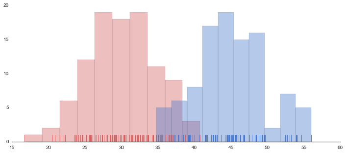
sns.set(style="white", palette="muted", color_codes=True)
rs = np.random.RandomState(11)

# Set up the matplotlib figure
f, axes = plt.subplots(1, 1, figsize=(12, 5), sharex=True)
sns.despine(left=True)

# Generate a random univariate dataset
d = rs.normal(30, 5, size=100)
d2 = rs.normal(45, 5, size=100)

# Plot a simple histogram with binsize determined automatically
sns.distplot(d, kde=False, rug=True, color="r", bins=10)
sns.distplot(d2, kde=False, rug=True, color="b", bins=10)

plt.show()
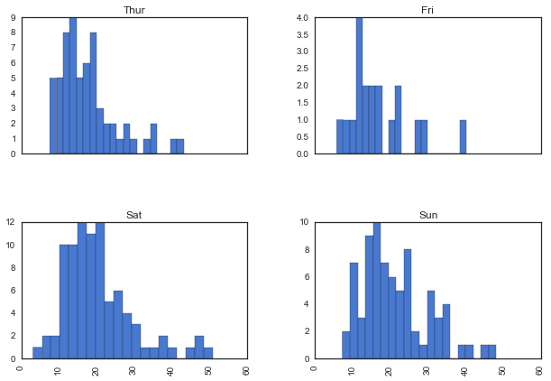
tips.hist(by='day', column='total_bill', bins=20, figsize=(10,7), sharex=True)
plt.show()
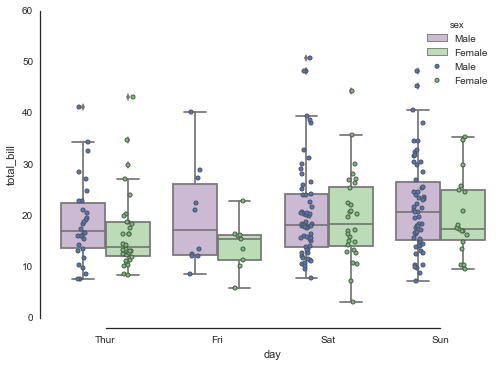
sns.boxplot(x="day", y="total_bill", hue="sex", data=tips, palette="PRGn")
ax = sns.stripplot(x="day", y="total_bill", data=tips,  hue="sex",
                   size=4, jitter=True, edgecolor="gray")
sns.despine(offset=10, trim=True)
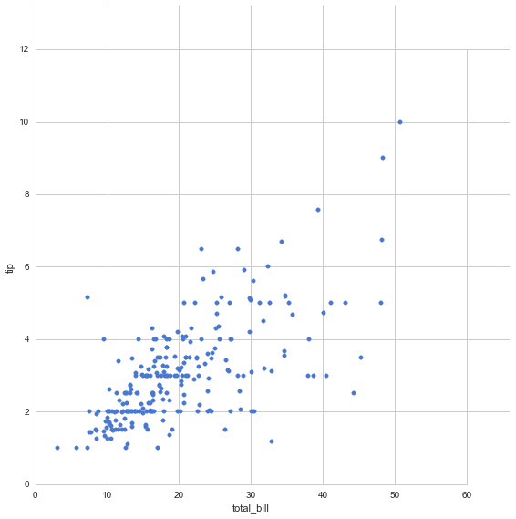
sns.set(style="whitegrid", palette="muted", color_codes=True)
tips = sns.load_dataset("tips")
grid = sns.JointGrid(tips.total_bill, tips.tip, space=0, size=8, ratio=10)
grid.plot_joint(plt.scatter, color="b")
plt.show()
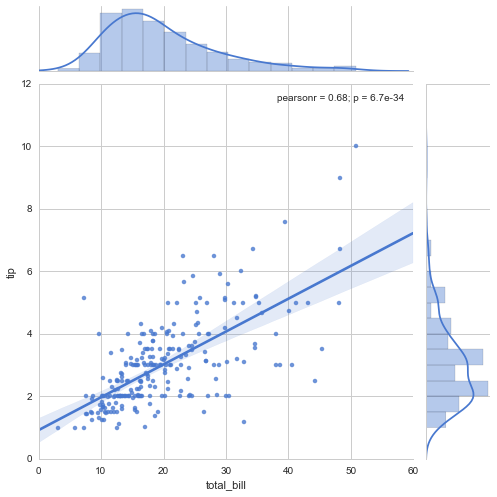
sns.jointplot("total_bill", "tip", data=tips, kind="reg", xlim=(0, 60), ylim=(0, 12), color="b", size=7)
plt.show()
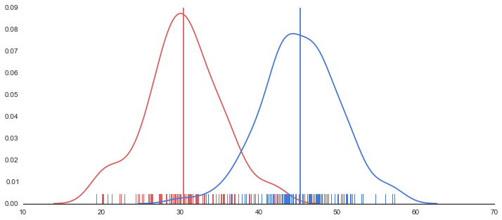
sns.set(style="white", palette="muted", color_codes=True)
rs = np.random.RandomState(10)

# Set up the matplotlib figure
f, axes = plt.subplots(1, 1, figsize=(12, 5), sharex=True)
sns.despine(left=True)

# Generate a random univariate dataset
d = rs.normal(30, 5, size=100)
d2 = rs.normal(45, 5, size=100)

# Plot a kernel density estimate and rug plot
sns.distplot(d, hist=False, rug=True, color="r")#, ax=axes[0, 0])
sns.distplot(d2, hist=False, rug=True, color="b")#, ax=axes[0, 0])

# Calculate average
m = np.mean(d)
m2 = np.mean(d2)

plt.plot([m,m],[0,0.09], 'r')
plt.plot([m2,m2],[0,0.09], 'b')

plt.show()
相関係数
# In[14]:

sns.set(style="whitegrid", palette="muted", color_codes=True)
tips = sns.load_dataset("tips")
grid = sns.JointGrid(tips.total_bill, tips.tip, space=0, size=8, ratio=10)
grid.plot_joint(plt.scatter, color="b")
tips[['total_bill', 'tip']].corr()
| total_bill | tip | |
|---|---|---|
| total_bill | 1.000000 | 0.675734 |
| tip | 0.675734 | 1.000000 |

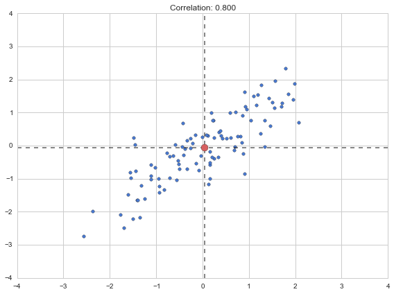
plt.figure(figsize=(8,6))

r = 0.8
mean = [0,0]
cov =  [[1,  r],
        [r,  1]]


X = rd.multivariate_normal(mean, cov, size=100)
m1 = np.mean(X[:,0])
m2 = np.mean(X[:,1])

plt.scatter(X[:,0], X[:,1])
plt.title("Correlation: {0:.3f}".format(r))
plt.scatter([m1], [m2], c="r", s=100, zorder=100)
plt.plot([m1, m1], [-4,4], "k--", alpha=.6)
plt.plot([-4,4], [m2, m2], "k--", alpha=.6)

plt.xlim(-4, 4)
plt.ylim(-4, 4)

plt.tight_layout()
plt.show()
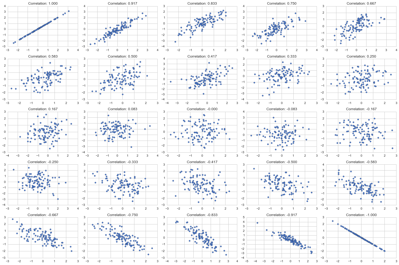
nn = 5
plt.figure(figsize=(18,12))

rel = np.linspace(-1,1, nn * nn)
for n in range(nn * nn):
    plt.subplot(nn, nn, n+1)
    r = -rel[n]
    mean = [0,0]
    cov =  [[1,  r],
            [r,  1]]
    X = rd.multivariate_normal(mean, cov, size=100)
    plt.scatter(X[:,0], X[:,1])
    plt.title("Correlation: {0:.3f}".format(r))


plt.tight_layout()
plt.show()
正規分布の成り立ち
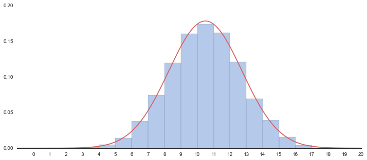
# コイン投げ, 20回投げて表が1, 裏が0
coin_toss = st.bernoulli.rvs(p=0.5, size=20)
coin_toss
out
array([0, 1, 1, 0, 0, 1, 0, 1, 0, 0, 1, 0, 1, 0, 1, 0, 1, 0, 1, 1])
20回コインを投げて表が出た回数を数える。これを100セット実施
set_20 = []
for i in range(100):
    coin_toss = st.bernoulli.rvs(p=0.5, size=20)
    print np.sum(coin_toss),
out
12 12 10 6 9 14 9 8 11 7 13 9 6 14 9 7 8 8 13 7 6 10 9 11 10 10 9 9 13 10 11 12 12 11 12 10 6 9 6 11 9 9 9 11 7 10 8 9 8 11 8 11 8 10 13 6 12 12 10 12 8 14 9 9 11 9 14 10 13 9 11 9 10 9 12 8 6 10 11 9 9 11 8 8 8 12 8 10 11 11 10 11 6 7 11 9 10 11 8 10
10000セット実施
set_20 = []
for i in range(10000):
    coin_toss = st.bernoulli.rvs(p=0.5, size=20)
    n = np.sum(coin_toss)
    set_20.append(n)
sns.set(style="white", palette="muted", color_codes=True)

# Set up the matplotlib figure
data = np.array(set_20)

f, axes = plt.subplots(1, 1, figsize=(12, 5), sharex=True)
sns.despine(left=True)

m = data.mean()
s = data.std()
# Plot a kernel density estimate and rug plot
sns.distplot(data, hist=True, kde=True, bins=16, rug=False, color="b", kde_kws={"lw":0})
plt.xticks(range(21))

xx = np.linspace(-5, 20, 501)
yy = st.norm.pdf(xx, loc=m, scale=s)
plt.plot(xx+.5,yy,"r")
plt.xlim(-1,20)
plt.ylim(0,0.20)
plt.show()
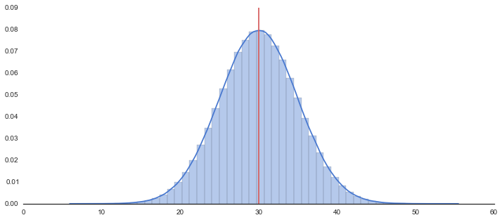
100万件のサンプルデータを生成
rs = np.random.RandomState(71)

# Generate a random univariate dataset
d = rs.normal(30, 5, size=1000000)
ヒストグラムの描画
# Set up the matplotlib figure
f, axes = plt.subplots(1, 1, figsize=(12, 5), sharex=True)
sns.despine(left=True)

# Plot a kernel density estimate and rug plot
sns.distplot(d, hist=True, kde=True, rug=False, color="b")

# Calculate average
m = np.mean(d)
print "average:{}".format(m)
plt.plot([m,m],[0,0.09], 'r')

plt.show()
割合を数えてみる
d = np.array(d)

all = len(d)              # 全データ数
small = len(d[d < 20])    # 20より小さいものの個数
large = len(d[d > 40])    # 40より大きいものの個数
mid = all - small - large # その中間にある個数

print "all:\t{0:7d}".format(all)
print "small:\t{0:7d}({1:.2f}%)".format(small, small/float(all)*100)
print "mid:\t{0:7d}({1:.2f}%)".format(mid, mid/float(all)*100)
print "large:\t{0:7d}({1:.2f}%)".format(large, large/float(all)*100)
out
all:	1000000
small:	  22641(2.26%)
mid:	 954600(95.46%)
large:	  22759(2.28%)
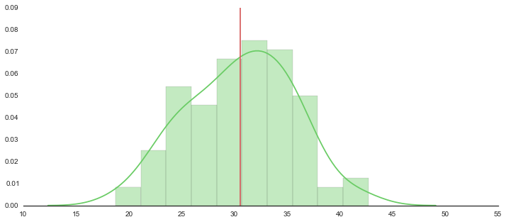
100万件から100個サンプリングする
df = pd.DataFrame(d, columns=['data'])
sample = df.sample(n=100,random_state=71)
sample
| data | |
|---|---|
| 329401 | 19.371665 |
| 818859 | 29.955302 |
| 318049 | 30.866991 |
| 167751 | 24.089591 |
| ... | ... |
| 409987 | 37.775277 |
| 307745 | 33.821469 |
| 532797 | 29.343810 |
| 16381 | 33.377021 |
100個のヒストグラム
f, axes = plt.subplots(1, 1, figsize=(12, 5), sharex=True)
sns.despine(left=True)

# Plot a kernel density estimate and rug plot
sns.distplot(sample, hist=True, kde=True, rug=False, color="g", bins=10)

# Calculate average
n = len(sample)
m = np.mean(sample)
sd = np.sqrt(np.var(sample))
print "average:{}".format(m)
print "sd:{}".format(sd)
print "lower:{0:.3f}, upper:{1:.3f}".format(float(m-2*sd/np.sqrt(n)), float(m+2*sd/np.sqrt(n)))

plt.plot([m,m],[0,0.09], 'r')

plt.xlim(10,55)
plt.show()
out
average:data    30.588533
dtype: float64
sd:data    5.036523
dtype: float64
lower:29.581, upper:31.596
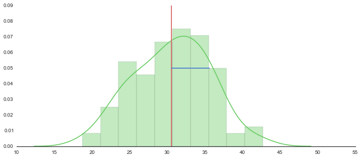
f, axes = plt.subplots(1, 1, figsize=(12, 5), sharex=True)
sns.despine(left=True)

# Plot a kernel density estimate and rug plot
sns.distplot(sample, hist=True, kde=True, rug=False, color="g", bins=10)

# Calculate average
n = len(sample)
m = np.mean(sample)
sd = np.sqrt(np.var(sample))
print "average:{}".format(m)
print "sd:{}".format(sd)
print "lower:{0:.3f}, upper:{1:.3f}".format(float(m-2*sd/np.sqrt(n)), float(m+2*sd/np.sqrt(n)))

plt.plot([m,m],[0,0.09], 'r')
plt.plot([m,m+sd],[0.05,0.05], 'b')

plt.xlim(10,55)
plt.show()
out
average:data    30.588533
dtype: float64
sd:data    5.036523
dtype: float64
lower:29.581, upper:31.596
f, axes = plt.subplots(1, 1, figsize=(12, 5), sharex=True)
sns.despine(left=True)

# Plot a kernel density estimate and rug plot
sns.distplot(sample, hist=True, kde=True, rug=False, color="g", bins=10)

# Calculate average
n = len(sample)
m = np.mean(sample)
sd = np.sqrt(np.var(sample))
print "average:{}".format(m)
print "sd:{}".format(sd)
print "lower:{0:.3f}, upper:{1:.3f}".format(float(m-2*sd/np.sqrt(n)), float(m+2*sd/np.sqrt(n)))

plt.plot([m,m],[0,0.11], 'r')
plt.plot([m,m+sd/np.sqrt(n)],[0.05,0.05], 'b')

plt.plot([m-2*sd/np.sqrt(n),m-2*sd/np.sqrt(n)],[0,0.11], "k--", alpha=.5)
plt.plot([m+2*sd/np.sqrt(n),m+2*sd/np.sqrt(n)],[0,0.11], "k--", alpha=.5)

plt.xlim(10,55)
plt.ylim(0,.09)
plt.show()
out
average:data    30.588533
dtype: float64
sd:data    5.036523
dtype: float64
lower:29.581, upper:31.596
f, axes = plt.subplots(1, 1, figsize=(12, 5), sharex=True)
sns.despine(left=True)
# Plot a kernel density estimate and rug plot
sns.distplot(sample, hist=True, kde=True, rug=False, color="g", bins=10)
# Calculate average
n = len(sample)
m = np.mean(sample)
sd = np.sqrt(np.var(sample))
print "average:{}".format(m)
print "sd:{}".format(sd)
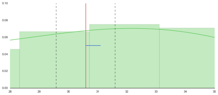
print "lower:{0:.3f}, upper:{1:.3f}".format(float(m-2*sd/np.sqrt(n)), float(m+2*sd/np.sqrt(n)))
plt.plot([m,m],[0,0.11], 'r')
plt.plot([m,m+sd/np.sqrt(n)],[0.05,0.05], 'b')
plt.plot([m-2*sd/np.sqrt(n),m-2*sd/np.sqrt(n)],[0,0.11], "k--", alpha=.5)
plt.plot([m+2*sd/np.sqrt(n),m+2*sd/np.sqrt(n)],[0,0.11], "k--", alpha=.5)
plt.xlim(28,35)
plt.ylim(0,.10)
plt.show()
out
average:data    30.588533
dtype: float64
sd:data    5.036523
dtype: float64
lower:29.581, upper:31.596
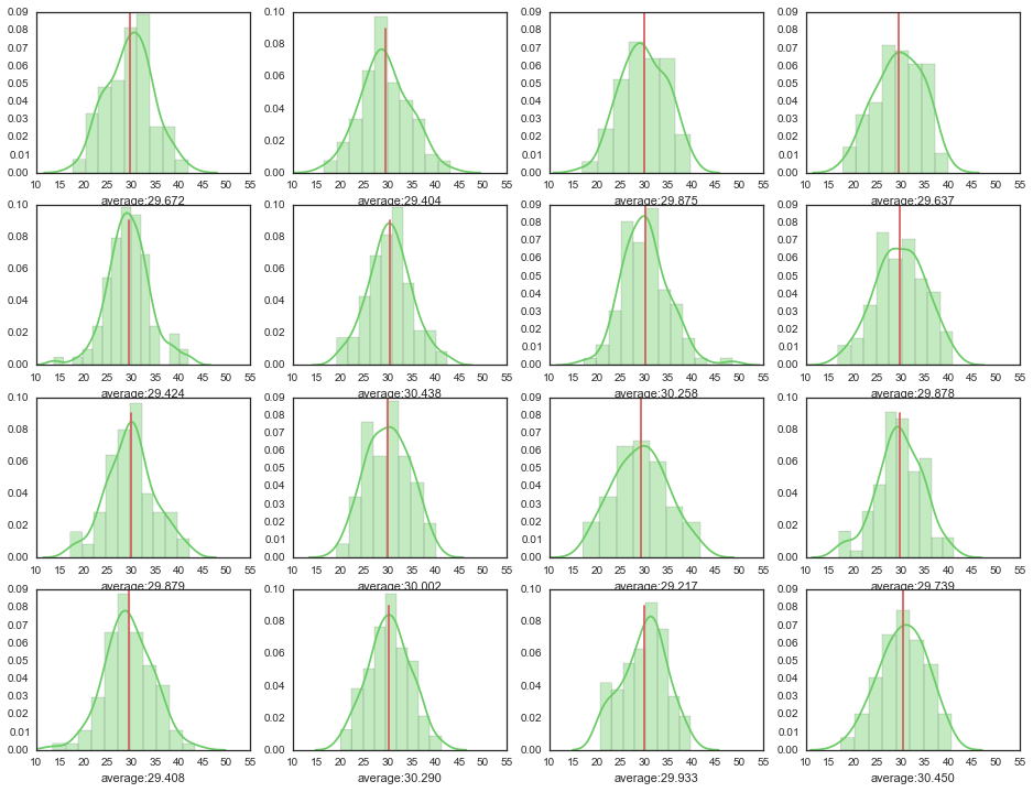
たくさん書いて眺めてみる
ncol = 4
nrow = 4

f, axes = plt.subplots(nrow, ncol, figsize=(nrow*4, ncol*3))

for i in range(nrow):
    for j in range(ncol):
        print "({},{})".format(i, j),
        sample = df.sample(n=100)
        m = np.mean(sample)
        sns.distplot(sample, hist=True, kde=True, rug=False, color="g", ax=axes[i, j],
                     axlabel="average:{0:.3f}".format(float(m)))
        axes[i, j].plot([m,m],[0,0.09], 'r')
        axes[i, j].set_xlim(10,55)
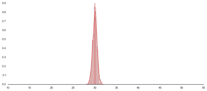
さらにたくさん(1000回)サンプリングして、その平均値を集めてみる
# ちょっと時間かかります
ave_list = [np.mean(df.sample(n=100)) for _ in range(1000)]
1000個の平均値でヒストグラムを描いてみる
f, axes = plt.subplots(1, 1, figsize=(12, 5), sharex=True)
sns.despine(left=True)

# Plot a kernel density estimate and rug plot
sns.distplot(ave_list, hist=True, kde=True, rug=False, bins=20, color="r")

# Calculate average
m = np.mean(ave_list)
print "average:{}".format(m)
plt.plot([m,m],[0,0.9], 'r')
plt.xlim(10,55)
plt.show()
out
average:30.0018428235
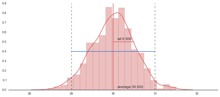
拡大
f, axes = plt.subplots(1, 1, figsize=(12, 5), sharex=True)
sns.despine(left=True)

# Plot a kernel density estimate and rug plot
sns.distplot(ave_list, hist=True, kde=True, rug=False, bins=20, color="r")

# Calculate average
m = np.mean(ave_list)
sd = np.sqrt(np.var(ave_list))
print "average:{}".format(m)
print "sd:{}".format(sd)
plt.plot([m,m],[0,0.9], 'r')
plt.text(m+.1,0.02,"average:{0:.3f}".format(m), size=12)
plt.plot([m,m+sd],[0.5,0.5],"b")
plt.text(m+.1,0.52,"sd:{0:.3f}".format(sd), size=12)
# plt.plot([m-2*sd,m+2*sd],[0.4,0.4])
# plt.plot([m-2*sd,m-2*sd],[0,0.9], "k--", alpha=.5)
# plt.plot([m+2*sd,m+2*sd],[0,0.9], "k--", alpha=.5)

plt.xlim(27.5,32.5)
plt.show()
out
average:30.0018428235
sd:0.499635405099

信頼区間を表示
f, axes = plt.subplots(1, 1, figsize=(12, 5), sharex=True)
sns.despine(left=True)

# Plot a kernel density estimate and rug plot
sns.distplot(ave_list, hist=True, kde=True, rug=False, bins=20, color="r")

# Calculate average
m = np.mean(ave_list)
sd = np.sqrt(np.var(ave_list))
print "average:{}".format(m)
print "sd:{}".format(sd)
plt.plot([m,m],[0,0.9], 'r')
plt.text(m+.1,0.02,"average:{0:.3f}".format(m), size=12)
plt.plot([m,m+sd],[0.5,0.5],"r")
plt.text(m+.1,0.52,"sd:{0:.3f}".format(sd), size=12)
plt.plot([m-2*sd,m+2*sd],[0.4,0.4])
plt.plot([m-2*sd,m-2*sd],[0,0.9], "k--", alpha=.5)
plt.plot([m+2*sd,m+2*sd],[0,0.9], "k--", alpha=.5)

plt.xlim(27.5,32.5)
plt.show()
out
average:30.0018428235
sd:0.499635405099
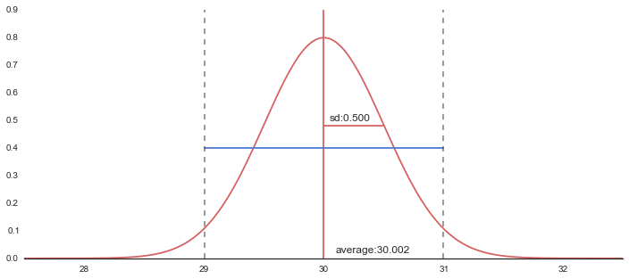
f, axes = plt.subplots(1, 1, figsize=(12, 5), sharex=True)
sns.despine(left=True)

# Plot a kernel density estimate and rug plot
# sns.distplot(ave_list, hist=True, kde=True, rug=False, bins=20, color="r")

# Calculate average
m = np.mean(ave_list)
sd = np.sqrt(np.var(ave_list))

xx = np.linspace(27.5,32.5, 301)
yy = st.norm.pdf(xx, loc=m, scale=sd)

plt.plot(xx,yy,"r")

print "average:{}".format(m)
print "sd:{}".format(sd)
print "lower:{0:.3f}, upper:{1:.3f}".format(m-2*sd, m+2*sd)

plt.plot([m,m],[0,0.9], 'r')
plt.text(m+.1,0.02,"average:{0:.3f}".format(m), size=12)
plt.plot([m,m+sd],[0.48,0.48],"r")
plt.text(m+.05,0.50,"sd:{0:.3f}".format(sd), size=12)
plt.plot([m-2*sd,m+2*sd],[0.4,0.4])
plt.plot([m-2*sd,m-2*sd],[0,0.9], "k--", alpha=.5)
plt.plot([m+2*sd,m+2*sd],[0,0.9], "k--", alpha=.5)

plt.xlim(27.5,32.5)
plt.show()
out
average:30.0018428235
sd:0.499635405099
lower:29.003, upper:31.001
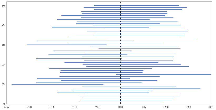
標本平均の信頼区間をいくつも描いてみる
sample = [df.sample(n=100) for _ in range(50)]

res = []
for d in sample:
    m = np.mean(d)
    sd = np.sqrt(np.var(d))
    n = len(d)
    upper = m + 2*sd/np.sqrt(n)
    lower = m - 2*sd/np.sqrt(n)
    #print "(u:{0:.3f}, l:{1:.3f},)".format(float(upper), float(lower))
    res.append((float(lower), float(upper)))

plt.figure(figsize=(14, 7))

cnt = 0
for i, d in enumerate(res):
    plt.plot([d[0],d[1]], [i+1, i+1], "b")
    if d[0] > 30 or d[1] < 30:
        cnt += 1

plt.plot([30, 30],[0,52], "k--")
plt.ylim(0,52)
print cnt/float(len(res))
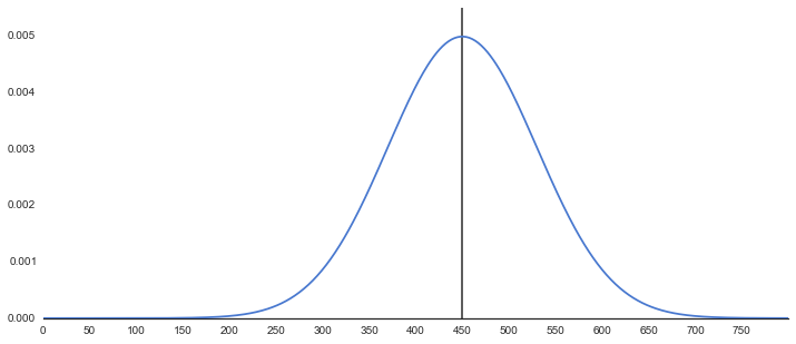
母集団の平均の検定
# 母集団
np.random.seed(32)

f, axes = plt.subplots(1, 1, figsize=(12, 5), sharex=True)
sns.despine(left=True)

m = 450
sd = 80

xx = np.linspace(0,800, 501)
yy = st.norm.pdf(xx, loc=m, scale=sd)

plt.plot(xx,yy,zorder=100)
plt.xticks(range(0,800,50))
plt.plot([450,450],[0,0.18],"k",alpha=.8)

plt.ylim(0,0.0055)
plt.show()
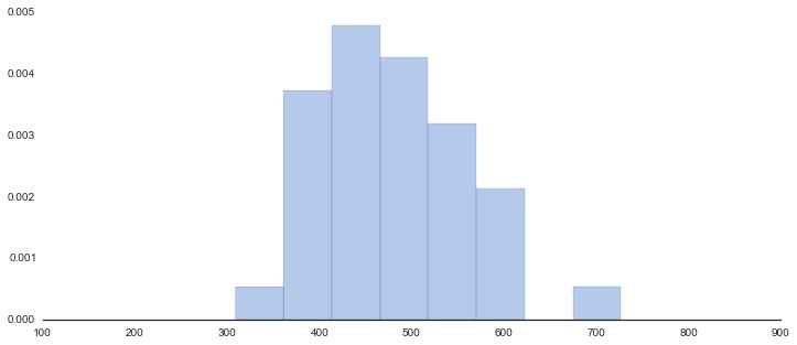
今年の新入生の結果(36人分)
np.random.seed(32)
data = st.norm.rvs(loc=480, scale=80, size=36)
data = np.array(map(int, data)) - 22

data[7] -= 22
data[1]  -= 2
print data

f, axes = plt.subplots(1, 1, figsize=(12, 5), sharex=True)
sns.despine(left=True)

n = len(data)
m = data.mean()
sd = data.std()
m_sd = sd/np.sqrt(n)

print "data size:{}".format(n)
print "average:{}".format(m)
print "sd:{}".format(sd)

xx = np.linspace(-15,10, 501)
yy = st.norm.pdf(xx, loc=m, scale=sd)

sns.distplot(data, hist=True, kde=True, bins=8, rug=False, color="b", kde_kws={"lw":0})
plt.show()
out
[430 534 504 463 520 504 575 569 437 402 402 613 602 494 412 467 579 486
 450 531 498 392 489 424 461 415 417 386 545 511 372 555 727 391 430 309]
data size:36
average:480.444444444
sd:82.0120060467
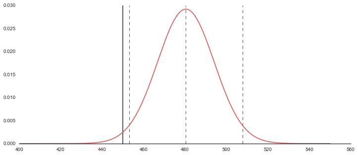
# 今年の新入生の結果(36人分)
f, axes = plt.subplots(1, 1, figsize=(12, 5), sharex=True)
sns.despine(left=True)

n = len(data)
m = data.mean()
sd = data.std()
m_sd = sd/np.sqrt(n)
up  = m+2*m_sd
low = m-2*m_sd

print "data size:{}".format(n)
print "average:{}".format(m)
print "sd:{}".format(sd)
print "m_sd:{}".format(sd/np.sqrt(n))
print "lower:{0:.3f}, upper:{1:.3f}".format(low, up)

xx = np.linspace(400,550, 501)
yy = st.norm.pdf(xx, loc=m, scale=m_sd)

plt.plot(xx,yy,"r",zorder=100)
plt.plot([450,450],[0,0.03],"k",alpha=.8)

plt.plot([m,m],[0,0.03],"k--", lw=1, alpha=.8)
plt.plot([low, low],[0,0.03],"k--", lw=1, alpha=.8)
plt.plot([up, up],[0,0.03],"k--", lw=1, alpha=.8)

plt.show()
log
data size:36
average:480.444444444
sd:82.0120060467
m_sd:13.6686676744
lower:453.107, upper:507.782