この記事ではスライダーコントロールの開発を紹介します。また各種ツールの使い方やスキャフォールドされるコードの詳細も解説していきます。開発環境の準備については こちらの記事 を参照してください。
情報元: Implement components using TypeScript
プロジェクトの作成
まず PAC を使ってフィールド用の PCF プロジェクトを作成します。
1. 任意のディレクトリを作成して移動。
mkdir LinearControl
cd LinearControl
2. 以下のコマンドを実行してプロジェクトを作成。
- 名前空間とプロジェクト名の指定
- template 引数は field を指定
pac pcf init --namespace SampleNamespace --name TSLinearInputControl --template field
3. npm パッケージをリストアして任意の IDE でフォルダを開く。ここでは Visual Studio Code を利用。
npm install
code .
スライダーコントロールの開発
コントロールマニフェストの編集
開発する UI コントロールのメタデータは ControlManifest.Input.xml に記述します。
参照: マニフェストスキーマ
1. まずはコントロールのメタデータを変更。ControlManifest.Input.xml の control 要素を以下の様に変更。
- namespace: 名前空間の指定
- constructor: UI コントロール読み込み時の初期化処理を行う関数名
- display-name, description: リソースファイルのキーまたは文字列をハードコード
<control
    namespace="SampleNamespace"
    constructor="TSLinearInputControl"
    version="0.0.1"
    display-name-key="Sample Slider Control"
    description-key="This is sample Slider Control"
    control-type="standard">
2. 次に control ノード内に各プロパティのメタデータを変更。今回は実際のフィールドの値にバインドする通知型のプロパティを 1 つだけ指定。
- name: プロパティの固有名
- display-name, description: リソースファイルのキーまたは文字列をハードコード
- of-type-group: サポートする型のグループ ※サポートする型が 1 つの場合は of-type で指定
- usage: UI コントロールとフィールドの値が双方向に反映する場合は bound、UI コントロールの設定値としてのみ使う場合は input を指定
- required: プロパティの設定が必須かどうか
<property
  name="sliderValue"
  display-name-key="Slider value"
  description-key="Slider value bound to the field"
  of-type-group="numbers"
  usage="bound"
  required="true" />
3. プロパティで指定された numbers グループを追加。
<type-group name="numbers">
  <type>Whole.None</type>
  <type>Currency</type>
  <type>FP</type>
  <type>Decimal</type>
</type-group>
4. 最後にプロジェクトで利用されるファイルの指定を resources に設定。css ファイルは後ほど追加。
<resources>
  <code path="index.ts" order="1"/>
  <css path="css/TS_LinearInputControl.css" order="1"/>
</resources>
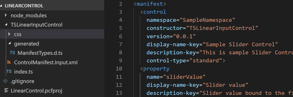
最終的に ControlManifest.Input.xml は以下の様になります。
<?xml version="1.0" encoding="utf-8" ?>
<manifest>
  <control
    namespace="SampleNamespace"
    constructor="TSLinearInputControl"
    version="0.0.1"
    display-name-key="Sample Slider Control"
    description-key="This is sample Slider Control"
    control-type="standard">
    <property
      name="sliderValue"
      display-name-key="Slider value"
      description-key="Slider value bound to the field"
      of-type-group="numbers"
      usage="bound"
      required="true" />
    <type-group name="numbers">
      <type>Whole.None</type>
      <type>Currency</type>
      <type>FP</type>
      <type>Decimal</type>
    </type-group>
    <resources>
      <code path="index.ts" order="1"/>
      <css path="css/TS_LinearInputControl.css" order="1"/>
    </resources>
  </control>
</manifest>
リソースファイルの追加
プロジェクトに必要なリソースを追加します。
1. ControlManifest.Input.xml と同じところに css フォルダを追加。
2. TS_LinearInputControl.css ファイルを追加して以下のコードに差し替え。
- 名前空間.コントロール名はクラス名として生成された DOM に自動付与される
- 名前空間やコントロール名を変えた場合は随時こちらも変更
.SampleNamespace\.TSLinearInputControl input[type=range].linearslider {
  margin: 1px 0;
  background: transparent;
  -webkit-appearance: none;
  width: 100%;
  padding: 0;
  height: 24px;
  -webkit-tap-highlight-color: transparent
}

.SampleNamespace\.TSLinearInputControl input[type=range].linearslider:focus {
  outline: none;
}

.SampleNamespace\.TSLinearInputControl input[type=range].linearslider::-webkit-slider-runnable-track {
  background: #666;
  height: 2px;
  cursor: pointer
}

.SampleNamespace\.TSLinearInputControl input[type=range].linearslider::-webkit-slider-thumb {
  background: #666;
  border: 0 solid #f00;
  height: 24px;
  width: 10px;
  border-radius: 48px;
  cursor: pointer;
  opacity: 1;
  -webkit-appearance: none;
  margin-top: -12px
}

.SampleNamespace\.TSLinearInputControl input[type=range].linearslider::-moz-range-track {
  background: #666;
  height: 2px;
  cursor: pointer
}

.SampleNamespace\.TSLinearInputControl input[type=range].linearslider::-moz-range-thumb {
  background: #666;
  border: 0 solid #f00;
  height: 24px;
  width: 10px;
  border-radius: 48px;
  cursor: pointer;
  opacity: 1;
  -webkit-appearance: none;
  margin-top: -12px
}

.SampleNamespace\.TSLinearInputControl input[type=range].linearslider::-ms-track {
  background: #666;
  height: 2px;
  cursor: pointer
}

.SampleNamespace\.TSLinearInputControl input[type=range].linearslider::-ms-thumb {
  background: #666;
  border: 0 solid #f00;
  height: 24px;
  width: 10px;
  border-radius: 48px;
  cursor: pointer;
  opacity: 1;
  -webkit-appearance: none;
}
ManifestTypes.d.ts
マニュフェストの定義でインプットやアウトプットの設定が完了したら、一旦プロジェクトをビルドして型定義を作成します。
1. index.ts の中身を全て削除してから、既存の generated\ManifestTypes.d.ts を開いて中身を確認。
- 元々マニュフェストにあった sampleProperty のみ存在。
/*
 * This is auto generated from the ControlManifest.Input.xml file
 */

// Define IInputs and IOutputs Type. They should match with ControlManifest.
export interface IInputs {
    sampleProperty: ComponentFramework.PropertyTypes.StringProperty;
}

export interface IOutputs {
    sampleProperty?: string;
}
2. Visual Studio Code のターミナルより npm run build を実行。
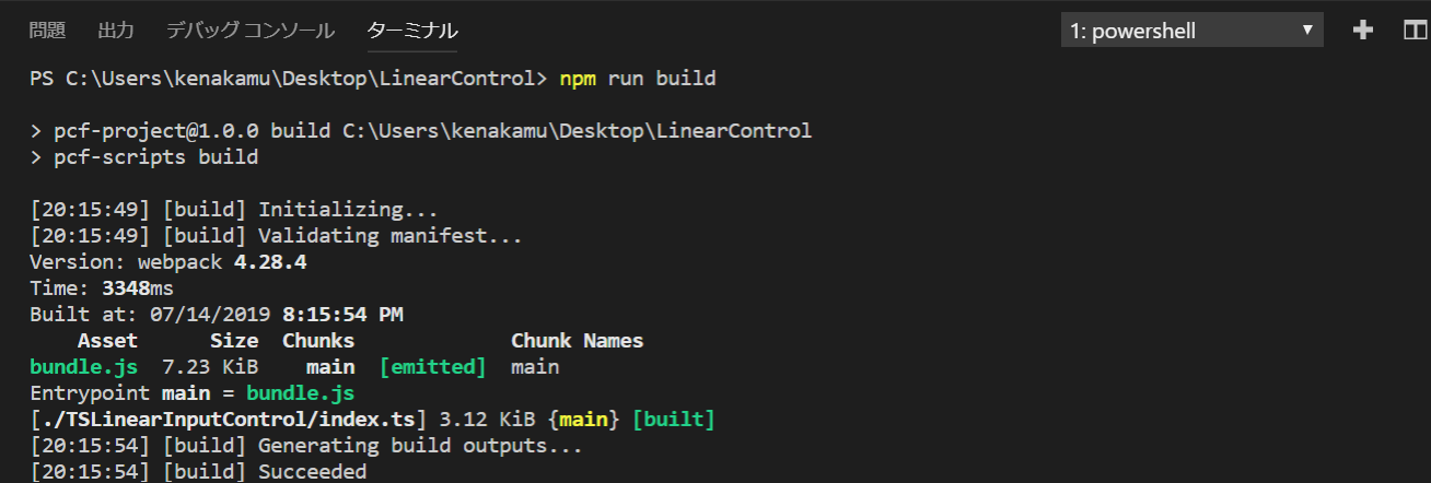
3. ManifestTypes.d.ts が更新されたことを確認。
/*
*This is auto generated from the ControlManifest.Input.xml file
*/

// Define IInputs and IOutputs Type. They should match with ControlManifest.
export interface IInputs {
    sliderValue: ComponentFramework.PropertyTypes.NumberProperty;
}
export interface IOutputs {
    sliderValue?: number;
}
構成ファイル類
拡張子から分かる通り、TypeScript での実装となります。まずは package.json を確認。
- scripts で pcf 関連の処理がいくつか存在
- @types パッケージを依存として読み込み
- pcf 系のパッケージを開発依存パッケージとして読み込み
{
  "name": "pcf-project",
  "version": "1.0.0",
  "description": "Project containing your PowerApps Component Framework (PCF) control.",
  "scripts": {
    "build": "pcf-scripts build",
    "clean": "pcf-scripts clean",
    "rebuild": "pcf-scripts rebuild",
    "start": "pcf-scripts start"
  },
  "dependencies": {
    "@types/node": "^10.12.18",
    "@types/powerapps-component-framework": "1.1.0"
  },
  "devDependencies": {
    "pcf-scripts": "^0",
    "pcf-start": "^0"
  }
}
次に TypeScript の構成を見てみます。
tsconfig.json を開くと以下の様に記述があります。
{
    "extends": "./node_modules/pcf-scripts/tsconfig_base.json",
    "compilerOptions": {
        "typeRoots": ["node_modules/@types"],
    }
}
extends: 継承する構成ファイル
compilerOptions: サポートする型として @types にあるものを指定
また継承している構成ファイルは以下の様になっています。
{
  "compilerOptions": {
    "jsx": "react",
    "target": "es5",
    "module": "commonjs",
    "lib": ["ES6", "DOM"],
    "strict": true,
    "strictPropertyInitialization": false
  },
  "exlude": [
    "./node_modules"
  ]
}
ES5 形式での出力が設定されていて、node_modules フォルダは含まれないようになっています。
jsx : jsx ファイルは react 形式で出力 参照: jsx オプション
target: 出力は ECMAScript ES5 形式で出力
module: commonjs を利用 参照: module オプション
lib: ES6 を利用
最後に pcfconfig.json を確認。ビルド結果の出力先が指定されています。
{
    "outDir": "./out/controls"
}
index.ts コードの編集
PCF で実装するコントロールは、以下のメソッドを実装します。参照: control
| メソッド | 説明 |
|---|---|
| init | UI のレンダリングやプロパティ値の設定など、各種初期操作を実行。データセットの値はここでは取得できないため、updateView メソッドで処理 |
| updateView | バインドしているフィールドやデータセット、画面のサイズが変わったり、オフラインになった際など様々な変更が発生した場合に呼び出される処理 |
| getOutputs | bound または output と設定されたプロパティの値をフレームワークが要求した場合に値を返す処理を実装 |
| destroy | UI コントロールが破棄される際に呼び出される。不要なオブジェクトなどを破棄する |
スライダーコントロールを実装していきます。
1. 既存のコードがある場合は一旦削除。その後 import を追加。ManifestTypes は先ほど npm run build で作成されたインプット、アウトプットの型情報を提供。
import {IInputs, IOutputs} from "./generated/ManifestTypes";
2. ComponentFramework.StandardControl 継承するように、TSLinearInputControl クラスを追加。
export class TSLinearInputControl implements
ComponentFramework.StandardControl<IInputs, IOutputs> {
}
3. クラスで使うプロパティの追加。
// スライダーの値を保持する変数
private _value: number;
// 変更を画面に通知するイベントハンドラー
private _notifyOutputChanged: () => void;
// コントロールで使うラベル
private labelElement: HTMLLabelElement;
// スライダーのレンジとなるインプット
private inputElement: HTMLInputElement;
// コントロールをホストするコンテナ
private _container: HTMLDivElement;
// _refreshData のイベントハンドラー
private _refreshData: EventListenerOrEventListenerObject;
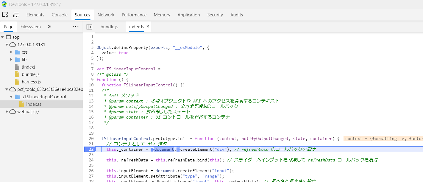
4. init メソッドの追加。ここではスライダーやラベルの初期化をしてコンテナに設定。
- context.parameters からインプット値を取得
/**
* init メソッド
* @param context : 各種オブジェクトや API へのアクセスを提供するコンテキスト
* @param notifyOutputChanged : 出力変更通知のコールバック
* @param state : 前回保存したステート
* @param container : UI コントロールを保持するコンテナ
*/
public init(
context: ComponentFramework.Context<IInputs>,
notifyOutputChanged: () => void,
state: ComponentFramework.Dictionary,
container: HTMLDivElement) {
// コンテナとして div 作成
this._container = document.createElement("div");
// ハンドラーの設定
this._notifyOutputChanged = notifyOutputChanged;
// refreshData のコールバックを設定
this._refreshData = this.refreshData.bind(this);
// スライダー用インプットを作成して refreshData コールバックを設定
this.inputElement = document.createElement("input");
this.inputElement.setAttribute("type", "range");
this.inputElement.addEventListener("input", this._refreshData);
// 最小値と最大値を設定
this.inputElement.setAttribute("min", "1");
this.inputElement.setAttribute("max", "1000");
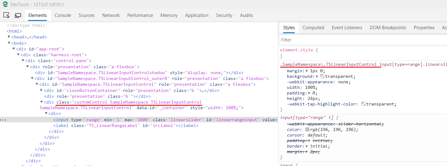
// コントロールに class と id を指定
this.inputElement.setAttribute("class", "linearslider");
this.inputElement.setAttribute("id", "linearrangeinput");
// スライダーの値を表示するラベルを作成
this.labelElement = document.createElement("label");
// コントロールに class と id を指定
this.labelElement.setAttribute("class", "TS_LinearRangeLabel");
this.labelElement.setAttribute("id", "lrclabel");
// 現在のフィールドの値を取得して、スライダーとラベルに設定
this._value = context.parameters.sliderValue.raw;
this.inputElement.setAttribute("value", context.parameters.sliderValue.formatted ? context.parameters.sliderValue.formatted : "0");
this.labelElement.innerHTML = context.parameters.sliderValue.formatted ? context.parameters.sliderValue.formatted : "0";
// スライダーとラベルをコンテナに設定し、コンテナを画面に設定
this._container.appendChild(this.inputElement);
this._container.appendChild(this.labelElement);
container.appendChild(this._container);
}
5. スライダーに設定した refreshData メソッドを追加。
- 値の変更後、_notifyOutputChanged() ハンドラー呼び出して画面に通知
/**
* スライダーを動かした際、値を内部変数とラベルに更新
*/
public refreshData(evt: Event): void {
	this._value = (this.inputElement.value as any) as number;
	this.labelElement.innerHTML = this.inputElement.value;
	// 変更があったことを通知
	this._notifyOutputChanged();
}
6. 画面側の変更で呼ばれる updateView メソッドを追加。
public updateView(context: ComponentFramework.Context<IInputs>): void {
	// 現在のフィールドの値を内部変数に保存
	this._value = context.parameters.sliderValue.raw;
	// スライダーとラベルに設定
	this.inputElement.setAttribute("value",context.parameters.sliderValue.formatted ? context.parameters.sliderValue.formatted : "");
	this.labelElement.innerHTML = context.parameters.sliderValue.formatted ? context.parameters.sliderValue.formatted : "";
}
7. 画面側に値を返す処理として getOutputs メソッドを追加。
public getOutputs(): IOutputs {
	return {
	sliderValue: this._value
	};
}
8. 最後に destroy メソッドを追加。
public destroy() {
	// イベントの解除
	this.inputElement.removeEventListener("input", this._refreshData);
}
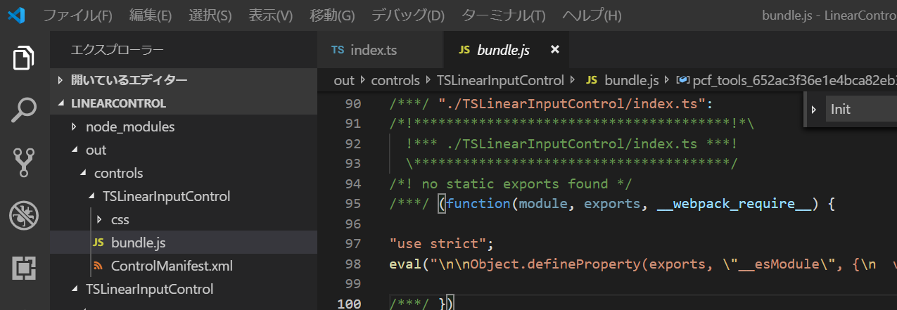
9. 全てを保存して npm run build を実行。pcfconfig.json にある通り、out\controls フォルダに結果が出力されていることを確認。
開発したコントロールのデバッグ
PCF ではコントロールのデバッグ機能が提供されます。
1. コンソールより npm start を実行。
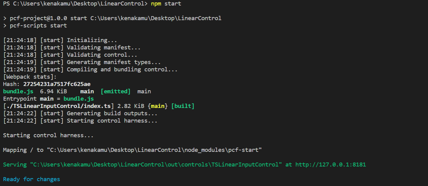
2. ブラウザが起動してコントロールが表示。
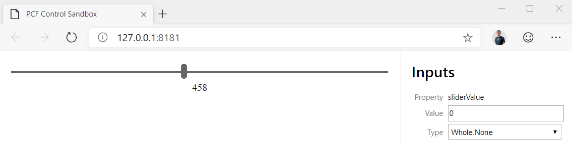
3. ブラウザの F12 ツールで init と updateView にブレークポイントおいて操作を確認。
4. 画面の要素でも CSS が意図したとおりに適用されているか確認。
5. デバッグが完了したら、ターミナルで Ctrl+C で終了。
まとめ
基本的な Web フロントエンドの知識と TypeScript 使えれば、開発を始める事が可能です。