前回は積み上げ棒グラフに必要なデータの構造の検討と実装を行いました。今回は取得したデータを使ってグラフを描画します。
グラフの入れ物を用意
まずは必要なライブラリの読込みと、キャンバスの準備を行います。キャンバスは d3 を利用して SVG の中にグラフの領域を追加します。
1. import を visual.ts に追加。
import * as d3 from 'd3';
2. Visual クラスのプロパティを以下に差し替え。
private settings: VisualSettings;
private svg: d3.Selection<d3.BaseType, any, HTMLElement, any>;
private stackBarContainer: d3.Selection<d3.BaseType, any, any, any>;
3. update 関数を以下に差し替え。
public update(options: VisualUpdateOptions) {
    debugger;
    let viewModel = this.converData(options);

    let width = options.viewport.width;
    let height = options.viewport.height;
    let margin = { top: 0, bottom: 0, left: 0, right: 0 }

    this.svg
        .attr("width", width)
        .attr("height", height);
}
この状態で描画すると以下のように svc と g 要素が確認できます。

軸と凡例の要素
変換されたデータはそれぞれが軸と凡例の値を持っているため、値が重複しています。

update 関数に以下のコードを追加して重複を取り除きます。
let viewModel = this.converData(options); の下に以下コードを追加。
- map ですべてのオブジェクトから必要な要素 (axis や legend) だけを抽出
- filter で重複を除外
let axises = viewModel.dataPoints.map(d => d.axis).filter((element, index, array) => {
    return array.indexOf(element) === index
});
let legends = viewModel.dataPoints.map(d => d.legend).filter((element, index, array) => {
    return array.indexOf(element) === index
});
スケール用関数の作成
X 軸、Y 軸の計算は d3 の機能を使うと簡単に実装できます。
d3.scaleBand
特定範囲の数字を、帯(Band)毎に計算して返すため、X 軸の計算に利用します。
例えば以下のように関数を定義したとします。
let x = d3.scaleBand()
    .domain(["orange","apple","banana"])
    .range([0, 90])
    .padding(0.1);

console.log(x("orange"));
console.log(x("apple"));
console.log(x("banana"));
この場合 0 から 90 の数値に対して orange, apple, banana の要素ごとに間隔(padding) 10% を考慮した値を返します。


d3.scaleLinear
特定範囲の数値に対して、ある数値(Linear)に対してスケールした値を返すため、Y 軸の計算に利用します。
例えば以下のように関数を定義したとします。
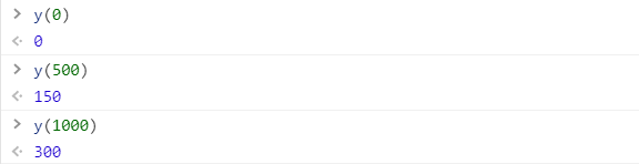
let y = d3.scaleLinear()
    .domain([0, 1000])
    .rangeRound([0, 300])

console.log(y(0));
console.log(y(1000));
console.log(y(500));
この場合 0 から 1000 の値を 0 から 300 にスケールして返します。
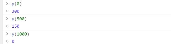
また範囲を逆にすることもでき、棒グラフではよくこの形式を使います。
let y = d3.scaleLinear()
    .domain([0, 1000])
    .rangeRound([0, 300])

console.log(y(0));
console.log(y(1000));
console.log(y(500));
スケール関数の追加
上記を踏まえ、以下のコードを update 関数に追加します。
- 値の範囲はカスタムビジュアルのサイズとマージンから計算
let x = d3.scaleBand()
    .domain(axises)
    .range([margin.left, width - margin.right])
    .padding(0.1);

let y = d3.scaleLinear()
    .domain([0, viewModel.maxValue])
    .rangeRound([height - margin.bottom, margin.top]);
凡例の色
凡例毎に別の色を付けたい場合、d3.scaleOrdinal を活用できます。scaleBand と似た動きをしますが、数値の代わりのオブジェクトを返すことができます。また d3 はあらかじめ色の配列を何パータンか提供しているため、今回はそちらを利用します。
update 関数に以下コードを追加します。これで凡例の値を渡すと対応する色を返してくれます。またドメインに指定していない値を渡すと、既定の #ccc を返します。
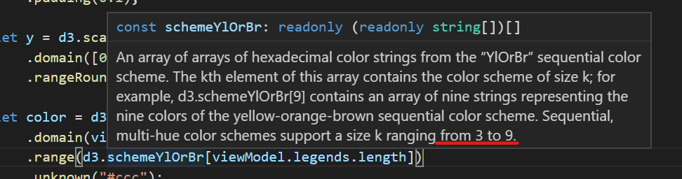
let color = d3.scaleOrdinal()
    .domain(legends)
    .range(d3.schemeYlOrBr[legends.length])
    .unknown("#ccc");
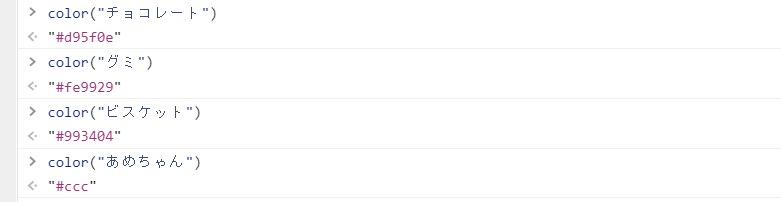
尚、schemeYlOrBr をはじめ用意されているものは、渡せる range の数に制限がある点注意してください。
チャートの描写
最後に積み上げ棒を描写します。d3 の機能を使ってすべてのデータについて、四角(rect)を描写します。
- fill, x, y, height, width は全て計算で取得
this.stackBarContainer.selectAll('rect')
    .data(viewModel.dataPoints)
    .join('rect')
    .attr('fill', d => color(d.legend).toString())
    .attr("x", (d, i) => x(d.axis.toString()))
    .attr("y", d => y(d.value2))
    .attr("height", d => y(viewModel.maxValue - d.value))
    .attr("width", x.bandwidth());
最終的に update 関数は以下のようになります。
public update(options: VisualUpdateOptions) {
    debugger;
    let viewModel = this.converData(options);

    let axises = viewModel.dataPoints.map(d => d.axis).filter((element, index, array) => {
        return array.indexOf(element) === index
    });

    let legends = viewModel.dataPoints.map(d => d.legend).filter((element, index, array) => {
        return array.indexOf(element) === index
    });

    let width = options.viewport.width;
    let height = options.viewport.height;
    let margin = { top: 0, bottom: 0, left: 0, right: 0 }

    this.svg
        .attr("width", width)
        .attr("height", height);

    let x = d3.scaleBand()
        .domain(axises)
        .range([margin.left, width - margin.right])
        .padding(0.1);

    let y = d3.scaleLinear()
        .domain([0, viewModel.maxValue])
        .rangeRound([height - margin.bottom, margin.top]);

    let color = d3.scaleOrdinal()
        .domain(legends)
        .range(d3.schemeYlOrBr[legends.length])
        .unknown("#ccc");

    this.stackBarContainer.selectAll('rect')
        .data(viewModel.dataPoints)
        .join('rect')
        .attr('fill', d => color(d.legend).toString())
        .attr("x", (d, i) => x(d.axis.toString()))
        .attr("y", d => y(d.value2))
        .attr("height", d => y(viewModel.maxValue - d.value))
        .attr("width", x.bandwidth());
}
動作確認
全てのコードが書き終わったので、実際にカスタムビジュアルを実行します。意図した通りに描写されることを確認します。

まとめ
今回は d3 のスケール関数を利用しながら積み上げ棒グラフを描写しました。次回は X 軸、Y 軸および凡例の表示を行います。