概要
グラフ可視化ライブラリ Altair は、pandas の DataFrame を入力することで様々なグラフを作成することができる。しかし、DataFrame の行数が 5000 を超えると次のようなエラーが起こる。
altair.utils.data.MaxRowsError:
The number of rows in your dataset is greater than the maximum allowed (5000).
For information on how to plot larger datasets in Altair, see the documentation
本稿では、関数型プログラミングライブラリ toolz を用いて、入力可能な最大行数を変更する方法を紹介する。
データの作成
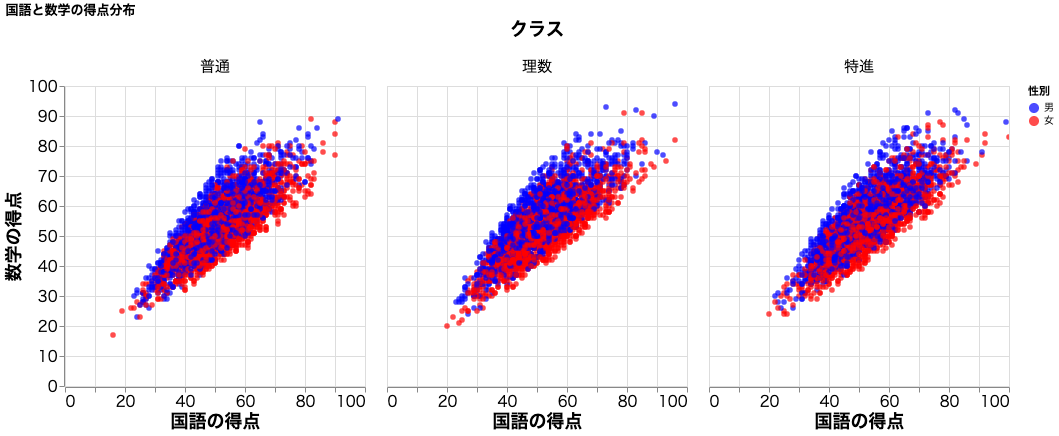
前稿 と同様に、疑似乱数を用いて架空の学校で行われた期末試験の得点をテストデータとして用いる。この学校には学生が 10000 人在籍し、普通、特進、理数の 3 クラスが存在する。期末試験の科目は国語、数学、理科、社会、英語で各教科 100 点満点とする。
データの作成
import numpy as np
import pandas as pd

np.random.seed(1) # 乱数の固定

df = pd.DataFrame()

n = 10000 # 学生の人数
s = np.random.normal(55,10,n) # 学生の学力
c = np.random.randint(0,3,n) # クラス
s = s * (1 + c * 0.015) # クラスの学力差をつける
g = np.random.randint(0,2,n) # 性別

s1 = np.random.uniform(0.75,1.1,n) * s * (1 + g * 0.02)
s2 = np.random.uniform(0.9,1.1,n) * s * (1 - g * 0.05)

sex = ['男','女']
cl = ['普通','理数','特進']

df['学生番号'] = list(map(lambda x: 'ID'+str(x).zfill(5), range(1,1+n)))
df['国語'] = list(map(lambda x: round(x), s1))
df['数学'] = list(map(lambda x: round(x), s2))
df['クラス'] = list(map(lambda x: cl[x], c))
df['性別'] = list(map(lambda x: sex[x], g))
print(df)
  学生番号  国語  数学 クラス 性別
0     ID00001  63  80  特進  男
1     ID00002  44  48  理数  女
2     ID00003  48  43  普通  女
3     ID00004  46  40  特進  女
4     ID00005  55  63  普通  男
...       ...  ..  ..  .. ..
9995  ID09996  59  60  特進  男
9996  ID09997  53  59  普通  男
9997  ID09998  36  48  普通  男
9998  ID09999  58  54  特進  女
9999  ID10000  41  45  普通  男

[10000 rows x 5 columns]
toolz を用いたエラーの回避
以下のように toolz の pipe で合成関数を作成する。関数内の max_rows で最大行数を指定すればよい。
demo.py
import altair as alt
from altair_saver import save
from altair import limit_rows, to_values
import toolz
t = lambda data: toolz.curried.pipe(data, limit_rows(max_rows=10000), to_values)
alt.data_transformers.register('custom', t)
alt.data_transformers.enable('custom')

scatter = alt.Chart(df).mark_circle(
		size=30
		).encode(
		x=alt.X('国語',
			scale=alt.Scale(
				domain=[0,100]
				),
			axis=alt.Axis(
				labelFontSize=15,
				ticks=True,
				titleFontSize=18,
				title='国語の得点')
			),
		y=alt.Y('数学',
			scale=alt.Scale(
				domain=[0, 100]
				),
			axis=alt.Axis(labelFontSize=15,
				ticks=True,
				titleFontSize=18,
				title='数学の得点')
			),
		column=alt.Column('クラス',
			header=alt.Header(
				labelFontSize=15,
				titleFontSize=18),
			sort = alt.Sort(
				cl
				),
			title='クラス'
			),
		color=alt.Color('性別',
			scale=alt.Scale(
				domain=sex,
				range=['blue', 'red']
				),
			),
		tooltip=['国語', '数学'],
	).properties(
		width=300,
		height=300,
		title="国語と数学の得点分布"
	).interactive()

save(scatter,'scatter_10000.html',embed_options={'actions':True})