お題:広い画面でボタンを右から左に並べ、狭い画面で上から下に並べる。
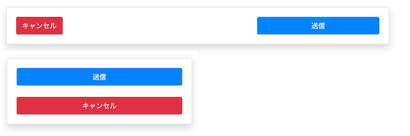
答え:flex-direction: row-reverse を使う。
HTMLはこんな感じです。Bootstrapを使っています。
    <div class="card shadow m-4">
      <div class="card-body">
        <div class="row row-submit">
          <div class="col-sm text-right">
            <button type="button" class="btn btn-primary">送信</button>
          </div>
          <div class="col-sm">
            <button type="button" class="btn btn-danger">キャンセル</button>
          </div>
        </div>
      </div>
    </div>
CSSはこんな感じです。デフォルトはモバイル版とし、広い画面で(@media (min-width: 576px))デザインを変えています。
  .row-submit button {
    width: 100%;
  }
  .row-submit .col-sm:not(:last-child) {
    margin-bottom: 1.5rem;
  }
  @media (min-width: 576px) {
    .row-submit {
      flex-direction: row-reverse;
      justify-content: flex-end;
    }
    .row-submit button {
      width: auto;
    }
    .row-submit button.btn-primary {
      width: 70%;
    }
    .row-submit .col-sm:not(:last-child) {
      margin-bottom: 0;
    }
  }
Bootstrapでは、.row と .col-sm には次のようなCSSが設定されています。
  .row {
    display: flex;
    flex-wrap: wrap;
  }
  @media (min-width: 576px) {
    .col-sm {
      flex-basis: 0;
      flex-grow: 1;
    }
  }