android studio: 4.2.2
sdk version: 30
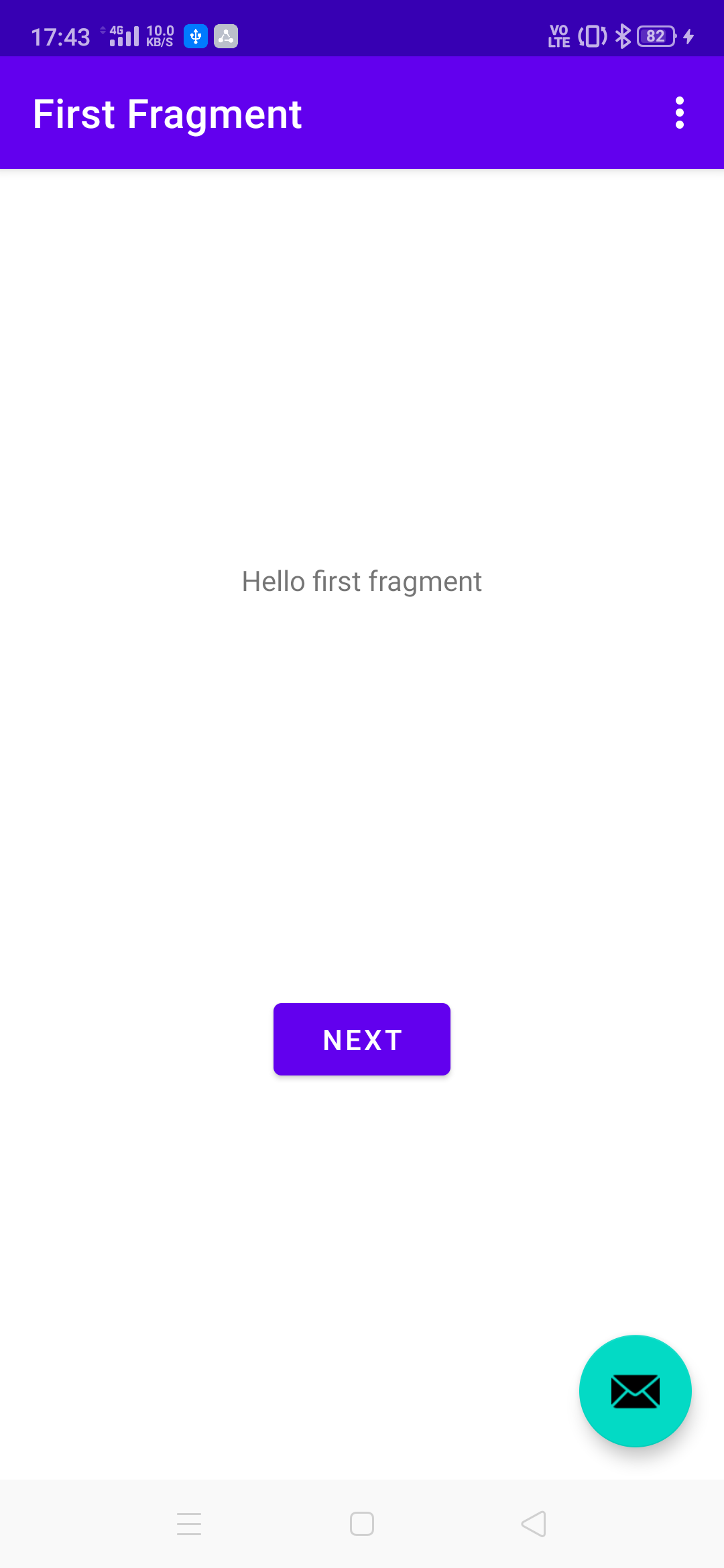
変更前
自動生成で以下のようなNavigation barが作成されます。
色合いが微妙なのでこれを変えていきます。
Navigation barを設定している場所
このnavigation自体は以下のpathで記述されています。
app/src/main/res/navigation/nav_graph.xml
そしてfragemntごとの記述を見ると以下のようになっています
  <fragment
      android:id="@+id/FirstFragment"
      android:name="com.XXX.XXX.FirstFragment"
      android:label="@string/first_fragment_label"
      tools:layout="@layout/fragment_first">
この箇所でlabelを設定しています。
ここでtextColorなどを指定しても変更されませんのでご注意を。
テキスト自体の変更はできます。
ThemeファイルでNavigation barなどのcolorを設定している
色の指定は以下のpathの箇所で行っています。
app/src/main/res/values/themes.xml
初期状態の指定color
  <!-- Base application theme. -->
  <style name="Theme.RestLibrary" parent="Theme.MaterialComponents.DayNight.DarkActionBar">
    <!-- Primary brand color. -->
    <item name="colorPrimary">@color/purple_500</item>
    <item name="colorPrimaryVariant">@color/purple_700</item>
    <item name="colorOnPrimary">@color/white</item>
    <!-- Secondary brand color. -->
    <item name="colorSecondary">@color/teal_200</item>
    <item name="colorSecondaryVariant">@color/teal_700</item>
    <item name="colorOnSecondary">@color/black</item>
    <!-- Status bar color. -->
    <item name="android:statusBarColor" tools:targetApi="l">?attr/colorPrimaryVariant</item>
    <!-- Customize your theme here. -->
  </style>
各パラメータの指定
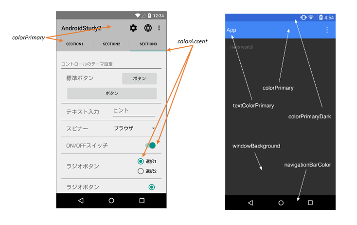
参考:android-テーマ「material」での色設定1
上記を参考してください。
各パラメータに対してcolorを設定することで好きな色に変えることができます。
ここまでを踏まえて以下のように変えてみました。
  <!-- Base application theme. -->
  <style name="Theme.RestLibrary" parent="Theme.MaterialComponents.DayNight.DarkActionBar">
    <!-- Primary brand color. -->
    <item name="colorPrimary">@color/face_light_blue</item>  // 背景にface_light_blueを指定
    <item name="colorPrimaryVariant">@color/face_light_blue</item>  // スマホ上端にface_light_blueを指定
    <item name="colorOnPrimary">@color/white</item>
    <!-- Secondary brand color. -->
    <item name="colorSecondary">@color/face_light_orange</item>  // face_light_orangeを指定
    <item name="colorSecondaryVariant">@color/teal_700</item>
    <item name="colorOnSecondary">@color/black</item>
    <!-- Status bar color. -->
    <item name="android:statusBarColor" tools:targetApi="l">?attr/colorPrimaryVariant</item>
    <!-- Customize your theme here. -->

    <item name="android:textColorPrimary">@color/white</item>  // android:textColorPrimaryにwhiteを指定

  </style>
変更箇所は今回は下記のみです
・colorPrimary
・colorPrimaryVariant
・colorSecondary
・textColorPrimary
color.xmlファイルに下記を追加しています。
  <color name="face_light_orange">#fac365</color>
  <color name="face_light_blue">#90d2ea</color>
結果以下のようになります。(おわり)

参考
AndroidのThemeで迷ったら見る資料
スタイルとテーマ
Material Componentの公式ドキュメント
Color Theming - Material Components for Android
Dark Theme - Material Components for Android
Shape Theming - Material Components for Android
Typography Theming - Material Components for Android