PCのChrome, Safari, Fifefox それぞれ最新版で 確認。
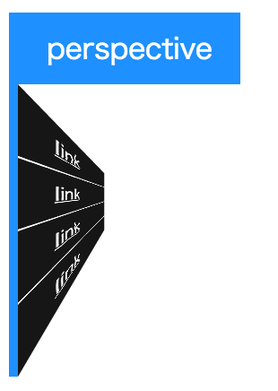
perspectiveは 3D配置された子要素に遠近感を与えるプロパティ。
perspective: ??px(em); 初期値: none, 数値で指定 (0,負の値は無効)
3D 配置された要素に遠近感を与えるため、z=0 平面とユーザ間の距離を決めます。z>0 である 3D 要素はより大きく、z<0 である 3D 要素はより小さくなります。効果の強度はこのプロパティの値から決められます。
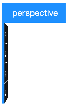
perspective と rotateY( )
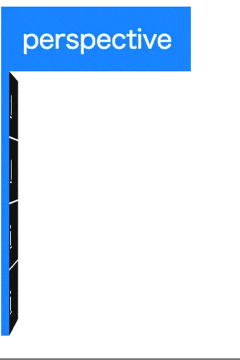
<div class="menu column" ontouchstart="">
  <div class="title">perspective</div>
  <a href="#">link</a>
  <a href="#">link</a>
  <a href="#">link</a>
  <a href="#">link</a>
</div>
.menu{
  display: flex;

  /* 子要素サイズに応じて可変 */
  width: -webkit-fit-content;
  width: -moz-fit-content;
  width: fit-content;
  height: auto;

  transform-style: preserve-3d;
  perspective: 1000px;
}

/* 縦並び */
.menu.column{
  flex-flow: column nowrap;
  border-left: .35em solid dodgerblue;
}

/* 共通 */
.menu .title,
.menu a{
  display: block;
  padding: .5em 1em;

  color: white;
}

.menu .title{
  background-color: dodgerblue;
}

.menu a{
  background-color: rgba(22,22,22,1);
  transition: .3s;
}

.menu.column a{
  transform-origin: left center;
  transform: rotateY(90deg);
}

.menu.column a + a{
  border-top: 1px solid currentColor;
}

/* animation  */
.menu:hover a{
  transform: none;
}

.menu a:hover{
  background-color: rgba(0,0,135,1);
}
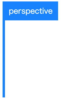
perspectiveを指定しないと...
perspective と rotateX( )
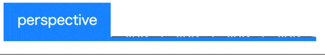
<div class="menu row" ontouchstart="">
  <div class="title">perspective</div>
  <a href="#">link</a>
  <a href="#">link</a>
  <a href="#">link</a>
  <a href="#">link</a>
</div>
.menu{
  display: flex;

  /* 子要素サイズに応じて可変 */
  width: -webkit-fit-content;
  width: -moz-fit-content;
  width: fit-content;
  height: auto;

  transform-style: preserve-3d;
  perspective: 1000px;
}

/* 横並び */
.menu.row{
  flex-flow: row nowrap;
  border-bottom: .35em solid dodgerblue;
}

/* 共通 */
.menu .title,
.menu a{
  display: block;
  padding: .5em 1em;

  color: white;
}

.menu .title{
  background-color: dodgerblue;
}

.menu a{
  background-color: rgba(22,22,22,1);
  transition: .3s;
}

.menu.row a{
  transform-origin: center bottom;
  transform: rotateX(90deg);
}

.menu.row a + a{
  border-left: 1px solid currentColor;
}

/* animation  */
.menu:hover a{
  transform: none;
}

.menu a:hover{
  background-color: rgba(0,0,135,1);
}
perspective の値の大きさによる違い
perspective: 1000px;
perspective: 30px;
perspective-origin
ユーザの視点を決めます
perspective-origin: x y; 初期値は50%, 数値またはキーワードで指定。
キーワード centerは 50%と同義
(他に、left right top bottomがあります)
perspective-origin: left bottom;とすれば 左下から見ている感じになります。
perspective-originによる見え方の違い
perspective: 800px;と指定
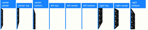
左から center center , center top, center bottom, left top, left center, left bottom, right top, right center, right bottom
demo