三角形
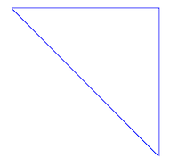
<div class="triangle blue"></div>
.triangle{
  position: relative;
  width: 300px;
  height: 300px;
  border: 2px solid transparent;
  border-top-color: currentColor;
  border-right-color: currentColor;
  overflow: hidden;
  box-sizing: border-box;
}

.triangle:before{
  position: absolute;
  content: "";
  width: 200%;
  border-top-width: inherit;
  border-top-style: inherit;
  border-top-color: inherit;
  transform-origin: left top;
  transform: rotate(45deg);
  box-sizing: inherit;
}

/* 色 */
.blue{
  color: blue;
}
枡記号
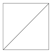
<div class="masu-symbol black"></div>
.masu-symbol{
  position: relative;
  width: 300px;
  height: 300px;
  border: 2px solid;
  border-color: currentColor;
  overflow: hidden;
  box-sizing: border-box;
}

.masu-symbol:before{
  position: absolute;
  right: 0;
  content: "";
  width: 200%;
  border-width: 0;
  border-top-width: inherit;
  border-style: inherit;
  border-color: inherit;
  transform-origin: right top;
  transform: rotate(-45deg);
}

.black{
  color: black;
}
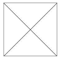
応用 四角の中にX印
.masu-symbol{
  position: relative;
  width: 300px;
  height: 300px;
  border: 2px solid;
  border-color: currentColor;
  overflow: hidden;
  box-sizing: border-box;
}

.masu-symbol:before{
  position: absolute;
  right: 0;
  content: "";
  width: 200%;
  border-width: 0;
  border-top-width: inherit;
  border-style: inherit;
  border-color: inherit;
  transform-origin: right top;
  transform: rotate(-45deg);
}

.masu-symbol:after{
  position: absolute;
  left: 0;
  content: "";
  width: 200%;
  border-width: 0;
  border-top-width: inherit;
  border-style: inherit;
  border-color: inherit;
  transform-origin: left top;
  transform: rotate(45deg);
}

.black{
  color: black;
}
台形
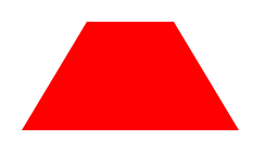
<div class="trapezoid red"></div>
.trapezoid{
  position: relative;
  width: 100px;
  border: 30px solid transparent;
  border-bottom: 50px solid currentColor;
  box-sizing: border-box;
}

.red{
  color: red;
}
応用 台形を2つ使って六角形
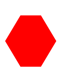
.trapezoid{
  position: relative;
  width: 100px;
  border: 30px solid transparent;
  border-bottom: 50px solid currentColor;
  box-sizing: border-box;
}

.trapezoid:before{
  position: absolute;
  top: 50px;
  left: 50%;
  content: "";
  width: inherit;
  border-width: inherit;
  border-style: inherit;
  border-color: transparent;
  border-top: 50px solid currentColor;
  box-sizing: inherit;
  transform: translateX(-50%);
}

.red{
  color: red;
}
currentColor
colorプロパティの値を背景色や枠線の色などに適用させる。
<div class="box blue"></div>
.blue{
  color: blue;
}

.box{
  background-color: currentColor;
}
.boxの背景色はblueになります
currentColorを使えば、colorで背景色や枠線の色などを指定できる。