TL;DR
- 最低限のパラメタ弄るUIなら,やはりImGuiが最強
- 頑張れば見た目もそこそこいい感じにできる
- 本気で最高にかっこいいUIを作りたいなら,ImGuiだと足りなくなる
ImGuiとは
『OpenGLやDirectXなGUIにimguiが最強すぎる - Qiita』の解説が丁寧なのでそちらに譲る.
雑に説明すると,ImmediateなGUIライブラリでoFやCinderのupdate()/draw()みたいなところで直感的にゴリゴリ描画していくやつ.「ImmediateなGUIライブラリ」といわれてもピンと来ないかもしれないが,update()やdraw()内にこういう書き方ができる.
// okボタンが押されたらtrueを返して,if内の処理が呼ばれる
if (ui::Button("ok")) {
  startAwesomeProcess();
}
ImGuiは最強なんだけど,デフォルトで利用していると他のアプリと見た目が被ってしまう.やっぱりそれは悔しいので,がんばってオリジナルでさらにイイ感じなUIを構築するのが本稿の目標である.
ImGuiで構築するGUIのスタイル
趣味で作っているPointCloudのViewerアプリのUIを例に挙げる.
標準だとこんな感じ.
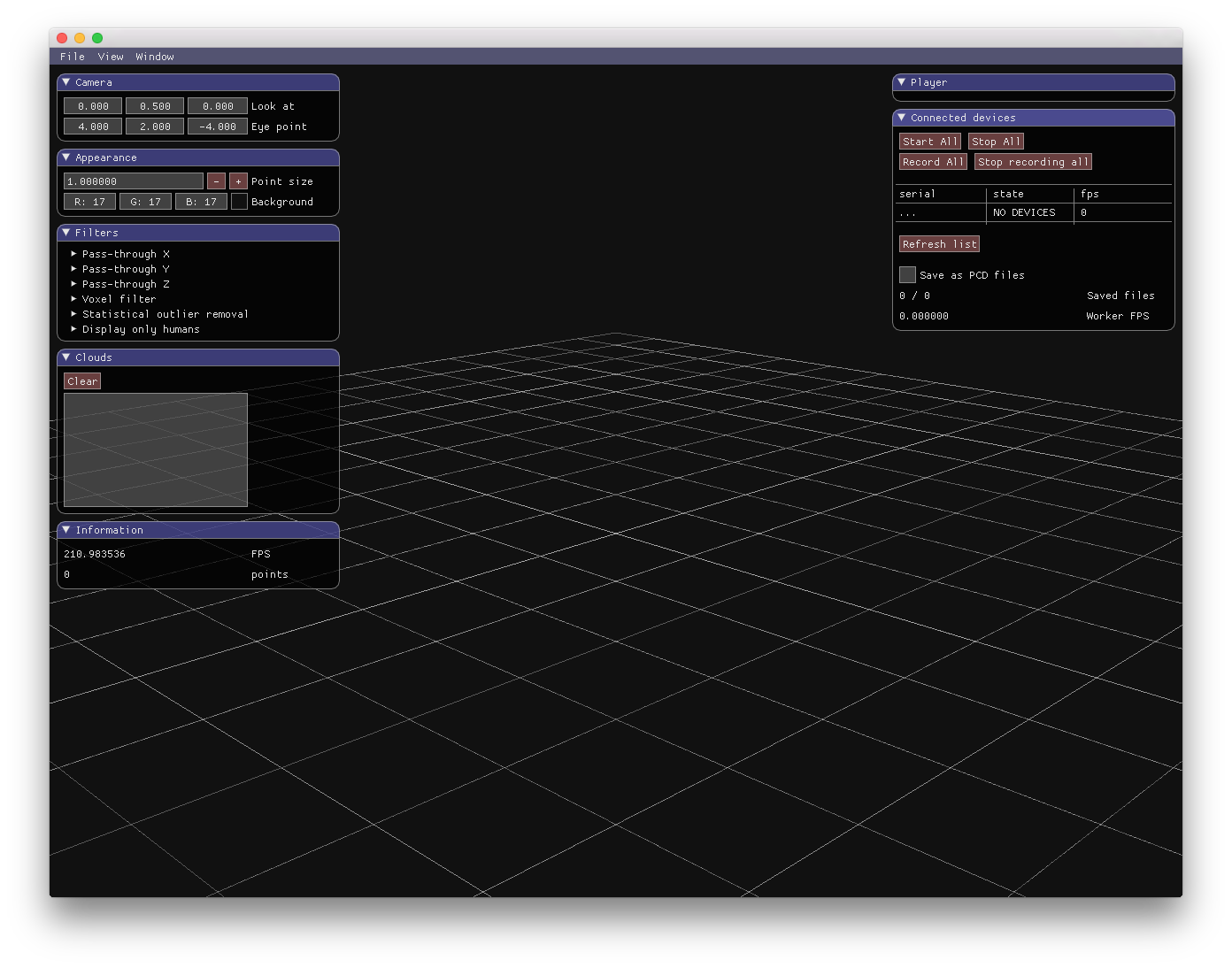
Cinder-ImGui標準.これでもかなりかっこいい.
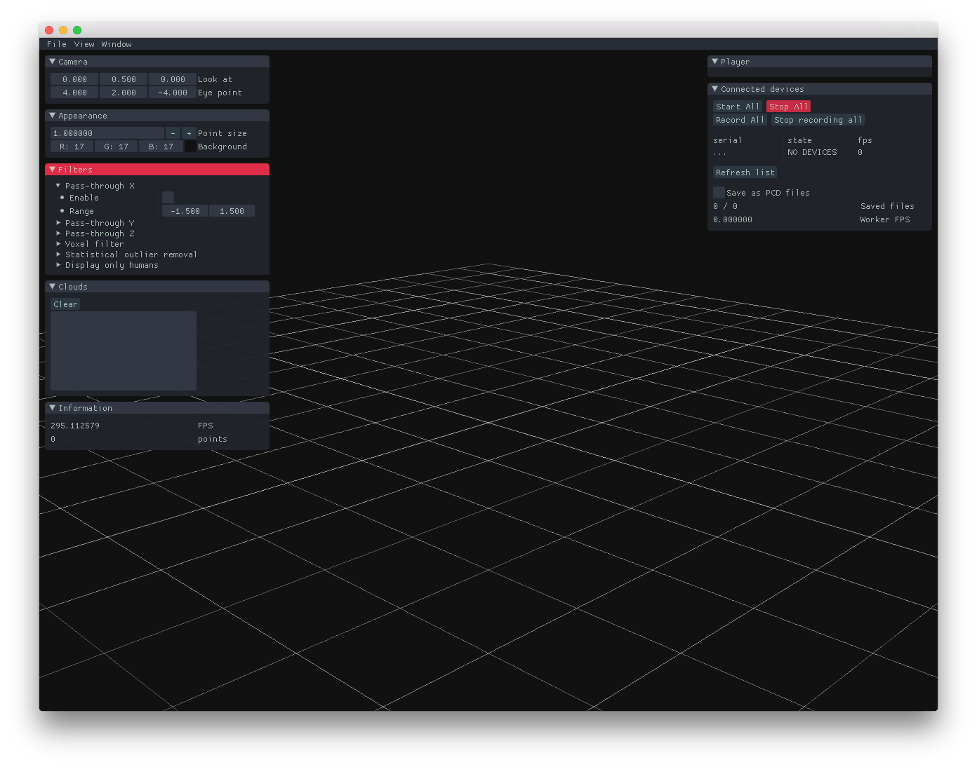
ちょっと弄ったやつ.
ちょっとコードを書くだけで,これくらい印象を変えることができる.
イイ感じにする
Cinderで利用する場合
実はui::initialize()にオプション(ui::Options)を渡せるようになっており,ここから諸々のパラメータを設定できる.
Cinder以外で利用する場合
ImGui::GetStyle()でImGuiStyleのインスタンスの参照が取れるので,これにパラメータを設定していく(※ 筆者はCinder以外でImGuiを利用したことがないので違っていたらすみません).
設定できるパラメータ
ImGuiStyle
- roundingやpadding,spacingなど諸々のサイズに関するパラメータ
- antialiaseの有効化など,その他いろいろ
-
ImGuiStyle.Colors: 色に関する設定(後述)
// https://github.com/ocornut/imgui/blob/v1.49/imgui.h#L701-L728
struct ImGuiStyle
{
    float       Alpha;                      // Global alpha applies to everything in ImGui
    ImVec2      WindowPadding;              // Padding within a window
    ImVec2      WindowMinSize;              // Minimum window size
    float       WindowRounding;             // Radius of window corners rounding. Set to 0.0f to have rectangular windows
    ImGuiAlign  WindowTitleAlign;           // Alignment for title bar text
    float       ChildWindowRounding;        // Radius of child window corners rounding. Set to 0.0f to have rectangular windows
    ImVec2      FramePadding;               // Padding within a framed rectangle (used by most widgets)
    float       FrameRounding;              // Radius of frame corners rounding. Set to 0.0f to have rectangular frame (used by most widgets).
    ImVec2      ItemSpacing;                // Horizontal and vertical spacing between widgets/lines
    ImVec2      ItemInnerSpacing;           // Horizontal and vertical spacing between within elements of a composed widget (e.g. a slider and its label)
    ImVec2      TouchExtraPadding;          // Expand reactive bounding box for touch-based system where touch position is not accurate enough. Unfortunately we don't sort widgets so priority on overlap will always be given to the first widget. So don't grow this too much!
    float       IndentSpacing;              // Horizontal indentation when e.g. entering a tree node. Generally == (FontSize + FramePadding.x*2).
    float       ColumnsMinSpacing;          // Minimum horizontal spacing between two columns
    float       ScrollbarSize;              // Width of the vertical scrollbar, Height of the horizontal scrollbar
    float       ScrollbarRounding;          // Radius of grab corners for scrollbar
    float       GrabMinSize;                // Minimum width/height of a grab box for slider/scrollbar
    float       GrabRounding;               // Radius of grabs corners rounding. Set to 0.0f to have rectangular slider grabs.
    ImVec2      DisplayWindowPadding;       // Window positions are clamped to be visible within the display area by at least this amount. Only covers regular windows.
    ImVec2      DisplaySafeAreaPadding;     // If you cannot see the edge of your screen (e.g. on a TV) increase the safe area padding. Covers popups/tooltips as well regular windows.
    bool        AntiAliasedLines;           // Enable anti-aliasing on lines/borders. Disable if you are really tight on CPU/GPU.
    bool        AntiAliasedShapes;          // Enable anti-aliasing on filled shapes (rounded rectangles, circles, etc.)
    float       CurveTessellationTol;       // Tessellation tolerance. Decrease for highly tessellated curves (higher quality, more polygons), increase to reduce quality.
    ImVec4      Colors[ImGuiCol_COUNT];

    IMGUI_API ImGuiStyle();
};
Cinder-ImGuiならui::Optionsにsetterが生えている.
// Example of Cinder-ImGui
const auto opts = ui::Options()
  .antiAliasedLines(true)
  .antiAliasedShapes(true)
  .windowRounding(0.0f)
  .frameRounding(0.0f);

ui::initialize(opts);
ImGuiCol_*
ImGuiStyle.Colorsに突っ込んでいく色の設定.
- foreground
-
ImGuiCol_Text: 通常時テキストの色 -
ImGuiCol_TextDisabled: 無効状態になっているテキストの色- 無効化されてるMenuItemとかButtonとかそんなん
-
- background
-
ImGuiCol_*Bg: 通常時の背景色 -
ImGuiCol_*BgHoverred: mouseover時の背景色 -
ImGuiCol_*BgActive: mouseclick時の背景色
-
- others
-
ImGui_Border/ImGui_BorderShadow- windowとかbuttonの枠線
- shadowはblurなし,ちょっとだけoffsetつけてborderが追加で描画されるイメージ
-
ImGuiCol_CheckMark- チェックボックス選択時の塗りつぶし色
-
ImGuiCol_TextSelectedBg- テキスト選択時の背景色
-
ui::TreeNode()やui::MenuItem()にhoverしたときの背景色
-
ImGui_Plot*/ImGui_Plot*Hoverred- グラフ的なやつの色
-
// https://github.com/ocornut/imgui/blob/v1.49/imgui.h#L592-L638
enum ImGuiCol_
{
    ImGuiCol_Text,
    ImGuiCol_TextDisabled,
    ImGuiCol_WindowBg,              // Background of normal windows
    ImGuiCol_ChildWindowBg,         // Background of child windows
    ImGuiCol_PopupBg,               // Background of popups, menus, tooltips windows
    ImGuiCol_Border,
    ImGuiCol_BorderShadow,
    ImGuiCol_FrameBg,               // Background of checkbox, radio button, plot, slider, text input
    ImGuiCol_FrameBgHovered,
    ImGuiCol_FrameBgActive,
    ImGuiCol_TitleBg,
    ImGuiCol_TitleBgCollapsed,
    ImGuiCol_TitleBgActive,
    ImGuiCol_MenuBarBg,
    ImGuiCol_ScrollbarBg,
    ImGuiCol_ScrollbarGrab,
    ImGuiCol_ScrollbarGrabHovered,
    ImGuiCol_ScrollbarGrabActive,
    ImGuiCol_ComboBg,
    ImGuiCol_CheckMark,
    ImGuiCol_SliderGrab,
    ImGuiCol_SliderGrabActive,
    ImGuiCol_Button,
    ImGuiCol_ButtonHovered,
    ImGuiCol_ButtonActive,
    ImGuiCol_Header,
    ImGuiCol_HeaderHovered,
    ImGuiCol_HeaderActive,
    ImGuiCol_Column,
    ImGuiCol_ColumnHovered,
    ImGuiCol_ColumnActive,
    ImGuiCol_ResizeGrip,
    ImGuiCol_ResizeGripHovered,
    ImGuiCol_ResizeGripActive,
    ImGuiCol_CloseButton,
    ImGuiCol_CloseButtonHovered,
    ImGuiCol_CloseButtonActive,
    ImGuiCol_PlotLines,
    ImGuiCol_PlotLinesHovered,
    ImGuiCol_PlotHistogram,
    ImGuiCol_PlotHistogramHovered,
    ImGuiCol_TextSelectedBg,
    ImGuiCol_ModalWindowDarkening,  // darken entire screen when a modal window is active
    ImGuiCol_COUNT
};
Cinder-ImGuiならui::Options#color( ImGuiCol option, const ci::ColorA &color )を利用できる.
const ci::ColorA8u color_white   = ci::ColorA8u(0xf5, 0xf5, 0xf5, 0xcc);
const ci::ColorA8u color_primary = ci::ColorA8u(0x1c, 0xfe, 0xff, 0xcc);
const ci::ColorA8u color_primary_dark = ci::ColorA8u(0x03, 0x19, 0x1a, 0xcc);

const ui::Options opts = ui::Options()
    .color(ImGuiCol_Text,     color_white)
    .color(ImGuiCol_WindowBg, color_primary_dark)
    .color(ImGuiCol_TitleBg,  color_primary);

ui::initialize(opts);
できないこと
- blurやglowみたいなカッコイイエフェクト
-
Sorry, it isn't a priority for ImGui to develop toward fancy visuals let alone animation.
- https://github.com/ocornut/imgui/issues/451
-
- selectableなテキストがhoverされたときの色(foreground color)
- これ結構不便
- ↓ こういうやつ,色変えたいけど…
Example
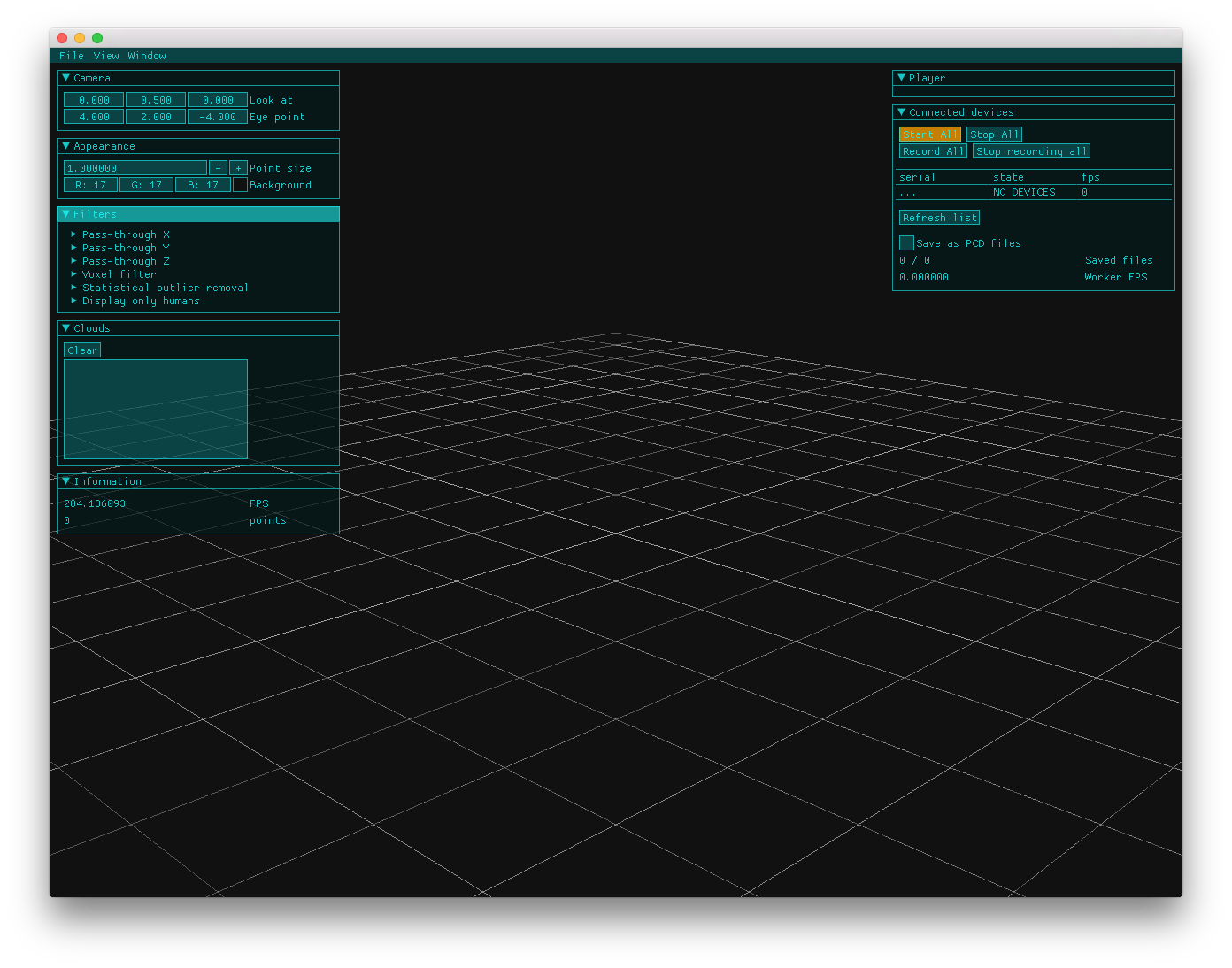
最初のスクショのやつ.サイバー感(?)出したかった.
- カクカクさせる
- 線をはっきりさせる
- 色をはっきりさせる
- ネオンカラーにしたらサイバー感でる?
シドニアの騎士みたいに飾り枠とかつけたり,Parallels eyesのようなグリッドな背景画像をいれたりするとまた雰囲気変わるかも(どちらもImGui実装ではないが…).
const ci::Color8u kColorPrimaryBase = ci::Color8u(0x1c, 0xfe, 0xff);
const ci::ColorA8u kColorPrimary = ci::ColorA8u(kColorPrimaryBase, 0xcc);
const ci::ColorA8u kColorPrimaryA99 = ci::ColorA8u(kColorPrimaryBase, 0x99);
const ci::ColorA8u kColorPrimaryA66 = ci::ColorA8u(kColorPrimaryBase, 0x66);
const ci::ColorA8u kColorPrimaryA33 = ci::ColorA8u(kColorPrimaryBase, 0x33);
const ci::ColorA8u kColorPrimaryDark = ci::ColorA8u(0x03, 0x19, 0x1a, 0xbb);
const ci::Color8u kColorAccentBase = ci::Color8u(0xff, 0xa1, 0x00);
const ci::ColorA8u kColorAccent = ci::ColorA8u(kColorAccentBase, 0xee);
const ci::ColorA8u kColorAccentAcc = ci::ColorA8u(kColorAccentBase, 0xcc);
const ci::ColorA8u kColorAccentA99 = ci::ColorA8u(kColorAccentBase, 0x99);
const ci::ColorA8u kColorWhite = ci::ColorA8u(0xdd, 0xdd, 0xdd, 0xcc);
const ci::ColorA8u kColorBlackA55 = ci::ColorA8u(0x11, 0x11, 0x11, 0x55);
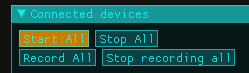
const ui::Options kUiOptions = ui::Options()
.darkTheme()
.color(ImGuiCol_MenuBarBg, kColorPrimaryA33)
.color(ImGuiCol_TitleBg, kColorPrimaryDark)
.color(ImGuiCol_TitleBgCollapsed, kColorPrimaryDark)
.color(ImGuiCol_TitleBgActive, kColorPrimaryA99)
.color(ImGuiCol_WindowBg, kColorPrimaryDark)
.color(ImGuiCol_Border, kColorPrimaryA99)
.color(ImGuiCol_FrameBg, kColorPrimaryA33)
.color(ImGuiCol_FrameBgHovered, kColorAccentAcc)
.color(ImGuiCol_FrameBgActive, kColorAccent)
.color(ImGuiCol_ScrollbarBg, kColorPrimaryA33)
.color(ImGuiCol_ScrollbarGrab, kColorPrimaryA99)
.color(ImGuiCol_ScrollbarGrabHovered, kColorPrimaryA99)
.color(ImGuiCol_ScrollbarGrabActive, kColorPrimary)
.color(ImGuiCol_CheckMark, kColorAccent)
.color(ImGuiCol_SliderGrab, kColorPrimaryA99)
.color(ImGuiCol_SliderGrabActive, kColorPrimary)
.color(ImGuiCol_Button, kColorPrimaryA33)
.color(ImGuiCol_ButtonHovered, kColorAccentAcc)
.color(ImGuiCol_ButtonActive, kColorAccent)
.color(ImGuiCol_Header, kColorAccentA99)
.color(ImGuiCol_HeaderHovered, kColorAccentAcc)
.color(ImGuiCol_HeaderActive, kColorAccent)
.color(ImGuiCol_Column, kColorBlackA55)
.color(ImGuiCol_ColumnHovered, kColorAccentAcc)
.color(ImGuiCol_ColumnActive, kColorAccent)
.color(ImGuiCol_PlotLines, kColorPrimaryA99)
.color(ImGuiCol_PlotLinesHovered, kColorPrimary)
.color(ImGuiCol_PlotHistogram, kColorPrimaryA99)
.color(ImGuiCol_PlotHistogramHovered, kColorPrimary)
.color(ImGuiCol_Text, kColorPrimary)
.color(ImGuiCol_TextDisabled, kColorPrimaryA66)
.color(ImGuiCol_TextSelectedBg, kColorAccent)
.color(ImGuiCol_PopupBg, kColorPrimaryDark)
.antiAliasedLines(true)
.antiAliasedShapes(true)
.windowRounding(0.0f)
.frameRounding(0.0f);