CSSの底力を見せてやる
「いいか…デザイナー…」
「これはCSSと私一人の問題だ…」
「CSSなんかに凝ったってSEOが捗るわけではないと知ったフウな事をいう者もいるだろう」
「SVGでいいじゃんという者もいる」
「だが」
「自分のCSSをドブに捨てられて
その事を無理矢理忘れてSVGをただ貼るなんて人生は
あたしはまっぴらごめんだし、
あたしはその覚悟をしてきた!!!」
…というわけではありませんが、なるべくリアルな眼球をHTMLとCSSでマークアップしていきます。
svgやcanvasは使わないしjsなんかもちろん使いません。
でも素で書くのは大変なのでpugとstylusでやっていこうと思います。
結果だけ知りたい人はこちら > eye2 pure css, without svg&canvas
ベースとなる眼球を作成しよう
.eye
@import 'nib'

body
  background-color #f1bb93
  min-height 100vh
  display flex
  flex-wrap nowrap
  flex-direction row
  align-items center
  justify-content center

.eye
  position relative
  size 200px
  border-radius 50%
  background radial-gradient(circle at 45% 45%, #fff 41%, #ccc 83%)
はい。まだただの丸ですね。
放射状グラデーションを中央からではなく少し左上を始点にしてかける事で立体感を演出しています。
虹彩を描こう
次に虹彩を書きたいと思います。
.eye
  .eye__iris
@import 'nib'

body
  background-color #f1bb93
  min-height 100vh
  display flex
  flex-wrap nowrap
  flex-direction row
  align-items center
  justify-content center

.eye
  position relative
  size 200px
  border-radius 50%
  background radial-gradient(circle at 45% 45%, #fff 41%, #ccc 83%)
+  &__iris
+    absolute top 25% left 25%
+    size 50%
+    border-radius 50%
+    box-shadow 0 0 5px 0 #000
+    background radial-gradient(circle at center, #b86e29 32%, #94c7d4 42%, #1c0a24 112%)
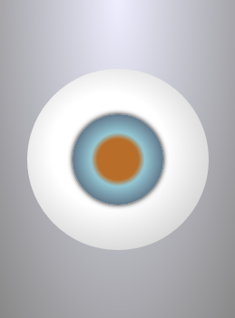
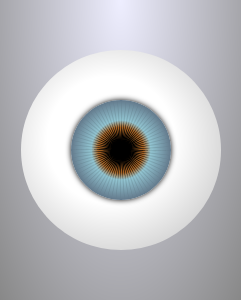
box-shadowを使って虹彩の境界をぼかし、また放射状グラデーションを使って瞳孔の色まで載せました。
毛様体をまず4本描こう
.eye
  .eye__iris
    ul.eye__ciliary
      li.eye__ciliary__item: span
@import 'nib'

body
  min-height 100vh
  display flex
  flex-wrap nowrap
  flex-direction column
  align-items center
  justify-content center
  background-image radial-gradient(ellipse at 50% 0%, #eef 0, #888 100%)

.eye
  position relative
  size 200px
  border-radius 50%
  background radial-gradient(circle at 45% 45%, #fff 41%, #ccc 83%)

  &__iris
    absolute top 25% left 25%
    size 50%
    border-radius 50%
    box-shadow 0 0 5px 0 #000
    background radial-gradient(circle at center, #b86e29 32%, #94c7d4 42%, #1c0a24 112%)

+  &__ciliary
+    display block
+    absolute top left
+    size 100%
+    transform rotateZ(1deg)
+
+    &__item
+      display block
+      size 100%
+      absolute top 50%
+      margin-top (@height / -2)
+
+      span
+        display block
+        size 100%
+        position absolute
+      &:before,
+      &:after,
+      & span:before,
+      & span:after
+        content ""
+        display block
+        size 100%
+        position absolute
+        background-color #000000
+        opacity .1
+
+      cilH = .025
+      cilW = .7
+
+      &:before
+        transform: scale(cilH, cilW) rotate(45deg);
+      &:after
+        transform: scale(cilW, cilH) rotate(45deg);
+      & span:before
+        transform: rotate(45deg) scale(cilH, cilW) rotate(45deg);
+      & span:after
+        transform: rotate(-45deg) scale(cilH, cilW) rotate(45deg);
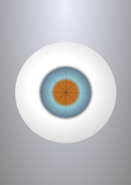
ここで具体的に何をやっているかと申しますと、
- まず、ulを虹彩と同じ大きさの正方形にします。
- 中のliも同じサイズの正方形にして、ulの中央に配置します。
- liの擬似要素(:before, :after)、spanの擬似要素をliと同じ大きさの正方形にします。
- 4つの擬似要素をtransformを使って細いひし形にします。具体的にはまず正方形を45度回転させ、縦方向か横方向どちらかにscaleを使って潰すことでひし形にします。その上でspan中の擬似要素は45度回転させます。
ひし形の長い方向にも0.7倍に縮小していますが、これは正方形の対角線の幅まであるひし形を、
円の直径相当まで縮めるためです。
\frac{1}{\sqrt{2}} = 0.707106...
毛様体を増やそう
.eye
  .eye__iris
    ul.eye__ciliary
      each n in Array(9)
        li.eye__ciliary__item: span
@import 'nib'

body
  min-height 100vh
  display flex
  flex-wrap nowrap
  flex-direction column
  align-items center
  justify-content center
  background-image radial-gradient(ellipse at 50% 0%, #eef 0, #888 100%)

.eye
  position relative
  size 200px
  border-radius 50%
  background radial-gradient(circle at 45% 45%, #fff 41%, #ccc 83%)

  &__iris
    absolute top 25% left 25%
    size 50%
    border-radius 50%
    box-shadow 0 0 5px 0 #000
    background radial-gradient(circle at center, #b86e29 32%, #94c7d4 42%, #1c0a24 112%)

  &__ciliary
    display block
    absolute top left
    size 100%
    transform rotateZ(1deg)

    &__item
      display block
      size 100%
      absolute top 50%
      margin-top (@height / -2)

      span
        display block
        size 100%
        position absolute

      &:before,
      &:after,
      & span:before,
      & span:after
        content ""
        display block
        size 100%
        position absolute
        background-color #000000
        opacity .1

      cilH = .025
      cilW = .7

      &:before
        transform: scale(cilH, cilW) rotate(45deg);
      &:after
        transform: scale(cilW, cilH) rotate(45deg);
      & span:before
        transform: rotate(45deg) scale(cilH, cilW) rotate(45deg);
      & span:after
        transform: rotate(-45deg) scale(cilH, cilW) rotate(45deg);

+     for num in (2..9)
+       &:nth-child({num})
+         transform rotateZ(5deg * (num - 1))
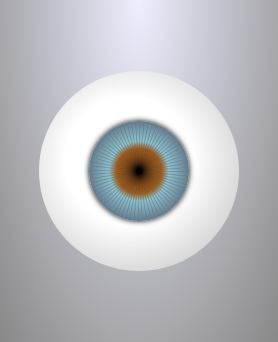
いよいよキモくなってまいりました。
pug側で9個に増やしたliに対して、stylusのfor文で最初以外のliを5度ずつ移動することによって、360度全体に毛様体を拡散させています。
瞳孔を描こう
.eye
  .eye__iris
    each i in [0, 1]
     ul.eye__ciliary(class = i ? 'eye__ciliary--sub' : false)
        each n in Array(9)
          li.eye__ciliary__item: span
@import 'nib'

body
  min-height 100vh
  display flex
  flex-wrap nowrap
  flex-direction column
  align-items center
  justify-content center
  background-image radial-gradient(ellipse at 50% 0%, #eef 0, #888 100%)

.eye
  position relative
  size 200px
  border-radius 50%
  background radial-gradient(circle at 45% 45%, #fff 41%, #ccc 83%)

  &__iris
    absolute top 25% left 25%
    size 50%
    border-radius 50%
    box-shadow 0 0 5px 0 #000
    background radial-gradient(circle at center, #b86e29 32%, #94c7d4 42%, #1c0a24 112%)

  &__ciliary
    display block
    absolute top left
    size 100%
    transform rotateZ(1deg)

    &__item
      display block
      size 100%
      absolute top 50%
      margin-top (@height / -2)

      span
        display block
        size 100%
        position absolute

      &:before,
      &:after,
      & span:before,
      & span:after
        content ""
        display block
        size 100%
        position absolute
        background-color #000000
        opacity .1

      cilH = .025
      cilW = .7

      &:before
        transform: scale(cilH, cilW) rotate(45deg);
      &:after
        transform: scale(cilW, cilH) rotate(45deg);
      & span:before
        transform: rotate(45deg) scale(cilH, cilW) rotate(45deg);
      & span:after
        transform: rotate(-45deg) scale(cilH, cilW) rotate(45deg);

      for num in (2..9)
        &:nth-child({num})
          transform rotateZ(5deg * (num - 1))

+   &--sub
+     size 60%
+     top ( (100 - @height) / 2)
+     left @top

+     .eye__ciliary__item
+       &:before,
+       &:after,
+       & span:before,
+       & span:after
+         opacity 1
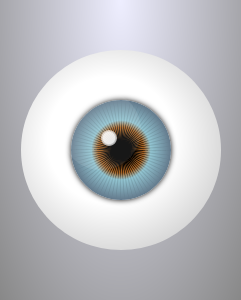
虹彩として作成したul.eye__ciliaryを複製して再利用します。
縮小して茶色い瞳孔部分にサイズを合わせ、虹彩部分より黒くすることで瞳孔っぽくしています。
反射を加えよう。
.eye
  .eye__iris
    each i in [0, 1]
      ul.eye__ciliary(class = i ? 'eye__ciliary--sub' : false)
        each n in Array(9)
          li.eye__ciliary__item: span
  .eye__reflect
  .eye__reflect.eye__reflect--sub
@import 'nib'

body
  min-height 100vh
  display flex
  flex-wrap nowrap
  flex-direction column
  align-items center
  justify-content center
  background-image radial-gradient(ellipse at 50% 0%, #eef 0, #888 100%)

.eye
  position relative
  size 200px
  border-radius 50%
  background radial-gradient(circle at 45% 45%, #fff 41%, #ccc 83%)

  &__iris
    absolute top 25% left 25%
    size 50%
    border-radius 50%
    box-shadow 0 0 5px 0 #000
    background radial-gradient(circle at center, #b86e29 32%, #94c7d4 42%, #1c0a24 112%)

  &__ciliary
    display block
    absolute top left
    size 100%
    transform rotateZ(1deg)

    &__item
      display block
      size 100%
      absolute top 50%
      margin-top (@height / -2)

      span
        display block
        size 100%
        position absolute

      &:before,
      &:after,
      & span:before,
      & span:after
        content ""
        display block
        size 100%
        position absolute
        background-color #000000
        opacity .1

      cilH = .025
      cilW = .7

      &:before
        transform: scale(cilH, cilW) rotate(45deg);
      &:after
        transform: scale(cilW, cilH) rotate(45deg);
      & span:before
        transform: rotate(45deg) scale(cilH, cilW) rotate(45deg);
      & span:after
        transform: rotate(-45deg) scale(cilH, cilW) rotate(45deg);

      for num in (2..9)
        &:nth-child({num})
          transform rotateZ(5deg * (num - 1))

    &--sub
      size 60%
      top ( (100 - @height) / 2)
      left @top

      .eye__ciliary__item
        &:before,
        &:after,
        & span:before,
        & span:after
          opacity 1

+ &__reflect
+   absolute top 80px left 80px
+   size 16px
+   border-radius 50%
+   background-image radial-gradient(circle at center, #fff 0%, #fff 50%, rgba(#fff, 0) 100%)
+   z-index 2
+   opacity .9

+   &--sub
+     size 80px
+     top 40px
+     left @top
+     background-image none
+     background-color rgba(#fff, .1)
+     z-index 3
いよいよ眼球めいてまいりました
薄めだがはっきりした大きな円と、濃いめだがぼやけた小さな円の二つを追加し反射を表現してみました。もっと複雑な図形を掛ければ湾曲した窓の写り込みなども表現できるかもしれませんが、私にはこれが精一杯です。
仕上げ
.eye
  .eye__iris
    each i in [0, 1]
      ul.eye__ciliary(class = i ? 'eye__ciliary--sub' : false)
        each n in Array(9)
          li.eye__ciliary__item: span
  .eye__reflect
  .eye__reflect.eye__reflect--sub
.shade
@import 'nib'

body
  min-height 100vh
  display flex
  flex-wrap nowrap
  flex-direction column
  align-items center
  justify-content center
  background-image radial-gradient(ellipse at 50% 0%, #eef 0, #888 100%)

.eye
  position relative
  size 200px
  border-radius 50%
  background radial-gradient(circle at 45% 45%, #fff 41%, #ccc 83%)

+ &:before
+ &:after
+   content ''
+   display block
+   size 100%
+   border-radius 50%
+   absolute top left
+ &:before
+   opacity .75
+   mix-blend-mode color-burn
+   background-image radial-gradient(circle at 45% 45%, #ffe 30%, #222 70%)
+   z-index 10
+ &:after
+   opacity .5
+   mix-blend-mode overlay
+   background-image radial-gradient(circle at 65% 65%, rgba(#000 ,1) 20%, rgba(#000, 0) 40%)
+   z-index 4

  &__iris
    absolute top 25% left 25%
    size 50%
    border-radius 50%
    box-shadow 0 0 5px 0 #000
    background radial-gradient(circle at center, #b86e29 32%, #94c7d4 42%, #1c0a24 112%)

  &__ciliary
    display block
    absolute top left
    size 100%
    transform rotateZ(1deg)

    &__item
      display block
      size 100%
      absolute top 50%
      margin-top (@height / -2)

      span
        display block
        size 100%
        position absolute

      &:before,
      &:after,
      & span:before,
      & span:after
        content ""
        display block
        size 100%
        position absolute
        background-color #000000
        opacity .1

      cilH = .025
      cilW = .7

      &:before
        transform: scale(cilH, cilW) rotate(45deg);
      &:after
        transform: scale(cilW, cilH) rotate(45deg);
      & span:before
        transform: rotate(45deg) scale(cilH, cilW) rotate(45deg);
      & span:after
        transform: rotate(-45deg) scale(cilH, cilW) rotate(45deg);

      for num in (2..9)
        &:nth-child({num})
          transform rotateZ(5deg * (num - 1))

    &--sub
      size 60%
      top ( (100 - @height) / 2)
      left @top

      .eye__ciliary__item
        &:before,
        &:after,
        & span:before,
        & span:after
          opacity 1

  &__reflect
    absolute top 80px left 80px
    size 16px
    border-radius 50%
    background-image radial-gradient(circle at center, #fff 0%, #fff 50%, rgba(#fff, 0) 100%)
    z-index 2
    opacity .9

    &--sub
      size 80px
      top 40px
      left @top
      background-image none
      background-color rgba(#fff, .1)
      z-index 3
+.shade
+  relative top -10%
+  z-index 1
+  size 200px 20px
+  background-image radial-gradient(ellipse at center, #000 0%, rgba(0,0,0, 0.6) 30%, rgba(0,0,0, 0) 70%)
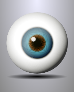
眼球にさらに立体感を出すため.eyeのbefore,after疑似要素を利用して、mix-blend-modeでフィルターをかけました。もはや、
フィーリングで、
としか言いようがないのですが、color-burnやovarlayなどのブレンドモードと放射状グラデーションを併用し重ねがけすることで
眼球に深みが出ます。
自分でも何を言ってるかちょっとわかりません。あと真下にボケた楕円を追加して、ちょっと浮いてるような影をつけてみました。
See the Pen eye2 pure css, without svg&canvas by ichimonzi (@ichimonzi) on CodePen.
眼球を作り終えて
やっぱり素直に画像貼ったほうが楽だなって思いました。