前回
では、
- 売上 = 男性売上 + 女性売上
のように分解して変化要因の可視化を行ったが、指標は掛け算的に分解されることも多い。例えば
- 売上 = 顧客数 × 平均客単価
changepointExt パッケージでこのような場合にも対応できるようにした。
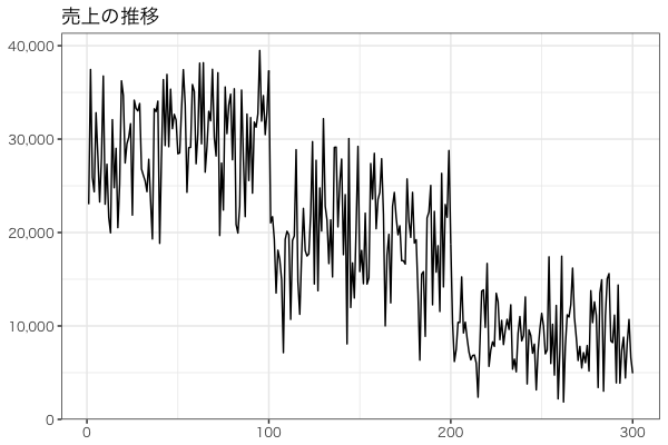
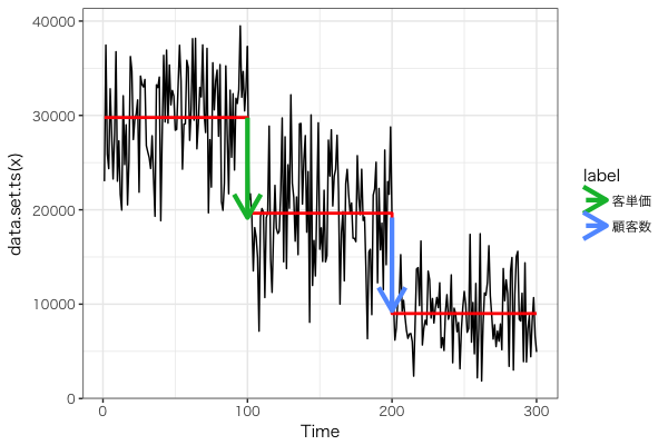
次のような売上に対して、
顧客数の変化と平均客単価の変化は次のようになった。
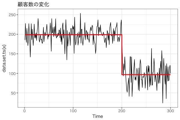
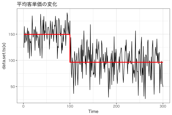
最初の変化は平均客単価が下がったためであり、次の変化は顧客数が下がったためである。
これを可視化するために、changepointExt パッケージの combine_cpts () 関数に operator という引数を追加した。
デフォルトは operator = "+" であり、指標を足し算的に分解したときに使う。
これを operator = "*" とすれば指標を掛け算的に分解したときに使える。
R
# 売上データを作成 -------------------------------------------------------------
set.seed(314)
average_spend <- c(rnorm(100, mean = 150, sd = 20),
                   rnorm(200, mean = 100, sd = 30))
customer_num <- c(rnorm(200, mean = 200, sd = 20),
                 rnorm(100, mean = 100, sd = 30))
# 売上 = 顧客数 × 平均客単価
sales <- customer_num * average_spend


# 変化点検出 -------------------------------------------------------------------
library(changepoint)

cpt_sales <- cpt.meanvar(sales, method = "PELT")
cpt_average_spend <- cpt.meanvar(average_spend, method = "PELT")
cpt_customer_num <- cpt.meanvar(customer_num, method = "PELT")


# 可視化 ---------------------------------------------------------------------
library(changepointExt)

combi <- combine_cpts("客単価" = cpt_average_spend, "顧客数" = cpt_customer_num,
                      operator = "*")
autoplot(cpt_sales) + autolayer(combi)
Enjoy!