目次
- はじめに
- 今日作るもの
- STEP 1:Day12用HTMLファイルを作る
- STEP 2:タイトルをDay12用に直す
- STEP 3:テーブルを横幅いっぱいに広げる
- STEP 4:見出し行に背景色を付ける
- STEP 5:thとtdに余白を付ける
- STEP 6:行の区切り線を付ける
- STEP 7:文字位置とサムネイルサイズを整える
- STEP 8:操作欄をボタン風に整える
- 完成コード
- 使ったTailwind CSSのclass
- 表示確認
- 今日分かったこと
- 次回やること
- シリーズ記事
はじめに
この記事は、Tailwind CSSで管理画面UIを1ステップずつ作る学習記録です。
過去記事は末尾の「シリーズ記事」にまとめています。
今日作るもの
Day12では、Day11で作った作品一覧テーブルの見た目を整えます。
Day11では、table、thead、tbody、tr、th、td を使って、作品一覧テーブルのHTML構造を作りました。
Day12では、そのテーブルにTailwind CSSのclassを追加して、管理画面の一覧テーブルらしく見えるようにします。
主に整える内容は以下です。
- テーブルを白い箱の幅いっぱいに広げる
- 見出し行の背景色を付ける
- セルに余白を付ける
- 行の区切り線を付ける
- 文字サイズや文字位置を整える
- サムネイル画像のサイズを整える
- 操作欄をボタン風に整える
STEP 1:Day12用HTMLファイルを作る
まず、Day12用のHTMLファイルを作成します。
day12-table-style.html
Day12では、Day11で作った作品一覧テーブルの見た目を整えるので、Day11ファイルをコピーして進めます。
cp day11-item-table.html day12-table-style.html
エクスプローラーでコピーしても大丈夫です。
現在の構成に、Day12用ファイルが追加される形です。
tailwind-learning/
├── day01-heading.html
├── day02-card-base.html
├── day03-image-card.html
├── day04-card-text.html
├── day05-card-buttons.html
├── day06-card-complete.html
├── day07-button-colors.html
├── day08-admin-header.html
├── day09-pc-sidebar.html
├── day10-pc-admin-layout.html
├── day11-item-table.html
├── day12-table-style.html
└── images/
    └── sample-poster.png
STEP 2:タイトルをDay12用に直す
day12-table-style.html の <title> を、Day12用に変更します。
修正前
<title>Day 11 作品一覧テーブルを作る</title>
修正後
<title>Day 12 テーブルの見た目を整える</title>
このSTEPでは、ブラウザタブに表示されるタイトルだけ を変更します。
画面に表示されているヘッダー、サイドバー、メインエリア、テーブル部分はまだ触りません。
STEP 3:テーブルを横幅いっぱいに広げる
今は table にclassが付いていないため、テーブルの横幅は中身の幅に合わせて表示されます。
Day12では、白い箱の中でテーブルを見やすく表示したいので、table に w-full を追加します。
修正前
<div class="bg-white border rounded-lg shadow-sm mt-6">
    <table>
        <!-- テーブル -->
        <thead>
            <tr>
                <th>ID</th>
                <th>サムネイル</th>
                <th>タイトル</th>
                <th>平均評価</th>
                <th>レビュー数</th>
                <th>操作</th>
            </tr>
        </thead>

        <tbody>
            <!-- 作品データ -->
        </tbody>
    </table>
</div>
修正後
<div class="bg-white border rounded-lg shadow-sm mt-6">
    <table class="w-full">
        <!-- テーブル -->
        <thead>
            <tr>
                <th>ID</th>
                <th>サムネイル</th>
                <th>タイトル</th>
                <th>平均評価</th>
                <th>レビュー数</th>
                <th>操作</th>
            </tr>
        </thead>

        <tbody>
            <!-- 作品データ -->
        </tbody>
    </table>
</div>
今回追加するclass
| class | 役割 |
|---|---|
w-full |
テーブルを親要素の幅いっぱいに広げる |
今回のポイント
w-full を付けることで、テーブルが白い箱の横幅いっぱいに広がります。
Day11ではテーブル構造を作ることが目的だったため、横幅の調整はしていませんでした。
Day12では、テーブルを管理画面の一覧表らしく見せるために、まず横幅を整えます。
STEP 4:見出し行に背景色を付ける
テーブルを w-full で横幅いっぱいに広げました。
次は、テーブルの見出し行が分かりやすくなるように、thead に bg-gray-700 と text-white を追加します。
修正前
<table class="w-full">
    <thead>
        <tr>
            <th>ID</th>
            <th>サムネイル</th>
            <th>タイトル</th>
            <th>平均評価</th>
            <th>レビュー数</th>
            <th>操作</th>
        </tr>
    </thead>

    <tbody>
        <!-- 作品データ -->
    </tbody>
</table>
修正後
<table class="w-full">
    <thead class="bg-gray-700 text-white">
        <tr>
            <th>ID</th>
            <th>サムネイル</th>
            <th>タイトル</th>
            <th>平均評価</th>
            <th>レビュー数</th>
            <th>操作</th>
        </tr>
    </thead>

    <tbody>
        <!-- 作品データ -->
    </tbody>
</table>
今回追加するclass
| class | 役割 |
|---|---|
bg-gray-700 |
テーブル見出し行の背景を濃いグレーにする |
text-white |
濃い背景でも見出し文字を読みやすくする |
今回のポイント
最初は bg-gray-100 や bg-gray-200 を試しましたが、画面全体の背景や白いテーブル本体との差が弱く、見出し行として少し分かりにくく感じました。
今回は bg-gray-700 と text-white を使い、見出し行を濃いグレー背景にしました。
これにより、テーブルの見出し行とデータ行の違いが分かりやすくなり、管理画面の一覧テーブルらしい見た目に近づきました。
STEP 5:thとtdに余白を付ける
見出し行に bg-gray-700 text-white を付けて、テーブルのヘッダー部分が分かりやすくなりました。
次は、th と td に余白を付けて、文字や画像がセルの端にくっつかないようにします。
修正前
<thead class="bg-gray-700 text-white">
    <tr>
        <th>ID</th>
        <th>サムネイル</th>
        <th>タイトル</th>
        <th>平均評価</th>
        <th>レビュー数</th>
        <th>操作</th>
    </tr>
</thead>

<tbody>
    <tr>
        <td>1</td>
        <td>
            <img
                src="images/sample-poster.png"
                alt="サンプル画像"
                class="w-16 h-24 object-cover rounded-md"
            >
        </td>
        <td>サンプル映画タイトル</td>
        <td>4.2</td>
        <td>12件</td>
        <td>
            詳細 編集 削除
        </td>
    </tr>
</tbody>
修正後
まずは、見出し行の th に px-4 py-2 を追加します。
<thead class="bg-gray-700 text-white">
    <tr>
        <th class="px-4 py-2">ID</th>
        <th class="px-4 py-2">サムネイル</th>
        <th class="px-4 py-2">タイトル</th>
        <th class="px-4 py-2">平均評価</th>
        <th class="px-4 py-2">レビュー数</th>
        <th class="px-4 py-2">操作</th>
    </tr>
</thead>
次に、各データ行の td にも px-4 py-2 を追加します。
<tbody>
    <tr>
        <td class="px-4 py-2">1</td>
        <td class="px-4 py-2">
            <img
                src="images/sample-poster.png"
                alt="サンプル画像"
                class="w-16 h-24 object-cover rounded-md"
            >
        </td>
        <td class="px-4 py-2">サンプル映画タイトル</td>
        <td class="px-4 py-2">4.2</td>
        <td class="px-4 py-2">12件</td>
        <td class="px-4 py-2">
            詳細 編集 削除
        </td>
    </tr>
</tbody>
2行目・3行目の td にも同じように px-4 py-2 を追加してください。
今回追加するclass
| class | 役割 |
|---|---|
px-4 |
セルの左右に余白を付ける |
py-2 |
セルの上下に余白を付ける |
今回のポイント
px-4 と py-2 を付けることで、セル内の文字や画像が端にくっつかなくなります。
px-4:左右の余白
py-2:上下の余白
テーブルは、文字や画像が詰まりすぎると読みにくくなります。
セルに余白を付けることで、見出し行もデータ行も読みやすくなり、管理画面の一覧テーブルらしい見た目に近づきます。
STEP 6:行の区切り線を付ける
th と td に余白を付けたので、文字や画像の詰まりは少し改善できました。
次は、データ行ごとの区切りを分かりやすくするために、tr に border-b を追加します。
修正前
<tbody>
    <tr>
        <td class="px-4 py-2">1</td>
        <td class="px-4 py-2">
            <img
                src="images/sample-poster.png"
                alt="サンプル画像"
                class="w-16 h-24 object-cover rounded-md"
            >
        </td>
        <td class="px-4 py-2">サンプル映画タイトル</td>
        <td class="px-4 py-2">4.2</td>
        <td class="px-4 py-2">12件</td>
        <td class="px-4 py-2">
            詳細 編集 削除
        </td>
    </tr>
</tbody>
修正後
<tbody>
    <tr class="border-b">
        <td class="px-4 py-2">1</td>
        <td class="px-4 py-2">
            <img
                src="images/sample-poster.png"
                alt="サンプル画像"
                class="w-16 h-24 object-cover rounded-md"
            >
        </td>
        <td class="px-4 py-2">サンプル映画タイトル</td>
        <td class="px-4 py-2">4.2</td>
        <td class="px-4 py-2">12件</td>
        <td class="px-4 py-2">
            詳細 編集 削除
        </td>
    </tr>
</tbody>
今回追加するclass
| class | 役割 |
|---|---|
border-b |
行の下側に区切り線を付ける |
今回のポイント
border-b を付けることで、各データ行の下に区切り線が入ります。
作品データが複数行ある場合、区切り線がないと行の境界が少し分かりにくくなります。
1行目
────
2行目
────
3行目
行ごとに線を入れることで、一覧テーブルとして読みやすくなります。
STEP 7:文字位置とサムネイルサイズを整える
行の区切り線を付けたので、データ行の境目が分かりやすくなりました。
最後に、テーブル全体の文字サイズ、見出しの文字位置、サムネイル画像のサイズを整えます。
今回は、table に text-sm を追加して、一覧テーブルらしく少し控えめな文字サイズにします。
さらに、th に text-center を追加して、見出し文字を中央寄せにします。
また、サムネイル画像は w-16 h-24 のままだと少し大きいため、w-12 h-12 に変更し、画像の周りに薄い枠線を付けます。
修正前
<table class="w-full">
    <thead class="bg-gray-700 text-white">
        <tr>
            <th class="px-4 py-2">ID</th>
            <th class="px-4 py-2">サムネイル</th>
            <th class="px-4 py-2">タイトル</th>
            <th class="px-4 py-2">平均評価</th>
            <th class="px-4 py-2">レビュー数</th>
            <th class="px-4 py-2">操作</th>
        </tr>
    </thead>
サムネイル画像はこの状態です。
<img
    src="images/sample-poster.png"
    alt="サンプル画像"
    class="w-16 h-24 object-cover rounded-md"
>
修正後
<table class="w-full text-sm">
    <thead class="bg-gray-700 text-white">
        <tr>
            <th class="px-4 py-2 text-center">ID</th>
            <th class="px-4 py-2 text-center">サムネイル</th>
            <th class="px-4 py-2 text-center">タイトル</th>
            <th class="px-4 py-2 text-center">平均評価</th>
            <th class="px-4 py-2 text-center">レビュー数</th>
            <th class="px-4 py-2 text-center">操作</th>
        </tr>
    </thead>
サムネイル画像は、3か所すべて以下に変更します。
<img
    src="images/sample-poster.png"
    alt="サンプル画像"
    class="w-12 h-12 object-cover rounded border border-gray-300"
>
今回追加するclass
| class | 役割 |
|---|---|
text-sm |
テーブル全体の文字サイズを少し小さくする |
text-center |
見出しセルの文字を中央寄せにする |
w-12 |
サムネイル画像の幅を固定する |
h-12 |
サムネイル画像の高さを固定する |
rounded |
サムネイル画像の角を少し丸くする |
border |
サムネイル画像に枠線を付ける |
border-gray-300 |
サムネイル画像の枠線を薄いグレーにする |
今回のポイント
text-sm を table に付けることで、テーブル全体の文字サイズを少し小さくしました。
また、th に text-center を付けて、見出し文字を中央寄せにしました。
サムネイル画像は、最初の w-16 h-24 では少し大きく見えたため、w-12 h-12 に変更しました。
さらに border border-gray-300 を付けることで、画像の輪郭が分かりやすくなりました。
STEP 8:操作欄をボタン風に整える
操作欄の 詳細 編集 削除 は、今は文字だけで表示されています。
次は、管理画面の操作欄らしく見えるように、button 要素に変更します。
修正前
<td class="px-4 py-2">
    詳細 編集 削除
</td>
修正後
<td class="px-4 py-2">
    <div class="flex gap-2 justify-center">
        <button class="px-2 py-1 text-xs border border-gray-300 text-gray-700 rounded hover:bg-gray-200">
            詳細
        </button>

        <button class="px-2 py-1 text-xs border border-blue-500 text-blue-600 rounded hover:bg-blue-100">
            編集
        </button>

        <button class="px-2 py-1 text-xs border border-red-500 text-red-600 rounded hover:bg-red-100">
            削除
        </button>
    </div>
</td>
3行分すべて同じように変更します。
今回追加するclass
| class | 役割 |
|---|---|
flex |
操作ボタンを横並びにする |
gap-2 |
ボタン同士の間隔を空ける |
justify-center |
操作ボタン全体を中央寄せにする |
px-2 |
ボタンの左右に余白を付ける |
py-1 |
ボタンの上下に余白を付ける |
text-xs |
ボタン文字を小さめにする |
border-gray-300 |
詳細ボタンの枠線をグレーにする |
border-blue-500 |
編集ボタンの枠線を青にする |
border-red-500 |
削除ボタンの枠線を赤にする |
rounded |
ボタンの角を少し丸くする |
今回のポイント
Day7で作った詳細・編集・削除ボタンの考え方を、今回はテーブルの操作欄に使います。
テーブル内のボタンなので、カード内のボタンより少し小さめにするため、text-xs と px-2 py-1 を使います。
また、操作欄の中でボタンが散らばらないように、flex gap-2 justify-center で横並びにして中央寄せにします。
詳細はグレー系、編集は青系、削除は赤系にすることで、操作の意味が分かりやすくなります。
完成コード
<!DOCTYPE html>
<html lang="ja">
<head>
    <meta charset="UTF-8">
    <meta name="viewport" content="width=device-width, initial-scale=1.0">
    <title>Day 12 テーブルの見た目を整える</title>
    <script src="https://cdn.tailwindcss.com"></script>
</head>
<body class="bg-gray-100">
    <header class="bg-gray-900 text-white px-6 py-4 flex justify-between items-center">
        <h1 class="text-xl">
            Admin Dashboard
        </h1>

        <p class="text-sm">
            管理者:遅咲きエンジニア
        </p>
    </header>

    <main class="flex items-start">
        <aside class="w-48 bg-gray-600 text-white p-4 min-h-screen">
            <!-- サイドバー -->
            <p class="font-bold">
                サイドバー
            </p>

            <ul class="mt-4 space-y-2 text-sm">
                <li class="px-2 py-1 rounded hover:bg-gray-500">ダッシュボード</li>
                <li class="px-2 py-1 rounded hover:bg-gray-500">作品一覧</li>
                <li class="px-2 py-1 rounded hover:bg-gray-500">レビュー管理</li>
            </ul>
        </aside>

        <div class="flex-1 p-6 bg-gray-100 min-h-screen">
            <h2 class="text-lg font-bold">
                作品管理
            </h2>

            <p class="text-sm text-gray-600 mt-1">
                登録済み作品の確認・編集・削除を行います。
            </p>

            <div class="bg-white border rounded-lg shadow-sm mt-6">
                <table class="w-full text-sm">
                    <thead class="bg-gray-700 text-white">
                        <tr>
                            <th class="px-4 py-2 text-center">ID</th>
                            <th class="px-4 py-2 text-center">サムネイル</th>
                            <th class="px-4 py-2 text-center">タイトル</th>
                            <th class="px-4 py-2 text-center">平均評価</th>
                            <th class="px-4 py-2 text-center">レビュー数</th>
                            <th class="px-4 py-2 text-center">操作</th>
                        </tr>
                    </thead>

                    <tbody>
                        <!-- 作品データ -->
                        <tr class="border-b">
                            <td class="px-4 py-2">1</td>
                            <td class="px-4 py-2">
                                <img
                                    src="images/sample-poster.png"
                                    alt="サンプル画像"
                                    class="w-12 h-12 object-cover rounded border border-gray-300"
                                >
                            </td>
                            <td class="px-4 py-2">サンプル映画タイトル</td>
                            <td class="px-4 py-2">4.2</td>
                            <td class="px-4 py-2">12件</td>
                            <td class="px-4 py-2">
                                <div class="flex gap-2 justify-center">
                                    <button class="px-2 py-1 text-xs border border-gray-300 text-gray-700 rounded hover:bg-gray-200">
                                        詳細
                                    </button>

                                    <button class="px-2 py-1 text-xs border border-blue-500 text-blue-600 rounded hover:bg-blue-100">
                                        編集
                                    </button>

                                    <button class="px-2 py-1 text-xs border border-red-500 text-red-600 rounded hover:bg-red-100">
                                        削除
                                    </button>
                                </div>
                            </td>
                        </tr>

                        <tr class="border-b">
                            <td class="px-4 py-2">2</td>
                            <td class="px-4 py-2">
                                <img
                                    src="images/sample-poster.png"
                                    alt="サンプル画像"
                                    class="w-12 h-12 object-cover rounded border border-gray-300"
                                >
                            </td>
                            <td class="px-4 py-2">サンプル映画タイトル2</td>
                            <td class="px-4 py-2">3.8</td>
                            <td class="px-4 py-2">8件</td>
                            <td class="px-4 py-2">
                                <div class="flex gap-2 justify-center">
                                    <button class="px-2 py-1 text-xs border border-gray-300 text-gray-700 rounded hover:bg-gray-200">
                                        詳細
                                    </button>

                                    <button class="px-2 py-1 text-xs border border-blue-500 text-blue-600 rounded hover:bg-blue-100">
                                        編集
                                    </button>

                                    <button class="px-2 py-1 text-xs border border-red-500 text-red-600 rounded hover:bg-red-100">
                                        削除
                                    </button>
                                </div>
                            </td>
                        </tr>

                        <tr class="border-b">
                            <td class="px-4 py-2">3</td>
                            <td class="px-4 py-2">
                                <img
                                    src="images/sample-poster.png"
                                    alt="サンプル画像"
                                    class="w-12 h-12 object-cover rounded border border-gray-300"
                                >
                            </td>
                            <td class="px-4 py-2">サンプル映画タイトル3</td>
                            <td class="px-4 py-2">4.7</td>
                            <td class="px-4 py-2">20件</td>
                            <td class="px-4 py-2">
                                <div class="flex gap-2 justify-center">
                                    <button class="px-2 py-1 text-xs border border-gray-300 text-gray-700 rounded hover:bg-gray-200">
                                        詳細
                                    </button>

                                    <button class="px-2 py-1 text-xs border border-blue-500 text-blue-600 rounded hover:bg-blue-100">
                                        編集
                                    </button>

                                    <button class="px-2 py-1 text-xs border border-red-500 text-red-600 rounded hover:bg-red-100">
                                        削除
                                    </button>
                                </div>
                            </td>
                        </tr>
                    </tbody>
                </table>
            </div>
        </div>
    </main>
</body>
</html>
使ったTailwind CSSのclass
| class | 内容 |
|---|---|
w-full |
テーブルを親要素の幅いっぱいに広げる |
bg-gray-700 |
テーブル見出し行の背景を濃いグレーにする |
text-white |
濃い背景でも見出し文字を読みやすくする |
px-4 |
セルの左右に余白を付ける |
py-2 |
セルの上下に余白を付ける |
border-b |
行の下側に区切り線を付ける |
text-sm |
テーブル全体の文字サイズを少し小さくする |
text-center |
見出しセルの文字を中央寄せにする |
w-12 |
サムネイル画像の幅を固定する |
h-12 |
サムネイル画像の高さを固定する |
object-cover |
指定したサイズに合わせて画像をトリミングして表示する |
rounded |
ボタンやサムネイル画像の角を少し丸くする |
border |
ボタンやサムネイル画像に枠線を付ける |
border-gray-300 |
詳細ボタンやサムネイル画像の枠線をグレーにする |
flex |
操作ボタンを横並びにする |
gap-2 |
操作ボタン同士の間隔を空ける |
justify-center |
操作ボタン全体を中央寄せにする |
px-2 |
ボタンの左右に余白を付ける |
py-1 |
ボタンの上下に余白を付ける |
text-xs |
ボタンの文字サイズを小さくする |
text-gray-700 |
詳細ボタンの文字色を濃いグレーにする |
hover:bg-gray-200 |
詳細ボタンのhover時背景色を薄いグレーにする |
border-blue-500 |
編集ボタンの枠線を青系にする |
text-blue-600 |
編集ボタンの文字色を青系にする |
hover:bg-blue-100 |
編集ボタンのhover時背景色を薄い青にする |
border-red-500 |
削除ボタンの枠線を赤系にする |
text-red-600 |
削除ボタンの文字色を赤系にする |
hover:bg-red-100 |
削除ボタンのhover時背景色を薄い赤にする |
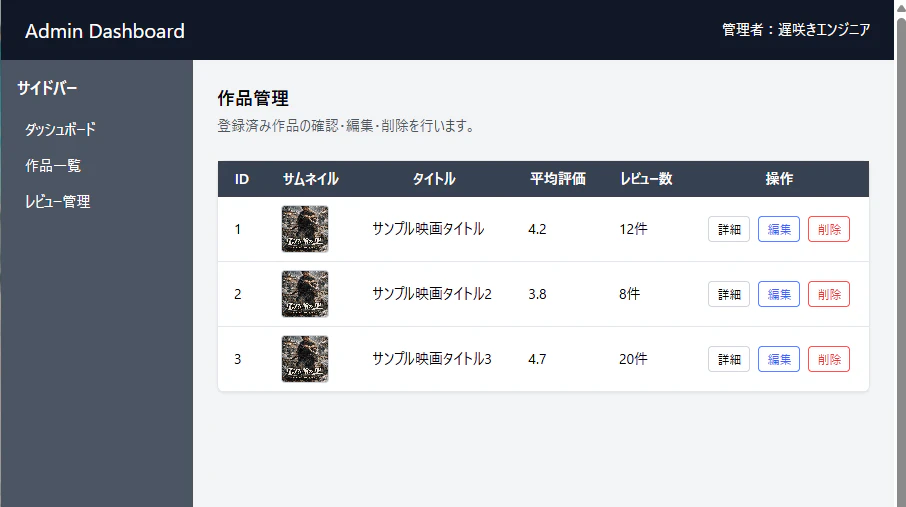
表示確認
以下の点をブラウザで確認しました。
- テーブルが白い箱の横幅いっぱいに広がっている
- 見出し行の背景色が濃いグレーになっている
- 見出し文字が白色で読みやすい
- th / td に余白が付き、文字や画像が詰まりすぎていない
- データ行ごとに区切り線が表示されている
- サムネイル画像が小さめの正方形で表示されている
- サムネイル画像に薄い枠線が付いている
- 操作欄の詳細・編集・削除がボタンとして表示されている
- 詳細ボタンはグレー系、編集ボタンは青系、削除ボタンは赤系になっている
- 操作ボタンが横並びで中央寄せになっている
- hover時にボタンの背景色が変わる
今日分かったこと
Day12では、Day11で作った作品一覧テーブルの見た目を整えました。
table に w-full を付けることで、白い箱の横幅いっぱいにテーブルを広げられました。
見出し行には bg-gray-700 と text-white を使い、データ行との違いを分かりやすくしました。
th と td に px-4 py-2 を付けることで、セル内に余白ができ、文字や画像が読みやすくなりました。
また、データ行に border-b を付けることで、行ごとの区切りが分かりやすくなりました。
サムネイル画像は w-12 h-12 の正方形にし、border border-gray-300 で薄い枠線を付けました。
操作欄は、詳細・編集・削除を小さめのボタンにして、テーブル内でも見やすい管理画面らしい表示にできました。
次回やること
【Tailwind CSS入門 Day13】レスポンシブ表示に切り替える
シリーズ記事
- 【Tailwind CSS入門 Day1】管理画面の見出しを作る
- 【Tailwind CSS入門 Day2】カードUIの土台を作る
- 【Tailwind CSS入門 Day3】画像付きカードを作る
- 【Tailwind CSS入門 Day4】作品情報の文字を整える
- 【Tailwind CSS入門 Day5】管理画面風のボタンを作る
- 【Tailwind CSS入門 Day6】作品カードUIを完成させる
- 【Tailwind CSS入門 Day7】管理画面風ボタンを色分けする
- 【Tailwind CSS入門 Day8】管理画面ヘッダーを作る
- 【Tailwind CSS入門 Day9】PC用サイドバーを作る
- 【Tailwind CSS入門 Day10】PC管理画面レイアウトを作る
- 【Tailwind CSS入門 Day11】作品一覧テーブルを作る
- 【Tailwind CSS入門 Day12】テーブルの見た目を整える ← 今回