Flutterのバージョンが2にアップデートしたときにRaisedButtonが非推奨になり、エディター上で線をひかれるようになりました。

非推奨なのでそのまま使うことができるのですが、バージョンが1のコードを移したいときとかによく引っかかるので新しい書き方をまとめておきました。
新しいボタン
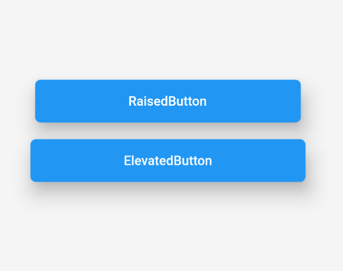
RaisedButtonはバージョン2からElevatedButtonに変わりました。
| 旧ボタン | 新ボタン |
|---|---|
| RaisedButton | ElevatedButton |
RaisedButton(
  child: Text('RaisedButton'),
  onPressed: () {}
)
ElevatedButton(
  child: Text('ElevatedButton'),
  onPressed: () {}
)

書き方はこの時点では同じです。
デフォルトでの見た目はRaisedButton時はグレー背景に黒文字、
ElevatedButton時は青背景に白文字になっています。
装飾の仕方
ではこちらのボタンを同じ背景色、文字色に装飾するときの違いを見ていきましょう。
RaisedButton
RaisedButton(
  onPressed: () {},
  splashColor: Colors.purple,
  child: Text('RaisedButton'),
  color: Colors.blue,
  textColor: Colors.white,
  shape: RoundedRectangleBorder(
    borderRadius: BorderRadius.circular(6),
  ),
  elevation: 16,
  padding: EdgeInsets.symmetric(
    vertical: 15.0,
    horizontal: 100,
  )),
)
RaisedButtonはそれぞれの装飾のプロパティをRaisedButtonの直下で記入できました。
テキストのカラーはtextColorで設定できます。
背景はcolor、ボタンを押したときはsplashColor
ElevatedButton
ElevatedButton(
  onPressed: () {},
  style: ElevatedButton.styleFrom(
    primary: Colors.blue,
    onPrimary: Colors.purple,
    shape: RoundedRectangleBorder(
      borderRadius: BorderRadius.circular(6),
    ),
    elevation: 16,
    padding: EdgeInsets.symmetric(
      vertical: 15.0,
      horizontal: 100,
    ),
  ),
  child: Text(
    'ElevatedButton',
    style: TextStyle(
      color: Colors.white,
    ),
  ),
)
ElevatedButtonはstyle: ElevatedButton.styleFromと書いてからその直下にプロパティを書くことになります。
テキストはstyle: TextStyleを設定してから色などを変更できます。
背景はprimaryで設定、ボタンを押したときはonPrimaryで設定します。
以上が新ボタンのまとめです。
FlatButtonからTextButtonやOutlineButtonからOutlinedButton も似たような感じです。