はじめに
React初心者がStorybook v6でStorybookに初挑戦、そして少しずつ前に進んでいくお話です。
コンポーネント設計としてAtomicDesign、スタイルはcss-modulesを利用していきます。
同じような境遇の方のお役に立てたら幸いです。
(初心者のため謎設計が多数出現すると思います。予めご了承ください。。。)
今回は、はじめの一歩。最初のコンポーネントを作ってみたのお話。
- 第1話 環境構築
- 第2話 最初のコンポーネント
AtomicDesignについて
デザイナーであるBrad Frost氏のUI設計に基づいたデザインシステムのこと。
デザインパーツを5つの分類に分けて構造構築していくというお話です。
この形がAtomicDesignであるという正解を見出すことは難しいようですが、AtomicDesignの思想を参考に、コンポーネント設計していこうというのが今回の目的です。
- Atoms(原子)・・・ボタン、アイコン、インプットエリアなどの要素の最小単位。
- Molecules(分子)・・・Atomsの集合体、アイコン付きのボタンや検索ボックスなど。
- Organisms(有機体)・・・Atoms、Moleculesの集合体。ヘッダーや検索エリアなど。
- Templates(テンプレート)・・・Organismsの集合体。ページレイアウトなど。
- Pages(ページ)・・・表示するページそのもの。
ざっくりの私の解釈としては今回下記のような分類にして構築していこうと思っています。
Propsを受け取るのみ。単体での意味やロジックを持たないコンポーネント。
Atoms、Molecules
Propsを渡すことができる。単体での意味やロジックを持つコンポーネント。
Organisms
ページレイアウトのみを持つコンポーネント。
Templates
最終的なページのみ。
Pages
最初のコンポーネント
AtomicDesignについては一旦置いておき、Storybookのテストを兼ねてボタンコンポーネントを作成します。
Storybookにコンポーネントを登録するには、通常のコンポーネントとは別に、***.sotries.tsxというStorybook用のファイル作成が必要です。
ボタンの作成
まずは、通常のボタンを作成します。
ボタンはAtomsとして作成したいので今回は、
/src/components/atoms/Button/index.tsxとして作成していきます。
import React from 'react';
const Button: React.VFC = () => {
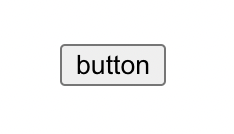
return <button>button</button>;
};
export default Button;
他のコンポーネントからAtomsを利用しやすいようにindexファイルを用意します。(Atomsを追加ごとに行を増やしていきます。)
export { default as Button } from './Button'
上記のファイルを用意することで、App.tsxファイルなど他のファイルからimportする際には、
import { Button, Input } from 'src/components/atoms';
このようにまとめてimportができるようになるのでとても便利です。
次に、ボタンコンポーネントの確認のためApp.tsxを下記のように書き換えます。
import React from 'react';
import { Button } from 'src/components/atoms';

const App: React.VFC = () => {
  return (
    <div>
      <Button />
    </div>
  );
};

export default App;
ここで一旦動作確認してみましょう。
$ yarn start
http://localhost:3000を開いていてボタンの表示を確認します。
Storybookへの登録
Storybookに登録するために、
/src/components/atoms/Button/index.stories.tsxを作成していきます。
import React from 'react';
import { Meta } from '@storybook/react';
import Button from './index';

export default {
  title: 'Design System/Atoms/Button', // コンポーネント表示名
  component: Button,
} as Meta;

export const Primary: React.VFC<{}> = () => <Button />;
登録したらStorybookを起動します。
$ yarn storybook
http://localhost:6006を開いていて表示を確認します。
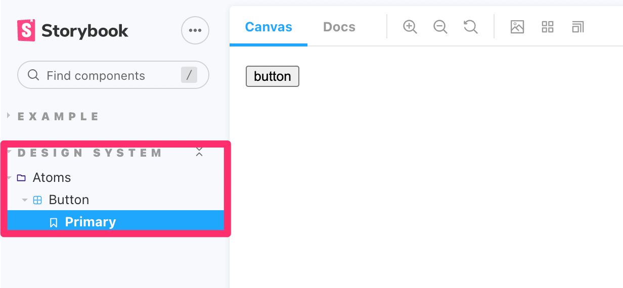
title: 'Design System/Atoms/Button'として記載した部分を基準に、階層が作られ、Primaryというexportした名前の中にボタンが表示されています。
これで記念すべき最初のコンポーネントが登録できました。
ボタンの調整
このままだとちょっとさみしいのでもう少し拡張してみます。
ボタンのテキストと種別によってデザインが変わるようにしてみましょう。
css modulesでSASSを利用したいためsass環境をインストールします。
$ yarn add -D sass
PrimaryボタンとSecondaryボタン用のスタイルを作成します。
.button {
  border: 2px solid black;
  width: 200px;
  text-align: center;
  font-size: 20px;
  font-weight: bold;
  padding: 10px;
  text-transform: uppercase;
  transition: background-color 0.3s, color 0.3s, border 0.3s;
  &Primary {
    background-color: black;
    color: white;
    &:hover {
      background-color: white;
      color: black;
    }
  }
  &Secondary {
    background-color: gray;
    color: black;
    &:hover {
      background-color: black;
      color: white;
    }
  }
}
ButtonコンポーネントとStroybookファイルは一気に色々と増えてきます。
import React from 'react';
import styles from './index.module.scss';
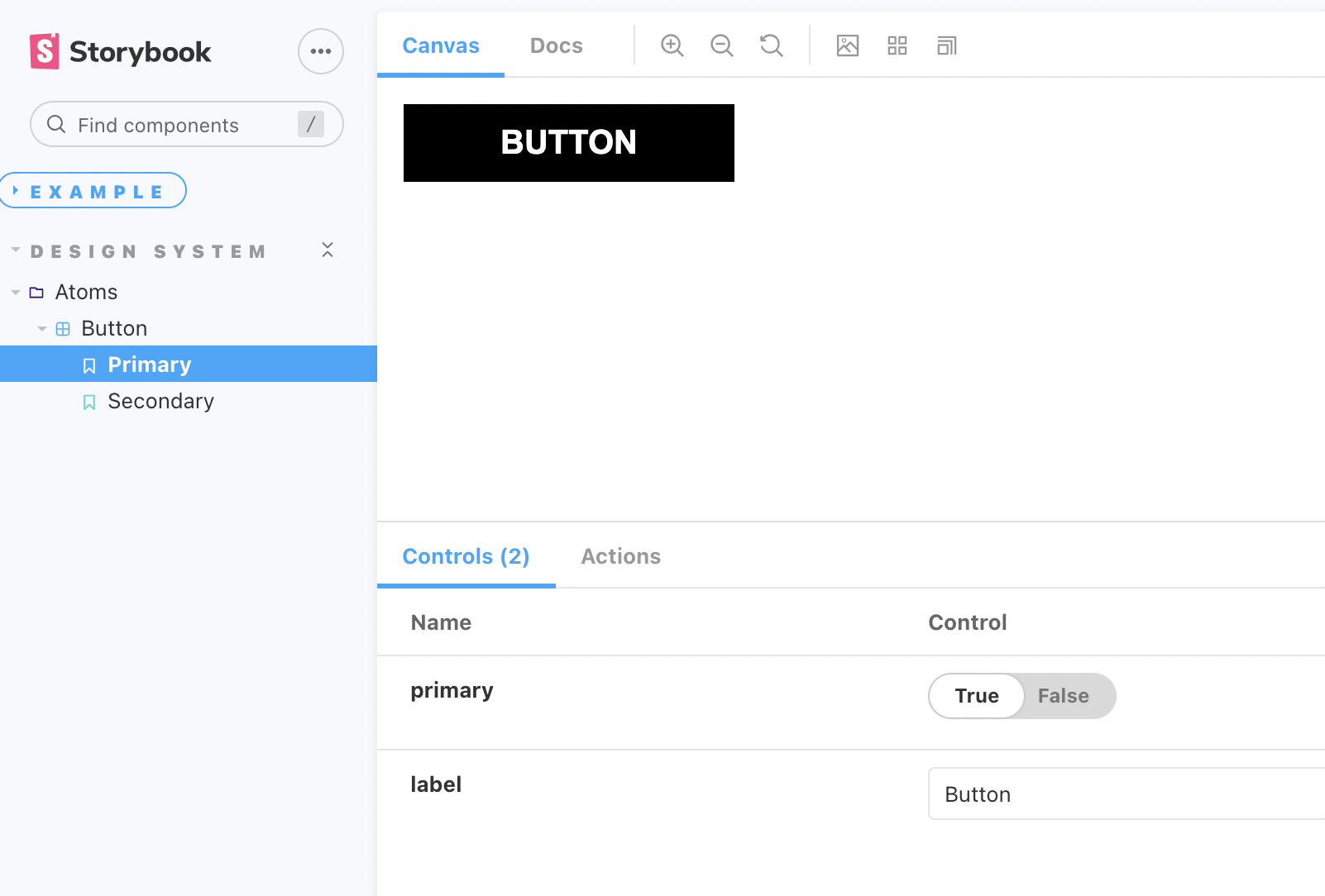
export type ButtonProps = {
primary?: boolean;
label: string;
};
const Button: React.VFC<ButtonProps> = ({ primary = false, label, ...props }) => {
// propsとしてprimaryを受け取った場合と、それ以外で付与するclassを分けます
const mode = primary ? styles.buttonPrimary : styles.buttonSecondary;
return (
<button type="button" className={[styles.button, mode].join(' ')} {...props}>
{/* propsとして受け取ったlabelをボタンのテキストとして表示します */}
{label}
</button>
);
};
export default Button;
記載が一気に増えていますが、ほとんどが決まりごとのようなものになってきますので、Storybookのドキュメントを参考に記載を確認してみてください。
import React from 'react';
import { Story, Meta } from '@storybook/react';
import Button, { ButtonProps } from './index';

export default {
  title: 'Design System/Atoms/Button',
  component: Button,
} as Meta;

// 共通となるボタンコンポーネントをテンプレートとして作成
const Template: Story<ButtonProps> = (args) => <Button {...args} />;

// Primaryボタンを作成 渡すargs違いでパータンを分けます
export const Primary = Template.bind({});
Primary.args = {
  primary: true,
  label: 'Button',
};

// Secondaryボタンを作成
export const Secondary = Template.bind({});
Secondary.args = {
  label: 'Button',
};
これで2種類のボタンを登録することができました!
Reactコンポーネントとしては下記のように利用します。
import React from 'react';
import { Button } from 'src/components/atoms';

const App: React.VFC = () => {
  return (
    <div>
      <Button primary label="button" />
    </div>
  );
};

export default App;

ようやくそれっぽいボタンの登録をすることができました。
まだまだ機能としては何もないボタンですが、最初の大きな一歩です!
次回からは、改めてデザインファイルに合わせてコンポーネントを作成していきます。