はじめに
こんにちは、デザイナーの早狩です。
CSS Gridは、2次元レイアウト(縦と横の両方向)を効率的に作成できるCSSの機能です。これまでFlexboxでは難しかった「行」と「列」の2次元配置が、シンプルなHTML構造で表現できます。
本記事ではGridの基礎というより、実践でよく使われる以下のプロパティに焦点を絞って解説します。
gridでよく使われるプロパティ・構文
grid-template-columnsgrid-template-rowsrepeat(auto-fit, minmax(...))grid-area
基本
Gridを使うには、まずコンテナに display: grid を指定します。
.container {
  display: grid;
}
これで、内部の要素はすべて「グリッドアイテム」として扱われるようになります。
※グリッドアイテム側の指定方法(grid-row、grid-column)は長くなりすぎるのでここでは割愛させていただきます。
grid-template-columns / grid-template-rows
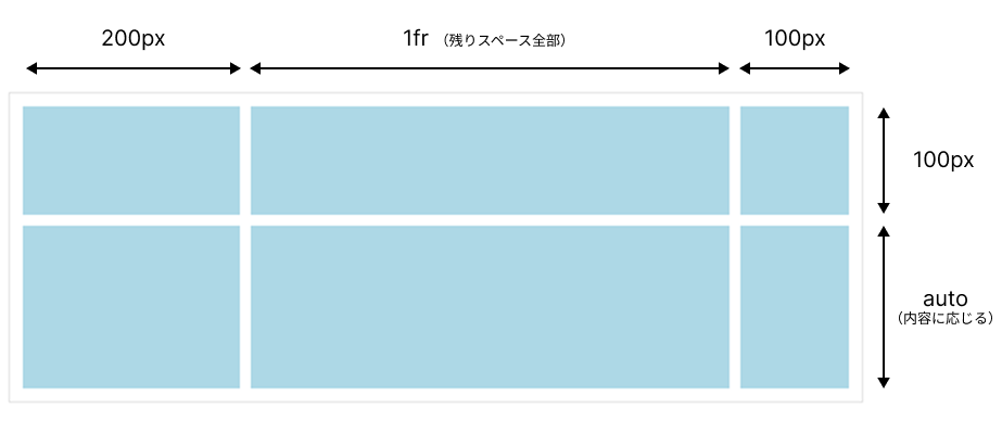
この2つは、列や行のサイズを定義するプロパティです。言い換えれば、各アイテムが入る『枠』の大きさを設定するものです。
.container {
  display: grid;
  grid-template-columns: 200px 1fr 100px;
  grid-template-rows: 100px auto;
}
-
grid-template-columns: 横方向(列)のサイズ → 200px, 1fr, 100px -
grid-template-rows: 縦方向(行)のサイズ → 100px, auto(内容に応じる)
イメージ
repeat(auto-fit, minmax(...)) でレスポンシブ対応
この書き方は、折り返しや内容に応じて伸縮するレスポンシブな列レイアウトを作る際に非常によく使われる構文です。
.container {
  display: grid;
  grid-template-columns: repeat(auto-fit, minmax(100px, 1fr));
  gap: 16px;
}
それぞれの意味
-
repeat(...): ()内の列のパターンを繰り返す。(繰り返す回数,繰り返す幅の指定) -
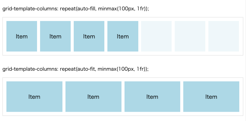
auto-fit: 可能な限り、グリッド・アイテムの幅が変わってスペースが埋められます -
minmax(100px, 1fr): 最小100px、残りのスペースを均等分配される(※後述するauto-fillではまた解釈が異なってきます)
こうなります
- 画面が広ければ → アイテムが横に並ぶ
- 狭くなると → minmaxの最小幅以下になってしまう場合、自動的に折り返されて表示
auto-fit と auto-fill の違い
auto-fitだけで無く、auto-fillという値も存在します。
-
auto-fit: 親要素にスペースが余る場合、可能な限りグリッドアイテムの幅が変化し、スペースが埋められます。 -
auto-fill: 親要素にスペースが余る場合、空のグリッドセルが作られます。
イメージ
grid-template-areas で「名前付きレイアウト」
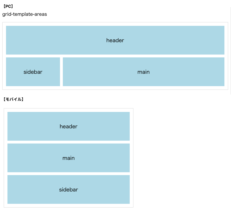
grid-area を使うと、名前を付けたエリアにアイテムを配置できます。
直感的でわかりやすく、使いどころとしては、モバイルでレイアウトの順番が入れ替わるときなどに役立ちます。
ステップ①:親に名前付きグリッドを定義
.container {
  display: grid;
  grid-template-areas:
    "header header"
    "sidebar main";
  grid-template-columns: 1fr 3fr;
  grid-template-rows: auto 1fr;
  gap: 16px;
}

/* モバイルでは縦一列で header → main → sidebar という順番に */
@media screen and (max-width: 768px) {
  .container {
    grid-template-areas:
      "header"
      "main"
      "sidebar";
    grid-template-columns: 1fr;
  }
}
ステップ②:子要素に grid-area を指定
.header {
  grid-area: header;
}
.sidebar {
  grid-area: sidebar;
}
.main {
  grid-area: main;
}
イメージ
まとめ
| プロパティ | 役割 |
|---|---|
grid-template-columns / grid-template-rows |
コンテナの列・行のサイズを指定 |
repeat(auto-fit, minmax(...)) |
レスポンシブ対応の列定義 |
grid-area |
名前付きのレイアウト領域 |
CSS Gridを使えば、行や列の位置指定が柔軟で、簡単にレイアウトやレスポンシブ対応が可能です。
今回はよく使われる上記のプロパティや記法に焦点を当てて解説しました。まずはこうした実践でよく使われる基本パターンから慣れていくことが、Gridを理解する第一歩となります!