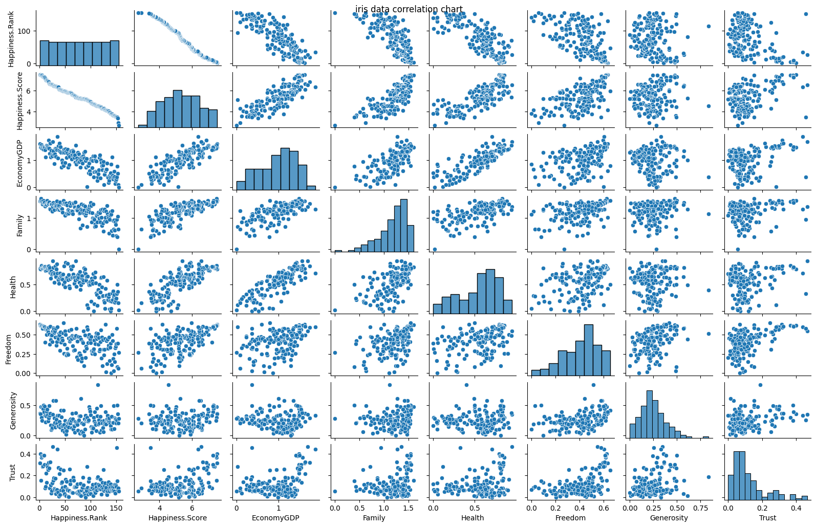
相関の可視化
Seabornのpairplotを使う。
デフォルトでは、Axesのグリッドを作成し、入力データの数値をx軸・y軸それぞれに配置し散布図を作成する。対角グリッドは各列のデータの周辺分布を示す。
下記コードの入力csvファイルを変更するだけで、そのcsvファイルに含まれるすべての数値データの相関グラフを作成してくれる。
import matplotlib as mpl
import matplotlib.pyplot as plt
import numpy as np
import pandas as pd
import seaborn as sns

df = pd.read_csv('./WHR_2019.csv', sep=',')

pg = sns.pairplot(df, height=2)
pg.fig.suptitle("Happiness score for each country")
plt.tight_layout()
plt.show()
pg.savefig('pairplot_default.png')

pg = sns.pairplot(df, height=2, hue='Country or region')
pg.fig.suptitle("Happiness score for each country")
plt.show()
pg.savefig('pairplot_separate.png')

有意差の可視化
Matplotlibのboxplotを使う。
アヤメのデータを使用して、各数値データの箱ひげ図を描いた。入力ファイルを変更して、箱ひげ図を描くカラム名を指定すれば、そのデータの箱ひげ図を作成してくれる
#ステップ1. Matplotlib(可視化ライブラリ) とNumpy(数値計算ライブラリ)を読み込む
import matplotlib as mpl
import matplotlib.pyplot as plt
from matplotlib.ticker import (MultipleLocator, AutoMinorLocator)
import numpy as np
import pandas as pd
import datetime
import seaborn as sns

df = pd.read_csv('student-mat.csv', sep=',')
df = sns.load_dataset("iris")

print(df)
print(df.shape, '\n') #行、列の数
print(df.index, '\n') #行数
print(df.columns, '\n') #列の名前
print(df.dtypes, '\n') #データタイプ

y_para = 'sepal_length'

for x_para in df.columns.values:
    cols_to_plot = list(set(df[x_para].values))
    data, labels = [], []
    for column_name in cols_to_plot:
        data.append(df[df[x_para] == column_name][y_para].values)
        labels.append(column_name)

    fig, ax = plt.subplots(figsize=(1.6*len(cols_to_plot), 6))
    ax.boxplot(data, labels=labels, widths=0.5, patch_artist=True, showmeans=True, zorder=0, \
                boxprops=dict(facecolor='#1E90FF80', color='black', linewidth=1),\
                medianprops=dict(color='black', linewidth=1))

    ax.set_xticklabels(cols_to_plot)
    ax.set_title(x_para)
    ax.set_xlabel('Columns')
    ax.set_ylabel('Values')
    plt.show()
    fig.savefig("iris_boxplot_%s.png"%x_para)

まとめ
今回は、Seabornのpairplotを用いた相関グラフの作成とMatplotlibのboxplotを用いた箱ひげ図の作成を紹介した。