ボタンやグラフにアイコンをつけて
もっと可愛く(かっこよく?)、分かりやすくしたい!!
けど、shadcnのタグから画像属性は設定できない、、、
img属性がないぞ、どうする?
そんな時は、コンポーネントを展開して、特定の場所に画像タグを入れれば良い!!
"use client";
import { tBarChartConfig, tBarChartData } from "@/lib/TypeDeclarations";

// 懸垂の自己記録を取得できるなら、その合計回数、平均回数、目標達成率、前週比などを含められると良い?
import { BarChart, Bar, XAxis, YAxis, Cell, LabelList } from "recharts";
import {
  ChartContainer,
  ChartTooltip,
  ChartTooltipContent,
} from "@/components/ui/chart";
import { Card, CardContent } from "@/components/ui/card";

export default function BarGraph({
  barChartData,
  selectedUser,
}: {
  barChartData: tBarChartData[];
  selectedUser: string | undefined;
}) {
  const maxValue = Math.max(...barChartData.map((d) => d.counts));

  const login: boolean = barChartData?.[0]?.mine !== undefined;

  const myMaxValue = login ? Math.max(...barChartData.map((d) => d.mine || 0)) : 0;
  const dataNumber = barChartData.length;

  interface CustomImageLabelProps {
    x?: number;
    y?: number;
    width?: number;
    height?: number;
    value?: number;
  }
  const CustomImageLabel = ({
    x = 0,
    y = 0,
    width = 0,
    height = 0,
    value = 0
  }: CustomImageLabelProps) => {

    if (value !== maxValue || maxValue === 0 || dataNumber <= 1) return null;

    const imageSize = width * 2;

    return (
      <image
        x={x + width / 2 - imageSize / 2}
        y={y + height / 2 - imageSize / 2}
        width={imageSize}
        height={imageSize}
        href="choi_king.png"
      />
    );
  };

+  const CustomMyImageLabel = ({
+    x = 0,
+    y = 0,
+    width = 0,
+    height = 0,
+    value = 0
+  }: CustomImageLabelProps) => {
+
+    if (value !== myMaxValue || myMaxValue === 0 || dataNumber <= 1) return null;
+
+    const imageSize = width * 2;
+
+    return (
+      <image
+        x={x + width / 2 - imageSize / 2}
+        y={y + height / 2 - imageSize / 2}
+        width={imageSize}
+        height={imageSize}
+        href="choi_king.png"
+      />
+    );
+  };

  interface CustomTickProps {
    x?: number;
    y?: number;
    payload?: { value: string };
    index: number;
  }
  const CustomTick = ({
    x = 0,
    y = 0,
    payload = { value: "" },
    index,
  }: CustomTickProps ) => {
    // ラベルを回転させるためにg要素でラップし、transformを適用
    return (
      <g transform={`translate(${x},${y})`}>
        <text
          x={0}
          y={0}
          dy={12} // Y軸方向のオフセットを調整
          textAnchor="end" // 回転の基点をテキストの終端にする
          fontSize={14} // フォントサイズを少し小さくすると見やすくなります
          fontWeight={600}
          transform="rotate(-45)" // テキストを-45度回転
          style={{
            fill:
              barChartData[index].highlight
                ? "#ef4444"
                : "#000000",
          }}
        >
          {payload.value}
        </text>
      </g>
    );
  };

  const barChartConfig: tBarChartConfig = {
    counts: {
      color: "#facc15",
      label: selectedUser || " "
    },
    mine: {
      color: "#ef4444",
      label: "YOU"
    }
  };

  return (
    <Card className="w-full max-w-6xl mx-auto mt-6">
      <CardContent>
        <ChartContainer config={barChartConfig}>
          {/* marginを追加して、回転したラベルの表示領域を確保 */}
          <BarChart data={barChartData} margin={{ bottom: 20 }}>
            <XAxis
              dataKey="name"
              stroke="#8884d8"
              interval={0}
              tick={CustomTick}
              // 回転したラベルのために高さを指定
              height={50}
            />
            <YAxis tick={{ fill: "#000000", fontWeight: 600, fontSize: 18 }} />
            <ChartTooltip content={<ChartTooltipContent />} />
+            <Bar dataKey="counts">
+              {barChartData.map((entry, index) => (
+                <Cell key={`cell-${index}`} fill={ entry.highlight ? "#ef4444" : "var(--color-counts)" } />
+              ))}
+              <LabelList dataKey="counts" content={<CustomImageLabel />} />
+            </Bar>
            {login &&
              <Bar dataKey="mine">
                {barChartData.map((entry, index) => (
                  <Cell key={`cell-${index}`} fill={ entry.highlight ? "#ef4444" : "var(--color-mine)" } />
                ))}
                <LabelList dataKey="mine" content={<CustomMyImageLabel />} />
              </Bar>
            }
          </BarChart>
        </ChartContainer>
      </CardContent>
    </Card>
  );
}
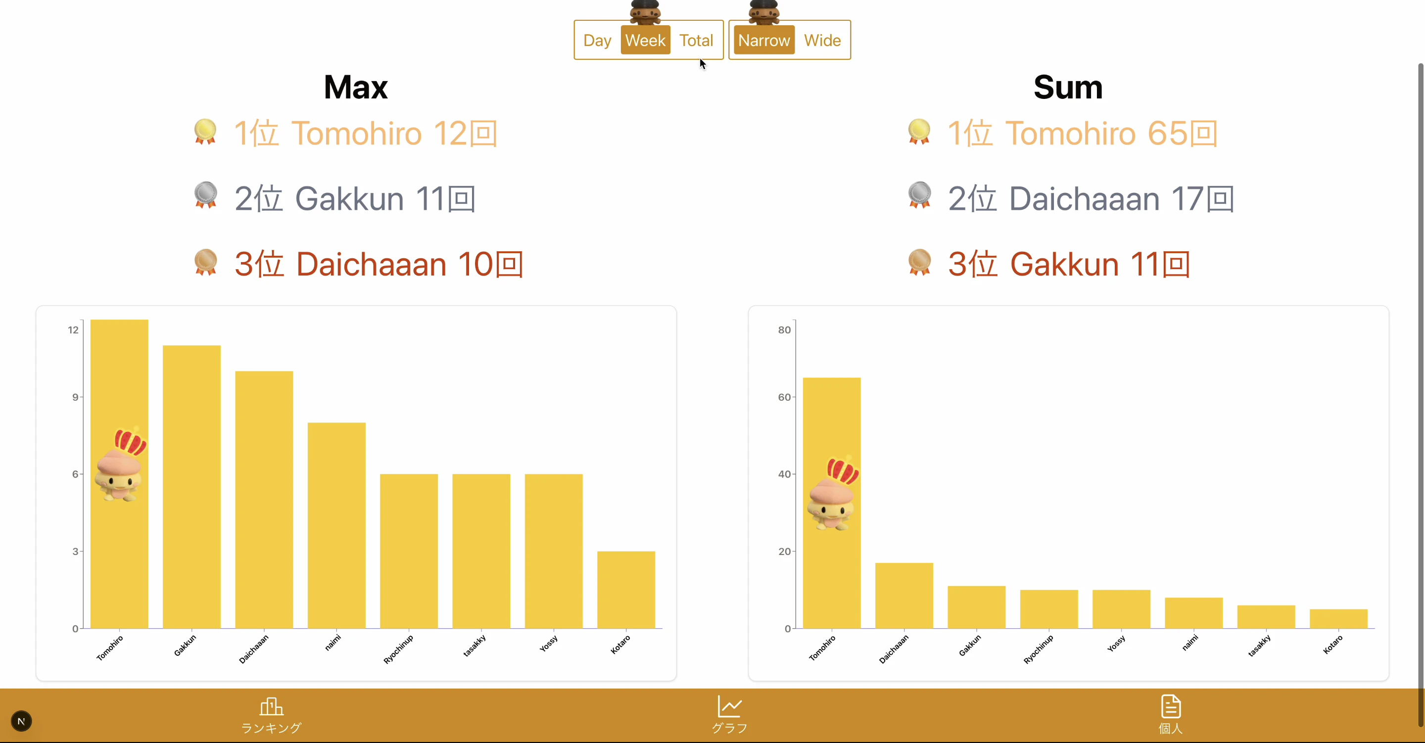
棒グラフなら、この部分!! 単純な画像タグだけでなく、上のように画像用のコンポーネントでも入れらる!!
↓↓ 結果!! ↓↓