import numpy as np
%matplotlib inline
import matplotlib.pyplot as plt
import xarray as xr
xarray の応用
xarray の少し進んだ使い方を紹介します。
xarray については、以前の投稿 をご覧ください。
Rolling
pandas.rollingに対応するものです。
多次元データあるの軸に沿った小区間に対して、同じ操作を繰り返し行うことができます。
特に、その小区間を1点ずつずらしながら操作を適用し、同じサイズのデータを返します。
データを重複しない小区間に区切って、その中で代表値を決める操作は、
この次に説明する binning です。
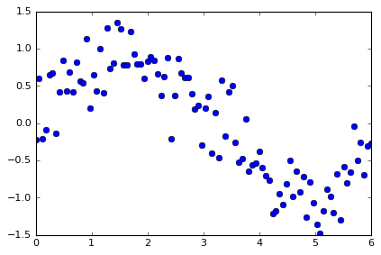
例データ
da = xr.DataArray(np.sin(np.linspace(0,6,100)) + np.random.randn(100)*0.3,
                  dims={'time'}, coords={'time':np.linspace(0,6,100)})
da
<xarray.DataArray (time: 100)>
array([-0.217099,  0.594632, -0.213687, -0.088451,  0.643075,  0.672311,
       -0.133941,  0.419469,  0.836265,  0.436087,  0.688019,  0.416498,
        0.81197 ,  0.567076,  0.536079,  1.135186,  0.202363,  0.643781,
        0.427754,  0.998932,  0.411504,  1.270951,  0.726597,  0.802427,
        1.354037,  1.265239,  0.782349,  0.78666 ,  1.231765,  0.931645,
        0.793739,  0.797864,  0.59434 ,  0.830584,  0.888593,  0.835981,
        0.662846,  0.372863,  0.629388,  0.875347, -0.206508,  0.374656,
        0.864203,  0.673541,  0.611431,  0.610227,  0.398388,  0.182321,
        0.238973, -0.300663,  0.202904,  0.36229 , -0.399834,  0.134846,
       -0.46481 ,  0.578797, -0.177458,  0.416176,  0.502337, -0.262874,
       -0.531168, -0.476578,  0.049585, -0.648642, -0.557033, -0.537415,
       -0.38051 , -0.600608, -0.709828, -0.767893, -1.211113, -1.175812,
       -0.948098, -1.091834, -0.814726, -0.499395, -0.98674 , -0.651322,
       -0.922065, -0.713906, -1.268239, -0.787697, -1.071392, -1.356153,
       -1.481535, -1.178269, -0.891799, -0.985956, -1.200543, -0.680796,
       -1.305116, -0.588287, -0.804333, -0.662258, -0.036607, -0.501065,
       -0.259611, -0.695071, -0.312524, -0.277099])
Coordinates:
  * time     (time) float64 0.0 0.06061 0.1212 0.1818 0.2424 0.303 0.3636 ...
plt.plot(da['time'], da, 'o')
[<matplotlib.lines.Line2D at 0x7f7a6f754048>]
rolling オブジェクトに対象とする軸と、移動平均のペアを指定します。
da_rolling = da.rolling(time=3).mean() # time軸に沿った方向に、3ポイントごとに移動平均をとる
da_rolling
<xarray.DataArray (time: 100)>
array([      nan,       nan,  0.054615,  0.097498,  0.113646,  0.408978,
        0.393815,  0.31928 ,  0.373931,  0.56394 ,  0.653457,  0.513534,
        0.638829,  0.598515,  0.638375,  0.746113,  0.624543,  0.660443,
        0.424633,  0.690156,  0.61273 ,  0.893796,  0.803017,  0.933325,
        0.96102 ,  1.140568,  1.133875,  0.944749,  0.933591,  0.983356,
        0.985716,  0.841082,  0.728648,  0.740929,  0.771172,  0.851719,
        0.795807,  0.623897,  0.555032,  0.625866,  0.432742,  0.347832,
        0.344117,  0.637467,  0.716392,  0.631733,  0.540015,  0.396979,
        0.273227,  0.04021 ,  0.047071,  0.088177,  0.05512 ,  0.032434,
       -0.243266,  0.082945, -0.021157,  0.272505,  0.247018,  0.218546,
       -0.097235, -0.42354 , -0.319387, -0.358545, -0.385363, -0.58103 ,
       -0.491653, -0.506178, -0.563649, -0.692776, -0.896278, -1.051606,
       -1.111675, -1.071915, -0.951553, -0.801985, -0.766954, -0.712486,
       -0.853376, -0.762431, -0.96807 , -0.92328 , -1.042442, -1.071747,
       -1.303026, -1.338652, -1.183868, -1.018675, -1.0261  , -0.955765,
       -1.062152, -0.858066, -0.899245, -0.684959, -0.501066, -0.399977,
       -0.265761, -0.485249, -0.422402, -0.428231])
Coordinates:
  * time     (time) float64 0.0 0.06061 0.1212 0.1818 0.2424 0.303 0.3636 ...
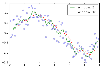
plt.plot(da['time'], da, 'o', alpha=0.3)
plt.plot(da['time'], da.rolling(time=5).mean(), '-', label='window: 5')
plt.plot(da['time'], da.rolling(time=10).mean(), '--', label='window: 10')
plt.legend()
<matplotlib.legend.Legend at 0x7f7a7180c908>
引数
pandasと同じように、rollingメソッドにより、Rollingクラスが返されます。
da.rolling(time=3)
DataArrayRolling [window->3,center->False,dim->time]
rollingオブジェクトを作るための引数は
- windows (辞書型)
上記のように、軸名をキーに、移動平均の点数を要素にして渡します。
(なお、現在は単一の軸に対するrollingにのみ対応しています。)
の他に、
- min_periods (整数, default : None)
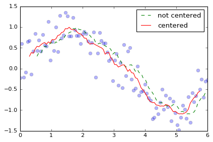
min_periodsを指定すると、それ以下の点数しかない区間の値はnanになります。 - center (論理値, default : False)
center を True にすると、計算値が窓の中心に入ります。
plt.plot(da['time'], da, 'o', alpha=0.3)
plt.plot(da['time'], da.rolling(time=10).mean(), '--', label='not centered')
plt.plot(da['time'], da.rolling(center=True, time=10).mean(), '-', label='centered')
plt.legend()
<matplotlib.legend.Legend at 0x7f7a6f69fb70>
メソッド
'argmax', 'argmin', 'max', 'min', 'mean', 'prod', 'sum', 'std', 'var', 'median' などの numpyメソッドに対応しています。
さらに。reduce(func, **kwargs) メソッドも用意されています。
例えば
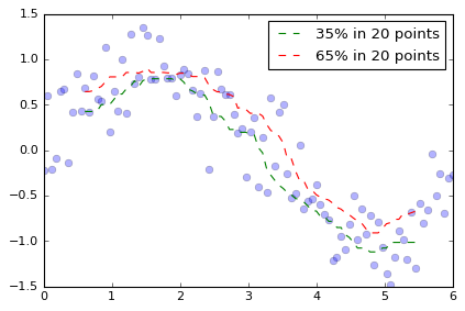
da_35percent = da.rolling(time=20, center=True).reduce(np.percentile, q=35)
da_65percent = da.rolling(time=20, center=True).reduce(np.percentile, q=65)
plt.plot(da['time'], da, 'o', alpha=0.3)
plt.plot(da['time'], da_35percent, '--', label='35% in 20 points')
plt.plot(da['time'], da_65percent, '--', label='65% in 20 points')
plt.legend()
<matplotlib.legend.Legend at 0x7f7a6f7a5a20>
のように、任意の関数オブジェクトを渡すことができます。
ただし、渡す関数オブジェクトは上記 numpy メソッドのように、
どの軸をreduceするか指定するaxisに対応している必要があります。
応用 ~数値的コンボリューション~
簡単な応用としては、コンボリューションが挙げられます。
$$
[f * g]i = \sum{n}^{N} f_{i-n} g_n
$$
ここで、$f_i$ はコンボリューションされるデータ
$g_n$ はサイズ $N$ のコンボリューションするデータです。
以下では、ウェーブレット的な関数を畳み込んでみます。
# functor to apply convolution
def conv(src, obj, axis=0):
"""
+ src: target data to be convoluted
+ obj: convoluting data
+ axis: which axis of src to convolute
"""
if src.shape[axis] == obj.shape[0]:
return np.sum(src*obj, axis=axis)
else:
return 0.0
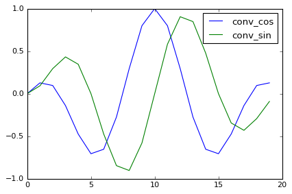
# convoluting data
n_window = 20
conv_cos = np.cos(2.0*np.pi * 2.0 * np.arange(n_window) / n_window) * np.sin(np.pi * np.arange(n_window) / n_window)
conv_sin = np.sin(2.0*np.pi * 2.0 * np.arange(n_window) / n_window) * np.sin(np.pi * np.arange(n_window) / n_window)
plt.plot(conv_cos, label='conv_cos')
plt.plot(conv_sin, label='conv_sin')
plt.legend(loc='best')
<matplotlib.legend.Legend at 0x7f7a6f585b00>
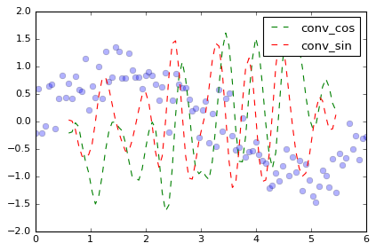
da_cos = da.rolling(time=20, center=True).reduce(conv, obj=conv_cos)
da_sin = da.rolling(time=20, center=True).reduce(conv, obj=conv_sin)
plt.plot(da['time'], da, 'o', alpha=0.3)
plt.plot(da['time'], da_cos, '--', label='conv_cos')
plt.plot(da['time'], da_sin, '--', label='conv_sin')
plt.legend()
<matplotlib.legend.Legend at 0x7f7a6f5c1978>
Dataset.rolling
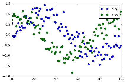
複数の xr.DataArray を集めた xr.Dataset も rolling に対応しています。
ds = xr.Dataset({'sin': ('time', np.sin(np.linspace(0,6,100)) + np.random.randn(100)*0.3),
                 'cos': ('time', np.cos(np.linspace(0,6,100)) + np.random.randn(100)*0.3)},
                coords={'time':np.linspace(0,6,100)})
ds
<xarray.Dataset>
Dimensions:  (time: 100)
Coordinates:
  * time     (time) float64 0.0 0.06061 0.1212 0.1818 0.2424 0.303 0.3636 ...
Data variables:
    sin      (time) float64 0.5826 -0.04678 -0.1069 -0.05271 0.08796 0.1871 ...
    cos      (time) float64 0.7281 0.9172 1.015 0.9138 0.4236 0.8481 0.8641 ...
plt.plot(ds['sin'], 'o', label='sin')
plt.plot(ds['cos'], 'o', label='cos')
plt.legend()
<matplotlib.legend.Legend at 0x7f7a6f4a6518>
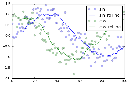
ds_mean = ds.rolling(time=10).mean()
plt.plot(ds['sin'], 'bo', label='sin', alpha=0.3)
plt.plot(ds_mean['sin'], '-b', label='sin_rolling')
plt.plot(ds['cos'], 'go', label='cos', alpha=0.3)
plt.plot(ds_mean['cos'], '-g', label='cos_rolling')
plt.legend()
<matplotlib.legend.Legend at 0x7f7a6f4b9080>
binning
rolling に似た機能として binning が挙げられます。
これは group_bins 操作で実現できます。
pandas.groupby_binsに対応するものです。
多次元データあるの軸に沿った重複しない小区間に対して、同じ操作を繰り返し行うことができます。
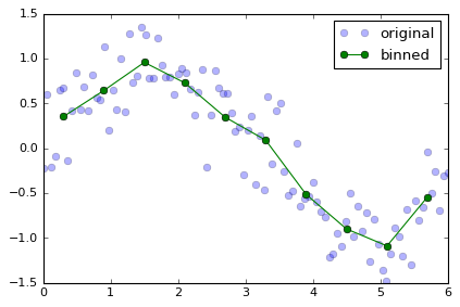
上記のdaの時間方向に10等分してその中の平均値を求めるには、
group引数に軸のラベルを、bins引数に等分の数を渡します。
最後にmeanメソッドを実行することで、新しいxr.DataArrayが作られます。
da_bin_mean = da.groupby_bins(group='time', bins=10).mean()
da_bin_mean
<xarray.DataArray (time_bins: 10)>
array([ 0.294866,  0.642766,  0.956317,  0.728154,  0.344657,  0.089237,
       -0.516009, -0.901501, -1.090238, -0.544197])
Coordinates:
  * time_bins  (time_bins) object '(-0.006, 0.6]' '(0.6, 1.2]' '(1.2, 1.8]' ...
新しく作られた DataArray は、中身が平均値、軸が少区間の両端の値に相当する点が格納されています。
実際の用途では、指定した小区間に対する操作がしたいことがあります。
その場合は、小区間の区切り点をbins引数に与えます。さらに、
bins = np.linspace(0,6,11) # 10個に区切る場合、両端を含めた小区間の区切り点である11個のアレイを渡す。
bin_labels = bins[:-1] + 0.3 # 10点に対応する軸を用意する。
da_bin_mean = da.groupby_bins(group='time', bins=bins, labels=bin_labels).mean()
da_bin_mean
<xarray.DataArray (time_bins: 10)>
array([ 0.351751,  0.642766,  0.956317,  0.728154,  0.344657,  0.089237,
       -0.516009, -0.901501, -1.090238, -0.544197])
Coordinates:
  * time_bins  (time_bins) float64 0.3 0.9 1.5 2.1 2.7 3.3 3.9 4.5 5.1 5.7
plt.plot(da['time'], da, 'o', label='original', alpha=0.3)
plt.plot(da_bin_mean['time_bins'], da_bin_mean, '-o', label='binned')
plt.legend()
<matplotlib.legend.Legend at 0x7f7a6f5a9748>