
pandas + seaborn の定番分析を Haskell でやってみる
「Haskell でデータ分析」と聞くと、行列を自分で組んで、プロットは R か Python に投げて……という
面倒な絵を思い浮かべる方が多いと思います。
そこで、Python でやっている作業を Haskell でもそのままできるように、統計ライブラリと
プロットライブラリを書きました。この記事では、その一番わかりやすいところ — CSV を
読んで、要約統計を見て、散布図を描いて、回帰を当てて、回帰直線を重ねる — を pandas +
seaborn + statsmodels と並べて書いてみます。
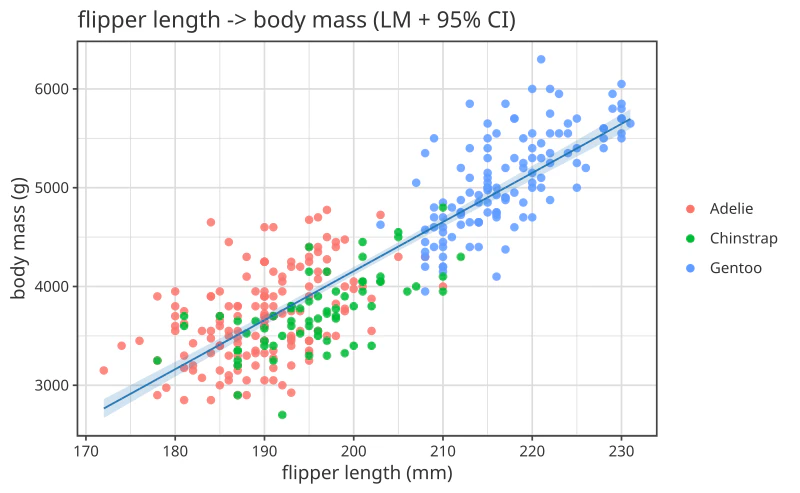
最終的にこうなります。
使うもの
| 役割 | ライブラリ |
|---|---|
| データフレーム (読み込み・整形・要約統計) |
dataframe — Michael Chavinda 氏による Hackage の DataFrame 実装 |
| 統計モデル (回帰など) | hanalyze — 自作の統計ツールキット。回帰・ベイズ・DOE・機械学習まで入っています (GitHub) |
| 作図 | hgg (Haskell Grammar of Graphics) — 同じく自作のプロットライブラリ。Grammar of Graphics の考え方 (レイヤを重ねて図を組む) は ggplot2 と同じですが、文法は Haskell 側に寄せた独自のものです (GitHub) |
データフレームは車輪の再発明をせず、既にある dataframe に乗ります。書いたのは
「統計モデル」と「作図」の 2 つだけで、データの取り回しは dataframe にそのまま任せます。
データは seaborn でおなじみの Palmer penguins (344 行)。species / island /
bill_length_mm / bill_depth_mm / flipper_length_mm / body_mass_g / sex / year の
8 列です。
動かすには
3 つとも Hackage にあるので、cabal init したプロジェクトの .cabal に依存を足すだけです。
build-depends:  base, vector, hmatrix, directory, filepath
              , dataframe      ^>= 2.3
              , hanalyze       ^>= 0.2   -- 統計モデル
              , hanalyze-plot  ^>= 0.2   -- fit 済みモデル -> 図 (|-> / toPlot)
              , hgg-core       ^>= 0.2   -- 作図 (Easy API)
              , hgg-frame      ^>= 0.2   -- df |>> spec (列名で図に束ねる)
              , hgg-svg        ^>= 0.2   -- SVG で保存
              , hgg-dataframe  ^>= 0.2   -- DataFrame を図に渡す instance
hanalyze とhgg は、用途ごとに分かれた小さいパッケージの束です。この記事で使うのは上の 6 つだけですが、PDF / PNG / 3D で出したければ hgg-pdf / hgg-rasterific / hgg-3d、ベイズや実験計画法まで使うなら hanalyze が依存として引いてくるので追加は要りません。
本文のコードは GHC 9.6.7 + 上記の構成で実際にビルド・実行したものです。
1. CSV を読む
Python:
import pandas as pd

raw = pd.read_csv("data/penguins.csv")
Haskell:
import qualified DataFrame as D

raw <- D.readCsv "data/penguins.csv"
読み込みは dataframe の標準機能をそのまま使います。型は推論され、NA は欠測として読まれます。
2. 欠測行を落とす
penguins には欠測があります。pandas は集計や回帰のときに黙って落としてくれますが、
どの行が落ちたのか分からないまま進むのは危ないので、両方とも明示的に落とします。
Python:
df = raw.dropna(subset=["flipper_length_mm", "body_mass_g", "species"])
Haskell:
let df = foldr D.filterJust raw ["flipper_length_mm", "body_mass_g", "species"]
D.filterJust は指定列に欠測のある行を落とす関数で、dropna(subset=) に当たります。
全列版の D.filterAllJust (= dropna()) もありますが、それだと今回使わない sex 列の
欠測まで巻き込んでしまうので、どちらも使う 3 列だけに掛けます。これで両方とも 342 行です。
3. 中身を見る
Python:
print(df["body_mass_g"].describe())
count     342.000000
mean     4201.754386
std       801.954536
min      2700.000000
50%      4050.000000
max      6300.000000
Haskell — dataframe の summarize が同じ仕事をします。
print . D.summarize . D.select ["flipper_length_mm", "body_mass_g"] $ df
-------------------------------------------
Statistic | flipper_length_mm | body_mass_g
----------|-------------------|------------
  Text    |      Double       |   Double
----------|-------------------|------------
Count     | 342.0             | 342.0
Mean      | 200.92            | 4201.75
Minimum   | 172.0             | 2700.0
25%       | 190.0             | 3550.0
Median    | 197.0             | 4050.0
75%       | 213.0             | 4750.0
Max       | 231.0             | 6300.0
StdDev    | 14.06             | 801.95
IQR       | 23.0              | 1200.0
Skewness  | 0.34              | 0.47
pandas の describe() とほぼ同じ内容で、IQR と歪度が付いてきます。StdDev は
pandas の std と同じ標本標準偏差 (n−1) で、値も一致しています。全列まとめて見たいときは
D.select を外して D.summarize df とすれば数値列が全部出ます。
4. 散布図を描く
Python:
import seaborn as sns

sns.scatterplot(data=df, x="flipper_length_mm", y="body_mass_g", hue="species")
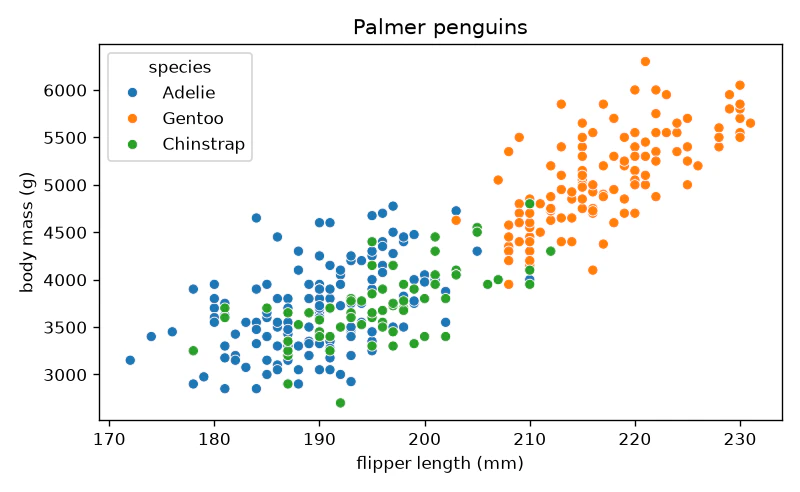
Haskell — 図そのもの (散布図と軸ラベル) は後でも使うので、先に束ねておきます。
import Graphics.Hgg.Easy
import Graphics.Hgg.Frame     ((|>>))
import Graphics.Hgg.DataFrame ()          -- instance PlotData DataFrame
import Graphics.Hgg.Backend.SVG (saveSVGBound)

let scatterBase :: VisualSpec
    scatterBase =
         layer (scatter "flipper_length_mm" "body_mass_g"
                  <> colorBy "species" <> size 5 <> alpha 0.85)
      <> xLabel "flipper length (mm)"
      <> yLabel "body mass (g)"

saveSVGBound "01-scatter.svg" $
  df |>> scatterBase <> title "Palmer penguins"
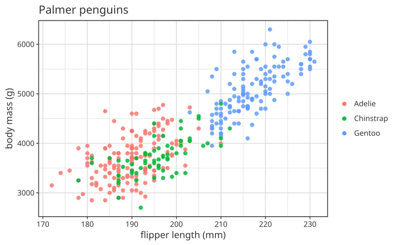
凡例の位置や既定色こそ違いますが、同じ図です。読み方は 2 つだけです。
-
df |>> 図— データフレームを図に束ねる。図の側には列名しか書きません (scatter "x列" "y列")。
実データは束ねるときに解決されます。seaborn のdata=/x=/y=とちょうど同じ役割分担です。 -
<>で部品を足す — mark、色分け、点の大きさ、軸ラベル、タイトル。ggplot2 の+に当たる
位置ですが、+の独自定義ではなく Haskell 標準の Monoid の<>をそのまま使います。
|>> は <> より結合が弱い (infixl 1 対 infixr 6) ので、括弧は要りません。
5. 回帰を当てる
Python:
import statsmodels.formula.api as smf

fit = smf.ols("body_mass_g ~ flipper_length_mm", data=df).fit()
Haskell — こちらも同じデータフレームに列名で当てます。
import Hanalyze.Plot ((|->), lm)

let fit = df |-> lm "flipper_length_mm" "body_mass_g"
|-> が「データフレームにモデルを当てる」動詞です。R の lm(y ~ x, data = df) に当たります。
lm を glm / robust / quantile / spline / gam などに差し替えれば、そのまま別のモデルに
なります。
結果を並べるとこうなります。
| Python (statsmodels) | Haskell (hanalyze) | |
|---|---|---|
| intercept | -5780.831358 | -5780.831358077073 |
| slope | 49.685566 | 49.685566406100094 |
| R² | 0.758993 | 0.758992519357118 |
| n | 342 | 342 |
表示桁の差だけで、値は一致しています。
6. 回帰直線を重ねる
Python:
sns.scatterplot(data=df, x="flipper_length_mm", y="body_mass_g", hue="species")
sns.regplot(data=df, x="flipper_length_mm", y="body_mass_g",
            scatter=False, color="C0")
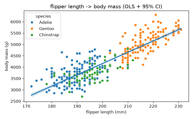
Haskell — 図は <> で足していくだけなので、さっき束ねた scatterBase に toPlot fit を
1 つ足すだけです (VisualSpec は Monoid なので、こうして部品として持ち回せます)。
saveSVGBound "02-lm.svg" $
  df |>> scatterBase <> toPlot fit
      <> title "flipper length -> body mass (LM + 95% CI)"
toPlot は「fit 済みモデルを図の部品に変える」関数です。帯 (95% 信頼区間) は統計側が計算した
値で、作図ライブラリが目分量で描いているわけではありません。lm を GLM や GAM に替えれば、
その分布・その平滑化に応じた帯がそのまま出ます。
7. 保存する
saveSVGBound は SVG ですが、backend を差し替えれば同じ図が PDF・PNG・ブラウザ (WebGL) にも
出ます。図の記述 (VisualSpec) は backend に依存しません。
まとめ
やったことを並べると、対応はほぼ 1 対 1 でした。
| やること | Python | Haskell |
|---|---|---|
| CSV を読む | pd.read_csv(path) |
D.readCsv path |
| 欠測を落とす | df.dropna(subset=cols) |
foldr D.filterJust df cols |
| 要約統計 | df.describe() |
D.summarize df |
| 散布図 | sns.scatterplot(data=, x=, y=, hue=) |
df |>> layer (scatter "x" "y" <> colorBy "g") |
| 回帰 | smf.ols("y ~ x", data=df).fit() |
df |-> lm "x" "y" |
| 回帰直線を重ねる | sns.regplot(...) |
<> toPlot fit |
覚えることは実質 3 つです。
-
df |>> 図でデータフレームを図に束ねる (図には列名だけ書く) -
df |-> モデルでデータフレームにモデルを当てる -
<>で部品を足す (図もモデルの図も同じ足し方)
今回は一番やさしいところだけをなぞりました。hanalyze には GLM・GAM・ロバスト回帰・分位点回帰・
罰則付き回帰・ガウス過程・ランダムフォレスト・時系列・生存分析・因果探索・実験計画法・ベイズ
階層モデル (NUTS) まで入っていて、そのどれもが |-> で当てて toPlot で描けるという同じ形に
なっています。そのあたりはまた別の記事で。
おまけ: 自作ライブラリが無かった頃はどう書いたか
dataframe/hanalyze/hgg が無い状態で、同じことを既存の Hackage パッケージだけで
書くとどうなるか— データの読み込み は cassava、統計はstatistics、作図はChart (+ diagrams backend) で書いてみました。
結果の数値は 3 者とも一致します。
| 指標 | Python | Haskell (本文) | Haskell (legacy) |
|---|---|---|---|
| n | 342 | 342 | 342 |
| mean (body_mass_g) | 4201.754386 | 4201.75 | 4201.75 |
| StdDev | 801.954536 | 801.95 | 801.95 |
| intercept | -5780.831358 | -5780.831358077073 | -5780.831358077166 |
| slope | 49.685566 | 49.685566406100094 | 49.68556640610061 |
| R² | 0.758993 | 0.758992519357118 | 0.7589925193571176 |
図もちゃんと出ます。
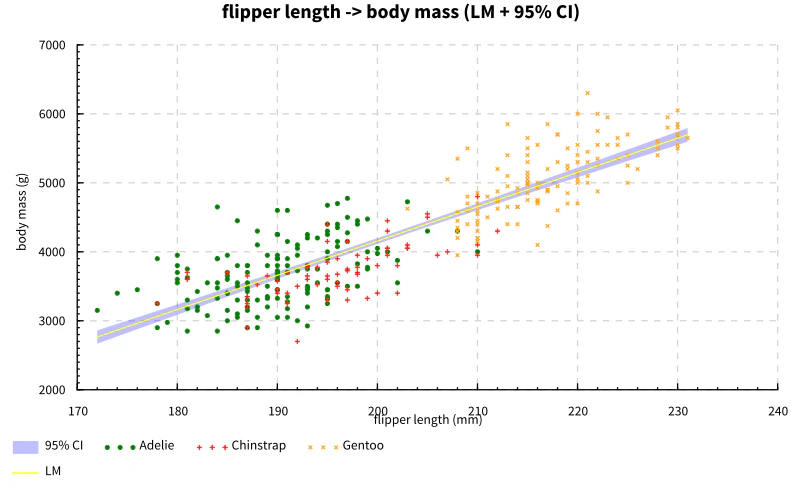
違うのは書く量です。実質行数で 45 行 → 約 110 行。増えた分の中身はこうでした。
-
CSV の行型と
"NA"判定を自分で書く —data Row+FromNamedRecordinstance +
naDoubleヘルパ。CSV の欄は全部文字列なので、どれを欠測とみなすかを自分で決めます -
要約統計の表を自分で組む —
mean/stdDev/quantileを 1 つずつ呼び、桁を
揃えて並べる。summarize相当は無いので表の形も自分持ちです -
95% 信頼区間の帯を自分で計算する —
olsRegressが返すのは (係数ベクトル, R²) の
タプルだけなので、t 分布の分位点を引いて標準誤差の式を書きます
tcrit  = quantile (studentT (fromIntegral n - 2)) 0.975
seAt x = sigma * sqrt (1 / fromIntegral n + (x - xbar) ** 2 / sxx)
band   = [ (x, (yhat x - tcrit * seAt x, yhat x + tcrit * seAt x)) | x <- gridX ]
-
種別の色分けを自分で分岐する —
colorBy "species"は無いので、種ごとにリストを
分けて系列を 3 本作ります
ついでに罠も踏みました。olsRegress の返す係数は [slope, intercept] の順で、
intercept が末尾です (coefs U.! 1 が切片)。
図の側も、凡例が図の下に溢れる・点の形が系列ごとに勝手に変わる・帯と点と線の重ね順を
自分で管理する、といった調整が要りました。
「できない」わけではなく、やることが全部自分持ちになるというのがこの比較の答えです。
付録: コード全文
Haskell (本文) — Penguins.hs
-- | 記事 I-1 「pandas + seaborn でやる定番分析を Haskell でやってみる」の
--   コード・図・出力を実際に生成する exe。
--
--   記事本文に載せるコードはすべてこのファイルから引用する (想像で書いたコードは
--   載せない)。図は scripts/gen-figures.sh 1 本で再生成できる状態を保つ
--   (umbrella CLAUDE.md の図規律)。
--
--   使い方 (このディレクトリから):
--     cabal run article-penguins -- ../figures
module Main (main) where

import           System.Environment      (getArgs)
import           System.Directory        (createDirectoryIfMissing)
import           System.FilePath         ((</>))
import qualified Numeric.LinearAlgebra   as LA

-- Hackage dataframe (読み込み・整形・要約は dataframe の標準機能をそのまま使う)
import qualified DataFrame                         as D

-- hanalyze (hanalyze)
import           Hanalyze.Model.Core        (coefficientsV, fittedList, rSquared1)
import           Hanalyze.Model.Wrappers    (lmResult)
import           Hanalyze.Plot              ((|->), toPlot, lm)

-- hgg (hgg)
import           Graphics.Hgg.Easy
import           Graphics.Hgg.Frame                ((|>>))
import           Graphics.Hgg.DataFrame            ()   -- instance PlotData DataFrame
import           Graphics.Hgg.Backend.SVG          (saveSVGBound)

-- | 引数: [出力ディレクトリ] [CSV パス]。既定はこのディレクトリからの相対。
main :: IO ()
main = do
  args <- getArgs
  let outDir  = case args of (d:_)     -> d; _ -> "../figures"
      csvPath = case args of (_:c:_)   -> c; _ -> "data/penguins.csv"
  createDirectoryIfMissing True outDir

  -- 1. CSV を読む (pandas: pd.read_csv)
  raw <- D.readCsv csvPath

  -- 2. 欠測行を落とす (pandas: df.dropna(subset=[...]))
  --    filterAllJust だと sex 等 無関係な列の NA まで巻き込むので、使う列だけに掛ける。
  let df = foldr D.filterJust raw ["flipper_length_mm", "body_mass_g", "species"]

  -- 3. 中身を見る (pandas: df.describe())
  --    dataframe の summarize が数値列ごとに記述統計を出す。
  putStrLn "== summarize =="
  print . D.summarize . D.select ["flipper_length_mm", "body_mass_g"] $ df

  -- 4. 散布図 (seaborn: sns.scatterplot(hue="species"))
  --    DataFrame をそのまま |>> に渡し、列名で描く。
  --    散布図と軸ラベルは 2 枚目でも使うので束ねておく (VisualSpec は Monoid)。
  let scatterBase :: VisualSpec
      scatterBase =
           layer (scatter "flipper_length_mm" "body_mass_g"
                    <> colorBy "species" <> size 5 <> alpha 0.85)
        <> xLabel "flipper length (mm)"
        <> yLabel "body mass (g)"

  saveSVGBound (outDir </> "01-scatter.svg") $
    df |>> scatterBase <> title "Palmer penguins"

  -- 5. 回帰を当てる (statsmodels: smf.ols(...).fit())
  --    fit も同じ DataFrame から列名で行う。
  let fit  = df |-> lm "flipper_length_mm" "body_mass_g"
      res  = lmResult fit
  putStrLn "== LM =="
  case LA.toList $ coefficientsV res of
    (b0:b1:_) -> do
      putStrLn $ "  intercept = " ++ show b0
      putStrLn $ "  slope     = " ++ show b1
    _ -> putStrLn "  (係数が取れませんでした)"
  putStrLn $ "  r2        = " ++ show (rSquared1 res)
  putStrLn $ "  n         = " ++ show (length $ fittedList res)

  -- 6. 回帰直線を重ねる (seaborn: scatterplot + regplot)
  saveSVGBound (outDir </> "02-lm.svg") $
    df |>> scatterBase <> toPlot fit
        <> title "flipper length -> body mass (LM + 95% CI)"

  putStrLn $ "図を書き出しました: " ++ outDir
Python (対比用) — penguins.py
"""記事 I-1 の Python 側 (pandas + seaborn + statsmodels) 参照実装。

記事本文に載せる Python コードはこのファイルから引用する (想像で書いたコードは
載せない)。Haskell 側 (Penguins.hs) と同じ手順・同じ列を扱い、出力が一致することを
確かめるために実際に走らせる。

引数は Haskell 側 (Penguins.hs) と同じ: [出力ディレクトリ] [CSV パス]。
既定値もこのディレクトリからの相対で揃えてある。

使い方 (このディレクトリから):
    ../../../../aelysce-analyze/bench/venv/bin/python penguins.py ../figures
"""

import sys
import pathlib

import pandas as pd
import seaborn as sns
import matplotlib
matplotlib.use("Agg")
import matplotlib.pyplot as plt
import statsmodels.formula.api as smf

out_dir = pathlib.Path(sys.argv[1] if len(sys.argv) > 1 else "../figures")
csv_path = sys.argv[2] if len(sys.argv) > 2 else "data/penguins.csv"
out_dir.mkdir(parents=True, exist_ok=True)

# 1. CSV を読む
raw = pd.read_csv(csv_path)

# 2. 欠測行を落とす (Haskell 側の foldr D.filterJust と同じ 3 列を対象にする)
df = raw.dropna(subset=["flipper_length_mm", "body_mass_g", "species"])

# 3. 中身を見る
print("== body_mass_g ==")
print(df["body_mass_g"].describe())
print("== flipper_length_mm ==")
print(df["flipper_length_mm"].describe())

# 4. 散布図 (種で色分け)
plt.figure(figsize=(6.5, 4))
sns.scatterplot(data=df, x="flipper_length_mm", y="body_mass_g", hue="species")
plt.title("Palmer penguins")
plt.xlabel("flipper length (mm)")
plt.ylabel("body mass (g)")
plt.tight_layout()
plt.savefig(out_dir / "py-01-scatter.png", dpi=800 / 6.5)  # 幅 800px (figsize 6.5 inch)
plt.close()

# 5. 回帰を当てる
fit = smf.ols("body_mass_g ~ flipper_length_mm", data=df).fit()
print("== OLS ==")
print(f"  intercept = {fit.params['Intercept']:.6f}")
print(f"  slope     = {fit.params['flipper_length_mm']:.6f}")
print(f"  r2        = {fit.rsquared:.6f}")
print(f"  n         = {int(fit.nobs)}")

# 6. 回帰直線つき散布図
#    Haskell 側 (scatterBase <> toPlot fit) と対等にするため、散布図は種で色分けし、
#    その上に全体の回帰直線 + 95% CI を重ねる (regplot の散布は描かせない)。
plt.figure(figsize=(6.5, 4))
sns.scatterplot(data=df, x="flipper_length_mm", y="body_mass_g", hue="species")
sns.regplot(data=df, x="flipper_length_mm", y="body_mass_g",
            scatter=False, color="C0")
plt.title("flipper length -> body mass (OLS + 95% CI)")
plt.xlabel("flipper length (mm)")
plt.ylabel("body mass (g)")
plt.tight_layout()
plt.savefig(out_dir / "py-02-lm.png", dpi=800 / 6.5)  # 幅 800px (figsize 6.5 inch)
plt.close()

print(f"図を書き出しました: {out_dir}")
Haskell (legacy: cassava + statistics + Chart) — legacy/Legacy.hs
{-# LANGUAGE OverloadedStrings #-}
-- | 記事 I-1 付録 — dataframe / hgg / hanalyze が「無かった頃」の同等実装。
--
--   CSV    = cassava
--   統計   = statistics (Statistics.Sample / Statistics.Quantile / Statistics.Regression)
--   作図   = Chart + Chart-diagrams backend
--
--   本体 (Penguins.hs) と同じ数値・同じ図を出す対照実装です。自作ライブラリを
--   一切使わないので、Hackage の既存パッケージだけで閉じています。
--
--   引数は本体と同じ: [出力ディレクトリ] [CSV パス]。
--
--   使い方 (このディレクトリから):
--     bash ../scripts/fetch-data.sh                        -- データが無ければ先に取得
--     cabal run article-penguins-legacy -- figures ../data/penguins.csv
module Main (main) where

import           System.Environment              (getArgs)
import           System.Directory                (createDirectoryIfMissing)
import           System.FilePath                 ((</>))
import           Data.Maybe                      (mapMaybe)
import           Data.List                       (nub, sort)
import qualified Data.ByteString.Lazy            as BL
import           Data.Text                       (Text)
import qualified Data.Text                       as T
import qualified Data.Vector                     as V
import qualified Data.Vector.Unboxed             as U
import           Text.Read                       (readMaybe)

import           Data.Csv                        (FromNamedRecord (..), (.:), decodeByName)

import qualified Statistics.Sample               as S
import qualified Statistics.Quantile             as Q
import           Statistics.Regression           (olsRegress)
import           Statistics.Distribution         (quantile)
import           Statistics.Distribution.StudentT (studentT)

import           Graphics.Rendering.Chart.Easy
import           Graphics.Rendering.Chart.Backend.Diagrams (toFile, FileOptions (..), FileFormat (SVG), loadSansSerifFonts)

-- ===========================================================================
-- 1. CSV を読む — 行の型を自分で定義し、"NA" を自分で Maybe にする
-- ===========================================================================

data Row = Row
  { rSpecies :: !Text
  , rFlipper :: !(Maybe Double)
  , rMass    :: !(Maybe Double)
  }

instance FromNamedRecord Row where
  parseNamedRecord m =
    Row <$> m .: "species"
        <*> (naDouble <$> m .: "flipper_length_mm")
        <*> (naDouble <$> m .: "body_mass_g")

-- | "NA" や空欄を欠測として扱う (CSV は全部文字列なので自分で判断する)。
naDouble :: Text -> Maybe Double
naDouble t
  | T.null s || s == "NA" || s == "NaN" = Nothing
  | otherwise                           = readMaybe (T.unpack s)
  where s = T.strip t

-- ===========================================================================

main :: IO ()
main = do
  args <- getArgs
  let outDir  = case args of (d:_)   -> d; _ -> "../figures-legacy"
      csvPath = case args of (_:c:_) -> c; _ -> "../code/data/penguins.csv"
  createDirectoryIfMissing True outDir

  -- 1. CSV を読む
  bs <- BL.readFile csvPath
  rows <- case decodeByName bs of
            Left err        -> error ("CSV の読み込みに失敗: " ++ err)
            Right (_, rs)   -> pure (V.toList rs :: [Row])

  -- 2. 欠測行を落とす — 3 列すべてが揃っている行だけ残す
  let complete = mapMaybe keep rows
      keep r = case (rFlipper r, rMass r) of
                 (Just x, Just y) -> Just (rSpecies r, x, y)
                 _                -> Nothing
      xs = U.fromList [ x | (_, x, _) <- complete ]
      ys = U.fromList [ y | (_, _, y) <- complete ]

  -- 3. 中身を見る — 統計量を 1 つずつ呼んで自分で並べる
  putStrLn "== summarize (自前) =="
  putStrLn "Statistic | flipper_length_mm | body_mass_g"
  mapM_ (putStrLn . statLine xs ys)
    [ ("Count",    \v -> fromIntegral (U.length v))
    , ("Mean",     S.mean)
    , ("Minimum",  U.minimum)
    , ("25%",      Q.quantile Q.s 1 4)
    , ("Median",   Q.quantile Q.s 2 4)
    , ("75%",      Q.quantile Q.s 3 4)
    , ("Max",      U.maximum)
    , ("StdDev",   S.stdDev)
    , ("IQR",      \v -> Q.quantile Q.s 3 4 v - Q.quantile Q.s 1 4 v)
    , ("Skewness", S.skewness)
    ]

  -- 4. 回帰を当てる — 戻り値は (係数ベクトル, R²) のタプルだけ
  --    ★係数の並びは [slope, intercept] (intercept が末尾)
  let (coefs, r2) = olsRegress [xs] ys
      slope     = coefs U.! 0
      intercept = coefs U.! 1
      n         = U.length xs
  putStrLn "== LM =="
  putStrLn $ "  intercept = " ++ show intercept
  putStrLn $ "  slope     = " ++ show slope
  putStrLn $ "  r2        = " ++ show r2
  putStrLn $ "  n         = " ++ show n

  -- 5. 95% 信頼区間の帯を自分で計算する
  --    ŷ ± t(0.975, n-2) · s · sqrt(1/n + (x-x̄)²/Sxx)
  let xbar = S.mean xs
      sxx  = U.sum (U.map (\x -> (x - xbar) ** 2) xs)
      yhat x = intercept + slope * x
      rss  = U.sum (U.zipWith (\x y -> (y - yhat x) ** 2) xs ys)
      sigma = sqrt (rss / fromIntegral (n - 2))
      tcrit = quantile (studentT (fromIntegral n - 2)) 0.975
      seAt x = sigma * sqrt (1 / fromIntegral n + (x - xbar) ** 2 / sxx)
      gridX  = [ U.minimum xs + (U.maximum xs - U.minimum xs) * fromIntegral i / 100
               | i <- [0 :: Int .. 100] ]
      band   = [ (x, (yhat x - tcrit * seAt x, yhat x + tcrit * seAt x)) | x <- gridX ]
      fitLine = [ (x, yhat x) | x <- gridX ]

  -- 6. 図を描く — 種ごとに系列を自分で分け、帯・線・散布を順に積む
  let species = sort (nub [ sp | (sp, _, _) <- complete ])
      ptsOf sp = [ (x, y) | (s, x, y) <- complete, s == sp ]
      opts = FileOptions (624, 384) SVG loadSansSerifFonts

  toFile opts (outDir </> "legacy-01-scatter.svg") $ do
    layout_title .= "Palmer penguins"
    layout_x_axis . laxis_title .= "flipper length (mm)"
    layout_y_axis . laxis_title .= "body mass (g)"
    mapM_ (\sp -> plot (points (T.unpack sp) (ptsOf sp))) species

  toFile opts (outDir </> "legacy-02-lm.svg") $ do
    layout_title .= "flipper length -> body mass (LM + 95% CI)"
    layout_x_axis . laxis_title .= "flipper length (mm)"
    layout_y_axis . laxis_title .= "body mass (g)"
    plot (fillBetween "95% CI" band)
    mapM_ (\sp -> plot (points (T.unpack sp) (ptsOf sp))) species
    plot (line "LM" [fitLine])

  putStrLn $ "図を書き出しました: " ++ outDir

-- | 1 統計量の行を「列ごとに関数を適用して」自分で組む。
statLine :: U.Vector Double -> U.Vector Double
         -> (String, U.Vector Double -> Double) -> String
statLine xs ys (name, f) =
  pad 9 name ++ " | " ++ pad 17 (show (round2 (f xs))) ++ " | " ++ show (round2 (f ys))
  where
    pad k s = s ++ replicate (k - length s) ' '
    round2 v = fromIntegral (round (v * 100) :: Integer) / 100 :: Double

-- | 帯を塗るための Chart ヘルパ。
fillBetween :: String -> [(Double, (Double, Double))] -> EC (Layout Double Double) (PlotFillBetween Double Double)
fillBetween title vs = liftEC $ do
  plot_fillbetween_title .= title
  color <- takeColor
  plot_fillbetween_style .= solidFillStyle (dissolve 0.25 color)
  plot_fillbetween_values .= vs
この記事のコード・図・数値はすべて実際に走らせた結果です。手打ちした数値はありません。
記事に出てきたコードは、そのまま動く形で置いてあります (本文・対比用の Python・おまけの版すべて)。
bash run.sh でデータの取得から図の生成まで通しで走ります。