似たような使い方をするAlertとDialogとModalの違い
ログインに失敗した時のエラーメッセージやユーザーに確認をとる時に使われるUIの作り方は何種類かあります。
その中で今回はReactNativeの標準に入っているAlert、ModalとライブラリのDialogの三つのそれぞれの違いをまとめました。
基本的にこの三つはほとんど同じUIで挙動や実装方法も同じです。ただ、Dialogじゃないとできないことなどもありましたので記事にしました。
ライブラリをインストール
dialog
yarn add react-native-dialog
Github:https://github.com/mmazzarolo/react-native-dialog
実装
プロジェクトを作成し、各ライブラリをインポートします。
import React from 'react';
import {Alert, Button, View,Modal} from 'react-native';
import Dialog from "react-native-dialog";
1、Alert
初めにAlertを作っていきます
import React from 'react';
import {Alert, Button, View,Modal} from 'react-native';
import Dialog from "react-native-dialog";
export const AlertDialog = () => {
const onPressAlert = () => {
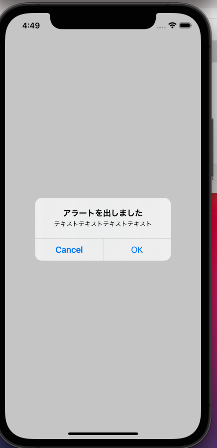
Alert.alert(
'アラートを出しました',
'テキストテキストテキストテキスト',
[
{
text: 'Cancel',
onPress: () => console.log('アラートのcancelをタップした時の挙動を書く'),
style: 'cancel',
},
{text: 'OK', onPress: () => console.log('アラートのOKをタップした時の挙動を書く')},
]);
};
return (
<View>
<Button title="Alert" onPress={onPressAlert} />
</View>
);
};
Buttonをタップした時にAlertを表示させます。
配列の一つ目にstyle:'cancel'と書かれていますが、これは表示する文字の色、太さを変更することができます。
cancelだと太文字に、destructiveだと赤文字になります。
こんな感じで表示されます。
次に配列内のボタンを一つ増やしてみます。
Alert.alert('アラートを出しました', 'テキストテキストテキストテキスト', [
      {
        text: 'setting',
        onPress: () =>
          console.log('アラートのsettingをタップした時の挙動を書く'),
        style: 'destructive',
      },
      {
        text: 'Cancel',
        onPress: () =>
          console.log('アラートのcancelをタップした時の挙動を書く'),
        style: 'cancel',
      },
      {
        text: 'OK',
        onPress: () => console.log('アラートのOKをタップした時の挙動を書く'),
      },
    ]);
すると。。。。
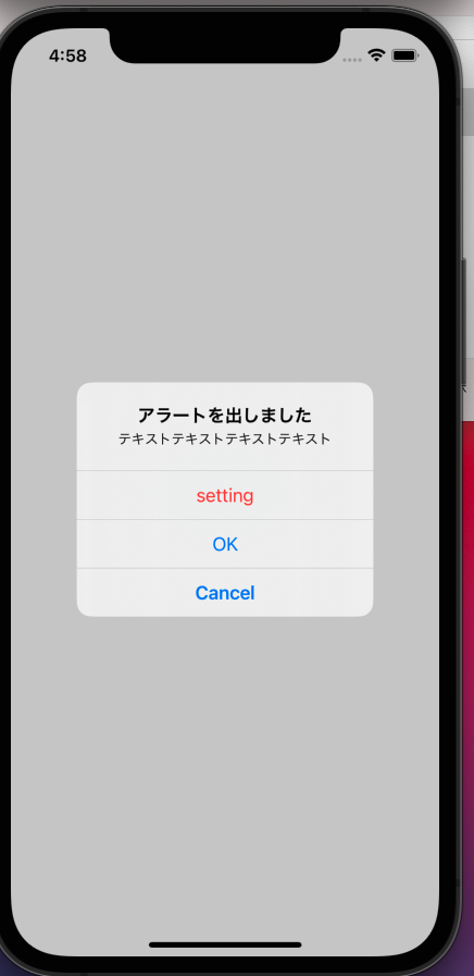
配列内が三つ以上の時は縦並びになります。
###ここで一つ気になる点があります。
配列は一番目に「setting」、二番目に「Cancel」、三番目に「OK」としているのに実際はCancelが一番下になってます。
これは「Cancel」内のstyleに’cancel’としていると思いますが、cancelというstyleを当てると、例え一番目に入れていても表示する時は自動的に一番下になります。
便利っちゃー便利かな。
ちなみに配列を一つだけにするとこんな感じです

Alertの特徴
1、アラートの上に出すタイトル(テキスト)のスタイリングができない
→もし色やフォントサイズを変更したくても変えれないです。
2、タイトルに画像やアイコンを入れられない
→基本テキストした入れないと思いますが、画像を入れたくても入れれないです。
3、手軽に実装できるので特に変わった実装が必要じゃない時はこれで十分かな
→できることは少ないですが、Alertの内容だけで十分なことがほとんどだと思うので、基本的にはこれを使えばいい
補足ですが、実装するときにアラートの第二引数(テキスト)を入れたくなくて消してしまうと
 Alert.alert('アラート',[
      {
        text: 'setting',
        onPress: () =>
          console.log('アラートのsettingをタップした時の挙動を書く'),
        style: 'destructive',
      },
      {
        text: 'Cancel',
        onPress: () =>
          console.log('アラートのcancelをタップした時の挙動を書く'),
        style: 'cancel',
        type:'login-password',
      },
      {
        text: 'OK',
        onPress: () => console.log('アラートのOKをタップした時の挙動を書く'),
      },
    ],
   );
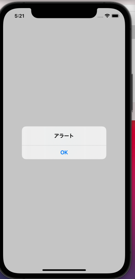
こんな感じに思ったUIにならないので、二行目にテキストが必要ない場合でも
 Alert.alert('アラート','',[
      {
        text: 'setting',
        onPress: () =>
          console.log('アラートのsettingをタップした時の挙動を書く'),
        style: 'destructive',
      },
      {
        text: 'Cancel',
        onPress: () =>
          console.log('アラートのcancelをタップした時の挙動を書く'),
        style: 'cancel',
        type:'login-password',
      },
      {
        text: 'OK',
        onPress: () => console.log('アラートのOKをタップした時の挙動を書く'),
      },
    ],
   );
こんな感じで空にしといてください!
Dialog
実装していきます
import React,{useState} from 'react';
import {Alert, Button, View,Modal} from 'react-native';
import Dialog from 'react-native-dialog';

export const AlertDialog = () => {
  const [visible,setVisible] = useState(false)
  return (
    <View>
      <Button title="Alert" onPress={()=>setVisible(true)} />
      <View>
        <Dialog.Container visible={visible}>
            <Dialog.Title>ダイアログを出しました</Dialog.Title>
            <Dialog.Description>
                あああああああああああああああああああああああああああああああああああ
            </Dialog.Description>
            <Dialog.Button label="Cancel" color='red' onPress={()=>setVisible(false)} />
            <Dialog.Button label="OK" onPress={()=>setVisible(false)} />
        </Dialog.Container>
      </View>
    </View>
  );
};
Alertではタップした時にAlertを出すようにしましたが、Dialogではvisibleがtrueの時に表示、falseで非表示にします。
ですのでuseStateを使ってtrueかfalseかを制御します。
Buttonをタップした時にtrueにし、ダイアログ内のボタンをタップすることでfalseとなり、非表示になります
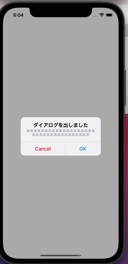
こんな感じで表示されます。Alertとほぼ同じですね。
では色々Dialogの特徴を紹介していこうと思います。
 <View>
    <Dialog.Container visible={visible}>
        <Dialog.Title style={{fontSize:30,marginBottom:40}}>ダイアログを出しました</Dialog.Title>
        <Dialog.Description>
            あああああああああああああああああああああああああああああああああああ
        </Dialog.Description>
        <Dialog.Button label="Cancel" color='red' onPress={()=>setVisible(false)} />
        <Dialog.Button label="OK" onPress={()=>setVisible(false)} />
        <Dialog.Button label="Setting" bold={true} onPress={()=>setVisible(false)} />
    </Dialog.Container>
 </View>
まずスタイリングですがtitleにもstyleを当てることができます。またボタンの方はカラーや太さを調整することができます。
こんな感じに表示されます。
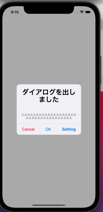
Alertの時は三つボタンがあると縦並びになりましたが、Dialogだと横並びに続いていきます。
さらにこんな事もできます
 <View>
    <Dialog.Container visible={visible}>
        <Dialog.Title style={{fontSize:30,marginBottom:40}}>
          <Icon name="user-o" size={70} />
        </Dialog.Title>
        <Dialog.Input placeholder='名前' />
        <Dialog.Button label="Cancel" color='red' onPress={()=>setVisible(false)} />
        <Dialog.Button label="OK" onPress={()=>setVisible(false)} />
        <Dialog.Button label="Setting" bold={true} onPress={()=>setVisible(false)} />
    </Dialog.Container>
  </View>
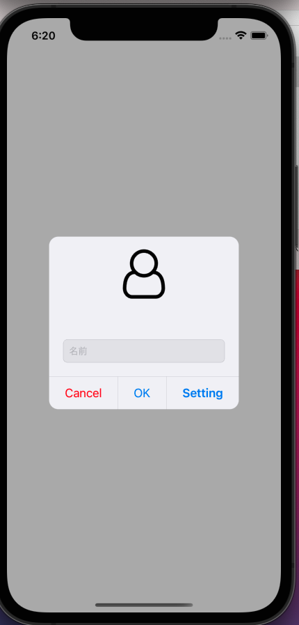
Dialog.title内をテキストではなく、アイコンを表示させています。
Alertではできませんでしたが、画像やアイコンも入れることができるんです。
そのほかにもDialog.inputでテキスト入力欄をダイアログにつけることができます!
Dialogの特徴
1、Alertよりできることが多い
2、スタイルを当てることができる
3、画像やアイコンを入れることができる
Modal
最後のModalです、実装していきます
import React, {useState} from 'react';
import {Alert, Button, View, Modal, StyleSheet, Text} from 'react-native';
import Dialog from 'react-native-dialog';
import Icon from 'react-native-vector-icons/FontAwesome';

export const AlertDialog = () => {
  const [modalVisible, setModalVisible] = useState(false);
  return (
    <View>
      <Button title="タップ" onPress={() => setModalVisible(true)} />
      <View>
        <Modal
          animationType="slide"
          transparent={true}
          visible={modalVisible}
          onRequestClose={() => {
            Alert.alert('Modal has been closed.');
            setModalVisible(!modalVisible);
          }}>
          <View style={styles.centeredView}>
            <View style={styles.modalView}>
              <Text style={styles.modalText}>Hello World!</Text>
              <Button title="閉じる" onPress={() => setModalVisible(false)} />
            </View>
          </View>
        </Modal>
      </View>
    </View>
  );
};

const styles = StyleSheet.create({
  centeredView: {
    flex: 1,
    justifyContent: 'center',
    alignItems: 'center',
    marginTop: 22,
  },
  modalView: {
    margin: 20,
    backgroundColor: 'white',
    borderRadius: 20,
    width:300,
    padding: 35,
    alignItems: 'center',
    shadowColor: '#000',
    shadowOffset: {
      width: 0,
      height: 2,
    },
    shadowOpacity: 0.25,
    shadowRadius: 4,
    elevation: 5,
  },
  button: {
    borderRadius: 20,
    padding: 10,
    elevation: 2,
  },
  buttonOpen: {
    backgroundColor: '#F194FF',
  },
  buttonClose: {
    backgroundColor: '#2196F3',
  },
  textStyle: {
    color: 'white',
    fontWeight: 'bold',
    textAlign: 'center',
  },
  modalText: {
    marginBottom: 15,
    textAlign: 'center',
  },
});
特徴はAlertやDialogと違い、ほぼほぼスタイリングで自分で実装しているところです。
よくも悪くも自分の理想のものを作ることができます。
UIはこんな感じになります。
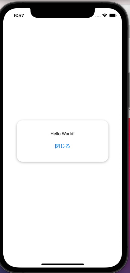
表示方法はDialogと同様にtrueの時は表示、falseで非表示としています。
ボタンをタップした時、モーダルは下から出てきます。
これはModalタグ内のanimatedTypeで設定しています。
現在はslideにしていますが、noneにすることでAlertやDialogと同じような感じで表示されます。
二つ目のtransparentはtrueかfalseで設定します。
trueの場合:モーダルを出した時に背景をもともと設定している色のままにする
falseの場合:モーダルを出すときは背景色を決めていても画面全体を真っ白にする
modal内はViewタグを使って一からスタイリングしているため、自分の思うようなものを作ることができますが、AlertやDialogに比べてめんどくさいです。
Modalの特徴
1、UIは自分で一から構築
2、自由度は高いがAlertやDialogに比べて実装がめんどくさい。
結論
以上三つの似たUIを作ってみましたが、僕的にはDialogが一番使いやすいと思いました。
ただ、OKとキャンセルを出すだけだったらAlertで十分です。
Modalは使うことはないかなと思いました。Dialogを使えばやりたいことはできると思いますので。