散布図とは
定義はMatplotlib定量比較-散布図をご参考ください。
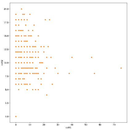
簡単な散布図
Seabornで散布図を描くには、scatterplotとrelplot(relational plot)の2つの方法があります。
scatterplotの場合:
import matplotlib.pyplot as plt
import seaborn as sns

sns.scatterplot(x='col01', y='col02', data=test_data)

plt.show()
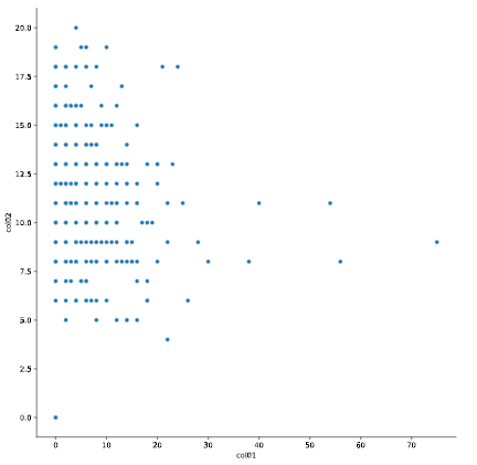
relplotの場合:
import matplotlib.pyplot as plt
import seaborn as sns

sns.relplot(x='col01', y='col02', data=test_data, kind='scatter')

plt.show()
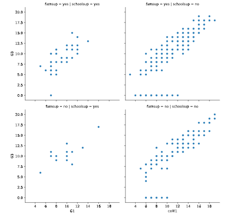
サブプロットで複数の散布図を描く
relplotのcolとrowパラメータで、横と縦で複数の散布図を描けます。
sns.relplot(x="G1", y="G3",
            data=student_data,
            kind="scatter",
            col="schoolsup",
            col_order=["yes", "no"],
            row='famsup',
            row_order=["yes", "no"])

plt.show()
常用オプション
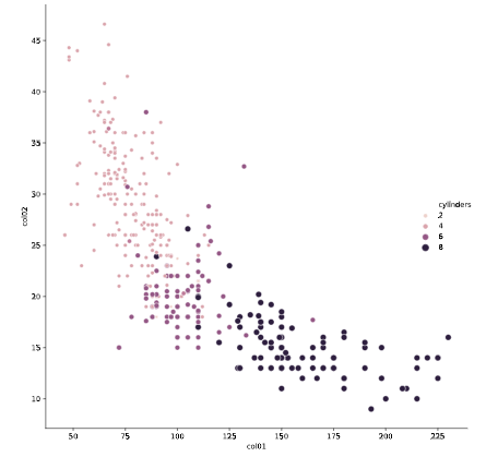
- size: 点のサイズ
- hue: 点の色
sns.relplot(x='col01', y='col02', data=test_data, kind='scatter', size='cylinders', hue='cylinders')

plt.show()
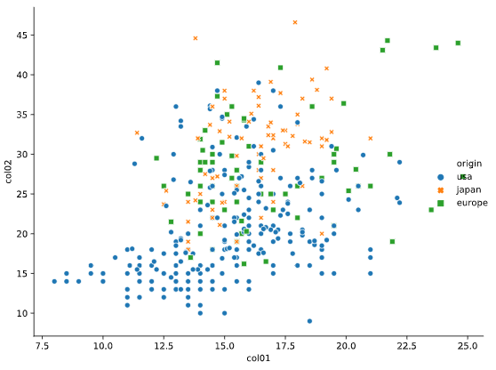
- style: 点のスタイル
sns.relplot(x='col01', y='col02', data=test_data, kind='scatter', hue='origin', style='origin')

plt.show()