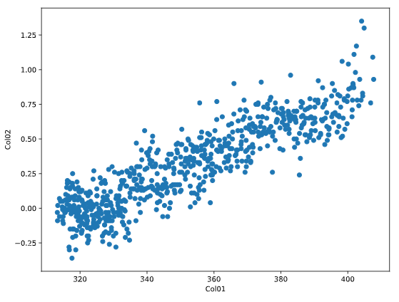
散布図とは
散布図は2つの変数に対して、x-y座標上に点をプロットしたグラフです。
散布図で2つの変数の関係性が見えます。
簡単な散布図
import matplotlib.pyplot as plt

fig, ax = plt.subplots()

ax.scatter(data['col01'], data['col02'])

ax.set_xlabel('Col01')
ax.set_ylabel('Col02')

plt.show()
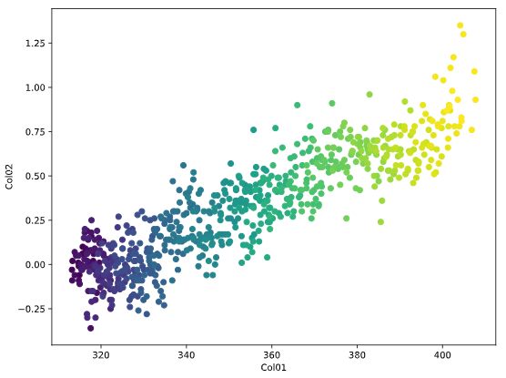
色で第3次元を表現する
色を使用して、時間を第3次元として表現できます。
下図では早い日付を暗い色、遅い日付を明るい色で表現しています。
import matplotlib.pyplot as plt

fig, ax = plt.subplots()

ax.scatter(data['col01'], data['col02'], c=data['date'])

ax.set_xlabel('Col01')
ax.set_ylabel('Col02')

plt.show()