CSS animation day 52 となりました。
以前の記事 にて、画像を切り取る方法として、mask プロパティをご紹介しました。
本日は別の手段である、clip-path プロパティについて、ご紹介いたします。
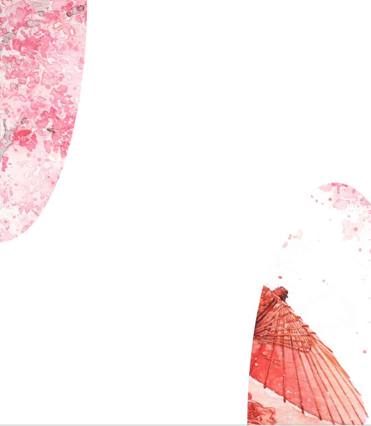
1. 完成版
See the Pen SAKURA by hiroya iizuka (@hiroyaiizuka) on CodePen.
2. 参考文献
CSS Clip Path Hover Circle Hover Effects | Html CSS
CSS Clip-Path Maker
Introduction to Clipping Using clip-path in CSS
3. 分解してみる
❶.
マークアップしましょう。
<!DOCTYPE html>
<html lang="ja">
  <head>
    <meta charset="UTF-8" />
    <link rel="stylesheet" href="css/styles.css" />
  </head>
  <body>
    <div class="container">
      <div class="picture"></div>
    </div>
  </body>
</html>
body {
margin: 0;
padding: 0;
}
.container {
position: relative;
width: 100%;
height: 100vh;
display: flex;
align-items: center;
justify-content: center;
}
.picture {
width: 100%;
height: 100%;
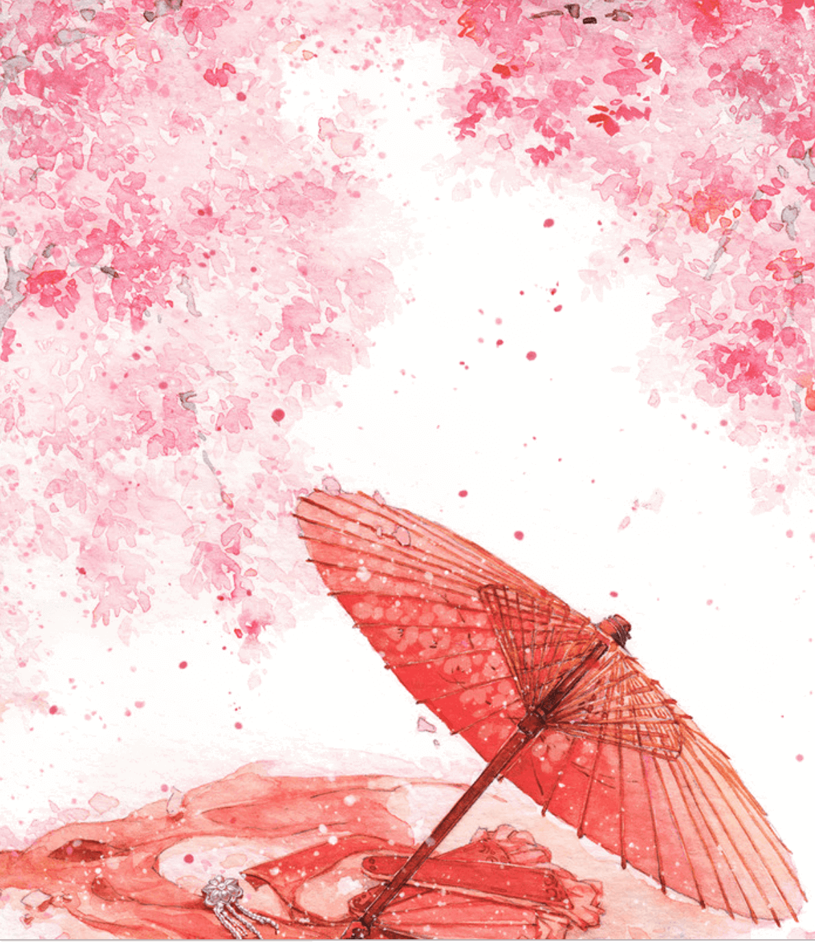
background: url("../img/wa.png");
background-repeat: no-repeat;
background-size: cover;
}
綺麗ですね。
❷.
では、clip-path プロパティを使いましょう。
.picture {
  width: 100%;
  height: 100%;
  background: url("../img/wa.png");
  background-attachment: fixed;
  background-size: cover;
  clip-path: circle(40%);
}
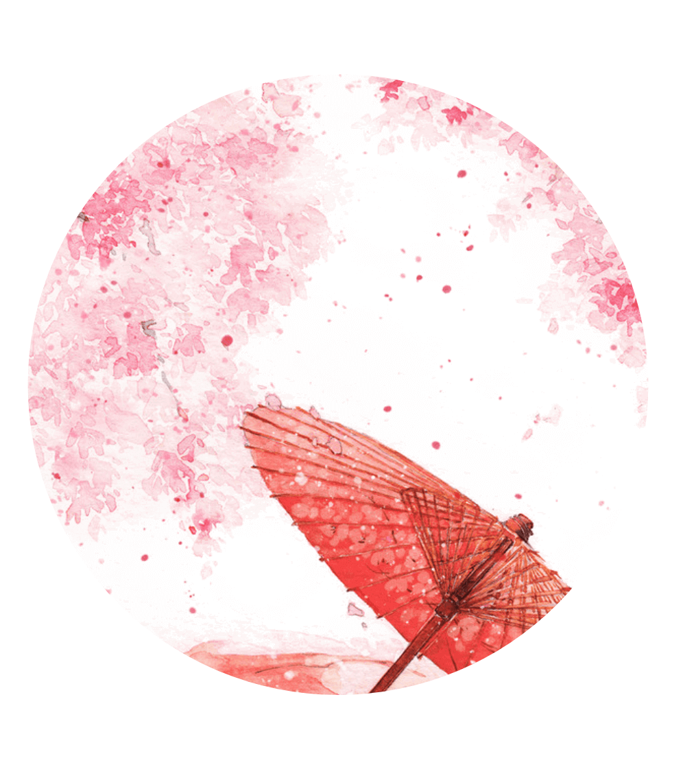
一気に、和の感じが出ました。おしゃれですね! Clip-Path プロパティを解説します。
・Clip- Path (参考文献:MDN)
要素の 「どの部分を表示するか?」 を設定するクリッピング領域を作るプロパティです。
領域の内部は表示され、外部は非表示になります。
clip-path: <> には、polygon や circle、ellipse などのジオメトリ値や、SVGの clip-path 要素を指定するurl を入れることができます。また、
参考文献のジェネレーターを使えば、自分の思い通りの形で画像を切ることができるでしょう。早速、使ってみましょう。
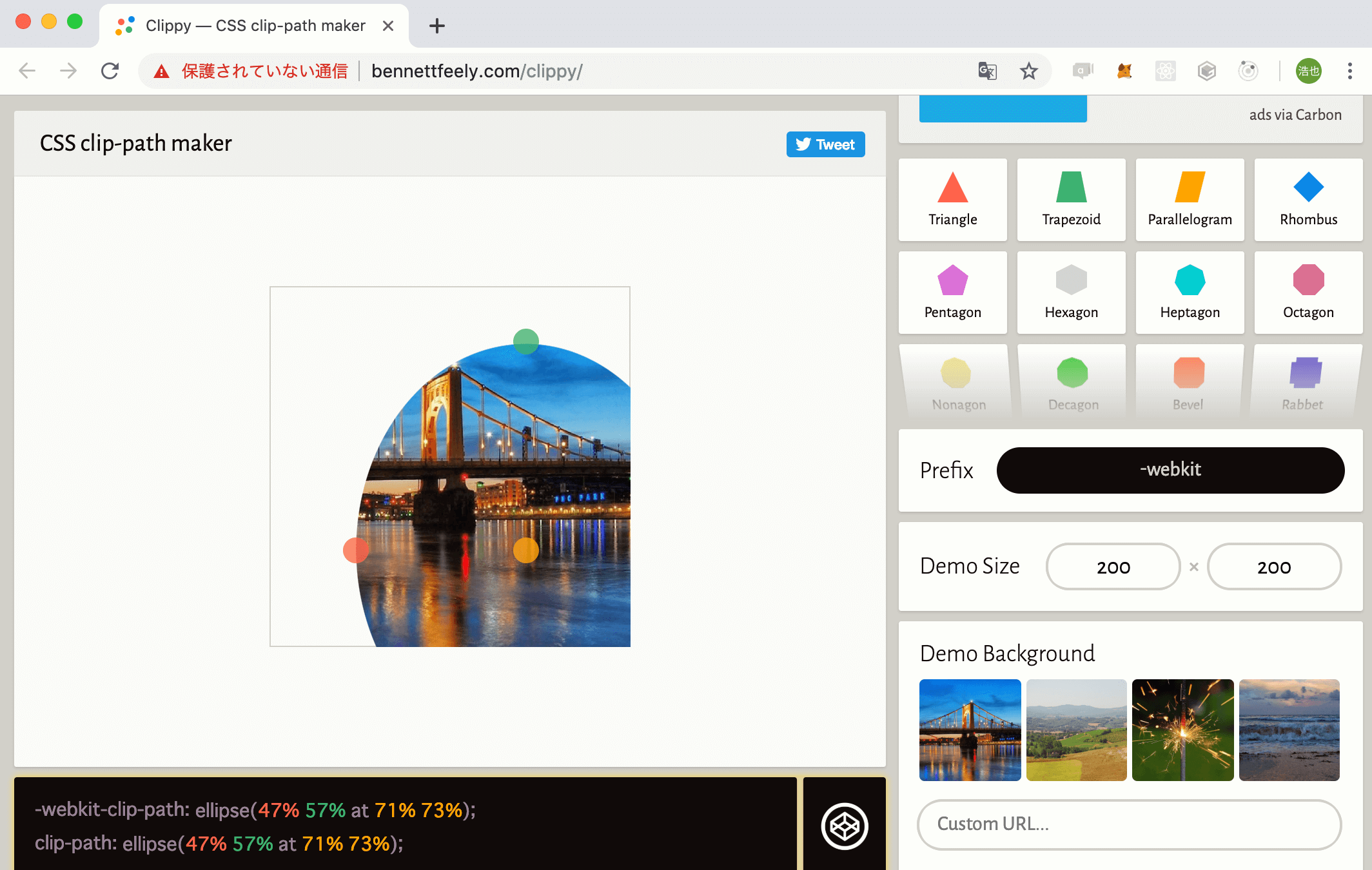
楕円を作りました。左下にあるコードをコピーし、自分のCSSに貼り付けます。
.picture {
  width: 100%;
  height: 100%;
  background: url("../img/wa.png");
  background-attachment: fixed;
  background-size: cover;
  clip-path: ellipse(47% 57% at 71% 73%);
}
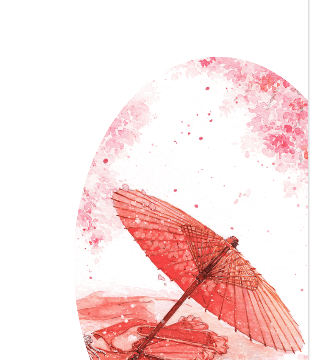
思い通りの形に、画像をクリッピングできました。
他にも、吹き出しの形だったり、星の形があったりするので、Web サイトの見出しや挿入に使えますね。
❸.
clip-path について、もう少し深くみていきましょう。
clip-path: ellipse(130px 140px at 10% 20%);
at を使うことで、 position の位置を決めることができます。
(position: absolute のときと同じ配置の決め方です。)
左上が、 clip-path: ellipse(47% 57% at 0% 0%);
右下が、 clip:path: ellipse(47% 57% at 80% 100%);
となります。
❹.
では、アニメーションを作っていきましょう。
このat ~ をkeyframe で動かします。
body {
  margin: 0;
  padding: 0;
  background: linear-gradient(to right, #200122, #6f0000); // 変更
}
.picture {
  width: 100%;
  height: 100%;
  background: url("../img/wa.png");
  background-attachment: fixed;
  background-size: cover;
  clip-path: circle(40%);
  animation: clipmove 12s ease-in-out infinite;
}

@keyframes clipmove {
  0%,
  100% {
    clip-path: circle(10% at 0 0);
  }

  50% {
    clip-path: circle(80% at 100% 100%);
  }
}
See the Pen SAKURA by hiroya iizuka (@hiroyaiizuka) on CodePen.
このように、clip-path プロパティのおかげで、photoshop のような画像操作ができて、大変素晴らしいですね。
それでは、また明日〜