CSS animation day 50 となりました。
やっと、50日。次は、100日を目指します。
一歩一歩大事ですね。
本日は、Codepen で見つけた 素敵な作品の Particle Button を作ります。
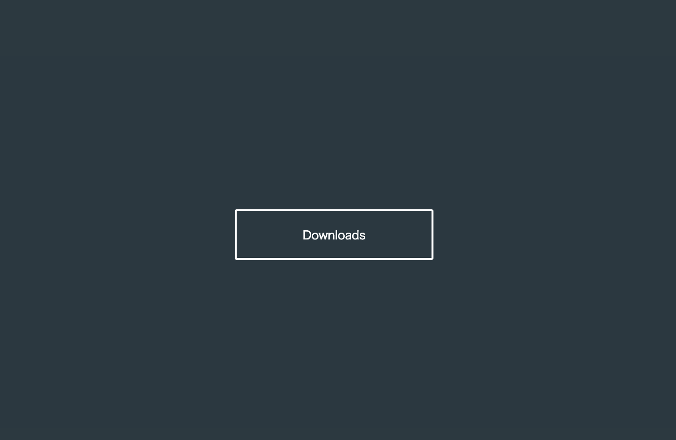
1. 完成版

See the Pen YgEgKp by hiroya iizuka (@hiroyaiizuka) on CodePen.
2. 参考文献
CSS Fizzy Button
[CSS Particle Button](CSS Particles button)
3. 分解してみる
❶.
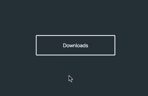
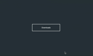
マークアップしましょう。
<!DOCTYPE html>
<html lang="ja">
  <head>
    <meta charset="UTF-8" />
    <link rel="stylesheet" href="css/styles.css" />
  </head>
  <body>
    <div class="container">
      <div class="button">Downloads</div>
    </div>
  </body>
</html>
body {
  margin: 0;
  padding: 0;
  background: #2c3940;
}

.container {
  position: relative;
  width: 100%;
  height: 100vh;
  display: flex;
  align-items: center;
  justify-content: center;
}

.button {
  width: 200px;
  height: 48px;
  background: transparent;
  color: #fff;
  line-height: 48px;
  text-align: center;
  font-size: 12px;
  border: 2px solid #fff;
  border-radius: 2px;
}
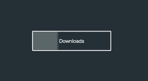
❷.
hover アニメーションをつけていきましょう。
hoverしたら、
1: boxの色が変わる
2: アイコンが出現する
3: Downloads の文字が右にずれる
4: icon が下から出現する
5: パーティクルが出現する
ようにします。
まず、1-3 まで、作りましょう。
 <div class="container">
      <div class="button">
        <span>Downloads</span>  //追加
      </div>
 </div>
.button {
  width: 200px;
  height: 48px;
  background: transparent;
  border: 2px solid #fff;
  border-radius: 2px;
  transition-duration: 0.2s;

  &:hover {
    animation: hoverEffect 1s ease;
    box-shadow: 220px 0px 20px #fff inset;

    span {
      transform: translateX(25px);
      transition-duration: 0.3s;
      color: #000;
    }
  }
}
いい感じです。
4: にうつります。
fontawsome を使って、ダウンロードボタンを表示しましょう。
fontawsome の使い方がわからない方は、こちら をご参照ください。
<!DOCTYPE html>
<html lang="ja">
  <head>
    <meta charset="UTF-8" />
    <link rel="stylesheet" href="css/styles.css" />
    <link
      rel="stylesheet"
      href="https://use.fontawesome.com/releases/v5.7.1/css/all.css"
      integrity="sha384-fnmOCqbTlWIlj8LyTjo7mOUStjsKC4pOpQbqyi7RrhN7udi9RwhKkMHpvLbHG9Sr"
      crossorigin="anonymous"
    />
  </head>
  <body>
    <div class="container">
      <div class="button">
        <span>Downloads</span>
        <i class="fas fa-download"></i>
      </div>
    </div>
  </body>
</html>
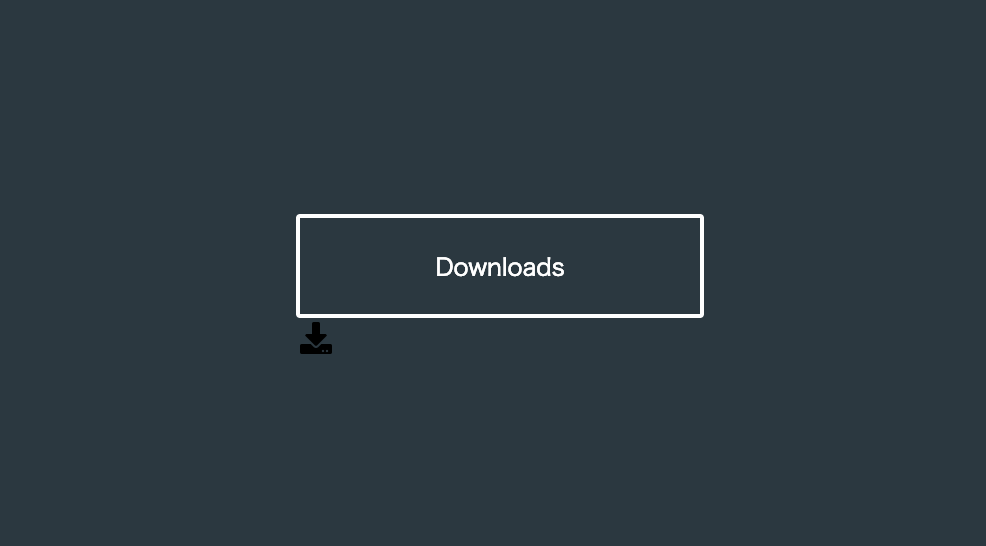
アイコンが出ました。
では、button をhover したら、アイコンが出現するようにしましょう。
  &:hover {
          ・・・
    i {
      opacity: 1;
      transition-duration: 0.3s;
      transform: translate(42px, -36px);
    }
  }
}

i {
  opacity: 0;
  transform: translate(42px, -26px);
}
❸.
5: パーティクルを出しましょう。ここが一番の難関です。
前回 の記事を参照しましょう。
<div class="container">
  <div class="button">
      <span>Downloads</span>
      <i class="fas fa-download"></i>
    <div class="particles">
      <div class="particle"></div>
      <div class="particle"></div>
                ・
          ・
          ・
         × 100
    </div>
  </div>
</div>
  &:hover {
        ・・・
    .particle {
      opacity: 1;
      animation:  particle 2s ease-out 0.1s infinite
    }
  }
}

.particles {
  position: absolute;
  top: 0;
  left: -100px;
  width: 300px;
  height: 100px;
  z-index: -1;
  .particle {
    display: inline-block;
    opacity: 0;
    width: 5px;
    height: 5px;
    border-radius: 50%;
    background-color: #fff;
    @for $i from 1 through 100 {
      &:nth-child(#{$i}) {
        transform: translate(random(100) * 1vw, random(100) * 1vh);
        background: hsl(random(360), 100%, 65%);
      }
    }
  }
}

@keyframes particle {
  0% {
    transform: translate(45vw, 42vh);
  }
  20% {
    opacity: 0.5;
  }

  60%,
  100% {
    opacity: 0;
  }
}
particleを button の中央に100個集め、z-index:-1 で後ろ側に回してます。
これは、ボタンの内側に particleが飛ばないようにするためです。
particleは、前回の記事の通り、roop 文とrandom() を使い、hsl で設定してます。
なかなか派手な動きですが、microinteraction としては、まだまだ完成度は低いです。
hover 時にフィードバックの演出がくどすぎて、不快感を与えかねません。
さらに効果的なボタンになるために、どうしたら良いでしょうか?長くなりそうなので、続きは次回です。
それでは、また明日〜