CSS animation day22 となりました。
本日は、カーテンが開くようなEffect についてです。
1. 完成版

2. なぜか?
毎日CSS animation のネタを探しており、その中でみたことがないeffect を発見しました。
SPA で使えば、面白いユーザー体験となると思ってます。
一般的に、画面のX軸、Y軸のみのアニメーションだけではなく、奥域を感じるZ軸へのアニメーションは、3D の印象を醸し出すことができ、大変おもしろいです。先日のStarWars では、rotateXを用い奥域を表現しましたが、この分野に関しては、今後も研究していきます。
3. 参考文献
4. 分解してみる
❶.
index.html
<!DOCTYPE html>
<html lang="ja">
  <head>
    <meta charset="UTF-8" />
    <link rel="stylesheet" href="css/styles.css" />
  </head>
  <body>
    <div class="curtain">
      <div class="curtain-wrapper">
        <div class="curtain-panel curtain-left"></div>
        <div class="curtain-center"></div>
        <div class="curtain-panel curtain_right"></div>
      </div>
    </div>
  </body>
</html>
styles.css
body {
  margin: 0px;
  padding: 0px;
  background: #fff;
  display: flex;
  justify-content: center;
}

.curtain {
  width: 100%;
  height: 100vh;
  overflow: hidden;
}

.curtain-wrapper {
  width: 100%;
  height: 100%;
}

.curtain-panel {
  background: rgb(107, 76, 129);
  position: relative;
  width: 50%;
  height: 100vh;
  float: left;
  z-index: 2;
}

.curtain-center {
  background: rgb(121,223,158);
  position: absolute;
  width: 100%;
  height: 100%;
  z-index: 1;
}

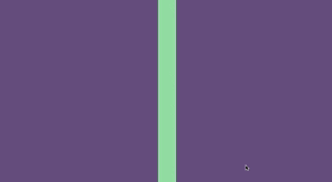
カーテンができました。裏にもう一枚、画面が隠れてます。
css でoverflow: hiddenとすることで、カーテンが開いたときに画面枠からはみ出た部分を、非表示にしてます。
❷.
クリックすると、カーテンが左右に動くというアニメーションをつけます。
Javascript なしで、pure CSSでやるにはどうしたら良いでしょうか?
前回の記事 のスキルを使いましょう!
index.html
  <body>
    <div class="curtain">
      <div class="curtain-wrapper">
        <div class="curtain-center"></div>

        <input type="checkbox" id="start" />
        <label for="start">
          <div class="curtain-panel curtain-left"></div>
          <div class="curtain-panel curtain-right"></div>
        </label>
      </div>
    </div>
  </body>
styles.css
body {
  margin: 0px;
  padding: 0px;
  background: #fff;
  display: flex;
  justify-content: center;
}

.curtain {
  width: 100%;
  height: 100vh;
  overflow: hidden;
}

.curtain-wrapper {
  width: 100%;
  height: 100%;
}

.curtain-panel {
  background: rgb(107, 76, 129);
  position: relative;
  width: 50%;
  height: 100vh;
  float: left;
  z-index: 2;
  transition-timing-function: ease-out;
  transition-duration: 1s;
}

.curtain-center {
  background: rgb(121, 223, 158);
  position: absolute;
  width: 100%;
  height: 100%;
  z-index: 1;
}

# start {
  display: none;
}

# start:checked + label .curtain-right {
  transform: translateX(100%);
}

# start:checked + label .curtain-left {
  transform: translateX(-100%);
}
できました!
ただし、これだと開きはするのですが、閉じません。
背景をクリックして、カーテンを閉じれるようにしましょう。
index.html
<body>
    <div class="curtain">
      <div class="curtain-wrapper">

        <input type="checkbox" id="start" />
        <label for="start">
          <div class="curtain-panel curtain-left"></div>
          <div class="curtain-panel curtain-right"></div>
          <div class="curtain-center"></div>
        </label>
      </div>
    </div>
  </body>
styles.css
# start:checked + label .curtain-right {
  transform: translateX(100%);
}

# start:checked + label .curtain-left {
  transform: translateX(-100%);
}

# start + label .curtain-right {
  transform: translateX(0);
}

# start + label .curtain-left {
  transform: translateX(0);
}
何をしたかというと、checkbox がチェックされているときは、動く。チェックされていないdefault の時は、translateX(0) で定位置に戻るという、アニメーションをつけております。
本日は以上です!
また明日〜