CSS animation day16 となりました。
本日からしばらく、SPAやアプリに使える、Gooey Effectについて、学んでいきます。なお、今後 Qiita で作る作品は、著作権フリーなので、ブログ紹介などで、どんどんコピペして気兼ねなくお使いください。(その際、いいね、シェアなどしていただけると、ハッピーです。)
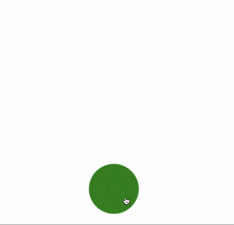
1. 完成版
2. なぜか?
Gooey Effect は (2019 年に勝手に流行ると思っている) 流体デザイン と相性がめちゃめちゃよいです。SPAやアプリに取り入れることで、柔らかい印象を与え、マイクロインタラクションにもってこいですね!
3. 参考文献
Codepen: Gooey Menu CSS ONLY
Codepen: Gooey Menu
4. 分解してみる
❶.
ボタンを押して、サークルが移動するためにはどうしたら良いでしょうか?
Javascript を使えば、
document.addEventLister('click', ()=> {...})
アローファンクションの中で、移動するアニメーションのクラスを addすれば、できそうですが、CSS のみでなんとかならないでしょうか?
結論から言うと、checkbox, input, label を使えば可能です。下記コードを参照ください。
 <input type="checkbox" id="start" />
 <label for="start">
     <div class="menu-open-button"></div>
 </label>
 .menu-open-button {
  position: absolute;
  top: 20%;
  left: 20%;
  width: 100px;
  height: 100px;
  border-radius: 50%;
  background: green;
  cursor: pointer;
  transition-timing-function: cubic-bezier(0.175, 0.885, 0.32, 1.275);
  transition-duration: 400ms;
  transform: scale(1, 1);
}

# start {
  display: none;
}

# start:checked ~ label .menu-open-button{
  transform: scale(5.0, 5.0);
}

.menu-open-button:hover {
  transform: scale(1.1, 1.1) translate3d(0, 0, 0);
}
ポイント:
1: CSS セレクタ ~ は、同じ階層のその後に続く要素に適応します。
この場合、label のことです。詳細は、[サルワカ] (https://saruwakakun.com/html-css/reference/selector) の記事をご参照ください。
2: input ボタンを、display: none することで、labelの要素(緑の丸)へのクリックが アニメーションと連動します。

こちら の記事が大変参考になりました。
❷.
では、ボタンをクリックして、別の緑の丸が動くようにします。
 <input type="checkbox" id="start" />
    <label for="start">
       <div class="menu-open-button"></div>
    </label>
    <div class="circle"></div>
# start {
  display: none;
}

.menu-open-button {
  position: absolute;
  top: 20%;
  left: 20%;
  width: 100px;
  height: 100px;
  border-radius: 50%;
  background: green;
  cursor: pointer;
  transition-timing-function: cubic-bezier(0.175, 0.885, 0.32, 1.275);
  transition-duration: 400ms;
  transform: scale(1, 1);
}

.menu-open-button:hover {
  transform: scale(1.1, 1.1);
}

.circle {
  position: absolute;
  top: 20%;
  left: 50%;
  width: 100px;
  height: 100px;
  border-radius: 50%;
  background: green;
}

# start:checked ~ .circle {
  margin-top: 200px;
}
ポイントは、
labelの中に起動ボタンを配置し、
labelの下に動かしたい要素を配置することです。

❸.
では、❶, ❷を組み合わせて、縦にボタンを2つ出して行きましょう。
<!DOCTYPE html>
<html lang="ja">
  <head>
    <meta charset="UTF-8" />
    <link rel="stylesheet" href="css/styles.css" />
  </head>
  <body>
    <div class="container">
      <div class="gooey">
        <input type="checkbox" id="start" />
        <label for="start">
          <div class="menu-open-button"></div>
        </label>
        <div class="circle1"></div>
     <div class="circle2"></div>
      </div>


      <svg xmlns="http://www.w3.org/2000/svg" version="1.1">
        <defs>
          <filter id="filter">
            <feGaussianBlur
              in="SourceGraphic"
              stdDeviation="20"
              result="blur"
            />
            <feColorMatrix
              in="blur"
              mode="matrix"
              values="1 0 0 0 0  0 1 0 0 0  0 0 1 0 0  0 0 0 18 -7"
              result="filter"
            />
            <feBlend in="SourceGraphic" in2="filter" />
          </filter>
        </defs>
      </svg>
    </div>
  </body>
</html>
body {
  margin: 0;
  padding: 0;
}

.container {
  position: relative;
  width: 100%;
  height: 100vh;
  display: flex;
  align-items: center;
  justify-content: center;
}

.gooey {
  width: 100%;
  height: 100vh;
  margin: 0 auto;
  filter: url("#filter");
}

# start {
  display: none;
}

.menu-open-button {
  position: absolute;
  top: 50%;
  left: 50%;
  width: 100px;
  height: 100px;
  border-radius: 50%;
  background: green;
  cursor: pointer;
  transition-timing-function: cubic-bezier(0.175, 0.885, 0.32, 1.275);
  transition-duration: 400ms;
  transform: scale(1, 1);
  z-index: 2;
}

.menu-open-button:hover {
  transform: scale(1.1, 1.1);
}

.circle1,
.circle2 {
  position: absolute;
  top: 50%;
  left: 50%;
  width: 100px;
  height: 100px;
  border-radius: 50%;
  background: green;
}

# start:checked ~ .circle1 {
  transform: translate3d(0, -150px, 0);
  transition-timing-function: cubic-bezier(0.175, 0.885, 0.32, 1.275);
  transition-duration: 800ms;
}

# start:checked ~ .circle2 {
  transform: translate3d(0, -300px, 0);
  transition-timing-function: cubic-bezier(0.175, 0.885, 0.32, 1.275);
  transition-duration: 800ms;
}

いい感じの動きになりました。
HTMLの下半分の SVG filter がよくわからない方は、こちら をご参照ください。
明日は、アニメーションの修正を加えたり、icon をつけて、ボタンの最終系を目指します。それではまた〜!