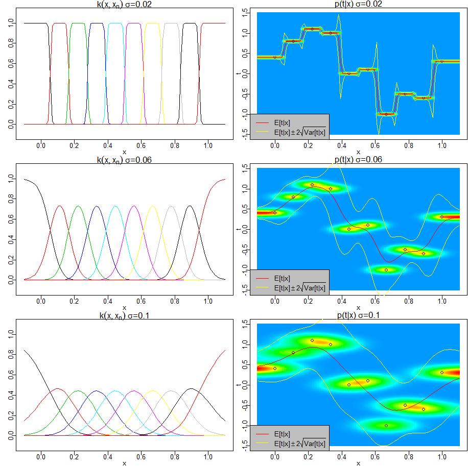
PRML図6.3と同様に、Nadaraya-Watsonモデル(カーネル回帰)により、以下を図示します。
- 回帰関数(条件付き期待値) $E[t|x]=\sum_{n=1}^Nk(x,x_n)t_n$
- 条件付き確率密度 $p(t|x)=\frac{1}{(2\pi\sigma^2)^{1/2}}\sum_{n=1}^{N}\exp(-\frac{(t-t_n)^2}{2\sigma^2})k(x,x_n)$
- 条件付き分散 $Var(t|x)=\sum_{n=1}^N(\sigma^2+t_n^2)k(x,x_n)-E[t|x]^2$
また、各観測点に関連付けられたカーネル関数 $k(x,x_n)$ も図示します。
なお、条件付き確率密度、条件付き分散は、演習6.18と同じく、分散を$\sigma^2$とする等方的ガウス分布 $f(x,t)$ によるカーネル $k(x,x_n)$ を用いて求めています。
f(x,t)=N((x,t)^T|\mathbf{0},\sigma^2\mathbf{I})=\frac{1}{2\pi\sigma^2}\exp(-\frac{x^2+t^2}{2\sigma^2}) \\
g(x)=\int f(x,t) dt \\
k(x,x_n)=\frac{g(x-x_n)}{\sum_m g(x-x_m)}
frame()
set.seed(0)
par(mfrow=c(3, 2))
par(mar=c(2, 2, 1, 0.1))
par(mgp=c(1, 0.2, 0))
xrange <- c(-0.1, 1.1)
yrange <- c(-1.5, 1.5)
xcell <- seq(xrange[1], xrange[2], .01)
ycell <- seq(yrange[1], yrange[2], .01)
colors <- rainbow(450)[256:1]
N <- 10
x <- seq(0, 1, 1 / (N - 1))
# y <- rnorm(length(x), sin(2 * pi * x), 0.2)
y <- c(0.4, 0.8, 1.1, 1.0, 0, 0.1, -1, -0.5, -0.6, 0.3)

doplot <- function(sigma) {

	# g(x)
	g <- function(x) {
		1 / sqrt(2 * pi * sigma ^ 2) * exp(-x ^ 2 / (2 * sigma ^ 2))
	}

	# k(x, x_n)
	kernel <- Vectorize(function(xx, xn) {
		g(xx - xn) / sum(g(xx - x))
	})

	# E[t|x]
	estimate <- Vectorize(function(xx) {
		sum(kernel(xx, x) * y)
	})

	# p(t|x)
	p <- Vectorize(function(xx, yy) {
		1 / sqrt(2 * pi * sigma ^ 2) * sum(exp(-(yy - y) ^ 2 / (2 * sigma ^ 2)) * kernel(xx, x))
	})

	# Var(t|x)
	variance <- Vectorize(function(xx) {
		sum((sigma ^ 2 + y ^ 2) * kernel(xx, x)) - estimate(xx) ^ 2
	})

	# k(x, xn)の描画
	for (n in 1:N) {
		if (n > 1) {
			par(new=T)
		}
		xn <- x[n]
		curve(kernel(x, xn), xlim=c(-0.1, 1.1), ylim=c(-0.1, 1.1),
			xlab=ifelse(n == 1, "x", ""), ylab="", axes=(n == 1), col=n)
	}
	title(bquote(paste(k(x, x[n]), ~ sigma, "=", .(sigma))))

	# p(t|x)の描画
	plot(x, y, xlim=xrange, ylim=yrange, xlab="x", ylab="t")
	image(xcell, ycell, outer(xcell, ycell, p), xlim=xrange, ylim=yrange, col=colors, axes=F, add=T)

	# 観測点の描画
	par(new=T)
	plot(x, y, xlim=xrange, ylim=yrange, xlab="", ylab="", axes=F)

	# E[t|x], Var(t|x)の描画
	par(new=T)
	curve(estimate, xlim=xrange, ylim=yrange, xlab="", ylab="", axes=F, col=2)
	hi <- function(xx){ estimate(xx) + sqrt(variance(xx)) * 2 }
	lo <- function(xx){ estimate(xx) - sqrt(variance(xx)) * 2 }
	par(new=T)
	curve(hi, xlim=xrange, ylim=yrange, xlab="", ylab="", axes=F, col=7)
	par(new=T)
	curve(lo, xlim=xrange, ylim=yrange, xlab="", ylab="", axes=F, col=7)

	legend("bottomleft", c(
		expression("E[t|x]"),
		expression("E[t|x]" %+-% 2 * sqrt("Var[t|x]"))
		), col=c(2, 7), lty=1, bg="gray")
	title(bquote(paste("p(t|x)", ~ sigma, "=", .(sigma))))

	# p(t|x)のtに関する積分が1であることを、いくつかのxで確認
	for (xx in seq(0, 1, 0.1)) {
		cat(paste0(
			"integral(p(t|x=", xx ,")dt)=",
			sum(sapply(seq(-10, 10, 0.01), function(yy) { p(xx, yy) * 0.01 })),
			"\n"
			))
	}
}

doplot(0.02)
doplot(0.06)
doplot(0.1)