はじめに
2次元分布するデータの分布状態を見たかったのでカーネル密度推定を scipy.stats.gaussian_kde でやってみた。成果図は以下の通り。(bw_method=‘scott’)
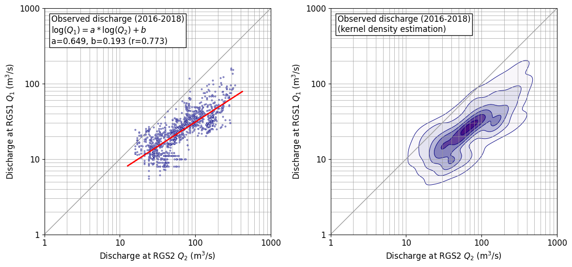
ちなみに、単回帰分析は、以下の通り numpy でサラッとやっている。(色々やっていると、こういうコードがすぐに出てきて使えることは重要なので、あえて書き出しておく。)
def sreq(x,y):
    # y=a*x+b
    res=np.polyfit(x, y, 1)
    a=res[0]
    b=res[1]
    coef = np.corrcoef(x, y)
    r=coef[0,1]
    return a,b,r
やりかた
やりかたは、以下に従った。投稿者さん、ありがとうございます。
工夫したところは以下の通り。
- 表示は対数軸のほうが素直なので、対数軸としたが、軸の数値も読み取りたかったので、マニュアルで対数軸を描画した。データ処理は生データの常用対数をとって行っている。
- コンター線を引く間隔を自前で制御した。
gaussian_kdeでは確率密度が求まるため、この値のてっぺんを1として、[0.01, 0.1, 0.3, 0.5, 0.7, 0.9, 1.0]に線を引くようにしている。リストの最小値 0.01 はデータの範囲を概ねカバーできるよう、目視で定めた。最大値 1.0 は、これがないと 0.9 以上の範囲が着色されず白抜きになってしまうため加えてある。なお、この値は、確率値を示すものではないことに注意。あくまでも見た目の調整のためである。
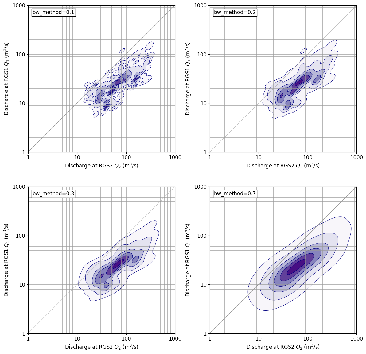
パラメータを変えてみると。。。
gaussin_kde には、bw_methodというパラメータがあり、これを変えてやると分布形状を表示する細かさを変えることができる。上に示した成果図は、defaultである、bw_method=‘scott’ の場合であるが、以下にbw_methodを変化させた場合の図を示す。bw_method=0.3 だとdefaultに近い分布を示している。bw_method の値が大きくなると、表示が粗っぽくなっていき、bw_method=0.7 だと通常の2次元正規分布に近い表示となっている。
なお、scipyマニュアル では、Scott’s Rule は、以下の定義となっており、データ数 n = 365 x 3 = 1095, 次元 d=2 を代入すれば bw_method (scotts_factor) = 0.311 となり、bw_method=0.3 と分布形状が概ね一致するのは理屈どおりである。
\begin{equation}
\text{scotts_factor}=n^{-1/(d+4)}
\end{equation}
プログラム
「はじめに」に示した成果図を作成したプログラムを以下に示す。このプログラムを試してみたい場合は、データについては各人適宜作るなりしてやってみてください。
import numpy as np
import pandas as pd
import matplotlib.pyplot as plt
import matplotlib.cm as cm
from scipy.stats import gaussian_kde


def sreq(x,y):
    # y=a*x+b
    res=np.polyfit(x, y, 1)
    a=res[0]
    b=res[1]
    coef = np.corrcoef(x, y)
    r=coef[0,1]
    return a,b,r


def inp_obs():
    fnameR='df_rgs1_tank_inp.csv'
    df1_obs=pd.read_csv(fnameR, header=0, index_col=0) # read excel data
    df1_obs.index = pd.to_datetime(df1_obs.index, format='%Y/%m/%d')
    df1_obs=df1_obs['2016/01/01':'2018/12/31']
    #
    fnameR='df_rgs2_tank_inp.csv'
    df2_obs=pd.read_csv(fnameR, header=0, index_col=0) # read excel data
    df2_obs.index = pd.to_datetime(df2_obs.index, format='%Y/%m/%d')
    df2_obs=df2_obs['2016/01/01':'2018/12/31']
    #
    return df1_obs,df2_obs


def drawfig(x,y,sstr,fnameF):
    fsz=12
    xmin=0; xmax=3
    ymin=0; ymax=3
    plt.figure(figsize=(12,6),facecolor='w')
    plt.rcParams['font.size']=fsz
    plt.rcParams['font.family']='sans-serif'
    #
    for iii in [1,2]:
        nplt=120+iii
        plt.subplot(nplt)
        plt.xlim([xmin,xmax])
        plt.ylim([ymin,ymax])
        plt.xlabel('Discharge at RGS2 $Q_2$ (m$^3$/s)')
        plt.ylabel('Discharge at RGS1 $Q_1$ (m$^3$/s)')
        plt.gca().set_aspect('equal',adjustable='box')
        plt.xticks([0,1,2,3], [1,10,100,1000])
        plt.yticks([0,1,2,3], [1,10,100,1000])
        bb=np.array([1,2,3,4,5,6,7,8,9,10,20,30,40,50,60,70,80,90,100,200,300,400,500,600,700,800,900,1000])
        bl=np.log10(bb)
        for a0 in bl:
            plt.plot([xmin,xmax],[a0,a0],'-',color='#999999',lw=0.5)
            plt.plot([a0,a0],[ymin,ymax],'-',color='#999999',lw=0.5)
        plt.plot([xmin,xmax],[ymin,ymax],'-',color='#999999',lw=1)
        #
        if iii==1:
            plt.plot(x,y,'o',ms=2,color='#000080',markerfacecolor='#ffffff',markeredgewidth=0.5)
            a,b,r=sreq(x,y)
            x1=np.min(x)-0.1; y1=a*x1+b
            x2=np.max(x)+0.1; y2=a*x2+b
            plt.plot([x1,x2],[y1,y2],'-',color='#ff0000',lw=2)
            tstr=sstr+'\n$\log(Q_1)=a * \log(Q_2) + b$'
            tstr=tstr+'\na={0:.3f}, b={1:.3f} (r={2:.3f})'.format(a,b,r)
        #
        if iii==2:
            tstr=sstr+'\n(kernel density estimation)'
            xx,yy = np.mgrid[xmin:xmax:0.01,ymin:ymax:0.01]
            positions = np.vstack([xx.ravel(),yy.ravel()])
            value = np.vstack([x,y])
            kernel = gaussian_kde(value, bw_method='scott')
            #kernel = gaussian_kde(value, bw_method=0.1)
            f = np.reshape(kernel(positions).T, xx.shape)
            f=f/np.max(f)
            ll=[0.01, 0.1, 0.3, 0.5, 0.7, 0.9, 1.0]
            plt.contourf(xx,yy,f,cmap=cm.Purples,levels=ll)
            plt.contour(xx,yy,f,colors='#000080',linewidths=0.7,levels=ll)
        xs=xmin+0.03*(xmax-xmin)
        ys=ymin+0.97*(ymax-ymin)
        plt.text(xs, ys, tstr, ha='left', va='top', rotation=0, size=fsz,
            bbox=dict(boxstyle='square,pad=0.2', fc='#ffffff', ec='#000000', lw=1))
    #
    plt.tight_layout()
    plt.savefig(fnameF, dpi=100, bbox_inches="tight", pad_inches=0.1)
    plt.show()


def main():
    df1_obs, df2_obs =inp_obs()

    fnameF='_fig_cor_test1.png'
    sstr='Observed discharge (2016-2018)'
    xx=df2_obs['Q'].values
    yy=df1_obs['Q'].values
    xx=np.log10(xx)
    yy=np.log10(yy)
    drawfig(xx,yy,sstr,fnameF)


# ==============
# Execution
# ==============
if __name__ == '__main__': main()
以 上