例
↓↓こういうことをやりたい時。
上の例で2つの要素は、縦並びのときと横並びのときでは、順番が異なります。
縦並びのときは、上→下(正順)、横並びのときは右→左(逆順)となっています。
SP, PCに限らず、レスポンシブに表示順を変えたい時に有効。
やり方
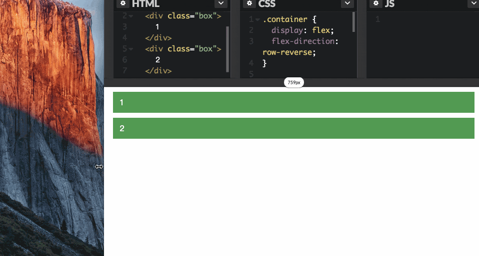
mediaクエリとflex-direction: row-reverse;を使います。
コード
HTML
flexを使うので、2重構造にしておきます。
<div class="container">
  <div class="box">
    1
  </div>
  <div class="box">
    2
  </div>
</div>
CSS
スクリーンサイズに応じて、display の値を切り替えます。縦並びのときはblockに、横並びのときはflexを指定します。
さらに、flex-direction: row-reverse;を指定しているので、横並びの際は逆順となります。
.container {
  display: flex;
  flex-direction: row-reverse;
}

@media screen and (max-width: 765px) {
  .container {
    display: block;
  }
}

/* 装飾用 */
.box {
  margin: 10px;
  padding: 10px;
  background-color: #595;
  color: #fff;
  font-family: sans-serif;
}
Codepan
Codepanにコード置いときました。
http://codepen.io/chuck0523/pen/kkGZaL
そもそもflexがよくわかっていない人
以下の記事がわかりやすいです。ぜひ。