概要と背景
Amplify StudioのFigma連携ができるようになったと聞いたので、試してみました。
AWS Amplify Studio - 最小限のプログラミングでFigmaからフルスタックのReactアプリを実現 | Amazon Web Services
想定読者
Amplify StudioのFigma-React連携どんな感じ?って方。
環境
Amplify CLI 7.6.9
前提知識
基本知識がある方は読み飛ばして大丈夫です。
AWS Amplify とは
簡単に言うと、フロントエンド駆動でのフルスタックアプリケーション開発が可能なツール。
Amplifyを使用することで、API, Lambda, Storage, Auth, HostingといったWebアプリケーションに必要な基本的なものが簡単に管理できます。
AWS Amplify Studio とは
私もこちらは初めて触るので、まずは公式の説明を引用して記載します(英語しかなかったので翻訳はGoogle様にお願いしました)。
AWS Amplify Studio | Visually Build Extensible, Full-Stack Apps Fast
AWS Amplify Studioは、開発者が完全なWebアプリとモバイルアプリを数週間ではなく数時間で簡単に構築して出荷できるようにするビジュアル開発環境です。Amplify Studioを使用すると、アプリのバックエンドをすばやく構築し、リッチユーザーインターフェイス(UI)コンポーネントを作成し、最小限のコーディングでUIをバックエンドに接続できます。Amplify Studioは、すべてのUIとインフラストラクチャアーティファクトをコードとしてエクスポートするため、アプリのデザインと動作を完全に制御できます。クラウドやAWSの専門知識を必要とせずに、より速く出荷し、スムーズに拡張できます。
Amplifyをよりよく使うための開発環境、という位置付けのようです。
その特徴の1つとして、Figma連携がある感じ。
React とは
JavaScriptのフレームワークです。特徴的なのはHTMLライクにコンポーネントが記述できる、JSXの仕様ですかね。
私もまだざっとハンズオンを学習した程度なので、これから学習していきます。
Vueはそこそこ経験があるのですが、Reactの方がすっきりかける印象です。
Figma とは
ワイヤーフレームなどを作成できるツールです。
私はデザイナーさんの作成したものを見るだけでほとんど使ったことがないので、細かい説明は省略させていただきます…
(勉強しなくちゃ)
手順
AWS Amplify Studio - 最小限のプログラミングでFigmaからフルスタックのReactアプリを実現 | Amazon Web Services
に記載の手順を元にハンズオンとして進めてみます。
GraphQL APIバックエンドとReactフロントエンドを持つ、サンプルReactアプリケーションをデプロイする
記事内のサンプルプロジェクトをデプロイ用のリンクが用意されていたので、ポチっと作成。

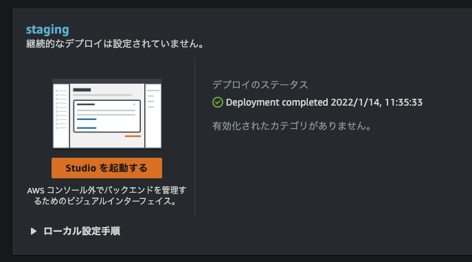
Amplify Studioを起動する
しばらく待つと Studio を起動する が表示されました。
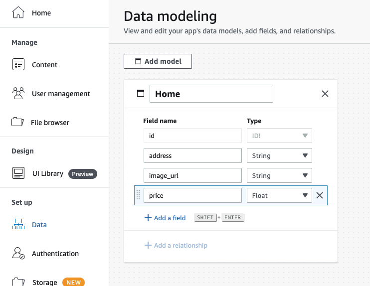
データモデル、データを作成
記事内容と同じ通りデータモデルを作成。Save and Deployで保存。
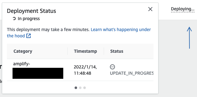
右上のDeploying...を押下するとCloudFormationのステータスも確認できました。
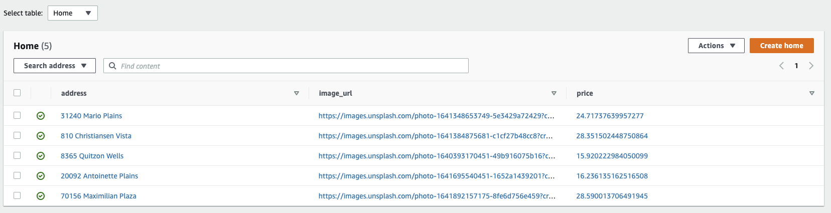
ランダムシードデータを作成。
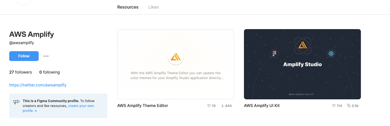
Figma側でAWS Amplify UI Kitをインストール
Communityで検索したら出てきたので、Duplicateで手元へ。
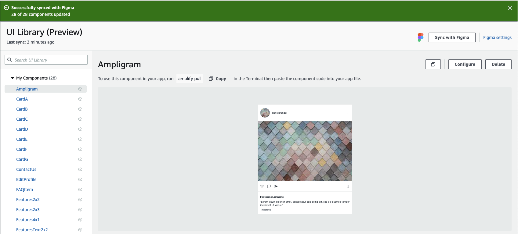
Amplify Studioで同期
Amplify Studio側でFigmaのURLを指定したら、Importすることができました!
Sync with Figmaをクリックするたびに、同期を取る仕様のようです。
手元のコードに反映
amplify pullしてみると、失敗。
$ amplify pull --appId <appId> --envName staging
Invalid feature flag configuration

These feature flags are defined in the "amplify/cli.json" configuration file and are unknown to the currently running Amplify CLI:
  - project
  - graphqltransformer.transformerversion
  - graphqltransformer.suppressschemamigrationprompt
  - auth.useenabledmfas

This issue likely happens when the project has been pushed with a newer version of Amplify CLI, try updating to a newer version.

Learn more about feature flags: https://docs.amplify.aws/cli/reference/feature-flags
versionが古かったので更新!
$ amplify version
6.3.0

$ amplify version
7.6.9
再pull OK。
$ amplify pull --appId <appId> --envName staging
Opening link: https://**********/staging/verify/
✔ Successfully received Amplify Studio tokens.
Amplify AppID found: ************. Amplify App name is: amplify-homes
Backend environment staging found in Amplify Console app: amplify-homes
? Choose your default editor: Visual Studio Code
? Choose the type of app that you're building javascript
Please tell us about your project
? What javascript framework are you using react
? Source Directory Path:  src
? Distribution Directory Path: build
? Build Command:  npm run-script build
? Start Command: npm run-script start
✔ Synced UI components.
GraphQL schema compiled successfully.

Edit your schema at <DIR_ROOT>/amplify/backend/api/amplifyhomes/schema.graphql or place .graphql files in a directory at <DIR_ROOT>/amplify/backend/api/amplifyhomes/schema
Successfully generated models. Generated models can be found in <DIR_ROOT>/src
? Do you plan on modifying this backend? No

Added backend environment config object to your project.
Run 'amplify pull' to sync future upstream changes.
src/ui-componens内にFigmaで定義したコンポーネント群が作成されました。
$ ls src/ui-components/
Ampligram.jsx                   CardF.jsx                       Features2x3.jsx                 HeroLayout3.jsx                 ProfileA.jsx
Ampligram.jsx.d.ts              CardF.jsx.d.ts                  Features2x3.jsx.d.ts            HeroLayout3.jsx.d.ts            ProfileA.jsx.d.ts
CardA.jsx                       CardG.jsx                       Features4x1.jsx                 HeroLayout4.jsx                 SideBar.jsx
CardA.jsx.d.ts                  CardG.jsx.d.ts                  Features4x1.jsx.d.ts            HeroLayout4.jsx.d.ts            SideBar.jsx.d.ts
CardB.jsx                       ContactUs.jsx                   FeaturesText2x2.jsx             MarketingFooter.jsx             SocialA.jsx
CardB.jsx.d.ts                  ContactUs.jsx.d.ts              FeaturesText2x2.jsx.d.ts        MarketingFooter.jsx.d.ts        SocialA.jsx.d.ts
CardC.jsx                       EditProfile.jsx                 FormCheckout.jsx                MarketingPricing.jsx            SocialB.jsx
CardC.jsx.d.ts                  EditProfile.jsx.d.ts            FormCheckout.jsx.d.ts           MarketingPricing.jsx.d.ts       SocialB.jsx.d.ts
CardD.jsx                       FAQItem.jsx                     HeroLayout1.jsx                 NavBar.jsx                      index.js
CardD.jsx.d.ts                  FAQItem.jsx.d.ts                HeroLayout1.jsx.d.ts            NavBar.jsx.d.ts
CardE.jsx                       Features2x2.jsx                 HeroLayout2.jsx                 ProductDetail.jsx
CardE.jsx.d.ts                  Features2x2.jsx.d.ts            HeroLayout2.jsx.d.ts            ProductDetail.jsx.d.ts
試しにCardDコンポーネントの中身をみてみます。
/***************************************************************************
 * The contents of this file were generated with Amplify Studio.           *
 * Please refrain from making any modifications to this file.              *
 * Any changes to this file will be overwritten when running amplify pull. *
 **************************************************************************/

/* eslint-disable */
import React from "react";
import { getOverrideProps } from "@aws-amplify/ui-react/internal";
import { Image, Text, View } from "@aws-amplify/ui-react";
export default function CardD(props) {
  const { overrides: overridesProp, ...rest } = props;
  const overrides = { ...overridesProp };
  return (
    <View
      width="320px"
      height="320px"
      position="relative"
      padding="0px 0px 0px 0px"
      {...rest}
      {...getOverrideProps(overrides, "View")}
    >
      <Image
        width="320px"
        height="320px"
        position="absolute"
        left="0px"
        top="0px"
        borderRadius="8px"
        padding="0px 0px 0px 0px"
        {...getOverrideProps(overrides, "View.Image[0]")}
      ></Image>
      <Text
        fontFamily="Inter"
        fontSize="32px"
        fontWeight="700"
        color="rgba(255,255,255,1)"
        lineHeight="40px"
        textAlign="center"
        display="flex"
        direction="column"
        justifyContent="flex-start"
        position="absolute"
        left="101px"
        top="240px"
        padding="0px 0px 0px 0px"
        children="Explore"
        {...getOverrideProps(overrides, "View.Text[0]")}
      ></Text>
    </View>
  );
}
/***************************************************************************
 * The contents of this file were generated with Amplify Studio.           *
 * Please refrain from making any modifications to this file.              *
 * Any changes to this file will be overwritten when running amplify pull. *
 **************************************************************************/

import React from "react";
import { EscapeHatchProps } from "@aws-amplify/ui-react/internal";
import { ViewProps } from "@aws-amplify/ui-react";
export declare type CardDProps = React.PropsWithChildren<Partial<ViewProps> & {
    overrides?: EscapeHatchProps | undefined | null;
}>;
export default function CardD(props: CardDProps): React.ReactElement;
あとはこのコンポーネントを使用するだけというところまで確認できました!!
まとめ
コンポーネントのReactがばばんと作成されて、大変便利だと感じました!!!
一方で実務レベルで考えると気になることもいくつかありましたので挙げておきます。
- Figmaの同期が手動のみに見えたので、それだと、古いUIコンポーネントを使用していることに気づかなさそう。
- Amplify Studioでの変更がFigmaに反映されなさそう
- 基本デザイン変更はFigma起点になるのかな?
- ハンズオンのコンポーネント管理レベルならよさそうだけど、ページ全体をこの方法で管理するとなると、機能仕様変更でちょっとデザインを変えたい時もデザイナーさん経由でFigma修正が発生する形になるのかな…
デザイン周りは詳しくないので誤解があるかもしれませんが、
コード生成もしてくれるStorybookみたいな立ち位置が今のところ一番しっくりきています。
全面的に使用すると細かい修正が不便だったり、スピード感が落ちたりといったことが出てきそうですね。
プロダクトで使用しましたら、フィードバックを追記していきたいと思います。