1. はじめに
今回、plotly、dash というライブラリを用いて LinkedIn データを可視化する Web アプリを作っていこうと思います。
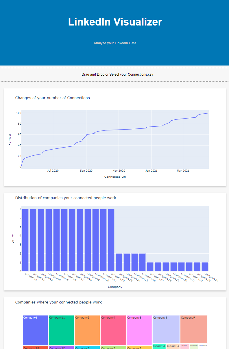
完成イメージは下の画像のような感じです。
要は、
- ユーザーがアップロードしたデータに応じて
- plotlyでグラフを書き
- グラフをユーザーに返してあげる
ような Dash アプリケーションを作ろうというものです。
https://linkedin-visualizer.herokuapp.com/ にて試していただくこともできます。
サンプルデータは こちら をお使いください。
LinkedInアカウントをお持ちの方は、(取得方法) に沿って Connections.csv というファイルを取得すると、ご自身のデータを可視化することができます。
2. Plotly、Dashについて
2.1 Plotly
Document から引用します
Plotly's Python graphing library makes interactive, publication-quality graphs. Examples of how to make line plots, scatter plots, area charts, bar charts, error bars, box plots, histograms, heatmaps, subplots, multiple-axes, polar charts, and bubble charts. (https://plotly.com/python/)
注目すべきは interactive というところ。
例えばマウスをホバーするとその時点の数字としてのデータが表示されたり、
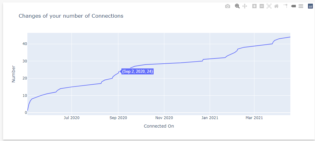
ズームしたりできます。

実は、Dash Core Componentというモジュールを用いると、スライサーをつけたり pull down をつけたりと、もう少し高度なことができます。
2.2 Dash
これも Document から引用します。
Dash is a productive Python framework for building web analytic applications.
Written on top of Flask, Plotly.js, and React.js, Dash is ideal for building data visualization apps with highly custom user interfaces in pure Python. It's particularly suited for anyone who works with data in Python.
Through a couple of simple patterns, Dash abstracts away all of the technologies and protocols that are required to build an interactive web-based application. Dash is simple enough that you can bind a user interface around your Python code in an afternoon.
Dash apps are rendered in the web browser. You can deploy your apps to servers and then share them through URLs. Since Dash apps are viewed in the web browser, Dash is inherently cross-platform and mobile ready.
この中で、"interactive web-based application" を簡単に構築できて、サーバーにデプロイすれば他の人とも作成物を共有できる、ということが書かれています。
ここに書かれていることを信じてやってみます。
今回はインタラクティブ性を「ユーザーがアップロードしたデータに応じたグラフのレンダリング」として与えることとし、
アプリケーションは Heroku サーバにデプロイすることとします。
3. 開発
ということで、作っていきます。
掲載するソースコードの全体は https://github.com/camsenec/linkedIn-visualization にあります。
実装は、
- ユーザーがアップロードしたデータに応じて
- plotlyでグラフを書き
- グラフをユーザーに返してあげる
という流れで進めます。
使用したモジュールとそのバージョンは以下です。必要に応じてインストールしてください。
numpy==1.20.1
dash==1.20.0
plotly==4.14.3
pandas==1.2.2
dash_html_components==1.1.3
dash_core_components==1.16.0
dash_table==4.11.3
3.1 準備
とりあえずDashアプリケーションを実行してみましょう。
import dash
import dash_html_components as html

app = dash.Dash(__name__)
app.layout=html.P("Hello World")

if __name__ == "__main__":
    app.run_server(debug=True, use_reloader=True)
というファイルを作成したうえで実行です。
python app.py
流れは、
- Dashアプリケーションのインスタンスを作って
- レイアウトを定義して
- 実行する
という形です。
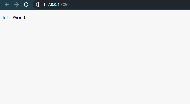
コマンドライン上に
Dash is running on http://127.0.0.1:8050/
といった表示がされるのでアクセスしてみましょう。すると、こんなページが見えるはずです。
このapp.layoutの値を変えれば、好きなようにhtmlレイアウトを構成できます。
ということで、こんな感じにしましょう。
# Initiate Application Instance
app = dash.Dash(__name__)
app.title = "LinkedIn Visualizer"

# HTML document that is initially displayed, which consists of a title area and an input form)
app.layout = html.Div(children=[
    # title area
    html.Div(
          children=[
              html.H1(
                  children="LinkedIn Visualizer", className="header-title"
              ),
              html.P(
                  children="Analyze your LinkedIn Data",
                  className="header-description",
              ),
          ],
                  className="header",
        ),
])
if __name__ == "__main__":
    app.run_server(debug=True, use_reloader=True)
CSSファイルやJSファイルは、assetsというディレクトリを作成しその配下に置くことで自動的に読み込まれます ( https://dash.plotly.com/dash-enterprise/static-assets )。
今回作るアプリのassetsディレクトリ内ファイルは、簡単な style.css のみで、
https://github.com/camsenec/linkedIn-visualization/tree/master/assets
にあります。
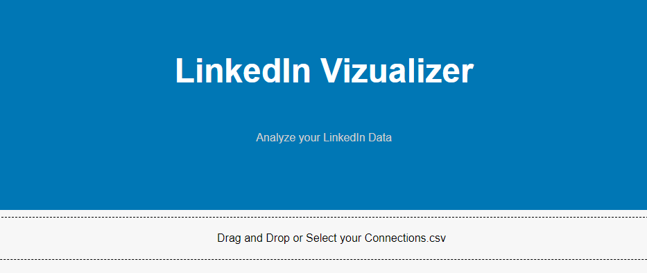
assets/style.css を配置するとこんな感じになります。

ではこれより機能実装していきましょう。
3.2 機能別実装
3.2.1 ユーザーのファイルアップロード
ファイルをアップロードするためのフォームには、dash_core_components.Upload() を用いることができます。 今回は Documentation で例示されているフォーム をほぼそのまま利用します。
import dash
import dash_core_components as dcc
import dash_html_components as html
from dash.dependencies import Input, Output, State
import visualizer

# Initiate Application Instance
app = dash.Dash(__name__)
app.title = "LinkedIn Visualizer"

# HTML document that is initially displayed, which consists of a title area and an input form)
app.layout = html.Div(children=[
    # title area
    html.Div(
          children=[
              html.H1(
                  children="LinkedIn Visualizer", className="header-title"
              ),
              html.P(
                  children="Analyze your LinkedIn Data",
                  className="header-description",
              ),
          ],
                  className="header",
        ),

    # input form
    dcc.Upload(
        id='upload-data',
        children=html.Div([
            'Drag and Drop or ',
            html.A('Select your Connections.csv')
        ]),
        style={
            'width': '100%',
            'height': '60px',
            'lineHeight': '60px',
            'borderWidth': '1px',
            'borderStyle': 'dashed',
            'borderRadius': '5px',
            'textAlign': 'center',
            'margin': '10px'
        },
        # Allow multiple files to be uploaded
        multiple=True
    ),
    # a hidden html element
    html.Div(id='output-data-upload'),
])
次に、アップロードされたファイルを処理する関数を書きます。この関数はコールバックとして実装し、アップロードフォームに紐づけます。具体的には以下のようにします。これもDocumentation で例示されているもの をほぼそのまま利用しています。
@app.callback(Output('output-data-upload', 'children'),
              Input('upload-data', 'contents'),
              State('upload-data', 'filename'),
              State('upload-data', 'last_modified'))
def update_output(list_of_contents, list_of_names, list_of_dates):
    if list_of_contents is not None:
        children = [
            visualizer.parse_contents(c, n, d) for c, n, d in
            zip(list_of_contents, list_of_names, list_of_dates)]
        return children
簡単に解説すると、この関数は
-
id=output-data-uploadで参照される HTML element のchildren(=アップロードフォーム) に入力されたファイルを受け取り -
contents と filename を
Stateとしてもち -
id=output-data-uploadで参照される HTML element のchildrenというフィールドに返り値を代入する
ということをします。つまり、dcc.Upload() 内の
    # a hidden html element
    html.Div(id='output-data-upload')
が、ユーザーのファイルアップロードに応じて
    # a hidden html element
    # children is the return value of upload_output function
    html.Div(id='output-data-upload', children=children)
と形を変えます。この children に HTML element を与えてあげることで、動的なビューを生成することができます。
このあとのステップは
2. plotlyでグラフを書き
3. グラフをユーザーに返してあげる
という形ですが、これまで行ってきたことを考えると、
plotlyでグラフを書いて、HTML フォーマットでレイアウトして、そのレイアウトを返却する関数
を書けばよさそうです。その返り値が html.Div(id='output-data-upload', children=children) の children に代入され、グラフビューを生成することになります。
3.2.2 plotlyでグラフを書く
Plotlyでのグラフの書き方そのものについてはこの記事では言及しません。公式ページに様々な例が紹介されており、それぞれコードを参照することができます。
また、Qiita上にも
といった記事を見つけることができました。
今回は、Connections.csvという 以下のような形式のデータ(取得方法 )を用います。
First Name,Last Name,Email Address,Company,Position,Connected On
Mcqueen, Mejiro, mcqueen@mejiro.com, Mejiro Shouji, Race Horse, 04-May-21
...
このデータをもとに、
- コネクション数の変化を表すグラフ
- つながっている人の所属分布
- つながっている人が所属している企業
- つながっている人が働いているポジション
を図示することにします。
import plotly.graph_objects as go
import plotly.express as px
import datetime

# Changes of the number of connections
def trend(connections_df):
    # This format list is prepared for the format variety
    # of LinkedIn Connection.csv dataset.
    format_cand = ["%d %b %y", "%d %b %Y", "%d-%b-%y", "%d-%b-%Y"]
    for format in format_cand:
        try:
            connections_df["Connected On"] = connections_df["Connected On"].apply(
                lambda x: datetime.datetime.strptime(x, format).strftime("%Y-%m-%d"))
        except:
            print("format error")
            continue
        else:
            break

    df = connections_df.groupby(by="Connected On").count().reset_index()
    df["count"] = 0
    for i, index in enumerate(df.index):
        if i == df.index[0]:
            df.loc[index,"count"] = df.loc[index,"First Name"]
        else:
            df.loc[index,"count"] = df.iloc[i-1]["count"] + df.loc[index,"First Name"]


    fig = go.Figure()
    fig.add_trace(go.Scatter(x=df["Connected On"],
                        y=df["count"]))
    fig.update_layout(title='Changes of your number of Connections',
                    xaxis_title='Connected On',
                    yaxis_title='Number')
    return fig

# Distribution of companies connected people work at
def company_hist(connections_df):
    fig  = px.histogram(connections_df, x = "Company")
    fig.update_layout(title='Distribution of companies your connected people work')
    return fig

# Companies where connected people work
def company_treemap(connections_df):
    df_by_company = connections_df.groupby(by="Company").count().reset_index().sort_values(
        by="First Name", ascending=False).reset_index(drop=True)
    company_treemap = px.treemap(df_by_company[:100], path=["Company"],
                    values="First Name",
                    labels={"First Name": "Count"})
    company_treemap.update_layout(title='Companies where your connected people work')
    return company_treemap

# Job Positions of connected people
def position_treemap(connections_df):
    df_by_position = connections_df.groupby(by="Position").count().reset_index().sort_values(
        by="First Name", ascending=False).reset_index(drop=True)
    position_treemap = px.treemap(df_by_position[:100], path=["Position"],
                    values="First Name",
                    labels={"First Name": "Count"})
    position_treemap.update_layout(title='Job Positions of your connected people')
    print(type(position_treemap))
    return position_treemap
3.2.3 グラフをユーザーに返す
最後にステップ 2 で定義した関数を呼び出し、ページ内に HTML Element として組み込んでいきます。parse_contents() という関数はファイルアップロードと同時に呼び出されるコールバック関数 update_output() 内で呼び出していた関数です。
ここではまず、 csv ファイルを pandas Dataframe として読み込み、そのDataframeを引数としてgraph.pyで定義した関数を呼び出しています。帰り値である plotly.graph_objects を dash_core_components.Graph でラップしてあげることでグラフを HTML Element として組み込むことができます。
import dash_core_components as dcc
import dash_html_components as html
import pandas as pd
import graphs

import base64
import datetime
import io

def parse_contents(contents, filename, date):
    content_type, content_string = contents.split(',')

    decoded = base64.b64decode(content_string)
    try:
        if 'csv' in filename:
            # Assume that the user uploaded a CSV file
            # Sometimes, LinkedIn dataset has "Notes" at the beginning
            # of the csv file. In this case, the "Notes" is removed.
            if "Notes:" == decoded.decode('utf-8')[0:6]:
                connections_df = pd.read_csv(io.StringIO(decoded.decode('utf-8').split('\n\n')[1]))
            else:
                connections_df = pd.read_csv(io.StringIO(decoded.decode('utf-8')))
        else:
           return html.Div([
            'This file extension is not supported'
        ])
    except Exception as e:
        print(e)
        return html.Div([
            'There was an error processing this file.'
        ])

    return html.Div(
    children=[
        html.Div(
            children=[
                html.Div(
                    children=dcc.Graph(
                      figure=graphs.trend(connections_df)
                    ),
                    className="card",
                ),
                html.Div(
                    children=dcc.Graph(
                        figure=graphs.company_hist(connections_df)
                    ),
                    className="card",
                ),
                html.Div(
                    children=dcc.Graph(
                        figure=graphs.company_treemap(connections_df)
                    ),
                    className="card",
                ),
                html.Div(
                    children=dcc.Graph(
                        figure=graphs.position_treemap(connections_df)
                    ),
                    className="card",
                ),
            ],
            className="wrapper",
        ),
    ]
)
3.3 テスト
最後に、
python app.py
と実行しローカルホストにもう一度アクセスしてみましょう。
すると、以下のようなページが見えるはずです。
ここに、サンプルデータを投げてみましょう。4つのグラフが表示されれば成功です。
うまくいかない場合や、私のコードに誤りがある場合はコメントいただけると幸いです。

4. まとめ
今回は、Dash と Plotly を用いて LinkedIn のデータを可視化するアプリを作ってみました。
他にも、
- ユーザーがアップロードしたデータに応じて
- plotly でグラフを書き
- グラフをユーザーに返してあげる
という流れで、
あらゆるデータセットから、あらゆる可視化をおこなうことができます。