事前準備
こちらの記事を参考にヘッダーまで作成してみましょう!
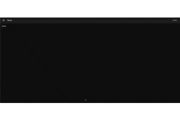
以下が作成した画面です。(ダークモード設定時)

ヘッダー部分とメニューボタンをコンポーネント化
ヘッダーのコンポーネント化
ヘッダーをコンポーネント化してトップ画面のコードを整理します。
import * as React from 'react';
import { Header } from '../../model/header/header';

export const Top = () => {
  return (
    <>
      <Header />
    </>
  );
}
ヘッダーコンポーネントのコードは以下の通りです。
import * as React from 'react';
import AppBar from '@mui/material/AppBar';
import Box from '@mui/material/Box';
import Toolbar from '@mui/material/Toolbar';
import Typography from '@mui/material/Typography';
import Button from '@mui/material/Button';
import IconButton from '@mui/material/IconButton';
import MenuIcon from '@mui/icons-material/Menu';

export const Header = () => {
  return (
    <Box sx={{ flexGrow: 1 }}>
      <AppBar position="static">
        <Toolbar>
          <IconButton
            size="large"
            edge="start"
            color="inherit"
            aria-label="menu"
            sx={{ mr: 2 }}
          >
            <MenuIcon />
          </IconButton>
          <Typography variant="h6" component="div" sx={{ flexGrow: 1 }}>
            News
          </Typography>
          <Button color="inherit">Login</Button>
        </Toolbar>
      </AppBar>
    </Box>
  );
}
これでヘッダーのコンポーネント化は完了です。
メニューボタンのコンポーネント化
メニューボタンをコンポーネント化して、ヘッダーのコードを整理します。
import * as React from 'react';
import IconButton from '@mui/material/IconButton';
import MenuIcon from '@mui/icons-material/Menu';

export function MenuButton() {
    return (
        <>
            <IconButton
                size="large"
                edge="start"
                color="inherit"
                aria-label="menu"
                sx={{ mr: 2 }}
            >
                <MenuIcon />
            </IconButton>
        </>
    );
 }
import * as React from 'react';
import AppBar from '@mui/material/AppBar';
import Box from '@mui/material/Box';
import Toolbar from '@mui/material/Toolbar';
import Typography from '@mui/material/Typography';
import Button from '@mui/material/Button';
import { MenuButton } from '../../ui/button/menuButton';

export const Header = () => {
  return (
    <Box sx={{ flexGrow: 1 }}>
      <AppBar position="static">
        <Toolbar>
          <MenuButton />
          <Typography variant="h6" component="div" sx={{ flexGrow: 1 }}>
            News
          </Typography>
          <Button color="inherit">Login</Button>
        </Toolbar>
      </AppBar>
    </Box>
  );
}
これでメニューボタンのコンポーネント化は完了です。
サイドバー開閉の実装
useContextについて
まずはサイドバー開閉の状態を管理するuseContextについて説明します。
useContext とは Context 機能をよりシンプルに使えるようになった React 独自の機能です。
簡単に言うと、親から props で渡されていないのに、Context に収容されているデータにアクセスできるというものです。
Context とは
props とは別の方法でコンポーネントに動的に値を渡す、 React 独自のAPIです。
props のバケツリレーを回避するために存在します。
useContextの実装
createContext メソッドを利用し、サイドバー開閉の状態を管理する menuContext を作成します。
import { createContext } from "react";

export const menuContext = createContext({
    isOpened: false,
    setOpened: (isOpen: boolean) => {}
});
menuContextを参照する
上記で作成した menuContext を参照します。
import * as React from 'react';
import IconButton from '@mui/material/IconButton';
import MenuIcon from '@mui/icons-material/Menu';
import { useContext } from 'react';
import { menuContext } from '../../../hooks/appState';

export function MenuButton() {
    const { isOpened, setOpened } = useContext(menuContext);
    const toggleOpen = () => setOpened(!isOpened);

    return (
        <>
            <IconButton
                size="large"
                edge="start"
                color="inherit"
                aria-label="open drawer"
                onClick={toggleOpen}
                sx={{ mr: 2 }}
            >
                <MenuIcon />
            </IconButton>
        </>
    );
 }
onClick イベントを追加することでヘッダーにあるメニューボタンをクリックした際に toggleOpen メソッドが呼び出され、menuContext の値が変化します。
サイドバーの作成
開閉するサイドバーを作成します。
import * as React from 'react';
import Box from '@mui/material/Box';
import Drawer from '@mui/material/Drawer';
import Toolbar from '@mui/material/Toolbar';
import List from '@mui/material/List';
import ListItem from '@mui/material/ListItem';
import ListItemButton from '@mui/material/ListItemButton';
import { ListItemText } from '@mui/material';

type Props = {
    open: boolean;
};

export const DesktopDrawer: React.FC<Props> = (props) => {
    return (
        <>
            <Drawer
                sx={{
                    width: 200,
                    flexShrink: 0,
                    '& .MuiDrawer-paper': {
                        width: 200,
                    },
                }}
                variant="persistent"
                anchor="left"
                open={props.open}
            >
                <Toolbar />
                <Box sx={{overflow: "auto"}}>
                    <List>
                        <ListItemButton>
                        <ListItemText
                            sx={{ my: 0 }}
                            primary="home"
                            primaryTypographyProps={{
                                fontSize: 18,
                                fontWeight: 'medium',
                                letterSpacing: 0,
                            }}
                        >
                        </ListItemText>
                        <ListItem />
                        </ListItemButton>
                    </List>
                </Box>
            </Drawer>
        </>
    );
};
サイドバー側では、drawer の開閉状態をシンプルに props で受け取るようにします。
トップ画面にサイドバー開閉を実装
トップ画面に作成したサイドバー開閉を反映させます。
import * as React from 'react';
import { Header } from '../../model/header/header';
import { menuContext } from '../../../hooks/appState';
import { DesktopDrawer } from '../../model/drawer/drawer';

export const Top = () => {
    const [isOpened, setOpened] = React.useState(true);

    return (
        <>
            <menuContext.Provider value={{isOpened, setOpened}}>
                    <Header />
                    <DesktopDrawer open={isOpened} />
            </menuContext.Provider>
        </>
    );
 }
トップ画面では、menuContext の Provider を通じて ReactContext を利用できるようにします。
その上で、開閉状態を読み取るコンポーネントである DesktopDrawer には isOpened プロパティを渡します。
Provider とは
全てのコンテクストオブジェクト(Context)にはプロバイダ(Provider)コンポーネントが付属しています。
Provider コンポーネントは、props として value を受け取ります。
この value に入れるのは、バケツリレーしていた値です。
作成した画面は以下の通りになります。

あ…
ヘッダーが隠れてしまいました…
これは私もつまずいた所で、完成したと思いきやこの画面が出てきた時は絶望しました(笑)
でも安心して下さい(笑)解決したからこの記事を書いています。
ヘッダーコンポーネントを以下のように修正すれば解決します。
import * as React from 'react';
import AppBar from '@mui/material/AppBar';
import Box from '@mui/material/Box';
import Toolbar from '@mui/material/Toolbar';
import Typography from '@mui/material/Typography';
import Button from '@mui/material/Button';
import { MenuButton } from '../../ui/button/menuButton';

export const Header = () => {
  return (
    <Box sx={{ flexGrow: 1 }}>
        <AppBar
            position="fixed"
            sx={{ zIndex: (theme) => theme.zIndex.drawer + 1 }}
        >
        <Toolbar>
          <MenuButton />
          <Typography variant="h6" component="div" sx={{ flexGrow: 1 }}>
            News
          </Typography>
          <Button color="inherit">Login</Button>
        </Toolbar>
      </AppBar>
    </Box>
  );
}
修正した箇所は、 <AppBar position="fixed" sx={{ zIndex: (theme) => theme.zIndex.drawer + 1 }} >
です。
これでヘッダーに隠れず、サイドバーの開閉が可能になりました!