実装したいこと
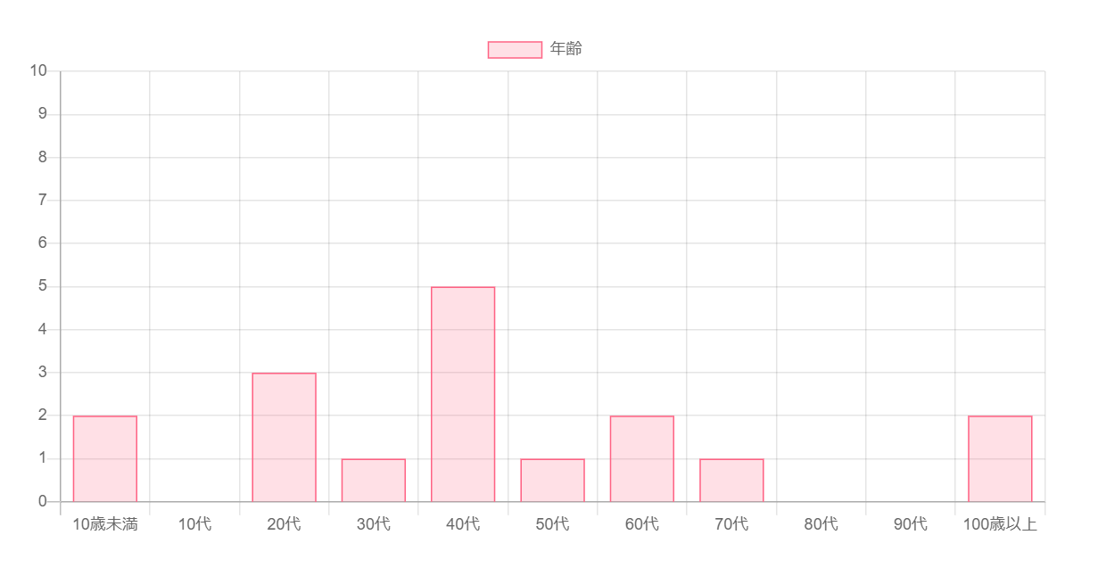
年齢人数を調べたデータベース「age_data」からグラフを作成する。
環境
- XAMPP Version 8.1.10
- Visual Studio Code Version 1.74.2
データベース(phpMyAdmin)
| テーブル「age_data」 | テーブル「age」 |
|---|---|
 |
 |
お手本にしたコード
<div>
  <canvas id="myChart"></canvas>
</div>

<script src="https://cdn.jsdelivr.net/npm/chart.js"></script>

<script>
  const ctx = document.getElementById('myChart');

  new Chart(ctx, {
    type: 'bar',
    data: {
      labels: ['Red', 'Blue', 'Yellow', 'Green', 'Purple', 'Orange'],
      datasets: [{
        label: '# of Votes',
        data: [12, 19, 3, 5, 2, 3],
        borderWidth: 1
      }]
    },
    options: {
      scales: {
        y: {
          beginAtZero: true
        }
      }
    }
  });
</script>
引用 : Getting Started | Chart.js
phpファイル
<?php
    try {
            $pdo = new PDO(
                'mysql:dbname=xxx;host=localhost;charset=utf8',
                'xxx',
                'xxx',
                [
                    PDO::ATTR_ERRMODE => PDO::ERRMODE_EXCEPTION,
                    PDO::ATTR_DEFAULT_FETCH_MODE => PDO::FETCH_ASSOC,
                    PDO::ATTR_EMULATE_PREPARES =>false
                ]
            );
            $sql = "SELECT age,count(age_id) FROM age_data
                    RIGHT OUTER JOIN age on age.id = age_data.age_id
                    GROUP BY age
                    ORDER BY age.id";
            $stmt = $pdo->prepare($sql);
            $stmt->execute();
            $result = $stmt->fetchAll();
        } catch (PDOException $e) {
            header('Content-Type: text/plain; charset=UTF-8', true, 500);
            exit($e->getMessage());
        }
        header('Content-Type: text/html; charset=utf-8');
?>
<!DOCTYPE html>
<html lang="ja">
    <head>
        <meta charset="UTF-8">
        <meta name="viewport" content="width=device-width, initial-scale=1.0">
        <title>example2</title>
    </head>
    <body>
        <center>
            <div class="chart-container" style="position: relative; height:40vh; width:60vw">
                <canvas id="myChart" ></canvas>
                <script src="https://cdnjs.cloudflare.com/ajax/libs/Chart.js/2.9.3/Chart.bundle.min.js"></script>
                <script>
                    var ctx = document.getElementById('myChart').getContext('2d');
                    var myChart = new Chart(ctx, {
                        type: 'bar',
                        data: {
                            labels: [<?php foreach($result as $row){
                                            echo '"'.($row["age"]).'",';
                                     } ?>],
                            datasets: [{
                                label: '年齢',
                                data: [<?php foreach($result as $row){
                                            echo $row["count(age_id)"].",";
                                       } ?>],
                                backgroundColor:
                                    'rgba(255, 99, 132, 0.2)',
                                borderColor:
                                    'rgba(255, 99, 132, 1)',
                                borderWidth: 1
                            }]
                        },
                        options: {
                            scales: {
                                yAxes: [{
                                    ticks: {
                                        beginAtZero: true,
                                        max: 10
                                    }
                                }]
                            }
                        }
                    });
                </script>
            </div>
        </center>
    </body>
</html>
ポイント解説
            $sql = "SELECT age,count(age_id) FROM age_data
                    RIGHT OUTER JOIN age on age.id = age_data.age_id
                    GROUP BY age
                    ORDER BY age.id";
テーブルageとage_dataを左外部結合する。
これで年齢データがない年代も0人として、グラフに表示されるようになる。
カラムageをグループ化することで、「10歳未満」、「10代」、「20代」…ごとにまとめる。
テーブルageのカラムidを昇順で並べてあげることで、「10歳未満」、「10代」、「20代」…のように順に表示させる。
 <div class="chart-container" style="position: relative; height:40vh; width:60vw">
    <canvas id="myChart" ></canvas>
グラフのサイズを変更するには、<canvas>タグを<div>タグで囲む。
参考:Responsive Charts | Chart.js
                        data: {
                            labels: [<?php foreach($result as $row){
                                            echo '"'.($row["age"]).'",';
                                     } ?>],
labels(x軸)には、テーブルageのカラムageをループで、「10歳未満」、「10代」、「20代」…と表示。
文字列は、""でくくる。
変数と文字列を結合するには、.でくくる。
                                data: [<?php foreach($result as $row){
                                            echo $row["count(age_id)"].",";
                                       } ?>],
年代別の人数count(age_id)をグラフのデータとして、渡す。
                        options: {
                            scales: {
                                yAxes: [{
                                    ticks: {
                                        beginAtZero: true,
                                        max: 10
                                    }
                                }]
                            }
                        }
Y軸yAxesの最大値を10とする。