はじめに
2025年も早いものでもう年の瀬ですね。年末といえば年賀状を作成すると思います。
そこで、今回は生成AI(ChatGPT + Nano banana)を使って、年賀状の作成に挑戦した結果を記事にまとめます。
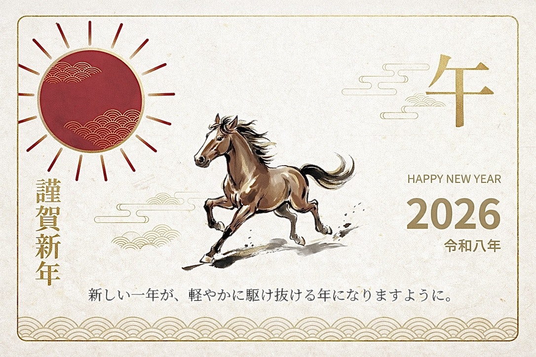
最終的に作成した年賀状のデザインがこちらです!

やったことはざっくりいうとこんな感じです。
- ChatGPTとSVGでレイアウトから組む
- 対話しながらデザインやレイアウトを修正していく
- 一定の品質になったらNano bananaを使ってSVGから画像化
- gpt-image-1.5を使って画像としての微調整
この記事は「デザイナーではないエンジニアが、AIをフル活用して年賀状を作るとこうなる」という記録だと思ってもらえれば幸いです。
準備:Skill(作業環境)を用意する
いきなり画像生成AIだけで完結させることもできますが、今回は
「印刷に耐えるデータを、ある程度再現性のある形で作りたい」
というモチベーションがあったので、まずは SVG ベースで組版できる環境 を用意しました。
SVG 用の Skill を作る
ChatGPT から見ると、外部スクリプトをまとめた「Skill」を渡しておくと、
いい感じにそれを呼びながら作業してくれます。
ディレクトリ構成はこんな感じにしました。
svg_skill_utils/
  ├─ skill.md
  ├─ install_fonts.py
  ├─ render_svg.py
  ├─ text_to_path.py
  └─ requirements.txt
skill.md には、
- どういう Python スクリプトがあって
- どういう引数で呼べばよくて
- 何に使うつもりなのか
という説明を書いておきます。
これを読ませておくと、ChatGPT が勝手に
「じゃあ
render_svg.pyでプレビュー出してみますね」
みたいに言いながら裏でスクリプトを叩いてくれます。
# SVG Skill (Create • Edit • Validate • Render-check) with Japanese font support

## When to use this skill
- Create SVG icons/illustrations/diagrams that may include Japanese text
- Edit/patch existing SVGs (layout, color, text, sizing)
- Produce reliable preview renders (PNG) that match intended typography

IMPORTANT: system/user instructions ALWAYS take precedence over this skill.

## Inputs / Outputs
- Input locations:
  - Assets provided by user MUST be in /mnt/data (SVG, font files, CSV, etc.)
- Output locations:
  - All deliverables MUST be written to /mnt/data
- Output formats:
  - Primary: .svg (source SVG)
  - Required by default: .png preview(s) rendered from SVG (unless user explicitly says no)
  - Optional: *_text2path.svg (portable SVG with text converted to paths)

## Primary tooling (installed in this environment)
### SVG generation
- Python + svgwrite (preferred)
- Python + lxml for structural edits & validation

### Fonts (Japanese rendering)
- Python stdlib: base64 (for embedding if needed)
- fontTools + brotli for optional subsetting + WOFF2 packaging

### Render-check (visual verification)
- Inkscape CLI (preferred, most reliable with fonts): `inkscape`
- CairoSVG is available and can be used as a secondary renderer, but Inkscape is default for Japanese text.

### PNG parts (sprite-sheet) extraction for collage
When users provide (or we generate) a PNG asset intended to be collaged into an SVG,
we often need to extract a clean "part" (e.g., one horse from a 2x2 grid).

**Do NOT** remove background by color-keying (e.g., "make black transparent").
That destroys legitimate details that share the same color (mane/hoof/outlines),
and produces a broken alpha channel.

Preferred approach: **crop tiles directly from the original RGBA image**.
This repo includes an alpha-safe splitter:

- `split_sprite_sheet.py` — split an R×C grid into tiles, optionally trim to the
  non-transparent bbox, and optionally emit alpha debug outputs (alpha view + histogram).

### Optimization
- svgo is NOT installed; do not rely on it.
- If optimization is needed, prefer Inkscape save/export or minimal structural cleanup via lxml.

## Japanese font policy (must-follow)
### Goal
- Japanese text MUST render correctly using a user-attached font when provided.

### Font input
- Accept font files in /mnt/data:
  - .ttf, .otf, .ttc, .woff, .woff2
- If multiple are provided, prefer user-specified one; otherwise pick the most likely JP-capable font.

### Rendering strategy (default)
1) Install attached font into the runtime fontconfig so Inkscape can render it:
   - Copy font into: ~/.local/share/fonts/svg_skill/
   - Run: `fc-cache -f` (or `fc-cache -f ~/.local/share/fonts`)
2) Set SVG text style to use that font family (font-family).
3) Produce PNG previews via Inkscape to confirm glyphs and layout.

### Portability strategy (choose based on request)
- If the user wants the SVG itself to carry typography reliably across machines:
  A) Preferred: export a second SVG with text converted to paths:
     - `inkscape in.svg --export-text-to-path --export-type=svg --export-filename=out_text2path.svg`
     - Pros: perfect fidelity everywhere
     - Cons: larger paths, no text editability
  B) Optional: embed the font into SVG via @font-face using a data URI:
     - If file size matters, subset to used glyphs and convert to WOFF2.
     - Pros: keeps <text> editable, works well in browsers
     - Cons: some non-browser viewers may not respect embedded @font-face

Default deliverables for Japanese text:
- out.svg (editable, uses the attached font family name)
- out_preview_1x.png (Inkscape-rendered)
- out_preview_2x.png (optional, recommended for UI)
- If portability is required: out_text2path.svg (Inkscape text-to-path)

## Workflow (golden path)
1) Read spec:
   - size (W,H), style constraints, Japanese text requirements, attached font path(s)
2) Prepare fonts (if provided):
   - Install font into ~/.local/share/fonts/svg_skill/ and refresh fc-cache
3) Build SVG skeleton:
   - <svg ... viewBox=...>
   - <defs> (styles, gradients)
   - layers/groups with meaningful ids
4) Draw / edit elements:
   - svgwrite for creation; lxml for safe structural edits
5) Validate:
   - XML parse OK
   - required attrs present (xmlns + viewBox)
   - unique ids; no broken url(#id) refs
6) Render-check (default Inkscape):
   - Export PNG 1x (and 2x if relevant)
   - Inspect: clipping, alignment, stroke joins, Japanese glyphs, line breaks, OVERLAPS
7) Iterate until clean:
   - If the preview shows any layout issues (overlap, collision across the divider, clipping, misalignment),
     fix the SVG and RENDER AGAIN.
   - Repeat this loop until the preview is clean. Do not consider the task done without a clean preview.
8) If portability requested:
   - Create out_text2path.svg via Inkscape --export-text-to-path
   - Render-check the text2path version as well.
9) Export final artifacts to /mnt/data.

## Recipe: extract a single tile from a 2×2 image (alpha-safe)
Example: a generated 1024×1024 PNG with 4 variants in a 2×2 grid.

1) Export the tile you want (0-indexed):
```bash
cd /mnt/data/svg_skill_utils
./split_sprite_sheet.py /mnt/data/input.png --rows 2 --cols 2 --tile 0,0 --out_dir /mnt/data --trim --pad 8 --alpha_debug
```

2) Use the resulting `*_tile.png` as the collage asset in your SVG (embed as base64 if you need portability).

Notes:
- `--tile` accepts either `r,c` or a row-major index (e.g. `0`, `1`, `2`, `3`).
- `--trim` uses alpha>=threshold (default 1) to find the bounding box, preserving real edges.
- `--alpha_debug` writes `*_alpha.png` and `*_alpha_hist.png` to quickly diagnose bad mattes.

## Quality expectations
- No unintended clipping
- Japanese glyphs render correctly (no tofu □□□)
- No overlap between regions (e.g., message vs. address)
- Deterministic output
- Self-contained SVG (no external refs) unless user explicitly requests otherwise

## Constraints / Anti-patterns
- Do NOT ship SVG without viewBox.
- Do NOT rely on external fonts for Japanese text.
- Do NOT use svgo (not installed).
- Avoid fragile text layout; prefer explicit x/y and baseline alignment.

## Final checks (must pass)
- SVG parses as XML without errors
- xmlns + viewBox present
- no duplicate ids
- previews render cleanly (Inkscape) using attached font
- if text-to-path export was requested: out_text2path.svg renders identically to preview
長いですが、ChatGPTに既存のスキルを参考に作成して、と指示して作ってもらっています。
フォントを入れる install_fonts.py
年賀状なので、日本語フォントは自前できっちり指定したいところです。
まずはフォントをインストールするスクリプトを用意しました。
import subprocess
import sys
from pathlib import Path

fonts = [Path(p) for p in sys.argv[1:]]

font_dir = Path.home() / ".local/share/fonts/custom_nengajo"
font_dir.mkdir(parents=True, exist_ok=True)

for f in fonts:
    target = font_dir / f.name
    target.write_bytes(f.read_bytes())

subprocess.run(["fc-cache", "-f"], check=False)
- ローカル(というかコンテナ)のユーザフォントディレクトリに TTF をコピー
-
fc-cacheでフォントキャッシュ更新
というだけのシンプルなものです。
ここに NotoSansJP-Light/Medium/Bold や ZenOldMincho などを入れておきました。
SVG を PNG にする render_svg.py
SVG を触るときは、すぐに PNG でプレビューがほしいので
シンプルなレンダリングスクリプトも作っておきます。
import argparse
import cairosvg

parser = argparse.ArgumentParser()
parser.add_argument("input_svg")
parser.add_argument("output_png")
parser.add_argument("--width", type=int, default=1480)
args = parser.parse_args()

cairosvg.svg2png(
    url=args.input_svg,
    write_to=args.output_png,
    output_width=args.width,
)
このあたりを ChatGPT に見せておくと、
「SVG を修正したので、
render_svg.pyで--width 1480でプレビュー出します」
みたいな感じで回してくれます。
人間は PNG を眺めて「もうちょい右」「もう少し大きく」と言うだけです。
作成の流れ
Step 1. SVG で年賀状の骨格を作る
準備ができたので、まずは ChatGPT に SVG で年賀状を描いてもらいました。
最初のプロンプトはだいたいこんな感じです。
サンプルで午の絵が描かれた2026年の年賀状のデザインを作ってほしい
すると、ChatGPT はそれっぽい viewBox="0 0 1480 1000" の SVG を返してくれます。
レンダリングしてみると以下のような感じでした。
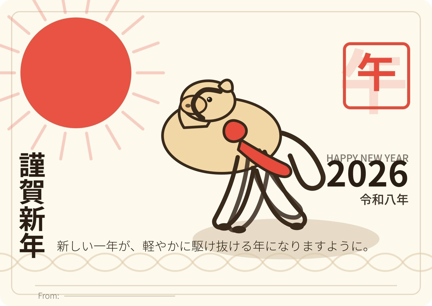
ご覧のように、レイアウトや情報量は良い感じでしたが、馬のデザインが壊滅的でした。
という状態だったので、次は 馬だけ差し替えることにしました。
Step 2. 馬だけ画像生成AIで差し替える
ここからは画像生成AIの出番です。ChatGPTに以下のように指示してパーツ画像を作りました。
午の絵が微妙なんでパーツとして画像生成してコラージュしたい。正方形でお願い。
といった条件で、馬のイラストだけを生成しました。

背景を透過 PNG にして SVG に配置するよう指示にしました。
一回ではなぜかうまくいきませんでしたが、最終的には以下のように差し替えることができました。
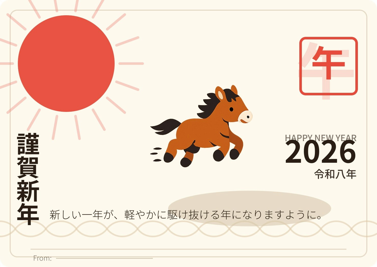
どうでしょうか。ちょっとマシになってきましたね。
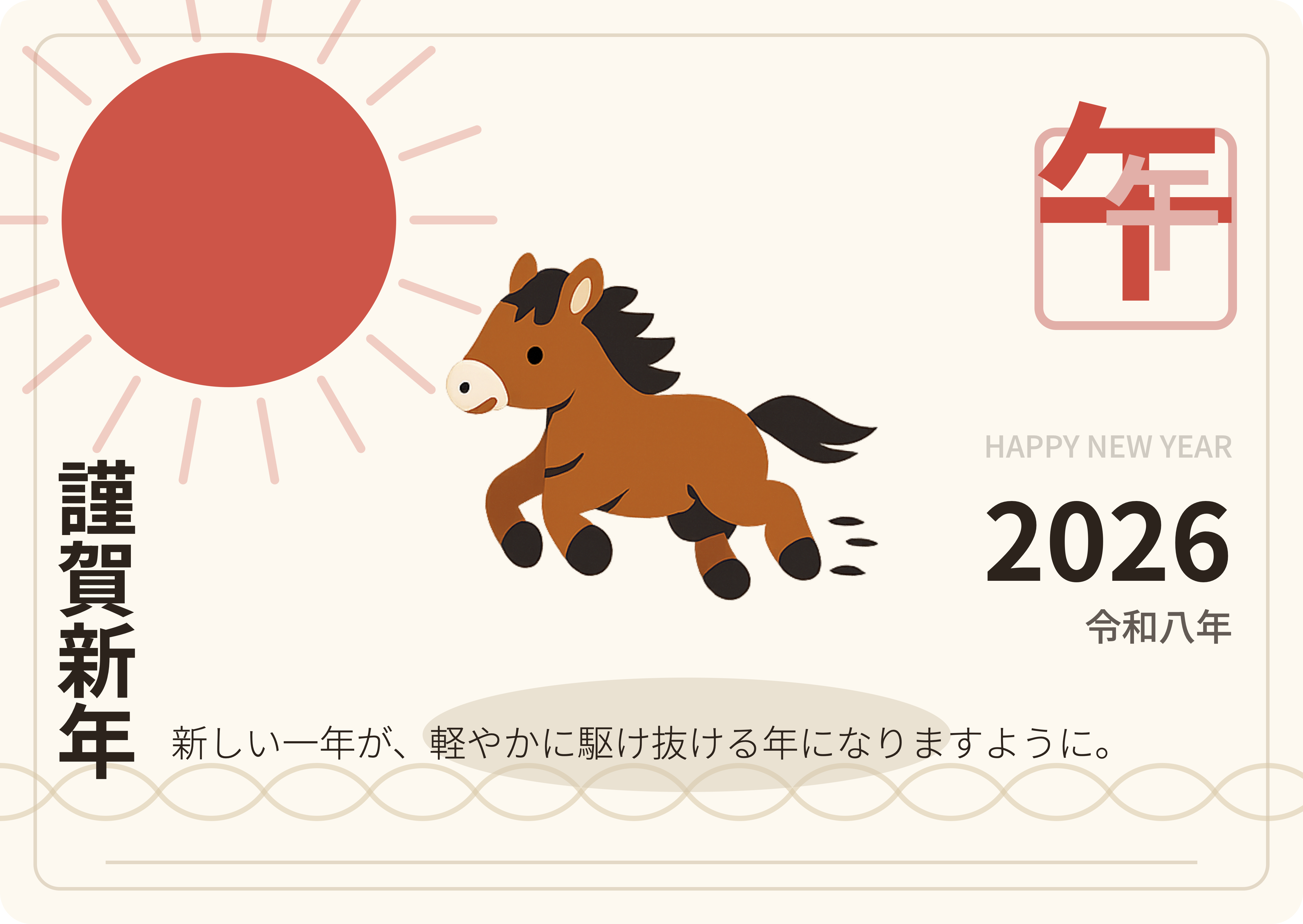
Step 3. レイアウトの微調整
ここからはチャットで気になったところを修正してきました。
デザインの微修正をしたい。差出人は裏に書くのでFromのところは不要。馬の大きさはもう少し大きい方が良さそう。左を向いていた方が自然かな。太陽、馬、影の大きさのバランスを調整してほしい。 またhappy new yearと2026の感覚が狭すぎるので調整してほしい。

右上の午のハンコのデザインを微調整したい。
現状 ハンコの枠の色:赤
大きい午:薄い赤
小さい午:赤
なのを
枠:薄い赤
大きい午:赤
小さい午:薄い赤
にして。 重なり順序は小さい午が一番上になるようにして。
この指示は一回ではうまくいきませんでしたが、何回か詰めていくことで修正することができました。
Step 4. フォントの調整
構図が固まってきたので、次はフォントを整えます。
デザインを工夫するにはどんなフォントを使うのがいいかな。
ChatGPTはデザインを見つつ、おすすめのフォントをサジェストしてくれました。
それを人間が確認しつつフォントを決めました。
フォントのzipを添付して以下のように指示するとChatGPTがフォントを差し替えてくれました。
縦書き、スタンプ:Zen Old Mincho
横書き:Noto Sans JPのまま にして
途中で、なぜかプレビューが急に明朝体だらけになりました。
原因は単純に 環境リセットで Noto Sans JP が消えていた だけです。
フォントの再インストールを指示すると直りました。
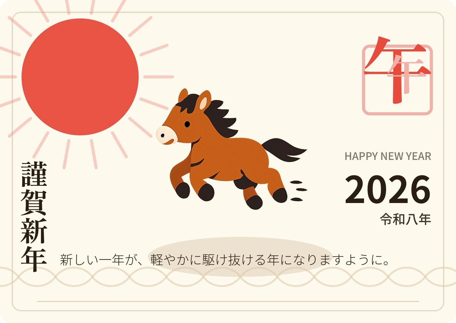
Step 5. SVG から画像生成へ
ここまでで、かわいい系の年賀状はほぼ完成していました。
個人的に友人に送る分にはこのくらいで十分なのかなと評価しています。
私はデザインの知見があるわけではないので、これ以上、プロンプトで指示して改善を進めるのは難しいです。
ということで、最後の仕上げに画像生成AI(Nano banana)を使いました。
SVG画像をPNG化したものを参照画像として渡して、以下のように指示しました。
年賀状作っているんですが、これをベースにプロフェッショナルなデザインにしてください。
するとNano bananaは以下のようなクオリティの高い年賀状デザインを作ってくれました!

これをChatGPTの画像生成AIに渡して微調整をしました。
gpt-image-1.5は日本語描画が弱いという課題がありますが、今回の場合は、事前にフォントでレンダリングしたものを修正させたので文字の劣化はほとんどありませんでした。
画像生成AIにリテイクしてもらったよ。ノイズだけ除去してほしい。
外枠は残しつつ、余白をやや広め(20px程度)にしてほしい。
いくつか微調整をして最終的な年賀状が完成しました。
まとめ:AI をどういう役割で使うと気持ちよいか
今回のワークフローを一言でまとめると、こんな感じでした。
- ChatGPT に SVG で骨格とレイアウトを作ってもらう
- 画像生成AIで 馬などのメインビジュアルだけパーツ化してコラージュする
- 再び ChatGPT に戻して フォントと配置を詰める
- 画像生成AIで 最終的な質感を調整する
つまり、
- ChatGPT → DTP オペレーター兼スクリプト職人
- 画像生成AI(GPT-image, Nano banana) → パーツ職人兼画風変換装置
として使うと、とても相性が良かったです。
最初から画像生成AIで微調整するスタイルに比べると、SVGという固定表現があることで、差分更新が正確にできるというのが今回のやり方の利点でした。
ただし、SVGで達成できるクオリティには限界があるので、パーツ化して画像生成したり、i2iで質感を変えたりすることで高品質な成果物に仕上げることができました。
「AI に全部任せて終わり」ではなく、
AI を部下というより“共同作業相手”として扱うイメージに近かったです。
ただ、作成の効率という観点では、DTPソフトでぽちぽち作ったがおそらく現時点では速いと思います。ただPCを一切ひらかず、スマホだけで完成できたのは新しい体験だと思います。