Figure.rectとFigure.image
bokeh公式のGalleryにはrectを使ったヒートマップの例が載っているが、imageを使った例でもヒートマップを作成できる。東京都が公開している新型コロナの陽性者データを使い、年代別のヒートマップを2つのやり方で作ってみる。
バージョン情報
- python 3.8.8
- bokeh 2.3.0
- jupyterlab 2.2.6
使用データ
東京都の都内の最新感染動向で公開している新型コロナの陽性者のデータ。
import numpy as np
import pandas as pd

from bokeh.plotting import figure, show, output_notebook
from bokeh.models import ColumnDataSource, ColorBar, LogColorMapper
from bokeh.transform import log_cmap

output_notebook()
データ加工
年代別に集計してrectとimageそれぞれに必要な形に変換する。
# データが大きいので必要な列だけ読み込む。年月日と年代ともう一列適当に。groupbyで集計するのに必要になる。
df = pd.read_csv('data/tokyo_positive.csv',
                 usecols=[0, 4, 8],
                 parse_dates=['公表_年月日'])
print(len(df))
print(df.head())
377159
   No     公表_年月日 患者_年代
0   1 2020-01-24   40代
1   2 2020-01-25   30代
2   3 2020-01-30   30代
3   4 2020-02-13   70代
4   5 2020-02-14   50代
AGES = ['10歳未満',
        '10代',
        '20代',
        '30代',
        '40代',
        '50代',
        '60代',
        '70代',
        '80代',
        '90代',
        '100歳以上',
        '不明']
# groupby

# groupbyで順番が崩れないように年代のデータ型をカテゴリーに
df['患者_年代'] = df['患者_年代'].str.replace('-', '不明')
df['患者_年代'] = pd.Categorical(df['患者_年代'], categories=AGES, ordered=True)

# 日付、年代で集計
nums = df.groupby(['公表_年月日', '患者_年代'], as_index=False).count()
nums.columns = ['date', 'age', 'nums']

nums.head(15)
| date | age | nums | |
|---|---|---|---|
| 0 | 2020-01-24 | 10歳未満 | 0 |
| 1 | 2020-01-24 | 10代 | 0 |
| 2 | 2020-01-24 | 20代 | 0 |
| 3 | 2020-01-24 | 30代 | 0 |
| 4 | 2020-01-24 | 40代 | 1 |
| 5 | 2020-01-24 | 50代 | 0 |
| 6 | 2020-01-24 | 60代 | 0 |
| 7 | 2020-01-24 | 70代 | 0 |
| 8 | 2020-01-24 | 80代 | 0 |
| 9 | 2020-01-24 | 90代 | 0 |
| 10 | 2020-01-24 | 100歳以上 | 0 |
| 11 | 2020-01-24 | 不明 | 0 |
| 12 | 2020-01-25 | 10歳未満 | 0 |
| 13 | 2020-01-25 | 10代 | 0 |
| 14 | 2020-01-25 | 20代 | 0 |
# image用のデータ

# データの形を変更して欠けている日付を補う
nums_table = nums.pivot('age', 'date', 'nums')

new_columns = pd.date_range(nums_table.columns.min(), nums_table.columns.max())
nums_table = nums_table.reindex(columns=new_columns)

nums_table.fillna(0, inplace=True)
nums_table = nums_table.astype(int)

# 7日間移動平均のデータ
mean_table = nums_table.rolling(7, axis=1, min_periods=1, center=True).mean()

nums_table
| 2020-01-24 | 2020-01-25 | 2020-01-26 | 2020-01-27 | 2020-01-28 | 2020-01-29 | 2020-01-30 | 2020-01-31 | 2020-02-01 | 2020-02-02 | ... | 2021-10-07 | 2021-10-08 | 2021-10-09 | 2021-10-10 | 2021-10-11 | 2021-10-12 | 2021-10-13 | 2021-10-14 | 2021-10-15 | 2021-10-16 | |
|---|---|---|---|---|---|---|---|---|---|---|---|---|---|---|---|---|---|---|---|---|---|
| age | |||||||||||||||||||||
| 10歳未満 | 0 | 0 | 0 | 0 | 0 | 0 | 0 | 0 | 0 | 0 | ... | 11 | 16 | 8 | 8 | 6 | 9 | 7 | 6 | 7 | 3 |
| 10代 | 0 | 0 | 0 | 0 | 0 | 0 | 0 | 0 | 0 | 0 | ... | 9 | 14 | 11 | 6 | 4 | 9 | 8 | 7 | 4 | 2 |
| 20代 | 0 | 0 | 0 | 0 | 0 | 0 | 0 | 0 | 0 | 0 | ... | 31 | 33 | 20 | 11 | 10 | 18 | 14 | 13 | 16 | 13 |
| 30代 | 0 | 1 | 0 | 0 | 0 | 0 | 1 | 0 | 0 | 0 | ... | 32 | 26 | 16 | 8 | 10 | 13 | 12 | 9 | 8 | 14 |
| 40代 | 1 | 0 | 0 | 0 | 0 | 0 | 0 | 0 | 0 | 0 | ... | 15 | 21 | 8 | 9 | 7 | 9 | 8 | 13 | 8 | 12 |
| 50代 | 0 | 0 | 0 | 0 | 0 | 0 | 0 | 0 | 0 | 0 | ... | 17 | 12 | 5 | 7 | 8 | 9 | 10 | 6 | 3 | 4 |
| 60代 | 0 | 0 | 0 | 0 | 0 | 0 | 0 | 0 | 0 | 0 | ... | 11 | 4 | 5 | 1 | 0 | 5 | 4 | 2 | 5 | 5 |
| 70代 | 0 | 0 | 0 | 0 | 0 | 0 | 0 | 0 | 0 | 0 | ... | 8 | 7 | 5 | 7 | 2 | 2 | 4 | 3 | 3 | 8 |
| 80代 | 0 | 0 | 0 | 0 | 0 | 0 | 0 | 0 | 0 | 0 | ... | 7 | 4 | 3 | 2 | 0 | 1 | 2 | 3 | 3 | 3 |
| 90代 | 0 | 0 | 0 | 0 | 0 | 0 | 0 | 0 | 0 | 0 | ... | 2 | 1 | 1 | 1 | 2 | 2 | 3 | 0 | 0 | 2 |
| 100歳以上 | 0 | 0 | 0 | 0 | 0 | 0 | 0 | 0 | 0 | 0 | ... | 0 | 0 | 0 | 0 | 0 | 0 | 0 | 0 | 0 | 0 |
| 不明 | 0 | 0 | 0 | 0 | 0 | 0 | 0 | 0 | 0 | 0 | ... | 0 | 0 | 0 | 0 | 0 | 0 | 0 | 0 | 0 | 0 |
12 rows × 632 columns
# rect用のデータ

# 陽性者数と平均をひとつのデータフレームに
rect_data = nums_table.unstack().reset_index()
rect_data.columns = ['date', 'age', 'nums']

mean = mean_table.unstack().reset_index()
rect_data['mean'] = mean.iloc[:, -1]

rect_data
| date | age | nums | mean | |
|---|---|---|---|---|
| 0 | 2020-01-24 | 10歳未満 | 0 | 0.00 |
| 1 | 2020-01-24 | 10代 | 0 | 0.00 |
| 2 | 2020-01-24 | 20代 | 0 | 0.00 |
| 3 | 2020-01-24 | 30代 | 0 | 0.25 |
| 4 | 2020-01-24 | 40代 | 1 | 0.25 |
| ... | ... | ... | ... | ... |
| 7579 | 2021-10-16 | 70代 | 8 | 4.50 |
| 7580 | 2021-10-16 | 80代 | 3 | 2.75 |
| 7581 | 2021-10-16 | 90代 | 2 | 1.25 |
| 7582 | 2021-10-16 | 100歳以上 | 0 | 0.00 |
| 7583 | 2021-10-16 | 不明 | 0 | 0.00 |
7584 rows × 4 columns
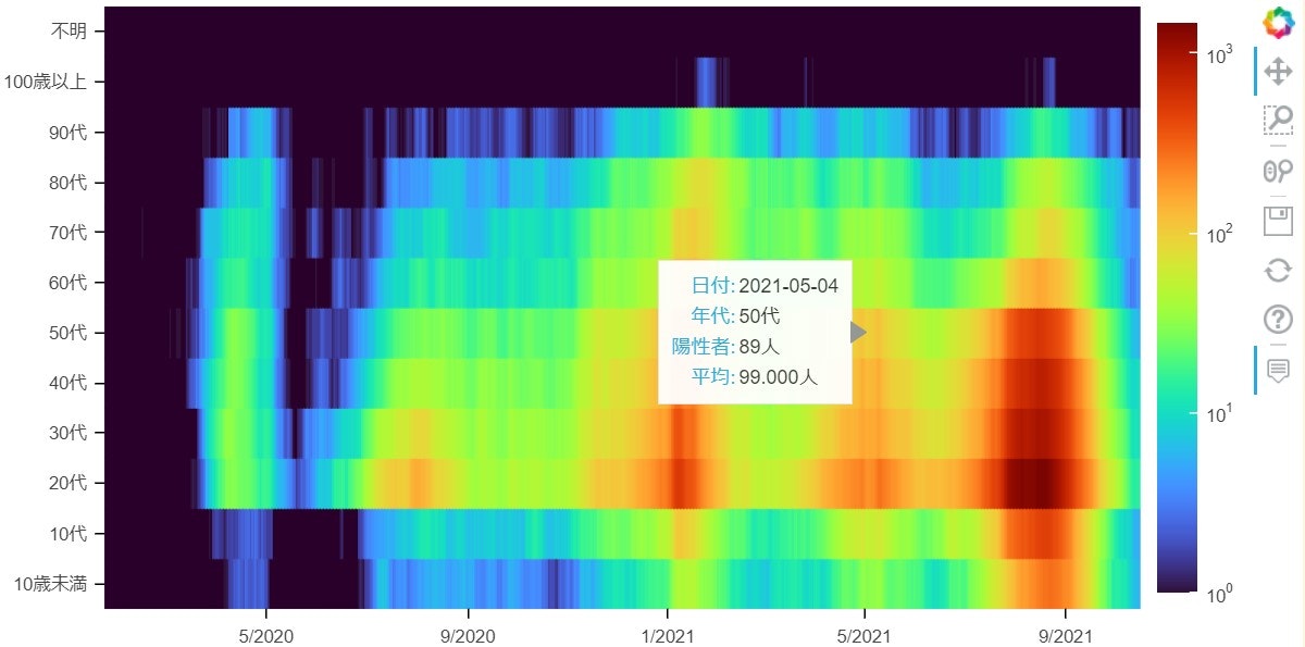
rect
座標(x, y)と幅と高さを指定して長方形を描く。
# rectによるヒートマップ

tooltips = [('日付', '@date{%Y-%m-%d}'),
            ('年代', '@age'),
            ('陽性者', '@nums{,}人'),
            ('平均', '@mean{,.000}人')]

# ソース
source = ColumnDataSource(rect_data)

# Figure
p = figure(plot_width=800,
           plot_height=400,
           x_axis_type='datetime',
           y_range=AGES,
           tooltips=tooltips)
p.tools[-1].formatters = {'@date': 'datetime'}  # HoverToolの設定
p.x_range.range_padding = 0
p.axis.major_tick_in = 0
p.axis.axis_line_color = None

# ColorMapper
mapper = log_cmap('mean', palette='Turbo256',
                  low=1, low_color='#290029',
                  high=rect_data['mean'].max(),
                  )
# ColorBar
colorbar = ColorBar(color_mapper=mapper['transform'])
p.add_layout(colorbar, 'right')

# Renderer
# 軸がdatetime型の時、1は 1ミリ秒なので、1日分の幅を指定するには
# 1000 * 60 * 60 * 24 又は 1日分のtimedelta
p.rect(x='date', y='age',
       width=pd.Timedelta('1D'),
       height=1,
       color=mapper,
       source=source
       )

show(p)
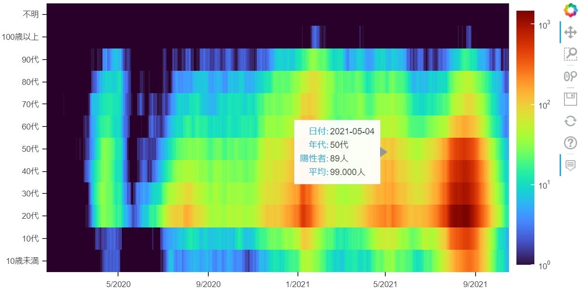
image
画像として出力する。2次元のデータを渡し、画像の位置を座標(x, y)と幅、高さで指定する。
# imageによるヒートマップ

tooltips = [('日付', '@date{%Y-%m-%d}'),
            ('年代', '@age'),
            ('陽性者', '@nums{,}人'),
            ('平均', '@mean{,.000}人')]

# 日付の最小値、最大値
minmax_dates = nums_table.columns.min(), nums_table.columns.max()

# ホバーツールに使う日付、年代の2次元データ
date_table, age_table = np.meshgrid(nums_table.columns, AGES)
data = dict(
    mean=[mean_table.to_numpy()],
    nums=[nums_table.to_numpy()],
    date=[date_table],
    age=[age_table]
)
# ソース
source = ColumnDataSource(data)

# Figure
p = figure(plot_width=800,
           plot_height=400,
           y_range=AGES,
           x_axis_type='datetime',
           tooltips=tooltips)
p.tools[-1].formatters = {'@date': 'datetime'}
p.x_range.range_padding = 0
p.axis.major_tick_in = 0
p.axis.axis_line_color = None

# ColorMapper
mapper = LogColorMapper(palette='Turbo256',
                        low=1, low_color='#290029',
                        high=mean_table.max().max()
                        )
# ColorBar
colorbar = ColorBar(color_mapper=mapper)
p.add_layout(colorbar, 'right')

# Renderer
# 座標(x, y)が画像の左下の位置
# dwが幅、dhが高さ
p.image(image='mean',
        x=minmax_dates[0],
        y=0,
        dw=minmax_dates[1] - minmax_dates[0] + pd.Timedelta('1D'),
        dh=len(AGES),
        color_mapper=mapper,
        source=source
        )

show(p)
まとめ
rectはマスの数だけ長方形を描画している。数が増えるとズームや移動した時に一旦消えて再描画という動きになる。imageは軽快に動く。一方でrectは枠線をつけたり、必要かどうかは別として長方形の幅や傾きを変えたりと融通が利く。