[試して理解]Linuxのしくみの第4章プロセススケジューラで、以下のようなグラフが出てくる。
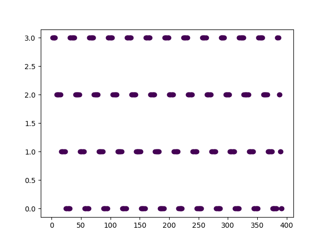
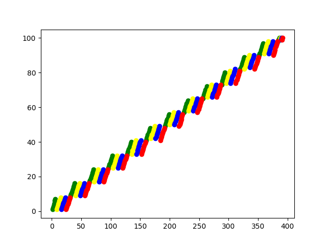
データを採取するスクリプトは本に載っているが、グラフの作り方は載っていない。はじめはスプレッドシートで作ろうと思ったがなかなかうまく行かず、Pythonで作成したほうが楽だったので、その方法を紹介する。
import matplotlib.pyplot as plt


def create_time_and_process_graph():
    fig = plt.figure()
    ax = fig.add_subplot(1, 1, 1)

    with open("./data.txt") as f:
        for line in f:
            line = line.rstrip()
            p1, p2, p3 = map(int, line.split())
            # print(p1, p2, p3)
            ax.scatter(p2, p1, c=p3)

    fig.savefig('./time_and_process')


def create_time_and_progress_graph():
    fig = plt.figure()
    ax = fig.add_subplot(1, 1, 1)

    with open("./data.txt") as f:
        for line in f:
            line = line.rstrip()
            p1, p2, p3 = map(int, line.split())
            # print(p1, p2, p3)
            ax.scatter(p2, p3, c=['red', 'blue', 'yellow', 'green'][p1])

    fig.savefig('./time_and_progress')


if __name__ == '__main__':
    create_time_and_process_graph()
    create_time_and_progress_graph()
このスクリプトを実行すると、time_and_process.pngとtime_and_progress.pngという画像ファイルが作成される。
おしまい。