こんにちは、Reikaです。
私は現在、アプレンティスの5期生として日々勉強に励んでいます。
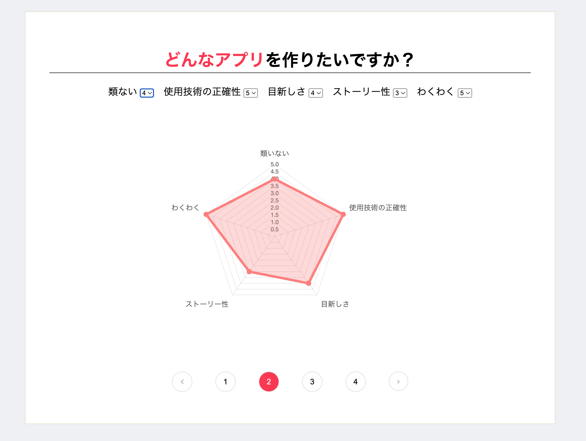
現在開発中のプロジェクトで、 selectボックスの数値を レーダーチャート に反映させるを実装しました。
その際に Chart.js を使用したので、この経験を通じて学んだことについて、記述していきます。
Chart.jsとは?
Chart.jsはJavaScriptでグラフを描画するためのライブラリです。
私が実装したレーダーチャートの他に、円グラフ、棒グラフ、鶏頭図などが作成できます。
使い方
1.インストール
まず、CDNを利用してテストとして使ってみました。
インストールは以下のタグを追加するだけです。
<head>
<script src="https://cdn.jsdelivr.net/npm/chart.js"></script>
</head>
2.グラフ描写の準備
表示させたい場所にcanvasタグを指定します。
<canvas id="feedBackRadarChart"></canvas>
3.作成
私は別でJavaScriptのファイルを作成し、以下のコードを記載しました。type, data, optionsの3要素をしてグラフの描写を行います。
要素については 4.要素の指定 で解説しています。
let RadarCtx = document.getElementById('feedBackRadarChart');

// レーダーチャートの作成
let radarConfig = {
  type: 'radar',
  data: {
    labels: ['類いない', '使用技術の正確性', '目新しさ', 'ストーリー性', 'わくわく'],
    datasets: [{
      label: 'Self',
      data: [0, 0, 0, 0, 0],
      backgroundColor: 'rgba(255, 136, 136, 0.3)',  // 赤色の透明な背景色
      borderColor: 'rgb(255, 136, 136)',  // 赤色の境界線
      borderWidth: 5
    }, {
      label: 'FB',
      data: [0, 0, 0, 0, 0],
      backgroundColor: 'rgba(54, 162, 235, 0.2)',  // 青色の透明な背景色
      borderColor: 'rgba(54, 162, 235, 1)',  // 青色の境界線
      borderWidth: 5
    }],
  },
  options: {
    plugins: {
      legend: {
        display: false // レジェンド(ラベル)を非表示にする
      },
      tooltip: {
        callbacks: {
          label: function (tooltipItem) {
            let datasetLabel = tooltipItem.dataset.label;
            if (datasetLabel === 'FB') {
              let commentId = 'comment' + (tooltipItem.dataIndex + 1);
              let comment = document.getElementById(commentId).innerText;
              return comment;
            } else {
              return tooltipItem.dataset.label + ': ' + tooltipItem.raw;
            }
          }
        }
      }
    },
    scales: {
      r: {
        suggestedMin: 0,
        suggestedMax: 5,
        ticks: {},
        pointLabels: {
          font: {
            size: 10
          }
        }
      }
    },
    layout: {
      padding: {
        top: 1,
        bottom: 1,
      }
    }
  }
};

let radarChart = new Chart(RadarCtx, radarConfig);
4.要素の指定
グラフの種類や軸のラベル名、色など要素を指定しながら作成します。
- type
グラフの種類の指定です。私はレーダーチャートのため、radarと記載。
type: 'radar',
| typeの値 | グラフの種類 |
|---|---|
| line | 線グラフ |
| bar | 棒グラフ |
| radar | レーダーチャート |
| pie | 円グラフ |
| doughnut | ドーナツチャート |
| polarArea | 鶏頭図(値によって半径が異なる円グラフ) |
| bubble | バブルチャート |
| scatter | 散布図 |
- data
軸のラベル名、初期値、背景色、境界線の太さなど、デザイン部分を指定。
私は2つのグラフを重ねた描写にしたので、2つ分記載。
  data: {
    labels: ['類いない', '使用技術の正確性', '目新しさ', 'ストーリー性', 'わくわく'],
    datasets: [{
      label: 'Self',
      data: [0, 0, 0, 0, 0],
      backgroundColor: 'rgba(255, 136, 136, 0.3)',  // 赤色の透明な背景色
      borderColor: 'rgb(255, 136, 136)',  // 赤色の境界線
      borderWidth: 5
    }, {
      label: 'FB',
      data: [0, 0, 0, 0, 0],
      backgroundColor: 'rgba(54, 162, 235, 0.2)',  // 青色の透明な背景色
      borderColor: 'rgba(54, 162, 235, 1)',  // 青色の境界線
      borderWidth: 5
    }],
  },
- options
ここでは、dataでは指定できない要素を指定します。
アニメーションの指定や特定の場合の表示方法、フォントのサイズなどを設定します。
私は、FBデータセットの場合は特定のコメントを表示し、それ以外の場合はデータセットラベルと値を表示するようにしました。
options: {
    plugins: {
      legend: {
        display: false // レジェンド(ラベル)を非表示にする
      },
      tooltip: {
        callbacks: {
          label: function (tooltipItem) {
            let datasetLabel = tooltipItem.dataset.label;
            if (datasetLabel === 'FB') {
              let commentId = 'comment' + (tooltipItem.dataIndex + 1);
              let comment = document.getElementById(commentId).innerText;
              return comment;
            } else {
              return tooltipItem.dataset.label + ': ' + tooltipItem.raw;
            }
          }
        }
      }
    },
    scales: {
      r: {
        suggestedMin: 0,
        suggestedMax: 5,
        ticks: {},
        pointLabels: {
          font: {
            size: 10
          }
        }
      }
    },
    layout: {
      padding: {
        top: 1,
        bottom: 1,
      }
    }
  }
終わりに
データベースのデータを反映する方法は、コントローラーやモデルを使用するため割愛させていただきました。