
はじめに
この記事では、SCSS における @mixin と @include の基本的な使い方を記載します。
Mixin とは
Mixin は、SCSS で再利用可能なスタイルのまとまりを定義する機能です。同じスタイルを複数の場所で使いたい場合に、コードの重複を避けることができます。
@mixin でスタイルの定義を行い、@include でそれを呼び出して使用します。
基本的な使い方
@mixin で定義する
@mixin button-base {
  padding: 10px 20px;
  border: none;
  border-radius: 4px;
  cursor: pointer;
  font-size: 16px;
}
@include で使用する
.primary-button {
  @include button-base;
  background-color: #007bff;
  color: white;
}

.secondary-button {
  @include button-base;
  background-color: #6c757d;
  color: white;
}
コンパイル後の CSS は以下のようになります。
.primary-button {
  padding: 10px 20px;
  border: none;
  border-radius: 4px;
  cursor: pointer;
  font-size: 16px;
  background-color: #007bff;
  color: white;
}

.secondary-button {
  padding: 10px 20px;
  border: none;
  border-radius: 4px;
  cursor: pointer;
  font-size: 16px;
  background-color: #6c757d;
  color: white;
}
引数を使った Mixin
Mixin には引数を渡すことができ、より柔軟な再利用が可能になります。
@mixin button($bg-color, $text-color) {
  padding: 10px 20px;
  border: none;
  border-radius: 4px;
  cursor: pointer;
  font-size: 16px;
  background-color: $bg-color;
  color: $text-color;
}

.primary-button {
  @include button(#007bff, white);
}

.success-button {
  @include button(#28a745, white);
}

.danger-button {
  @include button(#dc3545, white);
}
引数名を指定して呼び出すこともできます。
.warning-button {
  @include button($bg-color: #ffc107, $text-color: #212529);
}
この方法は、引数が多い場合や、特定の引数だけを指定したい場合に便利です。
デフォルト値を持つ Mixin
引数にデフォルト値を設定することで、省略可能な引数を作成できます。
@mixin box-shadow($x: 0, $y: 2px, $blur: 4px, $color: rgba(0, 0, 0, 0.1)) {
  box-shadow: $x $y $blur $color;
}

.card {
  @include box-shadow; // デフォルト値を使用
}

.elevated-card {
  @include box-shadow(0, 8px, 16px, rgba(0, 0, 0, 0.2)); // カスタム値を指定
}

.subtle-card {
  @include box-shadow($blur: 2px); // 一部の引数のみ変更
}
実践的な例
レスポンシブデザイン用の Mixin
@mixin responsive($breakpoint) {
  @if $breakpoint == mobile {
    @media (max-width: 767px) {
      @content;
    }
  } @else if $breakpoint == tablet {
    @media (min-width: 768px) and (max-width: 1023px) {
      @content;
    }
  } @else if $breakpoint == desktop {
    @media (min-width: 1024px) {
      @content;
    }
  }
}

.container {
  width: 100%;

  @include responsive(mobile) {
    padding: 10px;
  }

  @include responsive(tablet) {
    padding: 20px;
  }

  @include responsive(desktop) {
    padding: 40px;
    max-width: 1200px;
    margin: 0 auto;
  }
}
@content ディレクティブを使用すると、Mixin の中にスタイルブロックを渡すことができます。これにより、より柔軟な Mixin を作成できます。
Flexbox レイアウト用の Mixin
@mixin flex-center($direction: row) {
  display: flex;
  flex-direction: $direction;
  justify-content: center;
  align-items: center;
}

.hero {
  @include flex-center(column);
  min-height: 100vh;
}

.navbar {
  @include flex-center;
  padding: 20px;
}
テキストの省略表示
@mixin text-ellipsis($lines: 1) {
  @if $lines == 1 {
    overflow: hidden;
    text-overflow: ellipsis;
    white-space: nowrap;
  } @else {
    display: -webkit-box;
    -webkit-line-clamp: $lines;
    -webkit-box-orient: vertical;
    overflow: hidden;
  }
}

.single-line-text {
  @include text-ellipsis;
}

.multi-line-text {
  @include text-ellipsis(3);
}
トランジション効果
@mixin transition($property: all, $duration: 0.3s, $timing: ease) {
  transition: $property $duration $timing;
}

.button {
  @include transition;

  &:hover {
    transform: translateY(-2px);
  }
}

.fade-element {
  @include transition(opacity, 0.5s, ease-in-out);
}
実際に試してみる
SCSS を実際に使用するには、コンパイル環境が必要です。ここでは、ブラウザで直接試せるように、いくつかの方法を紹介します。
方法1: Node.js 環境でのセットアップ
ローカル環境で SCSS を使用する基本的な手順です。
- プロジェクトのセットアップ
# プロジェクトディレクトリの作成
mkdir scss-demo
cd scss-demo

# package.json の作成
npm init -y

# sass のインストール
npm install sass --save-dev
- ファイル構成
scss-demo/
├── index.html
├── scss/
│   └── style.scss
├── css/
│   └── style.css (コンパイル後)
└── package.json
- HTML ファイル
<!DOCTYPE html>
<html lang="ja">
<head>
  <meta charset="UTF-8">
  <meta name="viewport" content="width=device-width, initial-scale=1.0">
  <title>SCSS Mixin デモ</title>
  <link rel="stylesheet" href="css/style.css">
</head>
<body>
  <div class="container">
    <h1>SCSS Mixin デモ</h1>

    <section class="button-demo">
      <h2>ボタンの例</h2>
      <button class="primary-button">Primary Button</button>
      <button class="success-button">Success Button</button>
      <button class="danger-button">Danger Button</button>
      <button class="warning-button">Warning Button</button>
    </section>

    <section class="card-demo">
      <h2>カードの例</h2>
      <div class="card">
        <h3>通常のカード</h3>
        <p>デフォルトのボックスシャドウを使用しています。</p>
      </div>

      <div class="elevated-card">
        <h3>強調されたカード</h3>
        <p>より濃いシャドウで浮き上がって見えます。</p>
      </div>

      <div class="subtle-card">
        <h3>控えめなカード</h3>
        <p>薄いシャドウで控えめな印象です。</p>
      </div>
    </section>

    <section class="text-demo">
      <h2>テキスト省略の例</h2>
      <p class="single-line-text">
        これは非常に長いテキストで、1行に収まらない場合は省略記号(...)で表示されます。この機能は特に見出しやラベルなどで便利です。
      </p>

      <p class="multi-line-text">
        これは複数行のテキストの例です。3行まで表示され、それ以降は省略記号で表示されます。長い説明文やコメントなどで使用すると便利な機能です。この機能を使うことで、レイアウトを崩すことなく長いテキストを扱うことができます。
      </p>
    </section>
  </div>
</body>
</html>
- SCSS ファイル
// ボタン用 Mixin
@mixin button($bg-color, $text-color) {
  padding: 10px 20px;
  border: none;
  border-radius: 4px;
  cursor: pointer;
  font-size: 16px;
  background-color: $bg-color;
  color: $text-color;
  @include transition;

  &:hover {
    transform: translateY(-2px);
    opacity: 0.9;
  }
}

// ボックスシャドウ用 Mixin
@mixin box-shadow($x: 0, $y: 2px, $blur: 4px, $color: rgba(0, 0, 0, 0.1)) {
  box-shadow: $x $y $blur $color;
}

// トランジション用 Mixin
@mixin transition($property: all, $duration: 0.3s, $timing: ease) {
  transition: $property $duration $timing;
}

// テキスト省略用 Mixin
@mixin text-ellipsis($lines: 1) {
  @if $lines == 1 {
    overflow: hidden;
    text-overflow: ellipsis;
    white-space: nowrap;
  } @else {
    display: -webkit-box;
    -webkit-line-clamp: $lines;
    -webkit-box-orient: vertical;
    overflow: hidden;
  }
}

// レスポンシブ用 Mixin
@mixin responsive($breakpoint) {
  @if $breakpoint == mobile {
    @media (max-width: 767px) {
      @content;
    }
  } @else if $breakpoint == tablet {
    @media (min-width: 768px) and (max-width: 1023px) {
      @content;
    }
  } @else if $breakpoint == desktop {
    @media (min-width: 1024px) {
      @content;
    }
  }
}

// ベーススタイル
body {
  font-family: -apple-system, BlinkMacSystemFont, 'Segoe UI', Roboto, Oxygen, Ubuntu, Cantarell, sans-serif;
  line-height: 1.6;
  margin: 0;
  padding: 0;
  background-color: #f5f5f5;
}

.container {
  width: 100%;

  @include responsive(mobile) {
    padding: 10px;
  }

  @include responsive(tablet) {
    padding: 20px;
  }

  @include responsive(desktop) {
    padding: 40px;
    max-width: 1200px;
    margin: 0 auto;
  }
}

h1 {
  color: #333;
  text-align: center;
  margin-bottom: 2rem;
}

h2 {
  color: #555;
  margin-top: 2rem;
  margin-bottom: 1rem;
}

section {
  margin-bottom: 3rem;
}

// ボタンスタイル
.button-demo {
  display: flex;
  flex-wrap: wrap;
  gap: 10px;

  button {
    margin: 5px;
  }
}

.primary-button {
  @include button(#007bff, white);
}

.success-button {
  @include button(#28a745, white);
}

.danger-button {
  @include button(#dc3545, white);
}

.warning-button {
  @include button(#ffc107, #212529);
}

// カードスタイル
.card-demo {
  display: grid;
  grid-template-columns: repeat(auto-fit, minmax(250px, 1fr));
  gap: 20px;

  > div {
    background: white;
    padding: 20px;
    border-radius: 8px;
    @include transition;

    &:hover {
      transform: translateY(-4px);
    }

    h3 {
      margin-top: 0;
      color: #333;
    }

    p {
      color: #666;
      margin-bottom: 0;
    }
  }
}

.card {
  @include box-shadow;
}

.elevated-card {
  @include box-shadow(0, 8px, 16px, rgba(0, 0, 0, 0.2));
}

.subtle-card {
  @include box-shadow($blur: 2px);
}

// テキスト省略スタイル
.text-demo {
  background: white;
  padding: 20px;
  border-radius: 8px;
  @include box-shadow;

  p {
    background: #f8f9fa;
    padding: 15px;
    border-radius: 4px;
    margin: 10px 0;
  }
}

.single-line-text {
  @include text-ellipsis;
}

.multi-line-text {
  @include text-ellipsis(3);
}
- コンパイルコマンド
package.json に以下のスクリプトを追加します。
{
  "scripts": {
    "sass": "sass scss/style.scss css/style.css",
    "sass:watch": "sass --watch scss/style.scss css/style.css"
  }
}
コンパイルの実行:
# 1回だけコンパイル
npm run sass

# ファイルの変更を監視して自動コンパイル
npm run sass:watch
方法2: Vite を使用した開発環境
より本格的な開発環境を構築する場合は、Vite を使用すると便利です。
# Vite プロジェクトの作成
npm create vite@latest my-scss-app

cd my-scss-app
npm install

# SCSS をインストール
npm install -D sass

# 開発サーバーの起動
npm run dev
Vite では、.scss ファイルを直接 import するだけで自動的にコンパイルされます。
<script type="module" src="/main.js"></script>
import './style.scss'
動作確認
動作確認をします。
デスクトップ(1024px)
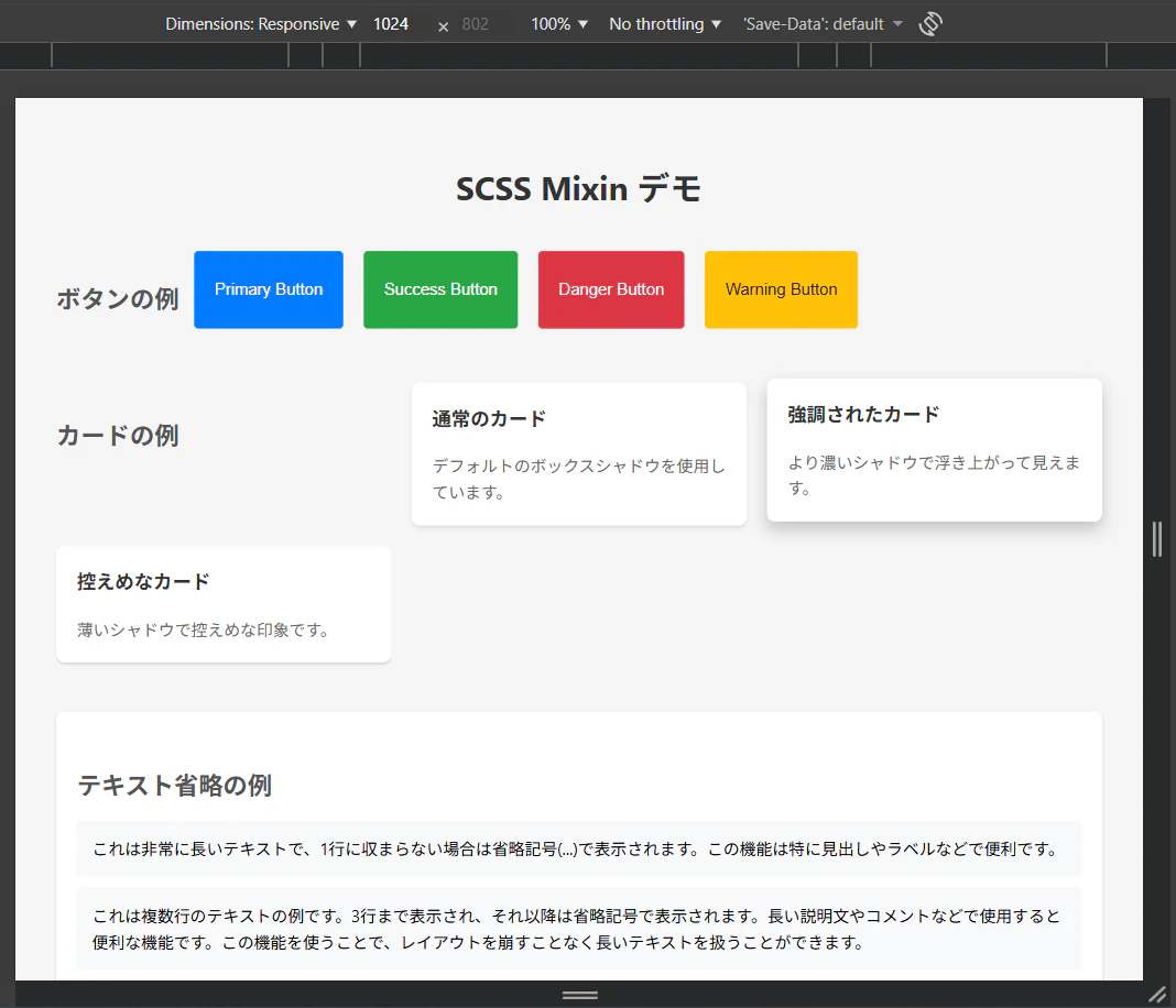
タブレット(768px)

モバイル(767px)

まとめ
SCSS の @mixin と @include を使うことで、スタイルの再利用性が大幅に向上します。
主なポイントは以下の通りです。
-
@mixinでスタイルのまとまりを定義し、@includeで呼び出す - 引数を使って柔軟にカスタマイズ可能
- デフォルト値により、省略可能な引数を設定できる
-
@contentを使用することで、スタイルブロックを渡すことができる - レスポンシブデザインやよく使うスタイルパターンを Mixin 化することで、保守性が向上
Mixin を適切に活用することで、DRY(Don't Repeat Yourself)原則に従った、保守しやすい SCSS コードを書くことができます。