
はじめに
この記事では、React / TypeScript 環境で chat-ui-kit-react を使ったチャット UI の実装方法を記載します。
chat-ui-kit-react とは
chat-ui-kit-react は、チャットアプリケーションの UI を構築するための React コンポーネントライブラリです。
事前にデザインされた豊富なコンポーネントを提供しており、メッセージリスト、入力エリア、会話リスト、アバターなど、チャット UI に必要な要素をすぐに利用できます。以下のような特徴があります。
- 豊富なプリビルドコンポーネント(30種類以上)
- レスポンシブデザイン対応
- カスタマイズ可能なスタイリング
- TypeScript サポート
- アクセシビリティ対応
- 軽量で依存関係が少ない
開発環境
開発環境は以下の通りです。
- Windows 11
- React 19.2.0
- TypeScript 5.9.3
- bun 1.3.6
- @chatscope/chat-ui-kit-react 2.0.3
- @chatscope/chat-ui-kit-styles 1.4.0
インストール
まずは以下のコマンドでインストールします。
bun install @chatscope/chat-ui-kit-react @chatscope/chat-ui-kit-styles
基本的な利用方法
スタイルのインポート
chat-ui-kit-react を使用するには、まずスタイルシートをインポートする必要があります。
import React from "react";
import ReactDOM from "react-dom/client";
import App from "./App";
import "@chatscope/chat-ui-kit-styles/dist/default/styles.min.css";

ReactDOM.createRoot(document.getElementById("root")!).render(
  <React.StrictMode>
    <App />
  </React.StrictMode>
);
基本的なチャット画面の構築
chat-ui-kit-react の基本的な構成は、MainContainer、ChatContainer、MessageList、MessageInput を組み合わせて作成します。
import {
  MainContainer,
  ChatContainer,
  MessageList,
  Message,
  MessageInput,
} from "@chatscope/chat-ui-kit-react";

export function App() {
  return (
    <div style={{ position: "relative", height: "500px" }}>
      <MainContainer>
        <ChatContainer>
          <MessageList>
            <Message
              model={{
                message: "こんにちは!",
                sender: "田中",
                direction: "incoming",
                position: "single",
              }}
            />
            <Message
              model={{
                message: "こんにちは!元気ですか?",
                sender: "自分",
                direction: "outgoing",
                position: "single",
              }}
            />
          </MessageList>
          <MessageInput placeholder="メッセージを入力..." />
        </ChatContainer>
      </MainContainer>
    </div>
  );
}

export default App;
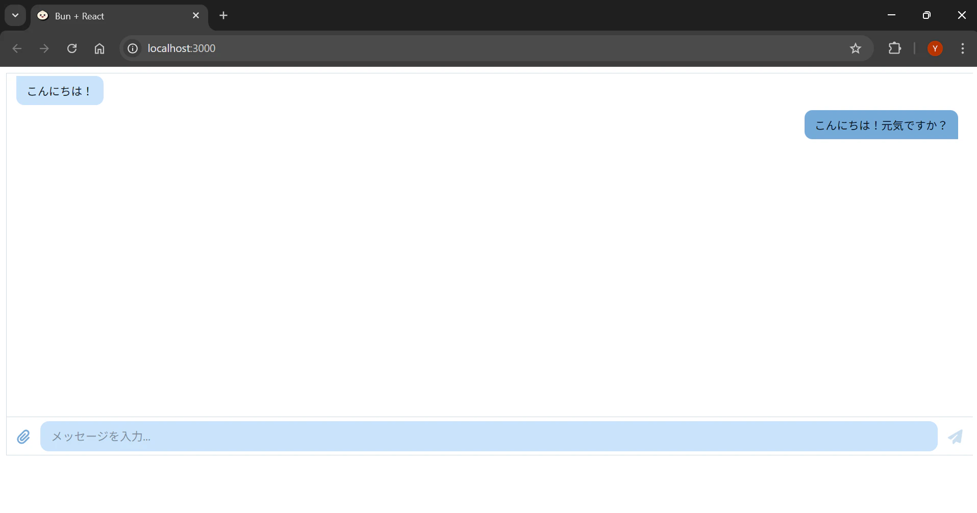
Message コンポーネントの詳細
Message コンポーネントの model プロパティには以下のプロパティを指定できます。
| プロパティ | 型 | 説明 |
|---|---|---|
| message | string | メッセージの内容 |
| sender | string | 送信者名 |
| direction | "incoming" | "outgoing" | メッセージの方向(受信/送信) |
| sentTime | string | 送信時刻 |
| position | "single" | "first" | "normal" | "last" | 連続メッセージ内での位置 |
| type | "html" | "text" | "image" | "custom" | メッセージタイプ(デフォルト: "text") |
| payload | string | object | allowedChildren([MessageCustomContent]) | カスタムデータやメタ情報 |
position プロパティは、同じ送信者からの連続したメッセージを表示する際に使用します。
値によってメッセージの吹き出しの形が変わります。
import {
  MainContainer,
  ChatContainer,
  MessageList,
  Message,
  MessageInput,
} from "@chatscope/chat-ui-kit-react";

export function ContinuousChat() {
  return (
    <div style={{ position: "relative", height: "500px" }}>
      <MainContainer>
        <ChatContainer>
          <MessageList>
            <Message
              model={{
                message: "こんにちは",
                sender: "田中",
                direction: "incoming",
                position: "first",
              }}
            />
            <Message
              model={{
                message: "今日の会議は15時からです",
                sender: "田中",
                direction: "incoming",
                position: "normal",
              }}
            />
            <Message
              model={{
                message: "よろしくお願いします",
                sender: "田中",
                direction: "incoming",
                position: "last",
              }}
            />
          </MessageList>
          <MessageInput placeholder="メッセージを入力..." />
        </ChatContainer>
      </MainContainer>
    </div>
  );
}
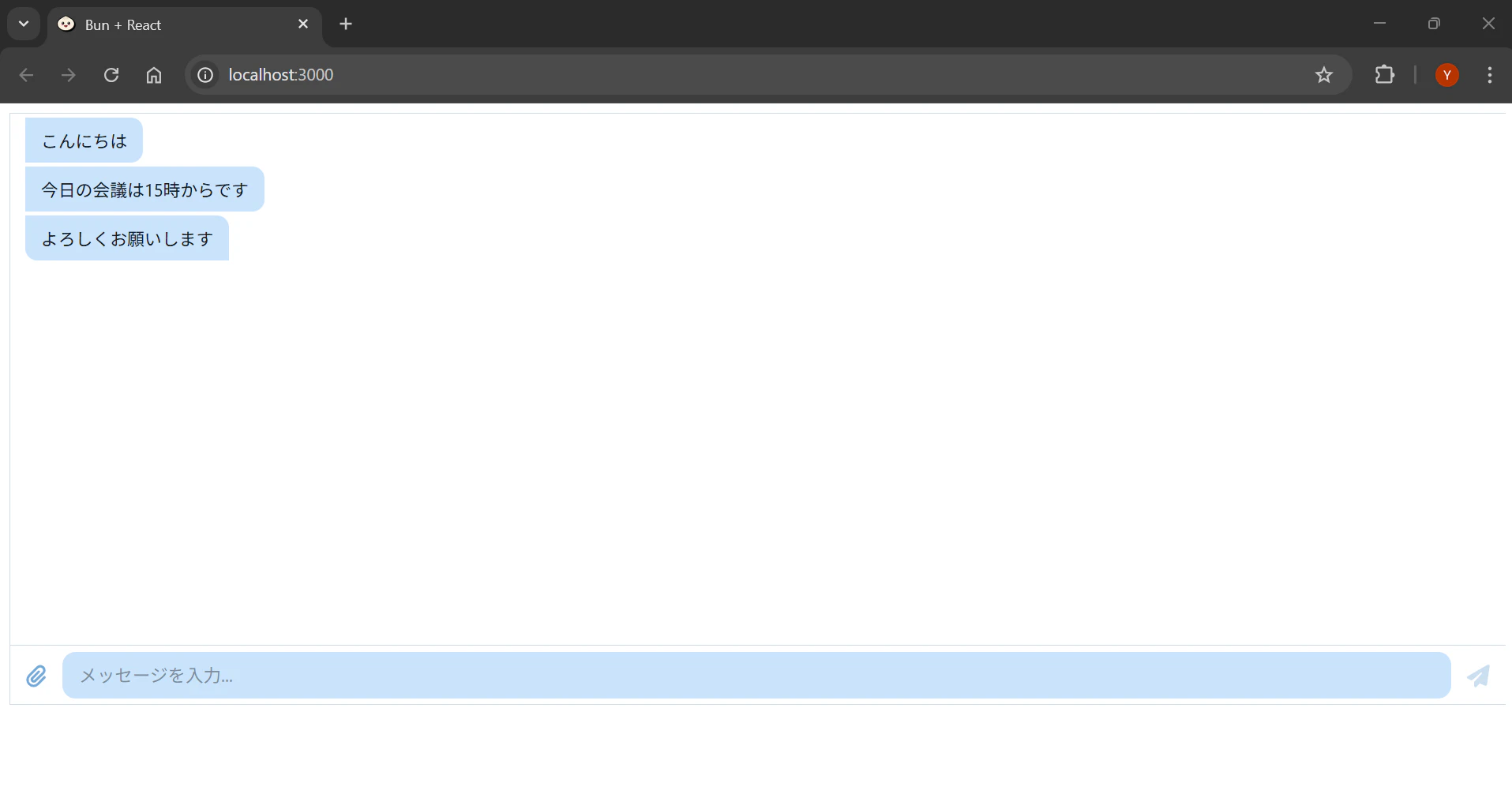
アバターの追加
Avatar コンポーネントを使用して、メッセージにアバター画像を追加できます。
import {
  MainContainer,
  ChatContainer,
  MessageList,
  Message,
  MessageInput,
  Avatar,
} from "@chatscope/chat-ui-kit-react";

export function ChatWithAvatar() {
  return (
    <div style={{ position: "relative", height: "500px" }}>
      <MainContainer>
        <ChatContainer>
          <MessageList>
            <Message
              model={{
                message: "こんにちは!",
                sender: "田中",
                direction: "incoming",
                position: "single",
              }}
            >
              <Avatar
                src="https://chatscope.io/storybook/react/assets/zoe-E7ZdmXF0.svg"
                name="田中"
              />
            </Message>
          </MessageList>
          <MessageInput placeholder="メッセージを入力..." />
        </ChatContainer>
      </MainContainer>
    </div>
  );
}
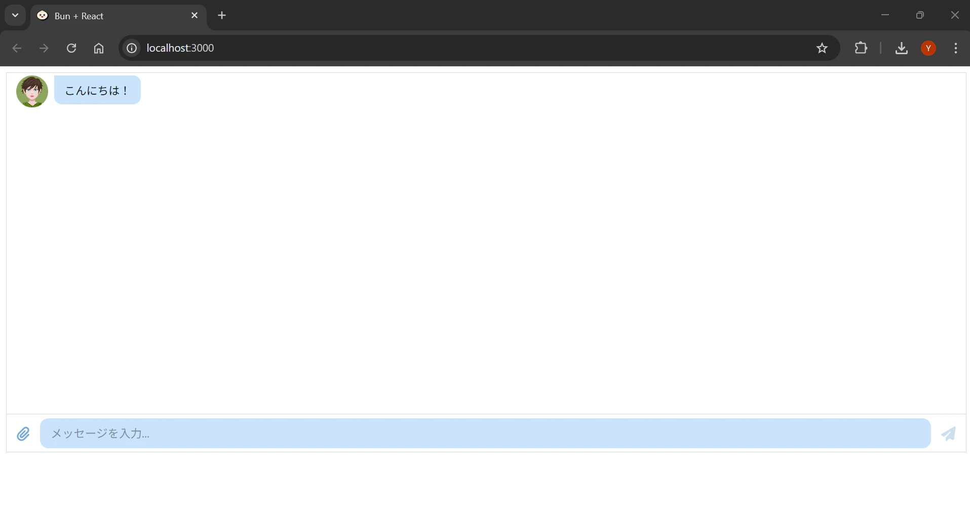
Avatar は Message コンポーネントの子要素として配置します。複数の連続メッセージでは、最後のメッセージ(position: "last" または position: "single")にのみアバターを表示するのが一般的です。
会話ヘッダーの追加
ConversationHeader を使用して、チャット画面の上部にヘッダーを追加できます。
import {
  MainContainer,
  ChatContainer,
  MessageList,
  Message,
  MessageInput,
  ConversationHeader,
  Avatar,
} from "@chatscope/chat-ui-kit-react";

export function ChatWithHeader() {
  return (
    <div style={{ position: "relative", height: "500px" }}>
      <MainContainer>
        <ChatContainer>
          <ConversationHeader>
            <ConversationHeader.Back />
            <Avatar
              src="https://chatscope.io/storybook/react/assets/zoe-E7ZdmXF0.svg"
              name="田中太郎"
            />
            <ConversationHeader.Content userName="田中太郎" info="オンライン" />
            <ConversationHeader.Actions>
              {/* アクションボタンを配置 */}
            </ConversationHeader.Actions>
          </ConversationHeader>
          <MessageList>
            <Message
              model={{
                message: "こんにちは!",
                sender: "田中",
                direction: "incoming",
                position: "single",
              }}
            />
          </MessageList>
          <MessageInput placeholder="メッセージを入力..." />
        </ChatContainer>
      </MainContainer>
    </div>
  );
}
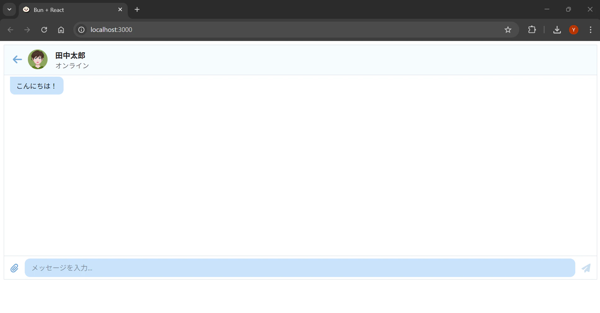
会話リストの実装
Sidebar と ConversationList を使用して、複数の会話を一覧表示できます。
import {
  MainContainer,
  Sidebar,
  Search,
  ConversationList,
  Conversation,
  Avatar,
  ChatContainer,
  MessageList,
  Message,
  MessageInput,
  ConversationHeader,
} from "@chatscope/chat-ui-kit-react";

export function ChatList() {
  return (
    <div style={{ position: "relative", height: "500px" }}>
      <MainContainer>
        <Sidebar position="left">
          <Search placeholder="検索..." />
          <ConversationList>
            <Conversation
              name="田中太郎"
              lastSenderName="田中"
              info="こんにちは!"
              active
            >
              <Avatar
                src="https://chatscope.io/storybook/react/assets/zoe-E7ZdmXF0.svg"
                name="田中太郎"
              />
            </Conversation>
            <Conversation
              name="佐藤花子"
              lastSenderName="佐藤"
              info="明日の予定は?"
            >
              <Avatar
                src="https://chatscope.io/storybook/react/assets/zoe-E7ZdmXF0.svg"
                name="佐藤花子"
              />
            </Conversation>
            <Conversation
              name="鈴木一郎"
              lastSenderName="鈴木"
              info="了解しました"
              unreadCnt={3}
            >
              <Avatar
                src="https://chatscope.io/storybook/react/assets/zoe-E7ZdmXF0.svg"
                name="鈴木一郎"
              />
            </Conversation>
          </ConversationList>
        </Sidebar>

        <ChatContainer>
          <ConversationHeader>
            <Avatar
              src="https://chatscope.io/storybook/react/assets/zoe-E7ZdmXF0.svg"
              name="田中太郎"
            />
            <ConversationHeader.Content userName="田中太郎" info="オンライン" />
          </ConversationHeader>
          <MessageList>
            <Message
              model={{
                message: "こんにちは!",
                sender: "田中",
                direction: "incoming",
                position: "single",
              }}
            />
          </MessageList>
          <MessageInput placeholder="メッセージを入力..." />
        </ChatContainer>
      </MainContainer>
    </div>
  );
}
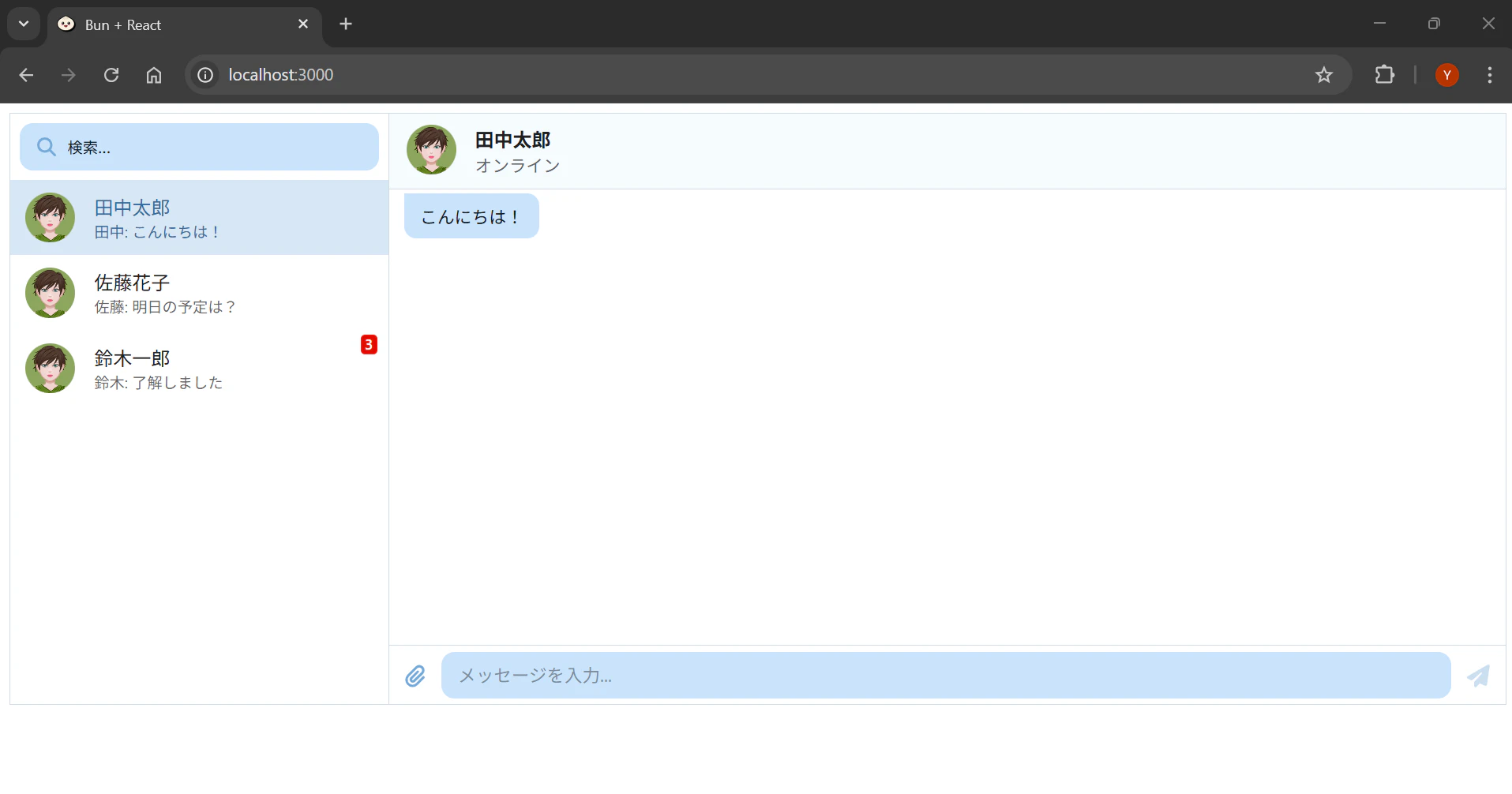
Conversation コンポーネントの主なプロパティは以下の通りです。
| プロパティ | 型 | 説明 |
|---|---|---|
| name | string | 会話相手の名前 |
| lastSenderName | string | 最後のメッセージの送信者名 |
| info | string | 最後のメッセージの内容 |
| active | boolean | アクティブ状態 |
| unreadCnt | number | 未読メッセージ数 |
タイピングインジケーター
相手が入力中であることを示す TypingIndicator を追加できます。
import {
  MainContainer,
  ChatContainer,
  MessageList,
  Message,
  MessageInput,
  TypingIndicator,
} from "@chatscope/chat-ui-kit-react";

export function ChatWithTyping() {
  return (
    <div style={{ position: "relative", height: "500px" }}>
      <MainContainer>
        <ChatContainer>
          <MessageList typingIndicator={<TypingIndicator content="田中が入力中..." />}>
            <Message
              model={{
                message: "こんにちは!",
                sender: "田中",
                direction: "incoming",
                position: "single",
              }}
            />
          </MessageList>
          <MessageInput placeholder="メッセージを入力..." />
        </ChatContainer>
      </MainContainer>
    </div>
  );
}

状態管理と組み合わせた実装
Jotai などの状態管理ライブラリと組み合わせて、動的なチャット機能を実装できます。
atom の定義
import { atom } from "jotai";

export interface ChatMessage {
  id: string;
  message: string;
  sender: string;
  direction: "incoming" | "outgoing";
  sentTime: string;
}

export const messagesAtom = atom<ChatMessage[]>([
  {
    id: "1",
    message: "こんにちは!何かお手伝いできることはありますか?",
    sender: "AI アシスタント",
    direction: "incoming",
    sentTime: new Date().toLocaleTimeString(),
  },
]);

export const addMessageAtom = atom(
  null,
  (get, set, newMessage: Omit<ChatMessage, "id" | "sentTime">) => {
    const messages = get(messagesAtom);
    const message: ChatMessage = {
      ...newMessage,
      id: Date.now().toString(),
      sentTime: new Date().toLocaleTimeString(),
    };
    set(messagesAtom, [...messages, message]);
  }
);

export const isTypingAtom = atom(false);
チャットコンポーネント
import { useAtomValue, useSetAtom } from "jotai";
import {
  MainContainer,
  ChatContainer,
  MessageList,
  Message,
  MessageInput,
  TypingIndicator,
} from "@chatscope/chat-ui-kit-react";
import { messagesAtom, addMessageAtom, isTypingAtom } from "../atoms/chatAtom";

export function DynamicChat() {
  const messages = useAtomValue(messagesAtom);
  const addMessage = useSetAtom(addMessageAtom);
  const isTyping = useAtomValue(isTypingAtom);

  const handleSend = (text: string) => {
    addMessage({
      message: text,
      sender: "自分",
      direction: "outgoing",
    });
  };

  return (
    <div style={{ position: "relative", height: "500px" }}>
      <MainContainer>
        <ChatContainer>
          <MessageList
            typingIndicator={
              isTyping ? <TypingIndicator content="AI が入力中..." /> : null
            }
          >
            {messages.map((msg, index) => {
              const isLastFromSender =
                index === messages.length - 1 ||
                messages[index + 1]?.sender !== msg.sender;

              return (
                <Message
                  key={msg.id}
                  model={{
                    message: msg.message,
                    sender: msg.sender,
                    direction: msg.direction,
                    position: isLastFromSender ? "last" : "normal",
                  }}
                />
              );
            })}
          </MessageList>
          <MessageInput
            placeholder="メッセージを入力..."
            onSend={handleSend}
          />
        </ChatContainer>
      </MainContainer>
    </div>
  );
}
カスタムスタイリング
chat-ui-kit-react は CSS 変数を使用してスタイルをカスタマイズできます。
/* メインコンテナのカスタマイズ */
.cs-main-container {
  --main-container-bg-color: #f5f5f5;
}

/* メッセージのカスタマイズ */
.cs-message__content {
  --message-content-bg-color: #e3f2fd;
}

.cs-message--outgoing .cs-message__content {
  --message-content-bg-color: #c8e6c9;
}

/* 入力エリアのカスタマイズ */
.cs-message-input {
  --message-input-bg-color: #ffffff;
  --message-input-border-color: #e0e0e0;
}

/* 会話リストのカスタマイズ */
.cs-conversation--active {
  --conversation-bg-color: #e3f2fd;
}
import React from "react";
import ReactDOM from "react-dom/client";
import App from "./App";
import "@chatscope/chat-ui-kit-styles/dist/default/styles.min.css";
import "./styles/chat-custom.css";

ReactDOM.createRoot(document.getElementById("root")!).render(
  <React.StrictMode>
    <App />
  </React.StrictMode>
);
TypeScript の型定義
chat-ui-kit-react は TypeScript をサポートしており、型定義が提供されています。
import type { MessageModel } from "@chatscope/chat-ui-kit-react";

export interface ChatUser {
  id: string;
  name: string;
  avatarUrl?: string;
  status: "online" | "offline" | "away";
}

export interface ChatConversation {
  id: string;
  participants: ChatUser[];
  lastMessage?: MessageModel;
  unreadCount: number;
}

export interface ChatState {
  currentUser: ChatUser;
  conversations: ChatConversation[];
  activeConversationId: string | null;
  messages: Record<string, MessageModel[]>;
}
主要コンポーネント一覧
chat-ui-kit-react が提供する主要なコンポーネントは以下の通りです。
| コンポーネント | 説明 |
|---|---|
| MainContainer | チャット UI のルートコンテナ |
| ChatContainer | 個別のチャット画面のコンテナ |
| MessageList | メッセージ一覧を表示 |
| Message | 個別のメッセージ |
| MessageInput | メッセージ入力エリア |
| Avatar | ユーザーアバター |
| ConversationHeader | チャット画面のヘッダー |
| Sidebar | サイドバー |
| ConversationList | 会話一覧 |
| Conversation | 個別の会話項目 |
| Search | 検索入力 |
| TypingIndicator | 入力中インジケーター |
| MessageSeparator | メッセージ間の区切り線(日付表示など) |
| ExpansionPanel | 展開可能なパネル |
| InputToolbox | 入力エリアのツールボックス |
まとめ
chat-ui-kit-react を使うことで、React / TypeScript アプリケーションに洗練されたチャット UI を簡単に導入できます。
主なポイントは以下の通りです。
- 豊富なプリビルドコンポーネントにより、迅速な開発が可能
- MainContainer、ChatContainer、MessageList、MessageInput の組み合わせで基本的なチャット画面を構築
- Avatar、ConversationHeader でリッチな UI を実現
- Sidebar、ConversationList で複数会話の管理が可能
- TypingIndicator でリアルタイム感のある UX を提供
- CSS 変数によるカスタマイズが可能
- TypeScript による型安全性
chat-ui-kit-react は、カスタマーサポートチャット、AI チャットボット、メッセージングアプリなど、様々なチャット機能の実装に活用できます。