Bootstrapとは
Bootstrapは旧Twitter社のエンジニアが開発した、HTML、CSS、JavaScriptで構成された、Webサイトを効率的に開発するためのオープンソースのフレームワークです。
主な特徴として、レスポンシブなデザインのレイアウト、細かなスタイル調整を可能にするユーティリティクラス、ボタン、フォームなどを構成する豊富なUIコンポーネントが挙げられます。
本記事ではこの3つの特徴について、簡単な例を挙げて紹介します。
前提条件
- npmがインストールされていること
- Angular CLIがインストールされていること
導入方法
1. Angularプロジェクトを作成
まず、Angularのプロジェクトを作成して、プロジェクトフォルダに移動します。
ng new my-bootstrap-app
cd my-bootstrap-app
2. Bootstrapのインストール
次にBootstrapをインストールします。
npm install bootstrap
3. Bootstrapを読み込む設定
方法は2通りあります。
方法1:angular.jsonに書き込む
angular.jsonファイルの"styles" と "scripts"に以下を追加
"styles": [
  "node_modules/bootstrap/dist/css/bootstrap.min.css",
  "src/styles.scss"
],
"scripts": [
  "node_modules/bootstrap/dist/js/bootstrap.bundle.min.js"
]
方法2:SCSSファイルに直接読み込む(スタイルをSCSSで選択している場合に可能)
src/styles.scssに以下を追加
@import "bootstrap/scss/bootstrap";
4. Bootstrapが動作するか確認
任意のhtmlに以下を追加します。
<div class="text-white bg-success">Bootstrap</div>
次にアプリを起動します
ng serve
ブラウザでhttp://localhost:4200を開き、
緑色の背景に、白い文字で「Bootstrap」が表示されればOKです。
レイアウト
基本構造
Bootstrapはcontainer,row、colを基本構造とします。
それぞれの意味は以下の通りです。
| クラス | 役割 |
|---|---|
container |
ページ全体の「枠」 |
row |
横並びの行(Row) |
col |
縦のカラム(Column) |
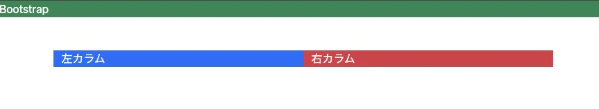
例:
<div class="container">
  <div class="row">
    <div class="col bg-primary text-white">左カラム</div>
    <div class="col bg-success text-white">右カラム</div>
  </div>
</div>
上記の内容で記述すると以下のように出力されます。
ちなみに、上のBootstrapと違って左右に余白があるのは、class="container"が中央寄せ+左右に余白ありの設定だからです。container-fluidを使うと、左右の余白がなくなり、全幅になります。
グリッドシステム
グリッドシステムとは、画面を一定の列(カラム)に分割してレイアウトを組む仕組みのことです。
Bootstrapのレイアウトは12等分で構成されています。
つまり、1行は「12カラム分」までとなります。
| クラス | 幅の割合 | 説明 |
|---|---|---|
col-12 |
100% | 全幅 |
col-6 |
50% | 半分 |
col-4 |
1/3 | 3列に分割 |
col-3 |
1/4 | 4列に分割 |
例:
<div class="container mt-3">
  <div class="row">
    <div class="col-4 bg-primary text-white">左</div>
    <div class="col-4 bg-secondary text-white">中央</div>
    <div class="col-4 bg-success text-white">右</div>
  </div>
</div>
以下のように出力されます。

レスポンシブ対応
Bootstrapでは、画面サイズに応じて自動でレイアウトを変えることができます。
| サイズ | クラス例 | 例 |
|---|---|---|
col- |
常に適用 | すべての画面サイズ |
col-sm- |
576px以上 | 小型画面(スマホ横向き) |
col-md- |
768px以上 | タブレット |
col-lg- |
992px以上 | ノートPC |
col-xl- |
1200px以上 | デスクトップ |
上記の表の例で書いてみると、
<div class="row">
  <div class="col-12 col-md-6 col-lg-4">A</div>
  <div class="col-12 col-md-6 col-lg-4">B</div>
  <div class="col-12 col-md-6 col-lg-4">C</div>
</div>
スマホ(col-12)だと1列に縦並びに、タブレット(col-md-6)だと2列表示に、ノートPCだと3列表示になります。
ユーティリティクラス
Bootstrapにはユーティリティクラスという、CSSを簡単に適用するための便利なクラスが大量に用意されています
margin/padding
marginは外側の余白、paddingは内側の余白を表します。
marginやpaddingを表す接頭辞(m/p)と上下左右を表す接尾辞と余白サイズを表す数字(0〜5)で指定します。
例:mt-3(上の余白16px)
| 接尾辞 | 意味 | 方向指定 | 対象範囲 |
|---|---|---|---|
t |
top |
mt-* / pt-*
|
上側のみ |
b |
bottom |
mb-* / pb-*
|
下側のみ |
l |
left(※Bootstrap 4まで) |
ml-* / pl-*
|
左側のみ |
r |
right(※Bootstrap 4まで) |
mr-* / pr-*
|
右側のみ |
x |
left & right |
mx-* / px-*
|
左右両方 |
y |
top & bottom |
my-* / py-*
|
上下両方 |
| 数字 | 余白サイズ |
|---|---|
0 |
0 |
1 |
0.25rem(約4px) |
2 |
0.5rem(約8px) |
3 |
1rem(約16px) |
4 |
1.5rem(約24px) |
5 |
3rem(約48px) |
auto |
自動(marginのみ) |
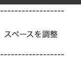
例:
<div class="mt-3 mb-2 p-2">スペースを調整</div>
以下のように出力されます。
文章の上下にスペースができていることがわかります。
2. 色/背景
text-primaryやtext-success(文字色)bg-light(背景色)など、用途に応じて文字色、背景色が定義されています。
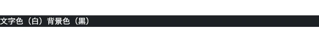
例:
<div class="text-white bg-dark">文字色(白)背景色(黒)</div>
以下のように出力されます。
UIコンポーネント
UIコンポーネントはボタン・フォーム・モーダルなど、ユーザーが触れる要素をまとめた部品のことです。
UIコンポーネントはclass属性にbtn(ボタン)やmodal(モーダル)など、「決まったクラス名」を書くだけでボタンやモーダルなどの部品を作ることができます。
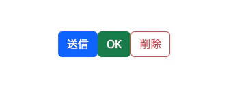
例:
<button class="btn btn-primary">送信</button>
<button class="btn btn-success">OK</button>
<button class="btn btn-outline-danger">削除</button>
以下のように出力されます。
まとめ
- Bootstrapとは:Webページのデザインを簡単に整えるためのCSSフレームワーク
- グリッドシステム:container・row・colを使ってレイアウトを柔軟に構成できる
- ユーティリティクラス:m-3やp-2など、余白や文字色・背景色を簡単に調整できる便利なクラス群
- UIコンポーネント:ボタン・ナビバー・モーダルなど、見た目付きのパーツをすぐに使える部品
終わりに
Bootstrapには、本記事で紹介したもの以外にも、Webページをデザインするためのさまざまなクラスや機能が用意されています。
クラス名が多くて難しそうな印象がありますが、実際に触ってみると意外と簡単です。
今回の基本を押さえておくと、他のコンポーネントやデザイン調整も理解しやすくなります。
参考