はじめに
Plotly の 3D グラフはデフォルト軸でも表示できるが、
「軸が見づらい」「どの方向がX/Y/Zなのか一瞬で判断しにくい」 ことがある。
そこで、Scatter3d(mode="lines") を使って
自分で軸の線を追加して"強調表示"すると、
グラフが一気に読みやすくなる。
X=赤, Y=緑, Z=青 の"XYZカラー"を使うと、さらに直感的。

この記事でできること
- 3D座標軸を「カスタム軸」として線で描画
- 軸の色・太さ・長さを自由に指定
- XYZカラー(R/G/B)で方向を強調
- Colabでそのまま動作
① 3D点群(例データ)を準備
import plotly.graph_objects as go
import numpy as np

np.random.seed(0)
x, y, z = np.random.randn(3, 200)
② 軸を引くための範囲を決める(min〜max)
xmin, xmax = x.min(), x.max()
ymin, ymax = y.min(), y.max()
zmin, zmax = z.min(), z.max()

# 軸の長さ(余裕を持たせる)
pad = 0.2
xr = [xmin-pad, xmax+pad]
yr = [ymin-pad, ymax+pad]
zr = [zmin-pad, zmax+pad]
③ カスタム座標軸(X/Y/Z)を線で描く
- X軸:赤
- Y軸:緑
- Z軸:青
- 太さは 6〜8 に設定
fig = go.Figure()

# 点群
fig.add_trace(go.Scatter3d(
    x=x, y=y, z=z,
    mode="markers",
    marker=dict(size=3, color=z, colorscale="Viridis", opacity=0.7),
    name="Points"
))

# X軸(赤)
fig.add_trace(go.Scatter3d(
    x=xr, y=[0,0], z=[0,0],
    mode="lines",
    line=dict(color="red", width=8),
    name="X-axis"
))

# Y軸(緑)
fig.add_trace(go.Scatter3d(
    x=[0,0], y=yr, z=[0,0],
    mode="lines",
    line=dict(color="green", width=8),
    name="Y-axis"
))

# Z軸(青)
fig.add_trace(go.Scatter3d(
    x=[0,0], y=[0,0], z=zr,
    mode="lines",
    line=dict(color="blue", width=8),
    name="Z-axis"
))

fig.update_layout(
    title="Custom 3D Axes",
    scene=dict(aspectmode="data")
)

fig.show()

結果:
- 軸が太く、色で方向もすぐに分かる
- 点群の位置が「どの方向に広がっているか」が瞬時に把握できる
④ 軸の中心を"データの中心"に合わせる
軸の原点を (mean(x), mean(y), mean(z)) に合わせると、
点群の中心から軸が伸びる ため視覚的に自然。
# 新しいグラフを作成
fig = go.Figure()

# 点群を再度追加
fig.add_trace(go.Scatter3d(
    x=x, y=y, z=z,
    mode="markers",
    marker=dict(size=3, color=z, colorscale="Viridis", opacity=0.7),
    name="Points"
))

# データの中心を計算
cx, cy, cz = x.mean(), y.mean(), z.mean()

# X軸(赤)- データ中心を通る
fig.add_trace(go.Scatter3d(
    x=[xr[0], xr[1]], y=[cy, cy], z=[cz, cz],
    mode="lines",
    line=dict(color="red", width=6),
    name="X-axis"
))

# Y軸(緑)- データ中心を通る
fig.add_trace(go.Scatter3d(
    x=[cx, cx], y=[yr[0], yr[1]], z=[cz, cz],
    mode="lines",
    line=dict(color="green", width=6),
    name="Y-axis"
))

# Z軸(青)- データ中心を通る
fig.add_trace(go.Scatter3d(
    x=[cx, cx], y=[cy, cy], z=[zr[0], zr[1]],
    mode="lines",
    line=dict(color="blue", width=6),
    name="Z-axis"
))

fig.update_layout(
    title="Custom 3D Axes (Data Center)",
    scene=dict(aspectmode="data")
)

fig.show()

結果:
- データ中心を基準にした軸 → 分布の偏りが読みやすい
- PCA可視化などで特に有用
⑤ 軸の端に"矢印"を付けて方向を示す
Plotly には 3D矢印プリミティブが無いため、
Cone(円錐) で矢印ヘッドを作る。
fig.add_trace(go.Cone(
    x=[xr[1]], y=[cy], z=[cz],
    u=[1], v=[0], w=[0],      # X方向
    sizemode="absolute",
    anchor="tail",
    colorscale=[[0, "red"], [1, "red"]],
    showscale=False
))

fig.add_trace(go.Cone(
    x=[cx], y=[yr[1]], z=[cz],
    u=[0], v=[1], w=[0],      # Y方向
    sizemode="absolute",
    anchor="tail",
    colorscale=[[0, "green"], [1, "green"]],
    showscale=False
))

fig.add_trace(go.Cone(
    x=[cx], y=[cy], z=[zr[1]],
    u=[0], v=[0], w=[1],      # Z方向
    sizemode="absolute",
    anchor="tail",
    colorscale=[[0, "blue"], [1, "blue"]],
    showscale=False
))

結果:
- どの軸がどの方向を向いているか 一目で分かる
- ロボットアーム・3D座標系の説明図に最適
⑥ 背景・軸設定でさらに見やすくする
fig.update_layout(
    scene=dict(
        xaxis=dict(backgroundcolor="rgb(245,245,245)"),
        yaxis=dict(backgroundcolor="rgb(245,245,245)"),
        zaxis=dict(backgroundcolor="rgb(250,250,250)"),
        aspectmode="data"
    )
)

結果:
- 背景が明るいと軸の強調がより引き立つ
- aspectmode="data" は形が歪まないように設定
まとめ
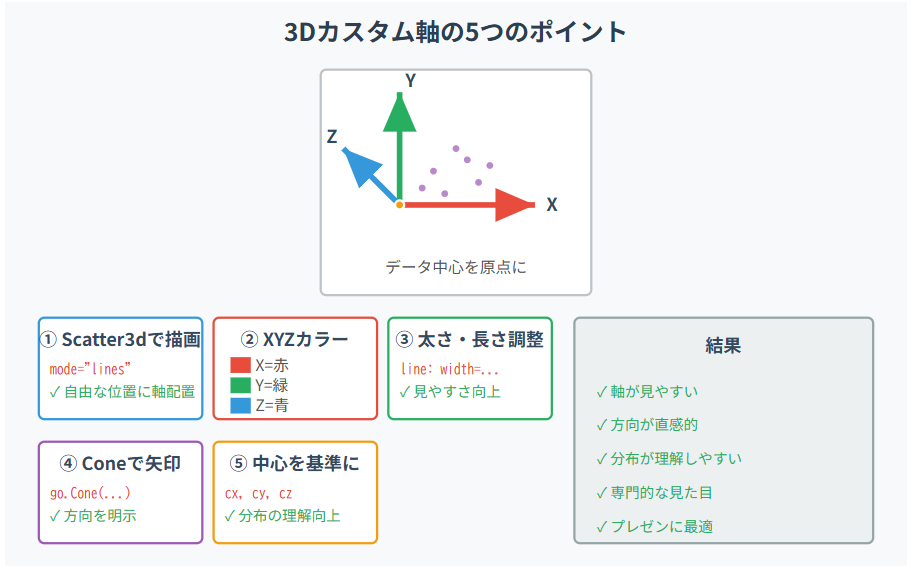
・Scatter3d(mode="lines") を使うと、好きな位置に軸線を追加でき、太さ・色・長さも自由に調整できて見やすくなる。
・XYZカラー(R/G/B)で方向が直感的に分かり、原点をデータ中心にすると分析にも向く。
・さらに Cone を付ければ、3D座標系の説明図としても活用できる。
カスタム軸を入れるだけで、3Dグラフの読みやすさは大きく向上する。
動画解説
プレゼン用資料 (著者用)