はじめに
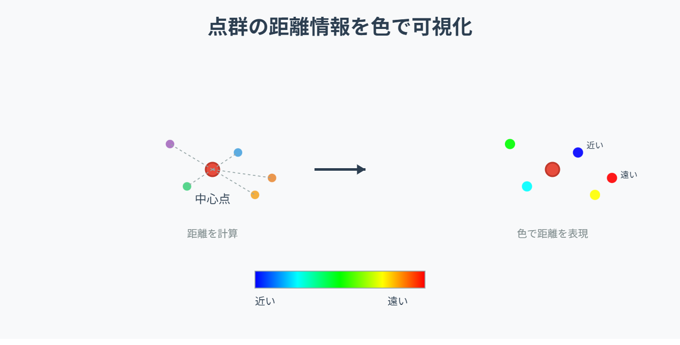
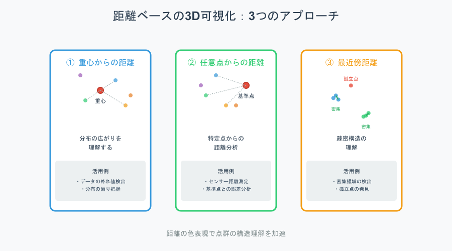
点群データでは「どの点が中心から近いか/遠いか」「ある点との距離がどのくらいか」を知りたいことが多い。
そこで距離を"色"として表現すると、
分布構造・外れ値・密集範囲・階層構造をひと目で把握できる。
PlotlyのScatter3dはmarker.colorに距離値を入れるだけで可視化可能。
この記事でできること
- 任意の基準点から距離を計算し、点の色で可視化
- 中心点(重心)からの距離で"広がり"を表示
- 特定の点との距離を可視化して"外れ点"発見
- Google Colabですぐ動くコードつき
必要なライブラリ
import numpy as np
import plotly.graph_objects as go
from sklearn.neighbors import NearestNeighbors  # セクション⑥で使用
① 例データ:3D点群を作成
import numpy as np
import plotly.graph_objects as go

np.random.seed(0)
x, y, z = np.random.randn(3, 300)
points = np.vstack([x, y, z]).T
② 基準点(center)の設定
最も一般的な基準:点群の重心(mean)
cx, cy, cz = points.mean(axis=0)
center = np.array([cx, cy, cz])
③ 各点の"中心からの距離"を計算
ユークリッド距離を使用:
dist_center = np.linalg.norm(points - center, axis=1)
- 大きいほど → 重心から遠い
- 小さいほど → 重心付近に存在
④ 距離を"色"で表現して可視化
fig = go.Figure()

fig.add_trace(go.Scatter3d(
    x=x, y=y, z=z,
    mode="markers",
    marker=dict(
        size=4,
        color=dist_center,        # 距離で色付け
        colorscale="Turbo",
        opacity=0.8,
        colorbar=dict(title="Dist from Center")
    )
))

fig.update_layout(
    title="3D Point Distance from Center",
    scene=dict(aspectmode="data")
)

fig.show()
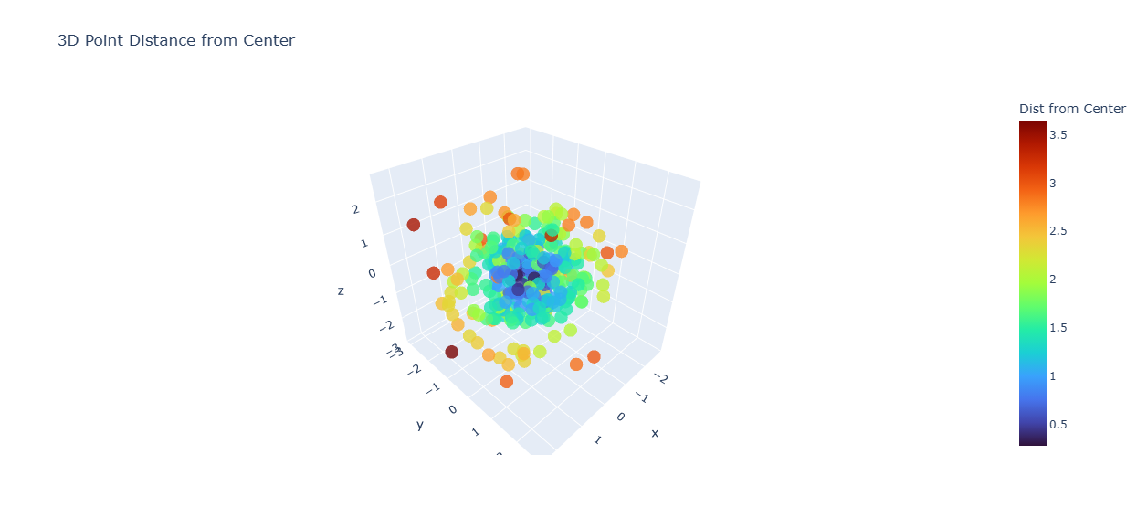
ポイント:
- 重心からの距離が"熱量(Heat)"として見える
- 広がりの傾向・偏り・外れ点がすぐにわかる
⑤ 任意の基準点との距離で可視化(特定点との距離)
たとえば「点 (1,1,1) からの距離」を色付け
target = np.array([1.0, 1.0, 1.0])
dist_target = np.linalg.norm(points - target, axis=1)

fig = go.Figure(go.Scatter3d(
    x=x, y=y, z=z,
    mode="markers",
    marker=dict(
        size=4,
        color=dist_target,
        colorscale="Viridis",
        opacity=0.8,
        colorbar=dict(title="Dist from (1,1,1)")
    )
))

fig.update_layout(scene=dict(aspectmode='data'))
fig.show()
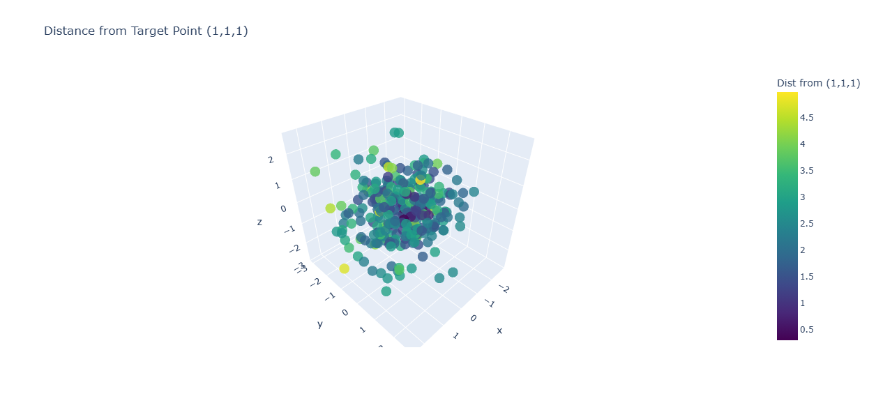
ポイント:
- 目的点から遠い領域が一瞬で分かる
- センサー距離・基準点との誤差分析に使いやすい
⑥ 点群中の"最近傍距離"を可視化(疎密構造の理解)
各点について「最も近い他点までの距離」を表示
- 密集地帯=距離が小さい
- 孤立点=距離が大きい(外れ値)
from sklearn.neighbors import NearestNeighbors

nn = NearestNeighbors(n_neighbors=2).fit(points)
distances, _ = nn.kneighbors(points)
nearest_dist = distances[:, 1]    # 自分以外の最短距離

fig = go.Figure(go.Scatter3d(
    x=x, y=y, z=z,
    mode="markers",
    marker=dict(
        size=4,
        color=nearest_dist,
        colorscale="Plasma",
        opacity=0.85,
        colorbar=dict(title="Nearest Dist")
    ),
    name="Nearest Neighbor Distance"
))

fig.update_layout(scene=dict(aspectmode="data"))
fig.show()
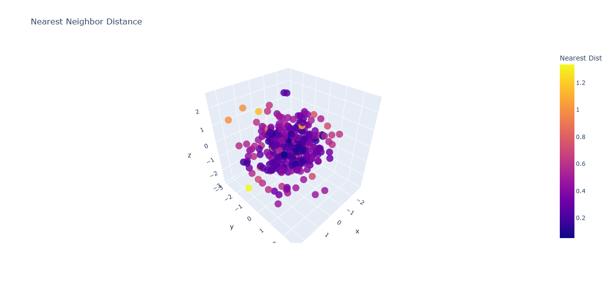
ポイント:
- "密集 vs 孤立" がひと目でわかる
- 外れ値検知に非常に有効
⑦ 距離と点の大きさを連動させる(距離エンコードの強化)
fig = go.Figure(go.Scatter3d(
    x=x, y=y, z=z,
    mode="markers",
    marker=dict(
        size=2 + (dist_center * 3),   # 距離が大きいほど大きく
        color=dist_center,
        colorscale="Turbo",
        opacity=0.8
    )
))

fig.update_layout(scene=dict(aspectmode="data"))
fig.show()
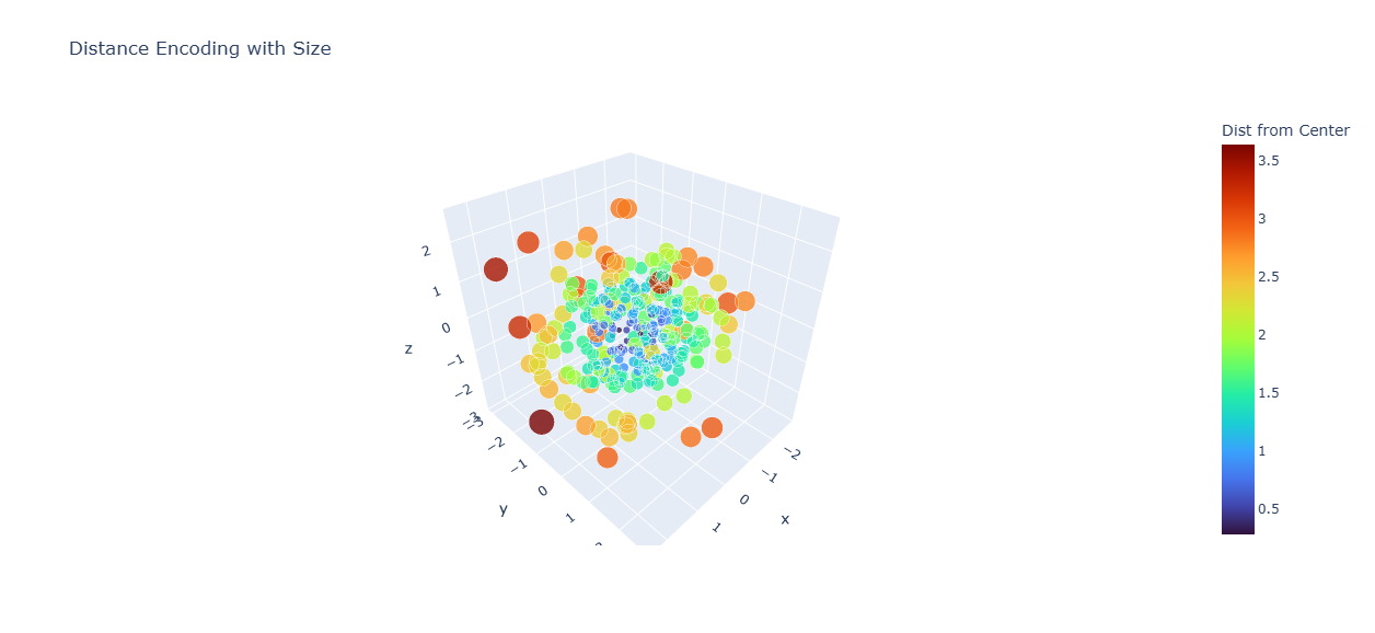
ポイント:
- 距離が大きい点が「浮かび上がる」
- 中心からの偏差を直感的に理解できる
⑧ 背景・軸を整えると距離色が際立つ
fig.update_layout(
    scene=dict(
        xaxis=dict(backgroundcolor="rgb(245,245,245)"),
        yaxis=dict(backgroundcolor="rgb(245,245,245)"),
        zaxis=dict(backgroundcolor="rgb(250,250,250)"),
        aspectmode="data"
    )
)
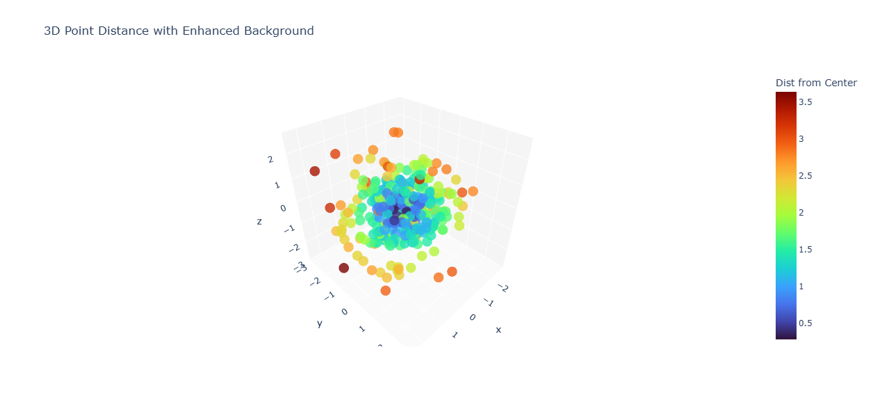
ポイント:
- 明るい背景 → 色付けが映える
トラブルシュート
| 問題 | 解決方法 |
|---|---|
| 色が見づらい |
colorscale="Viridis"や"Cividis"に変更 |
| 外れ点が溶ける |
sizeを距離連動にする |
| 点が多くて重い | 点数をsubsample(300→150) |
| 距離の絶対値が大きすぎる | 正規化:dist / dist.max()など |
まとめ
距離を指標にした3D可視化は、点群の形や広がりを直感的に把握するのに役立つ。
重心や基準点からの距離で色づけすれば分布の傾向が見え、最近傍距離を使うと密集度や外れ値がすぐに分かる。
距離に応じて色やサイズを変えることで、点群構造の理解がさらに進む。